
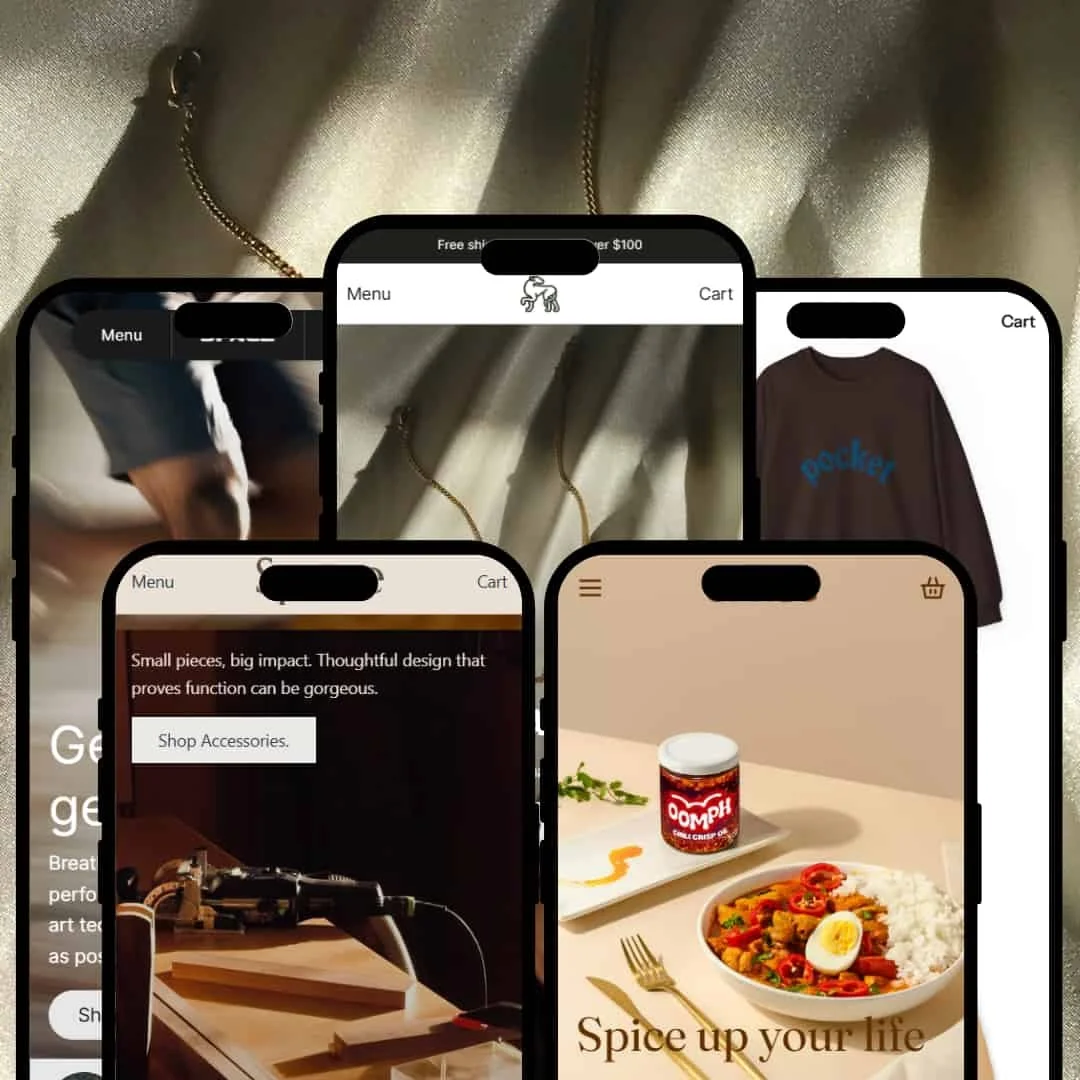
The Space Shopify theme is a versatile template offering five distinct presets: Swift, Shimmer, Silk, Spice, and Streetwear. Instead of rehashing the feature list, this review dives deep into how each preset actually performs in a real-world setting. We’ve tested the layouts, interactive elements, and overall user flow to give you a clear picture of its true strengths and weaknesses.
Pros.
〰️
Pros. 〰️
✚ Superior Feature Implementation: Standard Shopify features are elevated through design. Elements like Quick View modals, Before/After sliders, and Lookbooks are implemented with a polish that enhances brand perception and can support a higher average order value (AOV).
✚ Focus on Shopper Convenience: The theme consistently makes smart choices that reduce friction. The clear presentation of in-store pickup info, ingredient lists, and popup size charts directly on product pages answers key questions upfront, which can streamline the path to purchase and increase conversion rates.
✚ Strong Visual Storytelling: Every preset excels at using large-format imagery, video backgrounds, and editorial layouts. This allows merchants to build a compelling brand narrative, not just a product catalog, which can improve customer loyalty and time on site.
Cons.
〰️
Cons. 〰️
− The Minimalist Trap (Strategic Weakness): The theme's greatest strength is also a significant risk. Its elegant, spacious layouts (especially in Swift and Silk) depend heavily on professional, high-concept photography. For a merchant without high-quality visual assets, these designs can look empty or unfinished, which may detract from the site's professional appearance and damage customer trust.
− Inconsistent User Feedback: The theme-wide behavior of the "Add to Cart" function is inconsistent. Sometimes it triggers a slide-out cart drawer for immediate confirmation, while other times it only updates the header icon. This creates user friction that could negatively impact conversion rates, especially for impulse buys.
− Aesthetic Choices Impacting Usability: In pursuit of a specific style, some presets use typography (e.g., thin serif fonts, all-caps paragraphs) that can slightly hinder readability. This may create a frustrating experience for some users and requires careful customization by the merchant to avoid accessibility issues.
-
An impactful, auto-playing video hero immediately establishes a dynamic mood, flowing seamlessly into a structured grid of bold product images that encourages immediate exploration.
⊕ Pros
✚ The hero section effectively uses a full-width video with a non-intrusive, bottom-left aligned CTA, capturing attention without distracting from the core value proposition.
✚ The spacious, minimalist layout with ample white space creates a high-end, uncluttered canvas that makes professional product photography the central focus.
⊖ Cons
− On product pages, the horizontal image gallery thumbnails are small, which can make them slightly fiddly to click with precision and could increase mis-taps on mobile.
− The top announcement bar is thin and static, making it easy for visitors to overlook, potentially lowering the engagement rate of important promotions.
-
A sophisticated dark theme immediately sets a premium tone, using high-contrast serif fonts and glowing product photography to create an exclusive and immersive Browse journey.
⊕ Pros
✚ The dark-mode design is flawlessly executed, creating a rich, immersive backdrop that makes product imagery pop and supports a premium brand perception.
✚ The homepage masterfully integrates a "Before/After" image slider, presenting a compelling visual narrative that is perfectly suited for demonstrating product results and increasing conversion confidence.
⊖ Cons
− Desktop-Only: The main navigation lacks visual flair; for a luxury theme, incorporating small collection images into the mega menu could elevate the Browse experience and improve click-through rates to key categories.
-
This preset is purpose-built for the health and wellness industry, focusing on visual proof and product education.
⊕ Pros
✚ High-Impact "Before/After" Slider: This is the star of the homepage. The universal slider feature is used here to create a compelling, interactive case study that communicates a product's value far better than words alone.
✚ Clear Ingredient Highlights: Product pages feature a dedicated "Key Ingredients" section with icons and brief descriptions. It’s a clean, scannable design that makes complex product information easy for shoppers to understand.
✚ Prominent Trust Badges: Just below the main call-to-action on product pages, the theme displays clear, well-designed icons (e.g., "Vegan," "Cruelty-Free"). This is a smart, immediate way to build trust with conscientious buyers.
⊖ Cons
− Overly Subtle Promo Banners: In-page promotional sections lack strong visual distinction from other content blocks. Their muted design makes them easy to scroll past, which could negatively impact the visibility of key sales and offers.
-
Silk channels the feel of a high-fashion editorial, blending soft colors and sophisticated layouts for a story-driven shopping experience.
⊕ Pros
✚ The homepage layout masterfully weaves editorial content (blog posts) into product grids, creating a rich narrative that can increase time on page and build brand affinity.
✚ The product page ditches a standard thumbnail strip for a stylish multi-column collage for its image gallery, making product discovery more visually engaging and modern.
✚ The footer is exceptionally well-organized with clear headings and a prominent newsletter signup, providing a highly functional end-point that can boost email subscriptions.
⊖ Cons
− The stylish overlapping design elements can occasionally cause text to sit on busy parts of an image, creating low-contrast situations that hinder readability and could be an accessibility issue.
− Mobile-Only: The main mobile menu is a basic dropdown list, which feels like a missed opportunity to mirror the theme's luxurious desktop experience with a more visual, slide-out navigation panel.
-
This preset is purpose-built for the health and wellness industry, focusing on visual proof and product education.
⊕ Pros
✚ The homepage’s asymmetrical product grid is visually dynamic, breaking from standard e-commerce layouts to create an edgy look that can reduce bounce rate by capturing user interest.
✚ A minimal sticky header maximizes the screen real estate available for Browse products, improving the user experience and keeping focus on the merchandise, especially on mobile.
⊖ Cons
− The age verifier popup is aggressive on page load, creating an immediate barrier that could deter casual Browse and increase site abandonment rates.
− The heavy emphasis on full-screen lookbooks and large images demands an extensive library of professional, high-res photography that some startup brands may not have.
Niche Suitability
Not Ideal For
Final Recommendation
-
This theme is perfect for visually-driven brands with strong photography and a clear niche identity. Businesses in high-fashion, cosmetics, specialty foods, modern tech, and streetwear will find a preset that feels almost custom-built for them.
-
Merchants without a strong library of high-quality images may struggle to make this theme look its best. Likewise, large-catalog, big-box-style stores or those competing primarily on price may find the editorial, story-driven layouts are not optimized for their high-volume, low-margin business model.
★ 8.6/10
Rating
-
The theme flawlessly presents Shopify's standard features. It doesn't add revolutionary new functions, but its implementation of universal tools like product filtering, quick view, and promo sections is clean and highly usable. The demos showcased a well-styled presentation of the configured filters.
9
-
For the end customer, the theme is highly intuitive. For the merchant, the sections are logical, but achieving the high-end look of the demos requires significant creative effort and assets.
8
-
The theme is fully responsive and looks great on mobile. Minor deductions for inconsistent navigation (e.g., Silk's basic mobile menu) and some small click targets.
8
-
Based on hands-on testing, the theme felt fast and fluid. Interactive elements like the slide-out cart, quick view modals, and animations loaded smoothly without perceptible lag.
9
-
With five distinct and well-executed presets, the theme offers incredible flexibility out of the box. It’s a great starting point for brands across multiple premium niches.
9
FAQ
〰️
FAQ 〰️
-
👑 Yes, the "Spice" preset is specifically designed for food and beverage brands, with features like recipe-style blog layouts and clear nutritional information tabs.
-
📱Yes, it is fully responsive and performs well on mobile devices. Our testing found the mobile experience to be smooth, though we noted minor inconsistencies like a basic dropdown menu in the "Silk" preset that didn't match its luxurious desktop counterpart.
-
🎨 The theme is highly customizable through the Shopify theme editor. You can change colors, typography, and layouts. However, its core strength lies in its strong initial design, which works best when your brand identity aligns with one of the presets.
-
⚡During our hands-on testing, the theme demonstrated excellent performance. Interactive elements were responsive, pages loaded quickly, and animations were smooth, providing a fluid user experience.
-
👕 Yes, the theme supports product variants with clean dropdown menus and color swatches. Features like the in-page pop-up for the size chart in the "Streetwear" preset show a thoughtful approach to handling variants.
-
🔎 The theme follows Shopify’s SEO best practices for structure and code. It allows for all standard SEO inputs like meta descriptions and alt text through the Shopify admin.
-
💱 Yes, a language and currency switcher was present and functional in the header or footer across the demos, allowing merchants to use Shopify Markets to sell internationally.
-
⚙️ Yes, as with all modern Shopify themes, it is built to integrate with apps from the Shopify App Store. The demos show clean integration of features like product reviews, which often rely on apps.
-
🛒 Yes, Shopify allows you to add the Space theme to your store and customize it with your own products for free. You only pay if you decide to publish it as your live theme. All five presets can be previewed via the demo links in this review.
Disclaimer: This review is based on hands-on testing of the publicly available "Swift," "Shimmer," "Silk," "Spice," and "Streetwear" preset demos of the Space Shopify theme as of June 2025. Theme features, preset availability, and performance can change with subsequent updates from the theme developer.