
Spark is a Shopify theme designed for fashion retailers seeking an elegant presentation layer with built-in conversion tools. The theme packages standard e-commerce mechanics into a visually polished interface, offering merchants a slide-out cart drawer and accordion-style product information displays that keep shoppers engaged without overwhelming them. Testing showed Spark balances aesthetic flexibility with functional depth, letting merchants stage inventory within either a minimalist luxury framework or a vibrant, eco-conscious aesthetic depending on the chosen preset.
Pros.
〰️
Pros. 〰️
✚ Flexible presets, consistent core
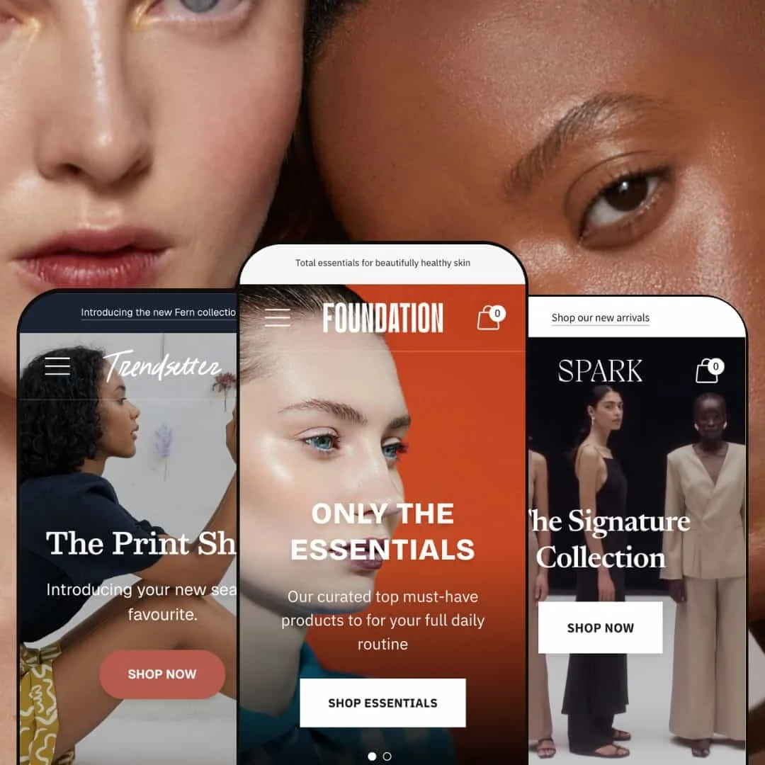
Flexible preset options that maintain core functionality while offering distinct aesthetic approaches. Default and Trendsetter present two clear archetypes—quiet luxury and high-energy sustainability—without changing how carts, galleries, or product information behave. Teams can switch moods without rebuilding the store.
✚ Accordion-based product information
Materials, fit, care, and related details live behind tidy toggles. Information remains accessible for meticulous shoppers while pages stay readable. The expanded sets seen in demos, including Description and Sustainability, show how deeper narratives fit without bloating the primary description.
✚ Full-screen media with smooth zoom
Product images open into a responsive lightbox and carousel cleanly. Texture, stitching, and drape are easy to inspect, which builds confidence for apparel where touch is impossible online.
✚ Variant-aware messaging and sizing support
Stock messages react to option changes, and the size-guide modal supplies straightforward tables. Together they cut guesswork and help prevent avoidable returns.
✚ Cart drawer that supports sharing
The slide-out cart is consistent and unobtrusive, and social share buttons make it simple to save or circulate finds. That can spark soft network effects without extra tooling.
✚ Social proof and trust modules
Instagram-style feeds and icon-plus-text trust badges can sit near the top of a page to answer objections early. Visible signals around sustainability, returns, and gifting build assurance before visitors commit time to deeper browsing.
Cons.
〰️
Cons. 〰️
− No true one-click quick-add from collection grids
Across presets, shoppers typically must visit the PDP to add to cart. For replenishment or low-consideration items, that extra step can dampen impulse conversion.
− Pagination-only collection browsing
Traditional page breaks interrupt long, exploratory sessions, especially on mobile where continuous scroll feels natural. It adds taps where none would otherwise be needed.
− Hidden recommendation-carousel affordances
On PDPs, secondary carousels don’t always advertise that more items are off-screen until you interact. Some cross-sell potential may go unseen.
-
A preset for brands that communicate luxury through restraint. The homepage opens with a calm, text-first hero and hands space to carefully lit product photography. The overall rhythm feels editorial rather than promotional.
What works in this preset
The hero composition is deliberately text-forward. A centered lockup replaces the usual full-bleed image, which keeps typography crisp and makes the first interaction feel curated rather than loud. That choice sets an editorial tone and steers attention toward the next sections without distraction.
Typography and palette do most of the branding. Serif headlines paired with muted earth tones read as “boutique” at a glance. The restraint creates perceived value; price-anchoring happens psychologically before a shopper even reaches a PDP.
Section pacing is measured. The event countdown appears mid-page rather than shouting from the top, so urgency supports the story instead of hijacking it. This lets limited-edition drops ride alongside evergreen content without breaking the calm.
Homepage pathways feel intentional. A dual-CTA announcement bar and tightly edited collection callouts direct new visitors to either discovery or shopping modes. The lack of heavy background imagery keeps load perception snappy and makes the product photography carry the narrative.
-
The Foundation preset leans into wellness and beauty. Earthy tones, ample white space, and subtle gradients produce a fresh, “clean label” mood that suits skincare and self-care products.
What works in this preset
The palette flatters dewy product shots and textured packaging. Greens, sands, and off-whites help liquids, balms, and serums pop without harsh contrast, so ingredient lists and usage notes remain readable.
Subtle gradient accents tie promotions into the overall look. Banners and hero areas feel integrated rather than bolted on, which keeps the page flowing and avoids the “ad block” effect some shoppers ignore.
Overall spacing gives longer storytelling room to breathe. Skincare routines, benefits callouts, and routine builders appear digestible because typography and background tones separate information into calm segments.
Where it stumbles
Footer selectors and small icons can run light on contrast against darker backgrounds. Merchants should nudge color values for accessibility, especially for currency or language controls.
Some sliders hide their affordances in the design. Arrows and pagination are elegant but faint, so first-time visitors may miss that additional items are one tap away.
-
A preset that reorients Spark around sustainability storytelling and visual energy. Bright color, sans-serif type, and community-friendly touches create an approachable, optimistic storefront.
What works in this preset
Hover-activated size swatches on product cards reduce dead-end clicks. Shoppers can check size availability and pre-select quickly, which trims frustration and keeps momentum high for repeat buyers who know their fit.
The color system is intentionally punchy. Saturated yellows and greens match outdoor and activewear categories, cueing “fun and friendly” without sacrificing clarity. It reads native on mobile and invites scrolling.
Product-card hover interactions lower the chance of bouncing from a PDP. By previewing sizes before the click-through, visitors avoid landing on out-of-stock variants and stay focused on items that are actually available.
Where it stumbles
The social feed can lengthen the page when used, which on content-heavy stores may push critical CTAs further down and soften their visibility.
Lookbook-style storytelling is less prominent than in Default. Brands that sell through editorial outfits or campaign imagery may miss that emphasis here.
The vibrant palette can fight with neutral photography. If your catalog is largely monochrome, Trendsetter’s energy can overshadow it unless tones or imagery are adjusted.
Niche Suitability
Not Ideal For
-
Fashion and accessories brands that prioritize editorial presentation and trust-building over raw speed. Strong product stories, craftsmanship, or sustainability credentials benefit from Spark’s structure.
-
High-volume discounters and flash-sale models built around rapid browsing and impulse adds. If your funnel leans on infinite scroll and aggressive quick-buy patterns, Spark’s measured flow may feel slow.
-
Medium — Spark ships with effective defaults, but it rewards thoughtful content: good photography, clear accordion copy, and tuned section order. Brands without those assets should plan a content pass to unlock the theme’s best behavior.
Final Recommendation
★ 7.8/10
Rating
8
7
7
8
9
-
Solid implementation of core commerce mechanics: cart drawer, accordion product info, responsive media, and variant-aware stock messaging. Interactions behaved reliably in testing. Deduction for the lack of true quick-add from collections and the reliance on pagination.
-
Clear CTAs and logically named sections keep navigation straightforward. Accordion content keeps PDPs uncluttered. Friction appears when browsing deep catalogs due to pagination and PDP-first adds.
-
Layouts adapt cleanly and touch targets are appropriately sized. The cart drawer and accordions work smoothly on small screens. Pagination adds extra taps on long catalogs, and without a long-press alternative, product exploration still means full page loads.
-
Page transitions felt smooth and interactive elements responded without lag. Lightbox zoom handled high-resolution images well, and timers updated in real time. Perceived speed will depend on merchant image discipline and apps.
-
Three distinct presets cover minimalist luxury and vibrant sustainability. Section-based building blocks—hero, promos, testimonials, features—offer granular control over hierarchy and tone without custom code.
FAQ
〰️
FAQ 〰️
-
👑 Yes. Default demonstrates luxury apparel while Trendsetter focuses on sustainable casualwear. The accordion tabs adapt to either deep fabric notes or brand-values content, and the size-guide modal supports precise fit decisions.
-
📱Spark delivers a functional mobile experience with well-sized touch targets and a slide-out cart drawer that avoids hard redirects. Pagination requires extra taps versus continuous scroll, which can slow long sessions, but overall interactions stay stable.
-
🎨 Very. Default’s luxury minimalism and Trendsetter’s vibrant, values-driven tone show how far the visuals can stretch without changing the core. Reordering sections, tuning badges, and editing accordion content gives you fine control.
-
⚡ In testing, accordions, modals, and the cart drawer responded promptly. The image lightbox loaded high-res photography smoothly, and timers updated in real time. We didn’t hit noticeable bottlenecks.
-
👕 Variant selection triggers clear stock messages, and the integrated size guide shows measurements in a simple table. Trendsetter’s hover size swatches help shoppers avoid out-of-stock detours.
-
🔎 Spark rides Shopify’s native SEO features for titles, descriptions, and URLs. It organizes PDP details cleanly for search engines, but advanced schema or automation will require apps or custom work.
-
💱 Yes. It works with Shopify’s native Markets features for languages and currencies. Placement of selectors depends on your configuration, but the theme accommodates them.
-
⚙️ Yes. Standard review, upsell, and loyalty apps install as expected, and section/block insertion points are clear. For Liquid edits or bespoke blocks, developer effort varies by scope.
-
🛒 Yes. You can preview the live demos and install the theme in your admin to customize extensively before publishing. Charges apply only when you publish.
This review is based on hands-on testing of the publicly available “Spark (Defaullt)”, Foundation” and “Trendsetter” preset demos of the Spark Shopify theme as of October 23, 2025. Theme features, preset availability, and performance can change with subsequent updates from the theme developer.