
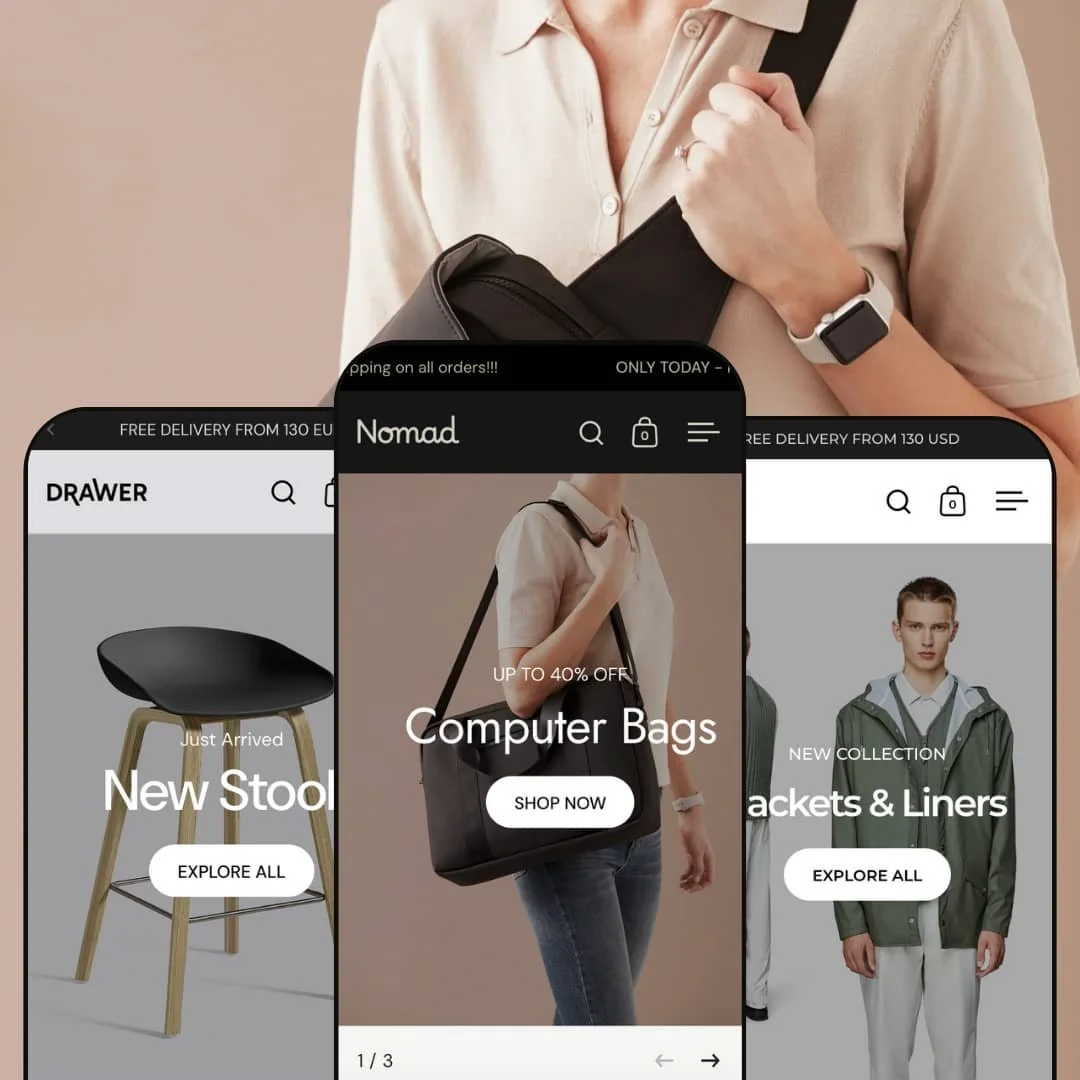
Split, from Krown Themes, is a Shopify theme with a clear editorial angle: a clean split-screen canvas that stages copy on one side and imagery on the other. It ships at $280 and comes in three distinct presets—Default (Cuber), Drawer (Looker), and Nomad (Jagger)—each steering the store in a different direction, from minimalist fashion to catalog-first furniture to a premium dark look.
For this review I tested all three demos, timing navigation flows, checking cart behavior, and examining product page staging. The goal is simple: show where Split excels, where it adds friction, and which merchants will get the most out of its two-panel design.
Pros.
〰️
Pros. 〰️
✚ Split-screen hero system that commands attention
Across presets the two-panel hero format lands a clear message alongside a full-height visual. It focuses the eye, sets narrative tone, and invites immediate action.
✚ Flexible presets, consistent core
Three distinct looks cover minimalist fashion, structured catalog browsing, and premium dark styling while keeping familiar building blocks. Teams can switch aesthetics without relearning the basic shopping flow.
✚ Versatile navigation and cart modes
Between hamburger and horizontal header patterns—and cart drawer versus a full cart page—stores can choose the approach that fits their audience and catalog size.
✚ Merchandising power tools baked in
Badges, quick-buy, color swatches, before/after sliders, promo components, size-chart links, and vendor attribution appear throughout the demos. These support faster evaluation and higher intent without heavy customization.
✚ Editorial sections that tell stories
Full-bleed video and “shop-the-look” compositions add magazine-style depth. They let brands pair imagery and commerce in a single, coherent scroll.
Cons.
〰️
Cons. 〰️
− Hidden navigation in two presets
Default and Nomad tuck categories behind a menu button. It’s elegant, yet discoverability can suffer for shoppers who prefer always-visible menus.
− Inconsistent PDP feature staging between presets
Elements like stock urgency bars and collapsible detail accordions appeared in one preset but not the others. This variance increases setup decisions per preset and requires extra QA to keep product pages aligned.
− A cautious approach to attention grabs
Aggressive promotional patterns (early popups, scrolling alerts) can help sales, yet they demand careful timing and frequency to avoid interruptions.
-
A minimalist, fashion-forward take that foregrounds imagery with a clean, neutral palette and a compact header. Navigation is intentionally quiet so campaigns and product visuals stay in focus.
What works in this preset
Product pages in this preset showcase urgency and clarity. The tested demo presented a stock-left indicator with a horizontal progress bar plus tidy information organization via collapsible “Details.” Together these cues encourage quicker decisions while keeping the above-the-fold view clean.
The homepage balances commerce and editorial without clutter. A three-across “Bestsellers” section supplies dense product exposure with badges and clear price treatments, including strikethroughs and “From” pricing for multi-variant items.
Where it stumbles
Breadcrumbs use a low-contrast grey against white. The look is refined, yet the subtlety can reduce wayfinding for some shoppers.
The Women collection employed a two-column grid on desktop. It feels spacious, though large monitors require more scrolling than a three-column layout.
-
A furniture-oriented presentation with wider catalog surfacing and an emphasis on structured browsing. Typography stays modern; the canvas favors orderly, high-density discovery.
What works in this preset
Collection pages defaulted to a three-column grid in testing, showing more products per view and speeding scanning on large screens.
On PDPs, circular color swatches replace plain dropdowns. Visual variant selection clarifies choices at a glance and feels polished.
The “Best Sellers” section uses a split composition—headline and “View all” on the left, grid on the right—giving structure to merchandising without sacrificing space for products. A scrolling announcement line with arrows cycles multiple messages in a single strip.
Where it stumbles
A “Final Clearance” promotional popup appeared moments after landing. It’s effective for sales, yet it can interrupt first-time visitors before they see the homepage.
The “Chairs” collection title renders small and centered, blending into whitespace. It looks elegant, though the heading could be easier to spot while scrolling.
-
A premium, dark-toned aesthetic for leather goods and accessories. The look is high-contrast and moody, with tan accent buttons standing out on charcoal backdrops.
What works in this preset
The dark presentation adds drama and immediately elevates perceived value. A bold announcement line that scrolls across the top amplifies urgency for limited-time offers.
Collections sustain the familiar split layout—title on the left, grid on the right—so the brand’s look carries through from hero to browsing. This continuity reinforces identity across shopping flows.
The footer carries a concise mission statement with social links. It reinforces positioning and gives shoppers fast paths to brand channels.
Where it stumbles
While luxurious, the dark canvas can reduce perceived detail on certain product types, especially light or pastel goods. Merchants with bright, colorful lines may find imagery pops more on a light theme.
Structurally it resembles Default in header style and hero approach, so teams expecting a radically different UX beyond palette and staging may find the change more cosmetic than behavioral.
The Weekend Bags collection employed a two-column grid. It keeps the aesthetic consistent but shows fewer items per view than denser grids.
Niche Suitability
Not Ideal For
-
Visually driven fashion, furniture, and lifestyle brands with strong photography and roughly 3–8 main categories. Teams that value editorial heroes, on-brand merchandising sections, and the ability to pick between compact or expansive navigation patterns.
-
Stores with deep hierarchies that require persistent navigation bars; merchants seeking perfectly uniform PDP behaviors across all presets; catalogs whose imagery relies on light backgrounds for clarity.
-
Medium to High — choosing the right preset is a strategic call because header, cart, and PDP staging differ. Expect a careful configuration pass per preset, plus testing to keep product pages consistent.
Final Recommendation
★ 7.4/10
Rating
-
Strong badges, size charts, vendor attribution, sharing, swatches, quick-buy, and promo elements. Feature staging varies by preset, which adds decisions during setup.
7
-
Split-screen patterns are easy once learned. Hidden navigation in Default/Nomad adds a click, and preset differences mean merchants must match UX to their workflow.
6
-
Split blocks stack cleanly and cart-drawer interactions felt smooth in testing. Hidden menus still add a tap, and cart-page flows on Nomad can feel less fluid on phones.
8
-
Page transitions felt responsive; the cart drawer opened quickly; large visuals loaded briskly in the demos. Heavy promo layers or dense media may warrant extra checks.
8
-
Three distinct presets cover minimalist, catalog-first, and premium dark looks. Core structure stays split-hero focused, which may not suit teams chasing classic full-width banners.
8
FAQ
〰️
FAQ 〰️
-
👑 Yes. The Default (Cuber) preset centers editorial campaign blocks, size-chart links, vendor attribution, ratings, and badges—useful signals for apparel evaluation.
-
📱Yes. The split layout stacks into clean sections on phones. In testing, cart-drawer and PDP interactions felt smooth; hidden menus naturally add an extra tap to reach categories.
-
🎨 High within each preset’s structure. You can adjust typography, colors, buttons, grids, and section mixes. Drawer demonstrates advanced touches like visual color swatches.
-
⚡ The demos felt quick to navigate, with fast cart interactions and crisp hero loads. As always, re-test after enabling popups or heavy media to confirm real-world performance.
-
👕 Yes. Variant selectors appear as buttons or circular swatches depending on preset and product. “From” pricing on cards communicates variant price ranges.
-
🔎 Standard Shopify SEO controls apply (titles, metas, URLs) and breadcrumb trails aid structure. Clean HTML and snappy loads in demos support solid technical foundations.
-
💱 Yes. EU translations are included, and the live demos expose language and country selectors in the footer. RTL support is also documented.
-
⚙️ Yes. App blocks and extensions slot into product pages and carts. Review apps, size-guide apps, and upsell tools complement what the theme already exposes.
-
🛒 Yes. You can install and test Split on a development store and preview all three live demos to compare header, cart, and PDP staging before launch.
This review is based on hands-on testing of the publicly available “Default” (also called “Cuber”), “Drawer” (also called “Looker”), and “Nomad” (also called “Jagger”) preset demos of the Split Shopify theme as of November 6, 2025. Theme features, preset availability, and performance can change with subsequent updates from the theme developer.