
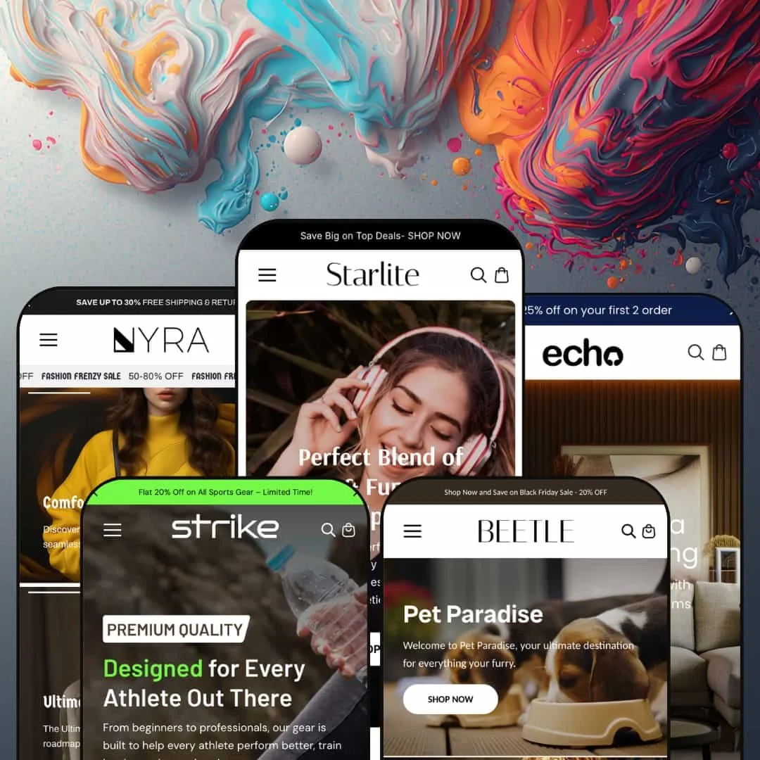
Most Shopify themes pick a single vertical and build everything around it. Starlite goes the other way: one purchase, five preset storefronts spanning electronics, furniture, women's fashion, pet supplies, and sports gear, each with its own menu architecture rather than a recolor of the last. That breadth is the entire pitch, which raises a fair question about whether range costs depth. Underneath sits a 2024-era Online Store 2.0 build, so the section library runs deep but stops short of the newest nested Theme-Blocks architecture.
Five real storefronts, one license
Agencies and multi-brand operators get the most from this. Starlite ships five presets that aren't recolors of one layout: electronics, furniture, women's fashion, pet supplies and sports gear, each with its own menu architecture, hero system and section mix. The differences run to architecture, not just color. For a studio standardizing on one theme across several client builds, or a single merchant in a mixed catalog still settling on a primary vertical, buying once and reskinning into a convincingly different store saves both the cost of a second theme and a second learning curve.
A product-comparison drawer built in
A Compare Products drawer ships with the theme, opening a table that lines up price, SKU, rating, discount, vendor, tags, weight, stock and a short description across the items a shopper selects. For categories where buyers genuinely cross-shop on attributes, that does merchandising work a plain grid can't. It is not decorative. It pays off most for electronics and sports-gear catalogs in the rough 20-to-200 SKU range, where considered purchases turn on spec differences. One caveat worth stating plainly: the table draws from product metafields and fields like vendor, weight and tags, so you populate that data before the feature earns its keep.
A conversion kit that's already wired in
Countdown timers, stock counters, promo tiles, promo popups, cross-sell rails, quick view, a slide-out cart and a sticky add-to-cart bar arrive as one coordinated merchandising kit, staged across every preset. For promo-led selling, having urgency, scarcity and cross-sell already in place means launch is a configuration job rather than an integration project. That saves weeks. It fits discount-driven, seasonal DTC stores that run frequent drops and lean on impulse purchases, where the gap between a flat catalog and a merchandised one is mostly a question of which surfaces you switch on.
A fuller starting box than Dawn
Set against Dawn, Shopify's free baseline, the difference is the section library. Dawn hands you a clean, minimal canvas; Starlite hands you image hotspots, before/after sliders, lookbook heroes, tabbed collection popups, an age verifier and a comparison drawer without app-hunting. It is a denser box out of the gate. For solo operators and small teams running mid-size catalogs who'd rather not vet and maintain a stack of merchandising apps, the trade is paying once for a heavier theme against assembling those pieces by hand and keeping them updated.
The design language is loud by default
Every preset speaks the same promotional dialect: scrolling sale marquees, urgency countdowns, discount popups and densely packed product walls. It sells hard, everywhere, all the time. For a brand built on restraint, that is a lot to unwind. Luxury and quiet-premium positioning, on high-ticket considered purchases like fine jewelry or designer furniture, will spend real hours toning the theme down before it reads the part.
Two headline features are Shopify Plus-only
Quantity pricing and combined listing both sit behind Shopify Plus, so merchants on standard plans see them on the feature list but can't switch them on. That gap is easy to miss at purchase. A wholesale or B2B-leaning seller that wants tiered quantity pricing, or a mid-market store reading the spec sheet at face value, should confirm their plan covers what they're buying. The rest of the feature set runs on standard plans.
It assumes a merchandising-heavy store
The theme is built around density: comparison tables, multi-section homepages, metafield-driven blocks and stacked promotions. Density is the default. Run a lean, impulse-led catalog and much of that becomes surface you maintain rather than lift you feel. A focused shop under roughly twenty-five SKUs, selling on impulse with little cross-shopping, inherits overhead from the very sections that reward larger, attribute-rich catalogs.
What it takes to launch
Expect a multi-day build: a full copy-and-imagery pass across all five presets' hero systems, a pricing and currency reset from placeholder values, metafield population for the comparison and variant-driven sections, mega-menu renaming for each vertical, a heading-and-copy audit to catch bleed between presets, and a review of the bundled EU interface strings.
-
What works in this preset
The homepage reads like a working electronics shop. A rotating hero of headphone banners gives way to a benefits row (original-product, free shipping, easy returns, secure pay) and a "Most Popular Products" rail with a Compare button on every card I checked. Predictive search opens with trending terms like Laptops and Speakers alongside product tiles, the kind of guided-discovery surface spec-shoppers expect. It moves quickly. The mega menu runs several columns deep, with groupings such as Earpods, Speakers, Earbuds and Mini Speakers each expanding into named products, so a catalog with real sub-categories has somewhere to live without bolting on a navigation app.
Behind every product card is a Compare Products drawer, opening a table keyed to price, SKU, rating, discount, vendor, tags, weight, stock and a short description. For audio gear, where buyers weigh driver size and battery life against price, that side-by-side earns its place. The product template carries color and size together, with variants rendered as tap-able swatches instead of a plain dropdown.
Where it stumbles
The "Generation of Electric Gadgets" block and the laptop-offer panels lean on long explanatory paragraphs that read more like filler than merchandising. Electronics sells on specs and imagery. Leading those sections with dense prose is a staging choice that works against the preset's own positioning, and it's the first thing I'd restructure before launch.
-
What works in this preset
Furniture is sold on rooms, and Echo leans into that. Before/after sliders, an image-hotspot section ("Find Your Ideal Furniture") and an accordion of collection stories (Heritage Haven, Elegant Enclave, Innovative Designs, Timeless Designs) give a decor catalog the editorial surfaces it needs. A countdown block and tabbed product groups (Ideal Furniture, Wood Crafted, Home Decor, Luxury Living) round it out. It is the most editorial preset of the set. The inline product card I clicked carried three variant axes at once, color, backrest type and material, which is exactly the configurability a sofa or lounge chair needs without pushing the merchant toward a third-party options app.
Image hotspots pin shoppable dots onto styled room shots, each one opening a quick view. For home goods, that turns a single lifestyle photo into a navigable catalog page. The result is a homepage that tells a story before it asks for the sale.
-
What works in this preset
Nyra is the fashion face, and it carries the theme's only light/dark toggle. The storefront ships dual logo variants and a dark-mode switch, with a scrolling "Fashion Frenzy" sale marquee riding over a stacked editorial hero. When I tapped a collection in the offers grid (Golden Hour, Effort Layers, Gala Glam, Feminine Flow), it opened a product-menu popup instead of a full page load, which keeps browsing quick on a lookbook-style page. It suits the category. Seasonal mega-menu groupings like Winter Warmers, Spring Refresh and Summer Collection map onto how apparel merchants actually plan by drop, so the navigation needs renaming far more than it needs rebuilding before launch.
The hero itself runs four stacked story banners rather than one image, giving a brand room to set tone before product. Colors are token-driven, so the dark theme is a setting, not a rebuild.
Where it stumbles
Those four story banners push the first product well down the page. Fashion converts on product visibility. Opening with that much editorial before a single item appears is a staging decision that delays the catalog, and high-intent shoppers may scroll straight past it.
-
What works in this preset
Pets buy by animal, and Beetle bakes that into the product. The inline card I opened used an "Animal type" option, Cats or Dogs, alongside a color swatch, so one listing serves both species without duplicate SKUs. An image-led mega menu shows product thumbnails (dog hoodie, cat belt, rubber bone, food bowl) right in the navigation, which fits an impulse-led catalog where browsing is visual. It is the most playful preset. The homepage stacks a multi-box video slideshow hero, a "Popular Categories" collection wall, a trust-badge row and a promo marquee, which is a great deal of surface, yet it matches the high-frequency, low-consideration rhythm of pet consumables.
The category wall links straight into themed collections (Paw Hub, Pet Emporium, Furball Frenzy), and the navigation keeps toys, beds and clothes in clean lanes. For a shop that lives on repeat staples, that quick-browse structure is the right instinct.
-
What works in this preset
Strike is the newest preset and the most focused. It opens on a clear sports-gear pitch, with collections split into Gym Equipment, Boxing Essentials and Luxe Swimwear. The catalog mixes hard goods (dumbbells, knee guards, weight sets) with apparel (leggings, tracksuits) and accessories (duffel bags, water bottles), and the menu keeps those lanes from blurring. It feels current. Because it shipped most recently, Strike's imagery and section pacing are tighter than the older presets, which matters if you want the demo that most resembles a 2026 store rather than a 2024 one.
The header carries a featured-product flyout in the mega menu, with slide images linking through to a carry bag, a matte bottle and training shoes. For a gear store built around a few hero SKUs, that turns navigation into a small merchandising slot.
The presets are builds, not skins
Read all five together and the achievement is clear: one section library recomposes into genuinely different information architectures, with different menu depth, hero systems and category logic per preset. That is why the breadth holds up instead of feeling like five color swaps on the same page. It is the strongest argument for the theme.
Every preset shares the same capability floor
Whichever preset you start from, the comparison drawer, image hotspots, countdowns, cross-sell and the dual product-page layouts are all available to it, so the feature set never thins out when you switch from one look to another. Choosing a preset is a styling decision, not a feature trade-off, which isn't true of every multi-preset theme. Pick the look you like.
It's a 2024-era build
This is Online Store 2.0, not the newest architecture. Buyers expecting nested Theme-Blocks or AI-assisted block generation won't find them here; the section model is deep but conventional. For most merchants this won't matter at all, but anyone specifically shopping for the latest block architecture, with deep nesting and generation tooling, should know exactly where this theme sits.
Range is paid for in depth
Because every section has to serve all five verticals, the library is general rather than specialized. A category that needs genuinely purpose-built tooling, like apparel fit-and-size systems or grocery and subscription flows, gets general sections adapted to fit rather than native ones designed for the job. Breadth and depth pull against each other. It chose breadth.
★ 7.4/10
Rating
-
A 35+ section library with a comparison drawer, image hotspots, countdowns, an age verifier and cross-sell covers most merchandising needs; quantity pricing and combined listing require Shopify Plus.
8
-
The presets give fast starting points and the Online Store 2.0 editor is familiar, but dense homepages and metafield-driven sections mean real configuration before a store reads clean.
7
-
Dedicated mobile banner assets, slide-out menus, a sticky add-to-cart and dark-mode awareness make the small-screen layouts feel deliberate rather than reflowed.
8
-
Homepages are image-heavy and stack marquees, slideshows and popups; lazy-loading helps, but expect to trim sections to keep pages light.
6
-
Five distinct presets, dual product-page layouts and a token-driven light/dark scheme give wide latitude, capped mainly by the conventional Online Store 2.0 block model.
8
Frequently Asked Questions
-
Yes. It's the newest of the five presets and ships with the theme, so one license covers every preset, not just the original four.
-
On presets that use it, yes: the pet preset's product card offers an "Animal type" option (Cats or Dogs) beside color, so a single listing covers both. The same variant-and-metafield approach extends to the other presets' product templates.
-
Start from the closest information architecture, Echo's grid for home goods, Nyra's editorial layout for apparel, Strike's lane split for gear, then reskin. The sections are shared, so you're choosing a layout rather than locking in a catalog type.
-
The Nyra preset ships a light/dark toggle and the theme carries dual logo variants, with colors driven by tokens. A dark storefront is a setting, not a rebuild.
-
Pre-translated interface strings, the theme's own buttons, labels and form text, for English, French, Italian, German and Spanish. The shopper-facing language and currency switching itself is handled by Shopify Markets at the platform level, not by the theme.
-
It launched in early 2024 on Online Store 2.0, and the most recent preset arrived in 2026. It's actively maintained, though it isn't built on Shopify's newest Theme-Blocks architecture.
This review is based on hands-on testing of the publicly available preset demos of the Starlite Shopify theme as of June 20 2026. Theme features, preset availability, and performance can change with subsequent updates from the theme developer.