
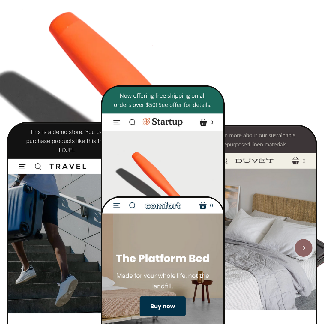
Startup is a lightweight Shopify theme aimed at brands that want to tell a story without crowding the screen. Across its presets the theme uses generous white space, large typographic headlines, and clear call‑to‑action buttons to guide shoppers. A free‑shipping announcement bar sits above a sticky header that stays pinned during scrolls, and a built‑in search icon opens a predictive search overlay, making it easy to find products. The default grooming preset uses a side drawer menu and minimal imagery, whereas the travel, bedding and home presets adopt broader layouts with stronger photography. None of the demos relied on in‑grid quick actions; browsing generally routes to a full product page.
Pros.
〰️
Pros. 〰️
✚ Flexible presets, consistent core
flexible preset options that maintain core functionality while offering distinct aesthetic approaches. Each preset changes the visual story—drawer vs horizontal menus, calm textiles vs bold gear—without changing how shoppers move through the store. That lets teams swap looks to suit the category while keeping the learning curve low.
✚ Navigation that stays put
Across presets, the header remains sticky while a compact announcement bar holds promotions in view. The effect is simple but meaningful: way‑finding and offers persist while you scroll, reducing the “where am I?” moment and keeping shoppers oriented.
✚ Search that helps you decide
The demos rely on a search icon that opens a focused overlay and a dedicated results page. That keeps shoppers in a deliberate find‑mode when they know roughly what they want, rather than forcing a detour through categories.
✚ Solid variant configuration on product pages
Where products carry options, selectors are prominent and updates are immediate. Shoppers get a clear sense of what they’re buying—size, color, price—without wrestling the interface, which lowers friction at a pivotal step.
✚ Storytelling modules for reassurance
The theme’s building blocks—testimonial sliders, FAQs and rich media placed near key decisions—support higher‑consideration purchases. By bringing social proof and answers into the primary scroll, the demos reduce pogo‑sticking to secondary pages.
✚ Structured product information
Tabs and clearly separated sections keep long‑form details readable. That structure gives merchants room to educate without turning product pages into walls of text, which helps maintain momentum toward the cart.
Cons.
〰️
Cons. 〰️
🚫 PDP‑centric shopping in the demos
The demos route most actions to the product page, so moving from grid to purchase takes conscious navigation. It’s a clean model, but it rewards brands with focused assortments more than those that depend on dense, in‑grid interactions.
🚫 A minimal interaction layer
The theme’s visual language prefers calm over flash. That restraint is on‑brand for many startups, but for large catalogs it can feel a little static unless augmented with stronger editorial or category storytelling.
🚫 Content governance matters
In at least one preset, staged footer links lead to a 404 page. The theme won’t save a store from broken content; teams still need to maintain page maps so navigation never dead‑ends.
-
Default frames the brand like a modern grooming label: restrained color, simple blocks, and a slide‑out menu instead of a wide, always‑visible navigation. It keeps focus on a small set of hero products with a compact navigation footprint.
What works in this preset
The side‑drawer menu defines the header composition. It reduces clutter and lets the hero and product imagery take center stage. For brands with a small, opinionated catalog, this keeps attention on the pitch rather than on multi‑level navigation.
The homepage pacing is intentionally calm. Large headlines and spaced‑out sections guide the eye toward the primary call to action without overwhelming the visitor. That visual restraint suits grooming and personal‑care launches that want to look purposeful rather than splashy.
The product page follows the same pared‑back idea, keeping the layout readable with clear hierarchy and generous spacing. The overall presentation makes the page feel deliberate and brand‑first rather than hurried.
Where it stumbles
Because the header collapses most choices into a drawer, category visibility is lower on wide screens. That puts a little more work on first‑time visitors who are browsing rather than arriving with a product in mind. The overall visual tempo is also conservative compared with the more image‑led presets, which may feel subdued for brands that want bolder storytelling on the home page.
-
Travel leans into larger photography and a horizontal menu with dropdowns, giving a gear‑centric store a more traditional site map across the header. The look is airier and more catalog‑oriented than Default, with strong product tiles and category names that invite exploration.
What works in this preset
The horizontal header with dropdowns is the defining move. Sections like Luggage, Bags and Accessories sit visibly in the frame, which rewards shoppers who arrive to browse and compare. It feels familiar in the best way for gear, where shoppers want to scan categories first.
Hero and section photography carry the brand tone. Larger images, generous margins and clear labels make the grid feel like a travel catalog, not a blog. The effect is confident and product‑forward without losing the theme’s minimalist language.
Product pages keep the same clarity, with images and copy arranged so the essentials read quickly. The page reads quickly, which suits considered but concise purchases and keeps the focus on the gear.
Where it stumbles
The small circular icon on product cards reads like an action, but it simply behaves as a link to the product page. That ambiguity adds a beat of hesitation before the click. In the footer, a handful of staged links route to a 404 page in the demo; if left unedited in a live store, that creates dead‑ends that erode confidence.
-
Duvet adapts the theme to soft goods. It presents linen sets and robes with a warm, editorial rhythm and inserts gentle education sections about materials and care between product blocks. The overall tone is quiet and tactile.
What works in this preset
The hero and opening blocks establish a home‑and‑textiles mood immediately. Color, spacing and typography skew soft and relaxed, which flatters fabric‑led products and slows the shopper into reading rather than skimming.
Education modules do real work. Sections like “Why linen?” and clear inclusions lists around the set calm decision‑making by answering obvious questions in‑line. That reduces the need to hunt for details and makes premium positioning feel earned.
The product storytelling stays consistent down the page. Lifestyle images mix with studio shots so buyers can imagine both the finish and the fit in a room. It keeps the pace steady and reduces the gap between inspiration and specification.
Where it stumbles
The neutral palette and subtle contrasts can feel a touch too quiet for some brands. If your identity relies on bolder, saturated accents, expect to adjust colors and image treatments so the page doesn’t wash out. That is a creative rather than technical task, but it is still effort.
-
Comfort reframes the theme around a single flagship item: a platform bed. The homepage behaves like a product page, placing size and leg‑color selectors and a purchase button right inside the hero, with assembly and care content nearby.
What works in this preset
The product‑first hero is the signature. Size and color controls sit in the main frame along with an add‑to‑cart button, so the first screen already feels like a purchase surface. When your business revolves around one hero item, collapsing discovery and purchase into the same space shortens the path.
Assembly storytelling is placed close to the decision. Demo imagery and content about how the bed goes together reduces friction by answering one of the biggest furniture objections: “Will this be a hassle?” Keeping that information within the primary scroll keeps the purchase mood intact.
The surrounding content supports the hero item rather than competing with it. The layout keeps reassurance close to the main decision, so objections are handled without sending the shopper away, and the buying frame remains intact.
Where it stumbles
Because the homepage is optimized for one flagship product, category browsing naturally takes a back seat. If your store has multiple equally important items, you’ll need to re‑stage the layout so the header and first screen signal broader choice. The same single‑product intensity can also feel a bit sparse for multi‑collection catalogs.
Niche Suitability
Not Ideal For
-
Startup is a strong fit for brands with focused assortments that want clean pages, direct product configuration, and reassurance content near the moment of decision.
-
If your catalog is wide and the shopping model hinges on dense, in‑grid interactions, you may prefer a theme staged around quicker card‑to‑cart flows out of the box.
-
Medium — setup is straightforward and the presets give you a clear starting point. Expect to invest time in content staging (filling story blocks, pruning dead links) and in design tokens if your brand relies on bolder color or denser category exposure.
Final Recommendation
★ 7.2/10
Rating
-
Core Shopify features are present with clear product configuration and a focused search and PDP experience. The demos keep interactions restrained rather than layering extra purchase shortcuts.
6
-
Sticky navigation, clean layouts and obvious option selectors make the store easy to move through; long‑form sections are structured to read.
7
-
Pages adapt cleanly and the key controls remain accessible; the calm layout translates well to smaller screens.
8
-
Pages load quickly and interactions feel responsive across presets.
8
-
Four distinct presets give different tones while preserving the core mechanics; deeper stylistic departures will come from customizing colors, typography and media.
7
FAQ
〰️
FAQ 〰️
-
👑 Focused catalogs that prize clear storytelling—grooming, travel gear, bedding, or a single hero furniture item. Each preset sets a tone while keeping the mechanics familiar.
-
📱The sticky header, search overlay and product pages adapt well to small screens, and option controls remain easy to tap. The simple layout helps pages feel uncluttered.
-
🎨 Yes. The presets demonstrate different color palettes and type, and the customizer allows you to adjust those tokens and section ordering to match your brand.
-
⚡ In testing, pages and option changes felt snappy. The restrained design and clean structure help the pages render quickly.
-
👕 Products with multiple options present selectors prominently; choosing a different option updates the context immediately so buyers see what they’ve configured.
-
🔎 Clean headings, readable content blocks and dedicated pages (About, FAQ, Blog) provide a solid content surface. Merchants should still add unique copy and descriptive media alt text.
-
💱 You can enable multiple languages and currencies through Shopify Markets, and the theme works with those settings when configured in your store.
-
⚙️ As an Online Store 2.0 theme, Startup supports app blocks and sections. Most modern apps that expose OS 2.0 blocks should slot into templates without custom code.
-
🛒 Yes. Public demos are available, and you can add the theme to your store to preview with your catalog before publishing.
This review is based on hands-on testing of the publicly available “Startup”, ‘‘Travel’’, ‘‘Duvet’’ and ‘‘Comfort preset demo of the Startup Shopify theme as of November 18, 2025. Theme features, preset availability, and performance can change with subsequent updates from the theme developer.