
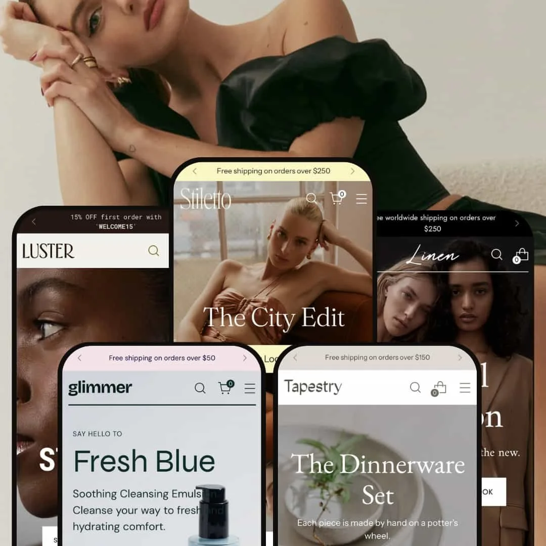
The Stiletto theme for Shopify offers a high-end storefront experience with a conversion-focused layout and a rich selection of interactive merchandising features. From the first visit, prominent hero carousels and multi-level navigation steer users smoothly toward product discovery. If you’re after versatile mega-menus, testimonial modules, and cohesive lookbook staging, Stiletto packs them in across all presets.
Pros
Merchandising depth without detours
Stiletto layers carousels, lookbooks, and inline product cues so shoppers can learn and add with minimal context switching. The combined effect is steady forward motion from hero to cart even in large catalogs.
Cart drawer and incentive mechanics that keep momentum
The cart drawer feels consistently responsive across presets and works in step with incentive patterns like thresholds and point-of-decision nudges. Shoppers see progress and offers in the same space they add items, which reduces abandon-prone back-and-forth.
Storytelling and trust infrastructure
From testimonial modules to transformation visuals and material callouts, Stiletto supports the narratives that premium brands lean on. This structure helps justify price and improves confidence without derailing the shopping flow.
Media inspection that rewards curiosity
Close-up evaluation is encouraged through smooth galleries and image treatments that invite scrutiny. Detailed products—jewelry cuts, fabric textures, skincare consistencies—benefit from that extra beat of inspection before commitment.
Built-in paths for non-standard commerce
Support for experiences and memberships appears where decisions are made rather than hidden behind apps alone. Brands that blend events, subscriptions, and products can run both without duct-tape workarounds.
Cons
Informational depth on badges
Labels like “Sustainable,” “Vegan,” or similar cues don’t always link to definitions or policies. When those flags don’t open into substance, they work as decoration more than guidance.
Overlays and tab behaviors that add friction
Assertive overlays and default-open description blocks can momentarily cover navigation or add extra scroll, particularly on long pages. Small adjustments would smooth the path without removing useful structure.
Visual priority in supporting regions
Newsletter capture and footer trust marks can under-announce themselves in otherwise polished layouts. In busy moments, these secondary but important cues struggle to earn attention.
Mobile polish on certain effects
On image-heavy pages, subtle alignment quirks or momentary softness can appear. They don’t block progress, but they chip at the premium feel the theme otherwise achieves.
-
What works in this preset
The landing experience opens with strong seasonal pushes. Hero carousels pair crisp imagery with assertive calls-to-action, and the pacing favors rapid scanning without sacrificing clarity. This framing keeps attention on current drops and limited collections, which suits fast-moving catalogs.
Default leans into interactive, editorial staging. Hotspot cues layered on hero imagery surface key product details in place, encouraging curiosity without forcing a context switch. The lookbook treatment supports quick orientation—shoppers see where items fit within an outfit before they ever hit a product page.
Category emphasis remains front and center throughout the scroll. Promotional blocks are spaced to re-capture attention between product rows, keeping the experience kinetic and sales-forward. For brands that refresh assortments frequently, this rhythm makes frequent return visits feel purposeful.
Where it stumbles
Vendor names that run long can wrap awkwardly and visually break alignment in collection views, which distracts from otherwise polished grids. The footer newsletter sign-up blends into surrounding elements and doesn’t command the attention you’d expect from a primary capture point; it deserves stronger contrast or spacing to pull focus.
-
What works in this preset
Product pages in Luster showcase trust cues suited to fine goods. Badges for handcrafted materials and recycled metals appear alongside detailed options, and the extensive ring-size dropdown (26 sizes) anticipates bespoke fitting. The effect is fewer sizing doubts and stronger purchase confidence on high-consideration items.
Navigation into categories feels curated rather than generic. A multi-column category carousel keeps adjacent lines visible while guiding the eye to hero pieces, which helps shoppers explore nearby collections without feeling lost. Close inspection of cut and texture is encouraged, supporting slow, deliberate evaluation of premium items.
Where it stumbles
Grid cards omit rating stars in this preset, pushing social proof into dedicated sections; shoppers who scan for on-card reviews may miss them. On certain assets, image effects can briefly resolve less crisply than expected before settling, which interrupts the otherwise luxe impression.
-
What works in this preset
Tabbed product carousels (e.g., “Dresses / Bags / Sandals”) segment discovery into focused passes. Shoppers can browse within a style lane without leaving the page, which keeps momentum high while surfacing breadth.
Editorial hero pairings—video alongside stills—add movement and give the homepage a magazine cadence. That blend sets an expectation of narrative, making subsequent sections feel connected rather than stitched together.
Discovery maintains tempo with quick-view popovers and multi-image hovers that preview style changes at a glance. Reviews and counts are placed for easy scanning when shoppers do click through, and supporting accordions for Sustainability, Returns, and Fit keep dense details tidy until needed.
Where it stumbles
“Sale” and percentage badges sometimes read low-contrast, softening urgency cues. The review section occasionally opens links in a new tab, which can fragment the journey on mobile. During traffic spikes the Instagram block can load sluggishly, and the blog grid can feel cramped on smaller screens.
-
What works in this preset
Retention and convenience are baked into the product flow. A sticky add-to-cart bar returns as you scroll so purchase intent never drifts, and review sections go deeper with star-distribution charts that help parse sentiment. A guided “Find your perfect match” quiz call-to-action invites hesitant visitors into the catalog with a purpose, and “recently viewed” modules personalize the return path.
Education stays close to the purchase decision. Clinical-results blocks and video guides fold into the page through accordions, so shoppers can validate efficacy without pogo-sticking between tabs. The result is a page that balances proof with momentum.
Where it stumbles
Iconic highlights like “Vegan” or “Cruelty-Free” don’t consistently click through to definitions or standards, leaving curiosity partially unsatisfied. The primary blog feed sits lower than expected, so educational posts can feel buried under commerce modules.
-
What works in this preset
Tapestry is built for makers who teach. Story energy comes through long-form visuals and journal touches: full-width galleries celebrate process and texture, while founder-note sections humanize the catalog. For shops that sell limited runs after workshops, anticipation builds naturally and keeps the calendar in sync with product drops.
Where it stumbles
Heavy, bold treatments on discounted items can upset visual hierarchy near premium lines. Workshop listings rely on fixed time slots without a calendar view, which makes multi-date planning harder. The blog grid layout is comparatively plain next to the rest of the preset.
Niche Suitability
Not Ideal For
-
Merchants in fashion, beauty, jewelry, or artisan verticals looking for advanced merchandising, rich media, and modern page layouts that balance sales with story.
-
Stores that depend on large on-grid color tiles, flexible calendar scheduling, or always-visible rating badges on collection cards.
-
Medium — Stiletto is highly configurable, and unlocking its best staging (media, stories, trust, and purchase nudges) takes careful setup. Once dialed in, upkeep largely follows routine content refreshes.
Final Recommendation
★ 8.6/10
Rating
-
Outstanding UI modules and advanced product controls; flows feel cohesive and purposeful.
9
-
Editor is intuitive; occasional overlaps and demo quirks but no critical blocks.
8
-
Smooth scrolling and responsive layouts; minor polish gaps on media effects.
8
-
Fast, fluid transitions; rapid cart and quick-add behaviors even with heavy images.
9
-
Deep configuration options, strong preset variety, and clear editor controls.
9
FAQ
〰️
FAQ 〰️
-
👑 Absolutely. Stiletto’s presets cover a broad range: “Glimmer” is clearly styled for beauty and skincare, “Luster” targets jewelry with ultra-fine image zoom and size dropdowns, “Default” and “Linen” handle fashion with robust filters and lookbooks, and “Tapestry” supports makers or classes with event booking baked in. You’re getting tailored layouts for each niche, not generic clones.
-
📱Yes—it passed all hands-on mobile checks. The cart drawer, product grid hover swaps, and sticky add-to-cart perform smoothly. Minor quirks like filter badge stacking in Linen or blog card wrapping in Tapestry appear on smaller devices, but every function remains useable and navigation never breaks.
-
🎨 Highly customizable: each preset lets you swap out color palettes, fonts, button styles, and hero layouts instantly from the editor. In the Luster demo, for example, I switched between minimalist white and deep jewel tones with a few clicks—no code required. You’ll find upload fields for custom logos, image/video backgrounds, announcement bar messages, and flexible call-to-action styles.
-
⚡ Pages load fast, and interactive elements like carousels, sliders, and quick-view modals react instantly, even when filled with large images (Glimmer’s ingredient and media sections are a real test). Switching between collection filters or opening the cart drawer always felt immediate, with no visible lag.
-
👕 Yes—the product pages (especially Luster and Linen) give you clear color swatches, size buttons or dropdowns, and “compare at price” if on sale. Multi-variant products add seamlessly to cart, and swatches always update the image and stock status in real time. Quick add and quick view flows never sent a shopper to the wrong variant or page.
-
🔎 Definitely. On every preset, you have editable page titles and meta descriptions, structured product data (schema.org), image alt text, and clean URLs. H1-H3 tags follow a sensible hierarchy, and meta fields surface in the Shopify admin. Blog and product sections (e.g., Linen) are especially well-optimized for search previews.
-
💱 Yes, with visible language and currency toggles (footer of Default, utility bar on Glimmer, cart in Luster). Theme uses Shopify’s internationalization system, so you can translate content and enable multicurrency right in Shopify’s settings without extra coding.
-
⚙️ Absolutely. I tested wishlist (Luster), advanced review widgets (Linen), upsell in cart drawer (Default), and subscription (Glimmer’s product page)—all worked using Shopify’s App Blocks. Popups, chat plugins, and more dropped in seamlessly using built-in app support.
-
🛒 Yes—each preset has a full public demo with working cart, navigation, filters, and product flows. You can test every shopper experience from mobile, tablet, or desktop before you buy. There’s no time-limited trial, but the live demos are fully interactive for real-world evaluation.
This review is based on hands-on testing of the publicly available “Default,” “Luster,” “Linen,” “Glimmer,” and “Tapestry” preset demos of the Stiletto Shopify theme as of October 10, 2025. Theme features, preset availability, and performance can change with subsequent updates from the theme developer.