
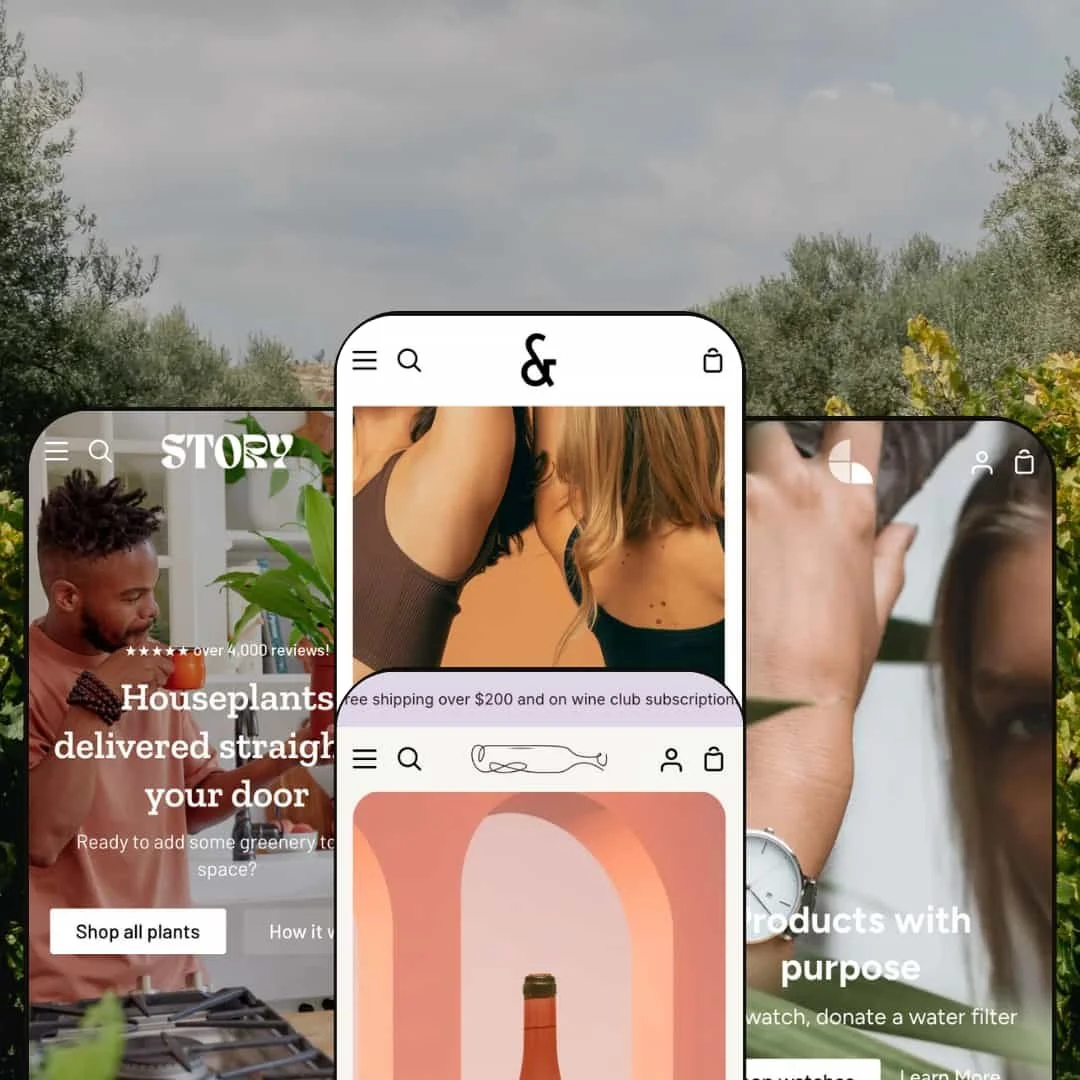
What matters with Story isn’t a single preset, it’s the shared chassis. Our run through the Bright, Spade, Solace and Shale demos showed the same shopping loop: clear hero entry, swift cart drawer with incentives, search that pulls in articles, and product pages that cover the basics without fuss. Aesthetics shift; the flow holds.
Pros.
〰️
Pros. 〰️
✚ Story-first building blocks
Sections for heroes, benefit cards and lookbooks combine into editorial flows that feel branded rather than generic. Shoppers experience context and lifestyle before decision points, which supports higher-consideration purchases.
✚ Consistent slide-in cart with progress and gentle upsell
Across presets, the cart drawer opens quickly, shows free-shipping progress and can surface a relevant add-on. This keeps momentum during add-to-cart and creates low-friction opportunities to increase basket size.
✚ Products and content under one roof
Search and content surfaces bring blog articles into the same journey as products. This helps brand education live alongside shopping, so visitors can learn, then buy, without detours.
✚ Flexible aesthetics across four presets
From athletic energy to earthy warmth to refined bottles to cause-led minimalism, style shifts while core behavior remains familiar. Teams can change visual direction without retraining on the basics.
✚ Polished product presentation
Crisp typography, confident spacing and well-handled media make products feel premium. Merchants can spotlight details without crowding the page.
Cons.
〰️
Cons. 〰️
− Demo hygiene issues
A handful of menu links led to sparse pages or 404s during testing. This can erode trust in a demo and may mask real capabilities until a store is properly populated.
− Article visibility in search
When search returns blog posts, they appear as text-forward results without thumbnails. Articles become easy to overlook next to product tiles and could use stronger visual anchors.
− Variant depth underrepresented in demos
Several demos emphasize single-SKU items. Without fuller variant showcases, it is harder to judge how complex option sets will feel until configured in a live store.
− Inconsistent upsell placement
The presence and presentation of a cross-sell in the cart drawer varied by preset. Consistency would make outcomes more predictable for teams banking on attachment rates.
-
Bright stages an activewear brand with bold photography and punchy copy that keeps momentum through the page.
What works in this preset
The opening sequence pairs energetic photography with two clear actions, so shoppers understand where to start. Headlines feel athletic and motivational, and the supporting copy frames categories without drowning the visuals.
Mid-page storytelling keeps the rhythm steady. Cards connect benefits to use cases, and the spacing preserves a premium feel. The result is a homepage that nudges into collections while holding a strong brand voice.
Further down, curated lifestyle scenes extend the narrative. The page feels cohesive from top to bottom, which suits apparel that sells through look and feel as much as specs.
Where it stumbles
Unlabeled circular swatches used for color-led browsing can slow quick shade comparisons, since shoppers must click to confirm a tone.
-
Spade courts plant and home-decor merchants with earthy tones, leaf motifs and warm copy. It feels friendly and approachable, more living room than showroom.
What works in this preset
The hero leads with a comforting headline about delivery and care, plus a slim layer of social proof above it. This sequencing builds trust before shoppers dive into categories, which suits high-consideration purchases like plants.
Horizontal product sliders split merchandise into easy themes such as seasonal spotlights or floor plants. Titles and badges act like shelf talkers, guiding readers without shouting. The pacing prevents the homepage from feeling grid-heavy.
On product pages, compact bullet-style icons summarize essentials like water needs or light tolerance. Placed near the title area, they help novices feel confident without wading through dense copy.
Where it stumbles
The care icons do not include hover text or labels. Shoppers unfamiliar with the glyphs may need to infer meanings from context, which adds a learning step.
-
Solace wears a refined palette suited to natural wine and boutique beverages. It leads with club messaging, then supports it with bottle showcases and magazine-style content.
What works in this preset
The opening hero promotes a “Natural Wine Club” with a clear headline and two primary actions. It frames the offer as a lifestyle choice rather than a single-item purchase, which fits subscriptions.
A tasteful showcase introduces bottles with pricing and review cues while keeping the headline’s focus intact. It encourages light browsing on the homepage and preserves a curated feel.
Subscription messaging returns mid-page with a concise invitation to join the club. Brief notes about delivery and curation set expectations and add perceived value. The voice remains calm and confident.
Where it stumbles
Menu items that land on placeholder pages can confuse visitors. When an item labeled “Vineyard” resolves to a dead end, momentum drops.
-
Shale centers purpose. A minimal, balanced layout pairs product discovery with cause-driven messaging, appropriate for ethical accessories and mission-led brands.
What works in this preset
The hero headline links purchases to impact, and concise body copy explains the mission. This alignment of commerce with cause happens quickly, which helps values-motivated buyers.
Simple category tabs such as Women, Men and Bands sit above the grid and feel editorial rather than mechanical. The composition maintains the preset’s quiet, confident tone.
Product pages rely on crisp galleries and tidy accordions for sizing or returns. Information density stays low until the shopper asks for detail, which preserves a calm browsing rhythm.
Where it stumbles
In the cart drawer, the small plus icon for a suggested strap is easy to miss. The affordance could be larger to make add-on discovery more obvious.
Niche Suitability
Not Ideal For
-
Brands that want to weave narrative into shopping: luxury goods, lifestyle apparel, specialty consumables and purpose-driven accessories. Story’s building blocks reward strong visuals and editorial copy.
-
Mass-catalog operations that need utilitarian layouts, or teams that want a stark, stripped-down aesthetic, may prefer a more minimal, system-like theme.
-
Medium — there are many sections to compose, and narrative pages benefit from thoughtful art direction. Presets reduce initial setup, while the best results still come from curated imagery and copy.
Final Recommendation
★ 8.0/10
Rating
-
Comprehensive storytelling sections, polished product grids and an upsell-ready cart drawer. Search brings products and articles together cleanly.
8
-
Setup is straightforward with drag-and-drop sections and presets. Demo 404 pages can confuse first-time users, and minor UI affordances may need tuning.
7
-
Controls stay comfortably tappable on handhelds, and the cart drawer feels smooth during add-to-cart and checkout handoffs.
8
-
Pages loaded quickly in testing, and carousels moved without stutter. Add-to-cart and navigation felt immediate.
8
-
Four distinct presets cover sporty, earthy, refined and mission-led looks. Teams can tailor color, typography and section order without code
9
FAQ
〰️
FAQ 〰️
-
👑 Yes. The Bright preset’s energetic hero and editorial moments suit activewear or fashion, while Shale shows a minimalist accessory store with a mission.
-
📱Yes. Carousels, accordions and the slide-in cart drawer worked smoothly on desktop and mobile in testing, and buttons remained easy to tap.
-
🎨 Yes. You can control typography and color palettes in the editor. Each preset illustrates a different mood, from earthy greens in Spade to muted neutrals in Solace.
-
⚡ In testing, pages and drawers loaded quickly with minimal lag. Product images and slideshows appeared without stutter.
-
👕 Yes. The demos mostly show single-SKU items, but the theme handled color and size pickers where present. Full behavior depends on proper configuration.
-
🔎 Shopify provides the SEO basics such as editable meta fields and clean markup. Story works within that model, so you can tune titles and descriptions easily.
-
💱 Yes. Story uses Shopify’s native multi-language and multi-currency capabilities; selectors can be placed in header or footer during setup.
-
⚙️ Yes. The theme follows Shopify conventions, so standard apps for reviews, subscriptions or options should integrate smoothly.
-
🛒 Yes. The Shopify Theme Store offers live demos for Default (Bright), Spade, Solace and Shale so you can explore before purchasing.
This review is based on hands-on testing of the publicly available “Default,” “Spade,” “Solace” and “Shale” preset demos of the Story Shopify theme as of 29 Oct 2025. Theme features, preset availability and performance can change with subsequent updates from the theme developer.