
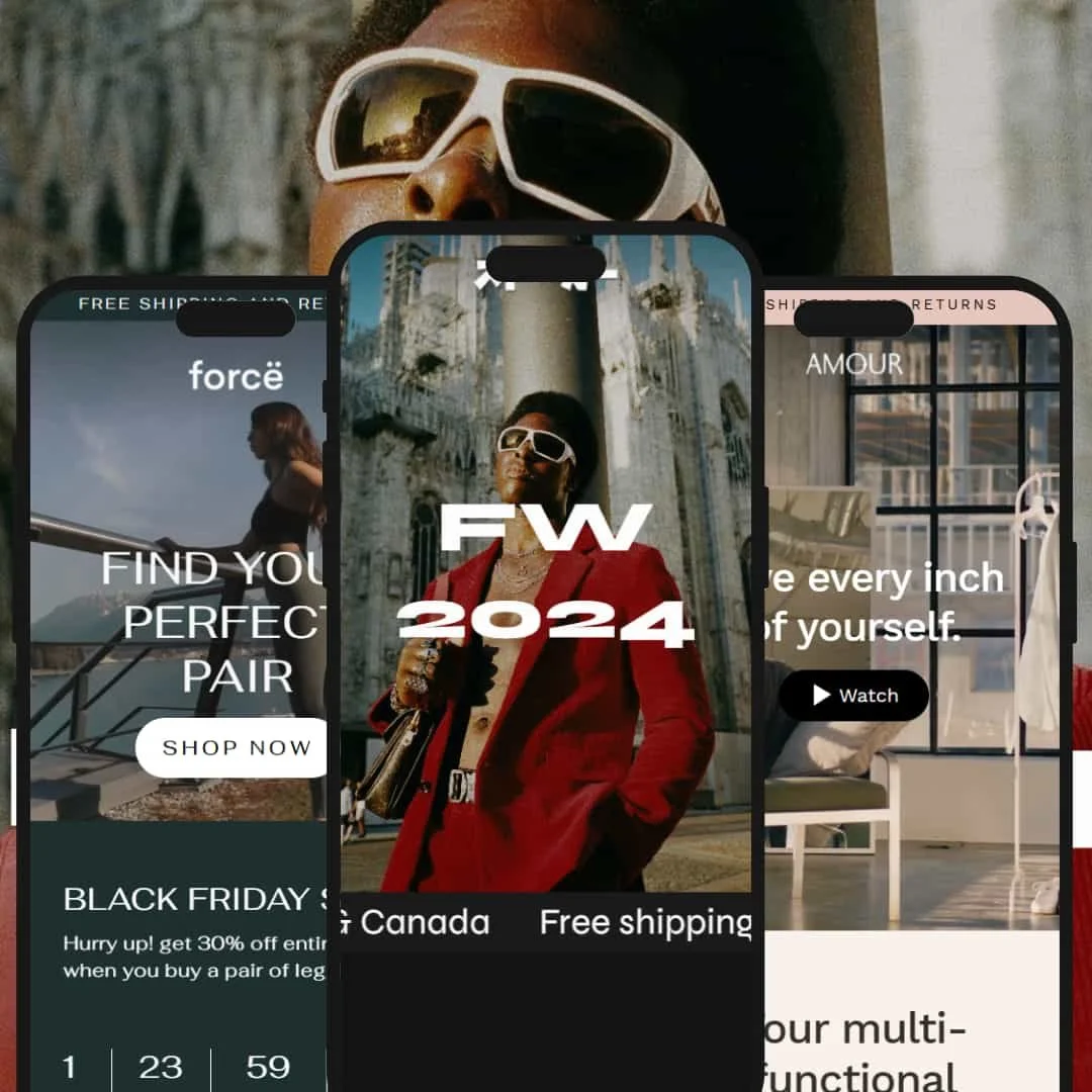
The Streamline Shopify theme is built for brands that sell visually. It leans hard into bold hero sections, urgency messaging, and fast paths from landing section to product grid. Across presets you see consistent use of badges, strong price and availability signaling, and immediate calls to shop. The typography reads clean, and the layouts are clearly optimized for scrolling commerce on mobile and desktop. Overall, Streamline feels tuned for fashion, jewelry, athleisure, and limited-edition drops where presentation and scarcity drive the sale.
Pros.
〰️
Pros. 〰️
✚ Product presentation and urgency
Streamline uses badges like “sale,” “sold out,” and other high-visibility markers across product cards, plus countdown timers on featured items. Shoppers are told exactly what’s scarce or time-limited, which encourages immediate action instead of passive browsing.
✚ Cart access and follow-through
After an item is added, Streamline keeps checkout within reach using a persistent mini cart bar. Shoppers never feel stranded; the path from “I like this” to “I’m paying for this” stays visible, which supports impulse-driven categories like streetwear and athleisure.
✚ PDP depth and sizing clarity
Product detail pages ship with large image galleries, benefit callouts, and direct access to size and fit information. Being able to choose a size, understand fabric claims, and review details without leaving the page helps reduce hesitation for apparel, lingerie, and fit-sensitive products.
✚ Countdown and drop culture
Timed promotions and limited-run language show up throughout the tested demos. This gives even a small catalog the energy of a live drop, which is powerful for gyms, fitness labels, and hype-driven resale or vintage models where “only a few left” is part of the brand voice.
✚ Mobile-first merchandising
Across presets, Streamline favors bold hero sections that immediately link into shoppable flows. The structure feels built for thumb scrolling: land, feel the brand, and tap straight into a product lane. That supports how fashion, jewelry, and streetwear buyers actually browse on phones.
Cons.
〰️
Cons. 〰️
− No inline quick add on collection pages
Collection and product grid cards always push you to the product page instead of letting you select a size or add directly from the grid. For repeat buyers who already know their size, that extra click slows them down.
− Slide-out cart drawer not present
Instead of opening a traditional slide-out drawer with line items, Streamline relies on a sticky cart bar at the top. Some merchants prefer a full side drawer because it supports upsell modules and quantity edits in one place. Brands that live off cart-level upsell may want that interaction without installing an app.
− Variant preview locked to the product page
Color and size variants sit inside the product page rather than appearing as swatches or alternate images in the grid. Shoppers who like to skim colorways from a listing view can’t do that here; they have to open each product detail page first.
-
Core is staged like an athleisure storefront, especially leggings and technical sports apparel. The layout speaks in the language of performance, motion, and fit. It drives attention toward apparel that needs to justify fabric, compression, and support instead of just color.
What works in this preset
Colors and typography in Core feel energetic and commercial rather than delicate or boutique. The preset uses a confident, active tone that matches leggings, sports bras, and compression tops. The whole storefront pushes the idea of “gear you train in,” not “lifestyle accessory,” and that intent stays consistent from the hero section through to the way products are framed. For a fitness or athleisure seller, that means your core value props — performance, support, durability — are already baked into how the demo stages content.
-
Satin is staged for modern intimates, loungewear, and jewelry. The tone is softer, more boutique. Typography is calmer and spacing is looser. It feels like a brand that wants you to trust the label, not just chase a discount timer.
What works in this preset
The Satin preset visually groups products by mood, color, and category instead of just dumping everything into “Shop All.” It walks you through curated clusters, which suits lingerie, satin sets, minimalist jewelry, and slow-fashion basics. That presentation style helps smaller catalogs feel intentional instead of sparse, because each grouping reads like a considered collection rather than leftover stock.
Color palette and type are controlled and quiet. Pastels, neutrals, and soft serif and sans-serif combinations make the store feel intimate and high-touch. The result is a storefront that supports self-care and comfort positioning instead of loud promo language. It fits loungewear and jewelry branding where tone and trust matter as much as price.
Brand reassurance is surfaced in normal page flow. FAQ-style answers, contact prompts, and trust/support blocks appear on informational pages instead of being buried in a footer. That reduces hesitation for first-time buyers in sensitive categories like intimates because sizing, returns, and contact are already acknowledged in a calm voice.
Where it stumbles
The cart page leans heavily into recommendation carousels and cross-sell suggestions. For a boutique or single-SKU brand, that stack of suggested add-ons can feel loud and slightly off-tone. It interrupts what is otherwise a gentle, editorial buying flow and briefly pulls you back into “you might also like” energy, which doesn’t always match the quiet, personal mood Satin is trying to create.
-
Fern is loud. It looks like a streetwear drop site: big type, high-contrast color, and “limited edition” language everywhere. It feels more like a live release wall than a polite storefront, and that is deliberate.
What works in this preset
The hero surface in Fern is built like a reveal. It blends bold motion, oversized visuals, and attention-grabbing framing so the very first block on the page feels like an announcement for a drop. The effect is that the homepage stops feeling like a catalog and instead reads like an event. That matches how streetwear and rare vintage apparel are usually sold — you’re not just buying a shirt, you’re buying a moment.
Niche Suitability
Not Ideal For
-
Fashion, jewelry, and streetwear sellers that trade on story, scarcity, and visual impact. If your pitch is “this is the drop,” Streamline supports it with urgency messaging, bold hero sections, and strong product detail depth.
-
Large catalogs that expect advanced inline merchandising on collection pages (for example, size pickers and cart actions directly in the grid) or heavy cart-drawer upselling out of the box.
-
Medium — It’s fast to launch a visually convincing storefront because the presets already map to real niches like athleisure, jewelry, and vintage streetwear. The tradeoff is that merchants who want inline quick add behavior, deep variant previews in the grid, or a classic slide-out cart drawer may need light custom code or an app.
Final Recommendation
★ 8.4/10
Rating
-
Product badge, sale, and countdown flows work without bugs.
8
-
Minimal steps to build pages; no code needed for visual edits.
9
-
Fast, thumb-friendly navigation; cart bar accessible.
9
-
Animations and carousels are smooth, and page loads stayed snappy.
8
-
Preset range covers niche needs; visual tone can shift per audience.
8
FAQ
〰️
FAQ 〰️
-
👑 Yes. The Satin preset supports jewelry and intimate apparel with curated groupings and reassurance content blocks.
-
📱Yes. Cart access stays visible, navigation stays reachable, and product grids are laid out for scrolling on a phone.
-
🎨 Each preset exposes color, typography, and grid adjustments, and merchants can surface product detail tabs and trust messaging without code.
-
⚡ Animations load quickly, and the sticky cart bar responds immediately after an item is added. Interactive elements did not stall in testing.
-
👕 Variants such as size and color appear as buttons or dropdowns on the product page. Inline swatch previews in the grid are not surfaced by default, so shoppers pick variants after clicking in.
-
🔎 Store owners can define titles and meta descriptions per page, and product and collection descriptions render in a clean, crawlable structure.
-
💱 Yes. Shopify’s built-in language and currency features are supported, so international buyers can browse in their market context.
-
⚙️ Yes. Review widgets, live chat, trust badges, and similar enhancements work with the theme extension ecosystem.
-
🛒 Yes. All presets are available as live demos, and you only license Streamline once you publish it to your store.
This review is based on hands-on testing of the publicly available “Core”, “Luxe”, and “Hype” preset demos of the Streamline Shopify theme as of October 28, 2025. Theme features, preset availability, and performance can change with subsequent updates from the theme developer.