
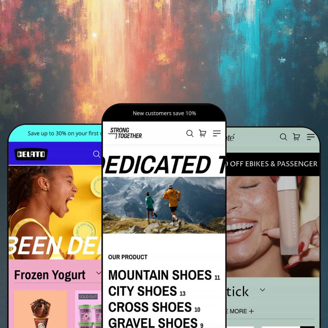
Strong is a versatile Shopify theme aimed at stores that want to convey energy and movement. In the demos, it pairs bold preset styling with commerce-focused modules such as mega menus, bundle builders, countdown promotions, multi-step forms, and a slide-out cart with a shipping progress bar. The palette ranges from muted earthy colours in the Default preset to bright candy hues in Celato, while Velvet leans into serene pastels and oversized typography. On landing, a large hero banner with oversized typography draws visitors into the product story, and the sticky header keeps navigation and the cart within reach. Overall, Strong balances bold aesthetics with solid commerce functionality.
Pros.
〰️
Pros. 〰️
✚ Flexible presets, consistent core
flexible preset options that maintain core functionality while offering distinct aesthetic approaches. The demos shift from muted earthy colours in Default to bright candy hues in Celato and a serene pastel look in Velvet, while keeping the overall shopping structure intact. This separation makes it easier to choose a visual identity without feeling like you are rebuilding the storefront’s foundation from scratch.
✚ Mega menu navigation that reduces “dead clicks”
The Shop menu expands into a wide dropdown that groups collections in a multi-column layout, helping shoppers jump into a category without extra steps. In Celato, the dropdown is shown in a dessert-focused configuration and can include a large illustrative image, reinforcing the preset’s mood while still functioning as a navigation tool. For stores with multiple collection entry points, this style of menu keeps browsing feeling direct rather than buried.
✚ Slide-out cart flow that keeps checkout momentum
Adding an item opens a cart drawer that shows line items, a free-shipping progress bar, and fields for notes and discounts alongside a terms checkbox. In testing, shoppers could adjust quantities without leaving the page, which keeps attention on the purchase rather than on page transitions. The overall effect is a clearer path to checkout, especially for shoppers adding and removing items while they browse.
✚ Quick view and quick add that adapt to product complexity
Product cards expose quick add and quick view entry points, and quick view opens a panel with an image gallery, variant options, and purchase actions to reduce clicks. Quick add behaves differently based on variants: single-SKU items add directly to the cart, while multi-variant items prompt selection and send shoppers to the product page. That split is expected behaviour in the demos and helps prevent shoppers from adding the wrong option when a product requires a choice.
✚ Merchandising sections built for bundles and urgency moments
The bundle builder section groups multiple products with plus icons and lets shoppers add the full set to cart in one click, which is positioned as useful for kits and upsells. The countdown promotion bar adds a timer-driven banner with a call-to-action, supporting limited-time offers without extra setup. Celato also demonstrates hero promotions with overlay buttons, including “Add to cart” placed directly on the banner image to encourage impulse-oriented buying.
✚ Search and storytelling blocks that support discovery and brand depth
Clicking search launches a fullscreen overlay with a prominent heading and input field, and typing triggers predictive suggestions along with trending searches. On the content side, the home page includes testimonials, blog or news feeds, and call-to-action sections that help surface story and social proof alongside products. The demos also show a back-to-top arrow near the bottom of longer pages, which supports extended scrolling sessions when shoppers are moving through story-led sections.
Cons.
〰️
Cons. 〰️
🚫 Key actions can be easy to miss when they depend on a long hover
Across the demos, some interactive controls are not immediately visible and appear only after a longer hover, which can reduce discoverability. Velvet’s cross-sell carousel, for example, reveals its overlay after about three seconds, and Celato similarly describes a prolonged hover before icons appear. The search results page is also shown with a simple product grid where hover overlays are not immediately apparent, which makes action entry points feel less consistent.
🚫 Pagination-first browsing adds extra steps for larger catalogues
In the Default demo, the All Products collection uses numbered pagination with only twelve products per page. The conclusion notes the same pagination approach across presets, rather than using infinite scrolling. For shoppers exploring a lot of items, that pattern can translate into more page changes during casual browsing.
🚫 The sticky header can feel crowded on small screens
On small screens, the sticky header compresses multiple elements into a single row and is described as feeling cramped. When the logo, menu icon, and account and cart icons are competing for space, the header can read as visually busy. The draft notes this may require custom tweaks for merchants who want a cleaner mobile header layout.
-
The Default preset targets active lifestyle brands such as running shoes, outdoor gear and accessories. The design relies on generous white space, crisp typography and high-contrast imagery to make products pop. The overall impression stays clean and modern, while still feeling energetic in presentation.
What works in this preset
The most defining choice here is the amount of white space. Sections breathe, and product imagery is given room to carry the message rather than competing with heavy backgrounds or dense ornamentation. That spacing creates a clear hierarchy from hero content to featured products to supporting content. For shoppers, it makes the storefront feel straightforward and easy to scan.
Typography is another strong signal in the Default look. Text stays crisp and confident, which supports the active, performance-oriented tone implied by the demo products. Headings and supporting copy read cleanly against the lighter layout, so the page doesn’t feel visually noisy. In practical terms, the copy is less likely to get lost beside photography.
High-contrast imagery is used to keep attention on the product. The preset leans on sharp, high-impact photos that stand out against the lighter structure and reinforce the “products first” approach. This works especially well for athletic and outdoor categories where texture and silhouette matter. The result is a presentation that makes items feel prominent and easy to evaluate at a glance.
Where it stumbles
The Default preset’s muted, earthy direction can feel restrained if your brand depends on a more playful colour punch. The demo’s clean structure is intentional, but it will not deliver the bright candy energy shown in Celato or the spa-like softness of Velvet. For merchants whose identity is built on loud colour, this preset may read as more understated than desired.
-
Celato (also known as the Bend preset) reimagines Strong for dessert and beverage stores. It pairs vibrant fuchsia and aqua backgrounds with playful fonts, emphasising fun and indulgence. The styling is intentionally bold, aiming to evoke the mood of an ice cream parlour or milkshake bar.
What works in this preset
Celato’s strongest preset-only advantage is its colour-first staging. Vibrant fuchsia and aqua backgrounds do most of the atmosphere-building work, so the storefront feels playful immediately. That approach suits categories where “treat yourself” is part of the purchase motivation. It sets a tone that is upbeat rather than restrained.
The palette details reinforce that intent throughout the pages. Pastel pinks and blues are paired with contrasting purple headers, and the combination reads as deliberately candy-like in the demo. This is not subtle branding, and it is not trying to be. For shoppers, the signal is clear: the store experience is meant to feel fun and indulgent.
Celato also uses its colour treatment to support readability on product pages. Core product details sit on coloured backgrounds rather than plain white, which creates a distinctive presentation while keeping information legible in the demo. That visual structure feels more like a designed menu board than a minimalist catalogue. It can be a strong match for compact product ranges where the vibe matters as much as the specifications.
Where it stumbles
Because Celato’s look is so committed, it is not a neutral starting point. The same vibrant fuchsia, aqua, and pastel combinations that make it feel like a dessert brand can feel out of place for utilitarian categories. If the store’s promise is practicality first, the indulgent styling may fight the message.
Celato also assumes you want a playful tone to be obvious from the first screen. That is a strength for cafés and treat-driven brands, but it can be limiting for merchants who want the design to disappear behind photography. In those cases, the preset’s personality can feel like the main impression rather than the product itself.
-
Velvet targets skincare and beauty retailers with a serene pastel palette and oversized typography. It creates a luxury spa vibe that invites visitors to slow down and explore. The preset reads as calm and premium rather than energetic or playful.
What works in this preset
Velvet’s mint-green backgrounds and light fonts create the most immediately distinctive mood of the three presets. The styling is tranquil and clean, which aligns well with skincare, self-care, and spa-adjacent categories. Instead of pushing urgency through colour intensity, the preset encourages a slower, more considered browsing rhythm. For shoppers, it signals “premium and calm” before they click anything.
Oversized typography supports that same pacing. Headings feel spacious and deliberate, which matches the “luxury spa” positioning described in the demo. This is a preset that gives language and imagery equal weight, rather than treating copy as a small caption under the product. In practice, it can make the brand voice feel more central to the shopping experience.
The home page layout also communicates the curated intent. Rather than opening with a traditional product grid, the landing page uses large image tiles for Body Care, Facial Cream, Lipstick, Masks and more. Each tile is designed to prompt exploration, so the first screen feels like an invitation to browse by category rather than a dense product overview. This structure feels closer to a guided boutique experience than a fast catalogue skim.
Where it stumbles
Velvet’s calm presentation will not be the right default for every brand. If your store’s identity depends on high-energy movement or candy-bright colour, the mint-green softness and oversized typography may feel too gentle. It is designed to soothe, not to shout.
The category-tile landing page also changes the first impression of shopping. Because it prioritises exploration through large tiles over a grid of products, the opening experience is more curated and less immediately comparative. That can be a benefit for boutique flows, but it may feel indirect for shoppers who prefer to see many items at once.
Niche Suitability
Not Ideal For
-
Strong is best suited to lifestyle, beauty, and food brands that want bold visuals, promotional modules, and curated storytelling in the shopping flow. If your store benefits from strong mood-setting at the preset level and you want the same core mechanics to carry across those looks, the theme’s preset approach fits well.
-
Merchants who want a very minimalist aesthetic, or who expect every shopping action to be instantly visible without any hover discovery, will likely prefer a different style of theme. It may also be less satisfying for stores that want browsing to feel continuous rather than broken into short, paginated sets.
-
Medium — while many features are built in, configuring colour palettes, menus, and promotional modules will take time. This effort increases if you plan to switch between presets, since the aesthetic direction shifts heavily even when the core structure stays consistent.
Final Recommendation
★ 7.6/10
Rating
-
Strong offers mega menus, a slide-out cart, quick view, a bundle builder, countdown promotions, and blogs. Some interactions require a longer hover to reveal, and browsing is structured around numbered pagination.
8
-
The theme editor provides many sections and blocks. Quick view and the cart drawer simplify shopping, but some controls only appear after a longer hover and the mobile header feels busy on small screens.
7
-
Sticky navigation and the slide-out cart worked smoothly on phones during testing. Some elements feel cramped on small screens, but overall usability held up well.
8
-
Pages loaded quickly and animations were smooth in testing. The slide-out cart appeared instantly. No major lag was encountered during the demo runs.
8
-
Colour schemes differ radically between presets and can be customised. Sections can be reordered and the theme offers various blocks, though some hover interactions are harder to discover.
7
FAQ
〰️
FAQ 〰️
-
👑 Yes. The Default preset showcases running shoes and outdoor gear with strong product grids, quick view, and bundle upsells, and it should adapt well to apparel inventory.
-
📱Yes. During testing, the sticky navigation and slide-out cart worked smoothly on phones. Some headers feel tight, but overall mobile usability is solid.
-
🎨 Colour palettes, fonts, and section order can be changed in the theme editor. Each preset demonstrates a different mood, ranging from muted neutrals to vibrant candy colours.
-
⚡ Pages and carts loaded quickly during testing, and interactions such as opening quick view or the cart drawer were instantaneous.
-
👕 Yes. Product pages let shoppers choose sizes or flavours via swatch selectors and quantity pickers. Quick view also supports variant selection before adding to cart.
-
🔎 The draft describes standard Shopify SEO basics such as editable meta tags, image alt text, and using the blog for content. It also states there are no built-in SEO audits in the theme, so advanced optimisation would rely on Shopify settings or third‑party tools rather than a dedicated in-theme audit feature.
-
💱 Languages and currencies are configured through Shopify, then surfaced through your storefront setup. Selector placement is a layout choice, so the demo’s header or footer presentation should not be treated as fixed.
-
⚙️ App integration depends on how a specific app outputs storefront elements, rather than on which preset you pick. In the demos, trust badges and social icons appear as built-in blocks, so app-driven UI is something you would validate in your own preview.
-
🛒 The draft notes two options: live demos for each preset, and the ability to install the theme in trial mode from the Shopify Theme Store to customise it before publishing.
This review is based on hands-on testing of the publicly available preset demos of the Strong Shopify theme as of 21 December 2025. Theme features, preset availability and performance can change with subsequent updates from the developer.