
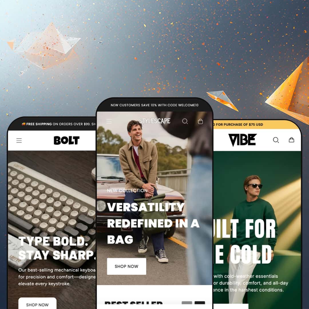
Most premium Shopify themes pick a single vertical and build everything around it. StyleScape takes the opposite bet, shipping three fully art-directed storefronts (bags, menswear, and tech) under one $250 license, each tuned to a different shape of catalog. That spread is the entire pitch, and it raises a fair question: can one theme serve three audiences without any of them feeling like an afterthought? It runs on Shopify's Online Store 2.0 architecture, with a single section library shared across all three looks.
Three real storefronts, one license
StyleScape ships three fully art-directed presets from one $250 purchase. They're distinct builds, not recolors. The bags storefront (StyleScape), the menswear storefront (Vibe), and the tech storefront (Bolt) each carry their own navigation, hero treatment, section mix, and footer composition. For an agency standing up several client stores, or a multi-brand operator running mid-size catalogs across categories, one license that covers three verticals is the headline value.
A section library deep enough to skip apps
The shared section library goes well past the basics. A homepage featured-product block (the StyleScape demo's 'Product of the Month') renders a full gallery, color picker, and add-to-cart inline, and Bolt's product-video sections embed motion without a third-party player. That depth lets you build storytelling pages in the editor instead of bolting on a page-builder. For visually merchandised brands in apparel, accessories, or design-led tech, especially at a premium price point, it removes a common reason to reach for extra apps.
Conversion and urgency tools built in
Stores that live on promotions get a usable toolkit out of the box. The multi-message announcement bar rotates offers (a welcome code, a free-shipping threshold, a guarantee), the slide-out cart shows a free-shipping progress prompt, countdown timers and low-stock counters ('Only 6 units left' on the Edge keyboard) add urgency, and sale badges price-strike automatically. It's a coordinated merchandising kit, not scattered widgets. For flash-drop and seasonal sellers chasing impulse conversions, it's ready on day one.
Variants and galleries that handle real catalogs
Variant handling is sturdier than the price suggests. The Barker oxford runs two axes at once, a color swatch plus a size group (9 to 10.5), while the Edge keyboard uses image swatches (Volcano Grey, Metallic Silver), and in both cases the gallery re-keys to the selected color. For mid-market apparel and footwear catalogs carrying color-and-size SKUs, that's the day-to-day machinery that simply has to work.
It demands strong photography
This is an image-forward theme. Weak photos break it. The oversized heroes and full-bleed lifestyle mosaics assume you've got art-directed photography to fill them; feed it supplier stock or phone snaps and the premium look falls apart. The three demos lean on polished libraries from Bellroy, Pexels, and Lofree for a reason. For budget operations or early-stage brands without a real shoot behind them, that's a cost to weigh before the theme can deliver the 'premium presence' it promises.
Out-of-the-box filtering is thin
Out of the box, collection filtering doesn't live up to the feature list. I went looking for richer filters on Bolt's keyboards page and found only availability and a price range; the swatch and attribute filters the Theme Store advertises depend on you configuring Shopify's Search & Discovery and the underlying product metafields first. The sort menu is complete, so this is about facets, not sorting. For catalog-heavy stores (100-plus SKUs, or variant-dense ranges like switches and keycaps) where shoppers filter to navigate, plan that setup work before launch or the discovery experience underdelivers.
It's built for a specific catalog shape
The presets share an unspoken assumption: a mid-size, multi-category, visually merchandised catalog. But the edges fit awkwardly. A single-product DTC brand inherits multi-collection mega menus and category mosaics it doesn't need, while a very large or marketplace-scale catalog pushes past what these curated layouts were arranged to show. For single-SKU launch brands or high-volume catalog operations, the theme works but asks for restructuring rather than meeting you where you are.
What it takes to launch
Expect a multi-day pass: swapping the licensed demo photography for your own across long, multi-section homepages, rewriting hero, story, and product copy throughout, configuring metafields and Search & Discovery to power filtering, re-staging each preset's mega menu around your catalog, and building out per-product page sections where you want the flagship treatment.
-
What works in this preset
Restraint is the whole idea here, and StyleScape commits to it. The mega menu does quiet work: the Wallets dropdown trades plain text links for product image tiles, so browsing feels like flipping through a lookbook instead of reading a sitemap. I clicked through every top-level menu. The rhythm held across all of them, with generous whitespace and one idea per row.
Lower down, a mosaic of collection tiles (Phone Wallets, Venture Watch Strap, Transit Carry-On) turns category navigation into something you actually want to scroll through rather than skip past. The testimonial row pairs short customer quotes with face photos. It reads as social proof without shouting. For a focused everyday-carry catalog selling to design-conscious repeat buyers, that unflashy confidence fits the positioning.
On the product page, the layout stays disciplined: a large multi-image gallery, tidy accordion tabs for materials and shipping, and a four-item trust row (free shipping, free returns, lifetime guarantee, recycled materials) sitting just under the buy button. Nothing fights the product. It reads as a clean retail page a premium bag brand can ship with light editing.
Where it stumbles
Restraint has a flip side. StyleScape hands you the most minimal of the three demos, with fewer sections, more whitespace, and a single hero, so a merchant who wants a busy, promotion-led homepage builds more from scratch here than they would from Bolt's denser starting point. For a lean brand with strong imagery that's a feature; for a store that merchandises hard, it's extra assembly.
-
What works in this preset
The piece that made me sit up is the before/after image slider. Vibe drops it into a section called "The Evolution in Every Step," where a shopper drags between two states of the same shot to watch a small design change reshape the whole look. That section is rarely seen. On a fashion store, it earns its place fast.
Vibe is also built to sell on a calendar. A storewide sale block ("Unlock up to 60% off") anchors the homepage, new-arrival and sale carousels stack discount badges, and the "Just In" rail keeps fresh stock up top. For a menswear label that runs seasonal drops and end-of-season clearances, the merchandising furniture is already in place.
The navigation and storytelling sections do real work too. The Shop mega menu fans into three labeled columns (collections, named products, trending), and further down the page two-column brand-story blocks and a "Shop by Style" image mosaic give the brand room to talk, not just sell. It suits a label with a point of view.
Where it stumbles
Vibe commits hard to urgency. Between the storewide-sale block and the discount-stacked sale carousels, the demo assumes you're always mid-promotion, so an evergreen menswear brand with stable pricing inherits a homepage that runs on discount energy it may not actually want. None of it is hard to strip out. But the preset is happiest with a sale on.
-
What works in this preset
Bolt is the maximalist of the three. It handles density without clutter. The homepage runs a multi-slide hero, collection cards that print live product counts (Keyboards shows 10 products, Keycaps 9), in-stock carousels, and a "Latest Stories" blog rail carrying real articles. For a tech or desk-setup store with a deep, browsable catalog and a content angle, that's a lot of merchandising surface working at once.
The product page is where Bolt flexes. On the Edge keyboard, the template stacks bespoke spec sections: a carbon-fiber construction story, a keycaps feature block, an embedded video, and a companion "Zero" stand pitch, so one product reads like a mini landing page. That's page-builder-grade depth without the page-builder. For a brand that wants to argue for a considered, higher-ticket product, it's a strong starting point.
Browsing holds up too. Collection grids show a second product image on hover and drop the occasional promo tile inline between products, so a category page stays visual instead of turning into a wall of thumbnails. It keeps momentum.
Where it stumbles
Bolt's strongest feature is also a commitment. The flagship product page gets its richness from bespoke sections the merchant builds by hand, so that depth isn't a default you inherit; it's per-product work. Set the bar at the Edge page and your plainer products will look thin until you give them the same treatment. Worth budgeting the section time across the catalog.
Three identities that actually hold up
The drop-off between them is small. This isn't one polished flagship preset with two thin alternates; StyleScape's minimalism, Vibe's editorial seasonality, and Bolt's technical density are each fully committed, each internally consistent down to the footer. That consistency of effort across three distinct tones is the theme's real achievement.
One library, three personalities
The same section toolkit produces all three faces, which says something useful about its flexibility. A library that can read as quiet everyday-carry retail, as seasonal menswear, and as dense desk-setup commerce will bend to most adjacent brands without a custom build. That's range, not a straitjacket.
Premium where you look first, do-it-yourself where you decide
The craft is uniformly front-loaded. Across all three presets, the polish concentrates in the homepage and the hero product page, while the connective tissue of online retail (collection filtering, automated cross-sell, customer reviews) is left to configuration or apps. The 'premium presence' is strongest above the fold and thins as the shopper moves toward the decision. It's a consistent scope boundary, and it's worth knowing where the theme stops doing the work for you.
A strong point of view cuts both ways
This is not a neutral canvas. The theme has opinions, about imagery, about urgency, about a mid-size multi-category catalog, and those opinions are exactly why its three verticals feel so resolved. The cost is that brands whose identity diverges from modern lifestyle retail will spend their time fighting the design rather than leaning on it. Know your fit before you commit.
★ 7.8/10
Rating
-
Broad, app-light toolkit: countdown timers, low-stock counters, a before/after slider, product video, mega menu, and a slide-out cart with a shipping-progress prompt. Reviews and richer filtering still lean on apps and configuration.
8
-
Online Store 2.0 sections make editing approachable, but matching the demos' depth (long multi-section homepages, bespoke product pages, filter setup) is a real time investment.
7
-
Responsive layouts, a slide-out mega menu, and a mobile filter-and-sort drawer; the long editorial homepages reward careful section ordering on small screens.
8
-
Progressive image loading and a restrained base layout help, though the image-dense presets (Bolt especially) carry heavy media that needs disciplined sizing to stay quick.
7
-
Three art-directed presets plus a deep shared section library give wide latitude; the main limit is the theme's strong, opinionated aesthetic.
9
Frequently Asked Questions
-
They're distinct, fully art-directed builds. StyleScape, Vibe, and Bolt differ in navigation, hero style, section mix, and footer, not just color, so you're choosing a storefront rather than a palette.
-
Yes, but choose by merchandising style rather than literal product. A homeware brand might start from Bolt's dense layout or StyleScape's minimal one and re-skin it; just expect to work with the theme's strong aesthetic, not against it.
-
Effectively all of it. The product imagery is licensed demo media from Bellroy, Pexels, and Lofree, and several copy blocks are unedited placeholder text, so budget a thorough content pass before you launch.
-
Yes. The theme includes blog and article section layouts; Bolt's demo runs a "Latest Stories" carousel of real posts, which helps if SEO content is part of your plan.
-
No native review engine. The star ratings and review counts on the demo products come from a third-party review app, which you'd add and pay for separately.
-
Yes. It's been on the Shopify Theme Store since 2023 and its most recent update landed in December 2025, so it's tracking current Shopify releases rather than sitting stale.
This review is based on hands-on testing of the publicly available preset demos of the StyleScape Shopify theme as of June 25, 2026. Theme features, preset availability, and performance can change with subsequent updates from the theme developer.