
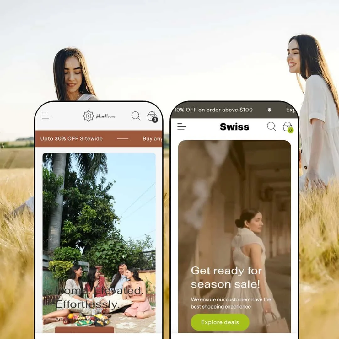
The Swiss theme pairs clean typography with generous white space to create a spacious, premium feel. In the Default demo the hero section features a calming video background overlaid with a “Home. Elevated. Effortlessly” call‑to‑action and an earthy palette that flows into product grids. The Elite demo takes a more fashion‑oriented direction with large photographic banners and promotional sliders encouraging seasonal shopping. Both styles use a consistent sans-serif type hierarchy and balanced spacing that guides the eye naturally from navigation to product cards. First impressions suggest a polished theme that relies on visuals rather than clutter to sell.
Pros.
〰️
Pros. 〰️
✚ Quick view and variant handling
Across both demos, Swiss uses quick view modals triggered from “Choose options” buttons to surface variant details without forcing a full page load. Inside those modals, shoppers can see key product media, pick colours or sizes, adjust quantities and add items to the cart in one place. On the full product pages, variant pills and size options update prices in line with selections, and size chart links are placed adjacent to the choices. This consistency means that whether a shopper starts from a grid or a detail page, the steps to choosing the right variant remain straightforward and predictable.
✚ Navigation and mega menu structure
The theme’s navigation is built around a clear mega menu that appears in both presets. Multi‑column layouts group categories, product types and featured collections, with supporting imagery used to anchor important ranges visually. This structure helps visitors move from high‑level intent, such as “rugs” or “dress,” into more specific areas without feeling lost in nested lists. For merchants, it offers enough surface area to promote priority categories and campaigns without resorting to cluttered sidebars or dense footer menus.
✚ Product detail and reassurance content
On product pages, Swiss layers in multiple reassurance elements that show up consistently between presets. Size chart links, stock indicators and small icon rows for things like money‑back guarantees or happy customers all appear around the core product information. These details do not overwhelm the layout, but they give cautious shoppers reasons to trust the purchase without hunting through fine print or separate FAQ pages. For merchants selling higher‑consideration goods, that extra context can reduce hesitation and keep support queries down.
✚ Cart experience and merchandising
Swiss supports both a cart drawer flow and a full cart page, as demonstrated by the Default and Elite presets. The drawer in Default allows quick review of line items and checkout access without disrupting browsing, while the cart page in Elite adds merchandising opportunities through “Trending this month” products and an area for order notes. This variety suggests that merchants can choose an emphasis on continuity or on cross‑selling, depending on their store’s priorities. Shoppers get a cart view that feels integrated into the rest of the design rather than bolted on, and merchants have more than one pattern to experiment with.
✚ Story‑driven layouts and editorial staging
Even though the presets target different verticals, both lean into storytelling layouts rather than purely utilitarian grids. Default uses an “Our Story” template with imagery and video to explain the brand’s craft, while Elite relies on editorial photography and campaign‑style sections to frame its clothing. This bias toward narrative content means Swiss can support brands that sell identity and lifestyle as much as products. For shoppers, the result is a storefront that feels closer to a magazine or lookbook than a generic catalogue page.
Cons.
〰️
Cons. 〰️
🚫 Extra clicks in some discovery and checkout flows
In both demos, multi‑variant items rely on the “Choose options” path before an item can be added. None of these steps are broken, but they do introduce additional clicks for certain tasks compared with setups that let shoppers move from a grid to checkout in fewer steps. Merchants whose audience values speed above all else may want to keep variant structures as simple as their catalogue allows so that this pattern feels as light as possible and does not make the journey feel longer than it needs to be.
🚫 Performance sensitivity of media‑heavy heroes
The theme’s reliance on large hero media, especially the video hero in Default and the banner photography in Elite, makes staging a key part of the experience. This is visually appealing, but unoptimised assets can slow down the moment when pages feel fully loaded, particularly on slower connections or older devices. Merchants adopting Swiss will need to budget time for compressing images and video so that the design intent does not conflict with responsiveness and perceived smoothness. When the media is prepared carefully, the impact remains high without sacrificing too much speed.
-
The Default style is staged as a home‑decor storefront focused on rugs, wall art and bath textiles. Its look is warm and neutral, with soft imagery and copy that lean into comfort and craftsmanship rather than hard selling. The layout feels calm and considered, which suits slower, higher‑intent browsing for big‑ticket items like rugs.
What works in this preset
The most distinctive choice in the Default preset is the video hero on the homepage. A lifestyle shot shows people relaxing on a rug, with motion that stays gentle instead of flashy. Overlay text and a clear call‑to‑action sit on top of the video without overwhelming it, so the message stays legible while the motion gives a sense of softness and tactility. For a home‑decor brand that wants to sell a feeling rather than only a pattern or size, this is a strong staging decision that immediately sets tone and expectation.
Below the hero, “Shop by Category” tiles highlight Handwoven Rugs, Wall Arts and Throws using large, editorial‑style images. Each tile fills a generous column, so the categories feel like curated worlds rather than cramped menu entries. The calm palette reinforces that feeling of curation and makes the homepage read more like a lookbook than a discount grid. It nudges visitors to explore through imagery first, which fits the considered purchase cycle for something like a living‑room rug.
The Default style also leans heavily into brand storytelling. The “Our Story” page uses a hero image with copy about the brand, followed by sections that talk through reasons to choose the company, material choices and sustainability‑leaning details in a structured narrative. Toward the bottom, additional imagery and a video hero reinforce the handloom craft positioning and make the brand feel tangible rather than abstract. Alongside this, a row of icons explains benefits such as premium quality, secure payment, easy returns and happy customers, so the preset feels like it has a complete brand pitch embedded into it rather than just a product catalogue.
Where it stumbles
The same video‑forward approach that makes the Default preset feel luxurious can also work against it on weaker connections. That hero video is a large piece of content, and if it is not optimised it can slow down the moment when the page feels fully ready. Merchants using this preset will need to keep an eye on video compression and length so that the atmosphere of the hero does not come at the cost of responsiveness and perceived snappiness.
-
The Elite style targets fashion retailers, especially boutiques with a focus on dresses and coordinated sets. Its hero area is built around large banner photography and promotional headlines that speak directly to seasonal sales. Compared with Default, the tone is more energetic and campaign‑driven, using imagery and text to frame the store as a destination for current looks.
What works in this preset
On the homepage, the Elite preset opens with a wide hero banner that promotes a season sale using bold typography. The imagery is full‑height on desktop and shows a model in motion, immediately signalling that this is a clothing‑first store rather than a general lifestyle brand. Call‑to‑action buttons such as “Explore deals” are embedded in the hero, which encourages shoppers to jump straight into promotional flows instead of lingering.
Further down, fashion photography carries the story through “Explore your style with us” sections and a “Featured collection” slider. Each card in these sections uses tall portrait images that keep the focus on the garments rather than the background. The combination of photography, muted interface chrome and large product names makes the preset feel like a boutique site that could support a lookbook or campaign drop. Promotional banners above the header reinforce this direction by calling out extra percentage discounts and new collections, so the store always feels like it is in an active season.
The Elite layout also devotes space to showcased selections that arrange outfits in a way that feels editorial instead of strictly grid‑based. These blocks allow a merchant to highlight a handful of key looks with narrative copy and strong imagery rather than yet another row of small cards. For brands that have a tight, curated assortment and rely on strong visuals, this staging helps each piece feel more special and makes the homepage feel more like a styled shoot than a warehouse catalogue.
Where it stumbles
The main friction point specific to the Elite preset is the lack of a visible search field or icon in the header. While the navigation still surfaces key categories, shoppers who are used to searching directly for a product name or size run do not get that instant entry point. For larger fashion catalogues, this can make the store feel harder to navigate than it needs to be, and merchants opting for this preset would have to decide whether category‑first browsing is enough for their audience or whether they want to customise the header.
Niche Suitability
Not Ideal For
-
Swiss is ideal for visually driven brands that want a store to feel editorial and story‑led while still offering solid shopping mechanics. Home‑decor merchants, fashion boutiques and other lifestyle‑oriented stores that invest in strong imagery and narrative will get the most from the presets, especially if they lean into the storytelling sections that are already available.
-
Merchants with extremely large catalogues, or audiences who care far more about speed and utility than about atmosphere, may prefer a theme with more aggressive quick‑add options and hover‑driven previews. Stores that depend heavily on in‑header search for discovery might also find the Elite preset’s layout limiting unless they are comfortable customising it to surface search more prominently.
-
Medium — configuring Swiss to play to its strengths requires thoughtful asset preparation and some experimentation with which preset and cart experience fit best. Once those choices are made and media is optimised, day‑to‑day merchandising and content updates remain straightforward thanks to the structured sections and reusable content blocks.
Final Recommendation
★ 7.6/10
Rating
-
Offers quick view modals, mega menus and variant swatches.
8
-
Navigation is intuitive and the mega menu helps users dive into categories quickly; however, the Elite style’s header omits search, which can slow direct access to specific items.
8
-
Layouts resize smoothly and icons remain accessible; the absence of search on Elite limits efficiency for mobile users who prefer to start with a query.
7
-
Pages load reasonably fast, though video heroes and large banners may affect initial load times if not carefully compressed.
7
-
Multiple presets and rich content sections offer flexibility; however, some elements like cart type are tied to stylistic choices between presets.
8
FAQ
〰️
FAQ 〰️
-
👑 The Default demo is geared toward home décor and artisan products, while the Elite demo fits fashion boutiques. Both rely on strong imagery and relatively minimal interface chrome, so they work best where visual storytelling matters more than dense technical specs.
-
📱On mobile, the layouts from both demos collapse into single‑column flows with navigation and icons still easy to reach. Product cards, quick view modals and cart views remain usable on smaller screens, even though the overall experience is more about tapping through than hover‑driven previews.
-
🎨 Merchants can change colours, typography, hero media and content blocks while keeping the underlying layout consistent. The presence of both a calm, decor‑oriented preset and a campaign‑driven fashion preset shows that Swiss can carry very different brand personalities without needing new templates.
-
⚡ In testing, pages felt responsive once media had loaded, but large hero assets such as video and full‑width banners clearly dominate performance. With sensible optimisation of imagery and video, Swiss should feel smooth enough for most shoppers while still delivering a rich visual experience.
-
👕 Variants appear as pills or swatches on the product page and inside quick view, with pricing updating in step with the selected option. Size chart links and stock indicators are placed near those controls so shoppers can make informed choices without jumping around the page.
-
🔎 The demos use clean headings, structured content sections and descriptive media, which are all friendly to search engines. Combined with Shopify’s built‑in SEO features, this gives merchants a solid baseline to work from when writing meta titles and descriptions.
-
💱 Both demos show a language and currency selector in the header. In a live store you connect those header controls to the Markets you configure in Shopify so shoppers can switch between the options you have set up without needing to change themes.
-
⚙️ Because Swiss is built as a standard Shopify Online Store 2.0 theme with sections and blocks, it should work with most mainstream apps that integrate via theme extensibility or app blocks. Merchants can reasonably expect to plug in reviews, upsell widgets and other enhancements without heavy code work.
-
🛒 Yes. The public demos can be browsed freely, and merchants can also install the theme in trial mode from the Shopify Theme Store. That makes it possible to test Swiss with real catalogue data and a staging storefront before paying.
This review is based on hands‑on testing of the publicly available ‘Default’ and ‘Elite’ demos of the Swiss Shopify theme as of 2025‑11‑30. Theme features, style availability, and performance can change with subsequent updates.