
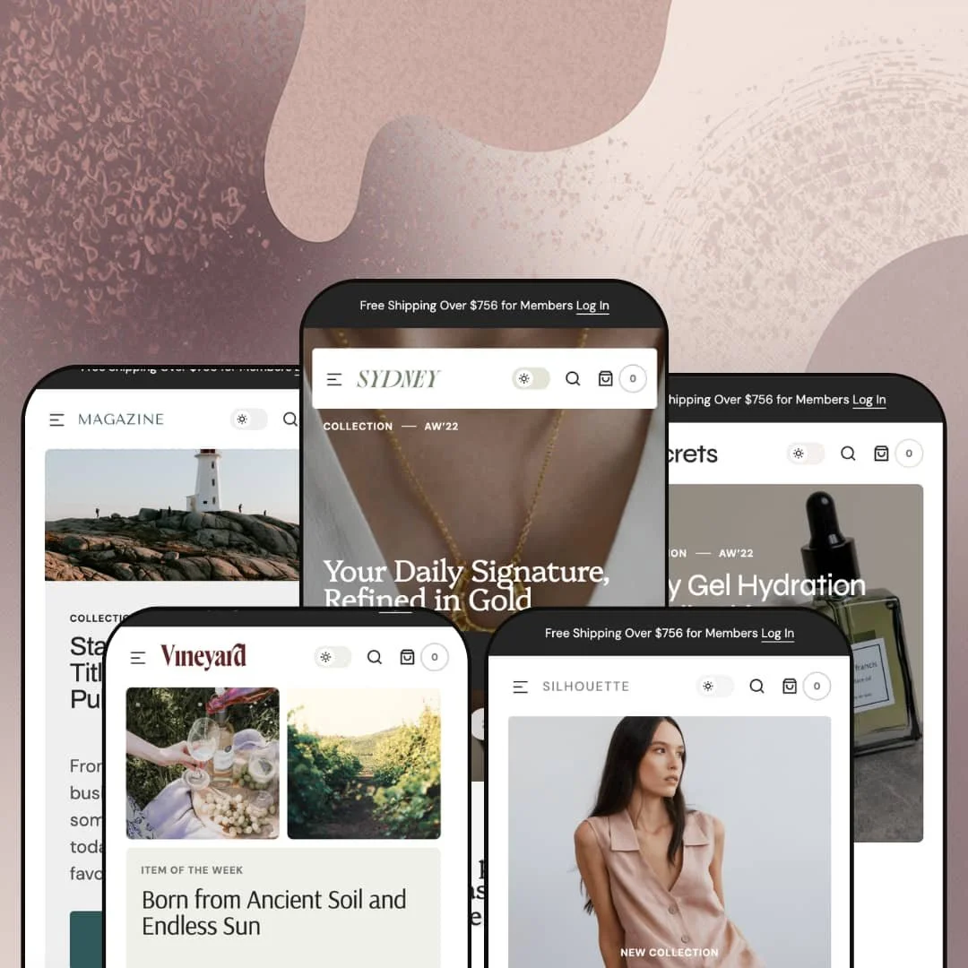
There's a dark-mode switch hiding in Sydney's search overlay, and it flips the entire storefront, on every one of the five demo stores. That small toggle says a lot about where Apparent Collective spent its energy on this $380 theme: visual atmosphere first, with five presets spanning jewelry, skincare, linen fashion, wine, and print magazines. Sydney is built on Online Store 2.0 architecture, so JSON templates and sections-everywhere editing come standard. The question is whether five verticals from one purchase means five genuinely different stores, or one store in five outfits.
A real dark mode, everywhere
Sydney ships a storewide light/dark toggle, surfaced in the search overlay across all five demos, with dual logo assets so branding survives the flip. That's rare. For brands whose photography is shot dark, think macro jewelry shots or moody bottle imagery, dark mode isn't a gimmick; it's the difference between the site framing the product and fighting it. Jewelry and beauty brands with photography-led, considered-purchase buyers get the most out of this one.
A coordinated conversion kit
Urgency, capture, and reassurance ship as one coherent toolkit rather than scattered options. Promo tiles open directly on the product page near the buy box, quick-view cards carry a register-for-discount prompt, and a stock counter, trust badges, promo popups, and banners round out the set. Individually, none of it is exotic. Together it means a launch-day page can be assembled without a single conversion app, and drop-model apparel brands selling impulse-friendly price points will use most of this kit weekly.
Every section has a live demo page
If you build your pages yourself instead of hiring an agency, Sydney's Features menu is worth the demo visit alone. Each demo store links a live example page for every section in the library, twenty-four in the current build, from Compare Block and Product Markers to Image Tabs and the before/after slider. Dawn, Shopify's free baseline, documents its sections in help articles; Sydney lets you scroll each one in a working storefront before you spend a dollar. Single-brand merchants with 30 to 100 SKUs doing their own builds can audit the entire toolbox in an afternoon.
Filtering that respects big grids
Faceted discovery is fully wired. The dresses demo exposes availability, a price range with open from/to fields, color, and size facets, each with live product counts, plus nine sort orders and a mobile drawer that applies filters per facet instead of forcing one giant submit. It's fast to narrow and hard to get lost. Apparel merchants running 100 to 500 variant-heavy SKUs, where a size-7 shopper needs three taps to a wearable grid, are the clear beneficiaries.
Promo pressure is the default temperature
Sydney's out-of-the-box posture is promotional: discount prompts layered into the browsing flow, sale strike-throughs across grids, and on the jewelry demo two promo panels wedged between the size selector and the buy button. Two promo interruptions before Add to Cart is one too many. Luxury-tier jewelry and fine-wine brands selling considered purchases will need to strip this messaging back deliberately, and the design loses some of its built-in energy when they do.
Five verticals, one skeleton
Read all five demos in a row and the sequencing barely moves: hero, popular items, numbered brand blocks, collection banners, a scrolling free-shipping ribbon, featured products, testimonials, blog posts, Instagram. The verticals differ in photography and copy, not in category tooling. Food-and-drink merchants with compliance-sensitive catalogs and considered-purchase buyers, who might reasonably expect the wine label to come with wine machinery, are buying art direction rather than vertical infrastructure.
Merchandising runs on hand-picking
The homepage engine is curation. Weekly hero slots, hand-picked featured rows, and spotlighted products all depend on someone choosing them, which is pleasant at 40 SKUs and a standing chore at scale since nothing in the theme automates rotation or surfaces products by rule. Restock-driven stores carrying 500+ SKUs should budget recurring merchandising hours, not just setup time.
What it takes to launch
Expect a two-to-three-day pass covering storewide copy replacement, testimonial and blog metadata cleanup, collection-to-menu remapping, promo and countdown re-configuration, and a review of the translated string sets before launch.
-
What works in this preset
The jewelry demo opens with rotating AW'22 campaign slides, each pairing a collection headline with its own call to action, and the pacing feels like a lookbook rather than a landing page. I clicked through the mega menu expecting the usual flat link list. Instead it runs a two-panel layout: nested product links on the left, large collection image tiles with their own shop buttons on the right, which gives a boutique catalog a sense of depth it doesn't technically have.
Scroll a product page and the buy box is only the beginning. The Adira Ring page runs breadcrumbs, a size selector, strike-through sale pricing, collapsible Description, Customer Service, and Return Policy panels, and then hands off to three numbered brand-story blocks and a recommendations row. For a considered purchase like a ring, that sequencing walks a shopper from specification to reassurance to story without a single app install.
The testimonial section pulls a smart trick. Each quote sits next to a shoppable product card, so social proof and the product it praises share one visual unit, and the whole strip doubles as a second featured-collection row.curated feel of the rest of the preset's design.
-
What works in this preset
You land on urgency-free skincare merchandising here, which is a deliberate change of temperature from the jewelry demo. Product cards swap to a second lifestyle photo on hover, sale badges render inline, and a quick-view trigger sits on every card so a routine-builder can inspect a serum without leaving the grid.
The homepage answers objections before they form. A three-question FAQ accordion covering payment methods, shipping windows, and the return policy sits directly on the homepage, and just above it the Compare Block stages a clinical-claims panel next to a hero product. That's pre-purchase reassurance handled in two native sections.
Where it stumbles
Skincare shoppers navigate by concern and by routine step, yet the demo stages three broad category buckets and stops there. I went looking for a shop-by-concern path and didn't find one staged. Nothing in the staging shows concern-based discovery, ingredient-led collections, or a routine-builder path, so the preset reads more like a general boutique wearing skincare photography than a store built around how this vertical actually browses.
-
What works in this preset
Is one hero message ever enough for a fashion brand mid-season? Silhouette answers with three stacked campaign slides: a new-collection story, a sale-up-to-50% push, and a special-items tease, each with distinct art direction. The rotation lets a single homepage speak to a full-price shopper and a bargain hunter in the same session.
Drop mechanics come staged and ready. A countdown block sits mid-page with an email field attached, so the wait for the next collection converts directly into list growth, which is exactly the loop drop-model brands run every cycle.
Color turns up where it matters most: in the grid. Product cards for the bag line carry Camel, Black, and Beige swatch chips right on the card, so a shopper comparing colorways never has to open five product pages to see the options.
-
What works in this preset
Wine retail lives and dies on the hero bottle, and this demo gets that. The homepage leads with an item-of-the-week feature that puts one bottle, its story, and a steep strike-through price front and center, a pattern that suits merchants who rotate a weekly allocation or a cellar-clearing offer.
Scarcity states read clearly at grid level. Sold-out and sale badges render on cards throughout the catalog, so a shopper scanning the red-wine collection sees availability at a glance instead of discovering it inside the product page.
Where it stumbles
The vertical fit is imagery-deep and not much deeper. Bottles photograph beautifully in the shared layout, but product options render as generic two-choice chips, and nothing in the staging speaks to how wine actually sells: vintages, formats, case quantities, tasting notes as structured data. A serious wine merchant gets a handsome shell here and a real staging project after purchase.
-
What works in this preset
Flat products are a quiet stress test for any theme. Magazine covers have no lifestyle context to lean on, and Sydney's image-led cards handle them cleanly, with cover art, sale and sold-out badges, and quick view all working at grid density. That's useful proof for anyone selling prints, packaging-led goods, or other 2D-first products.
The item-of-the-week pattern returns here as a current-issue feature, which maps naturally onto periodical retail where one title carries each week's promotion. It fits the vertical neatly.
Where it stumbles
The preset positions itself around publishing, but the editorial toolkit underneath is the theme's standard blog with a row layout and a column layout. A content-led brand hoping for magazine-grade article design will find a shop wearing magazine covers, not a publication.
One design language that survives five product types
Macro jewelry shots, flat magazine covers, bottle photography, and apparel lifestyle imagery all pass through the same layout system without breaking it. That's the real finding from reading the whole preset family: Sydney's grid, card, and hero patterns are genuinely photography-agnostic, which matters for merchants whose catalog will drift across categories over time.
Zero relearning across the family
Header logic, search behavior, cart pattern, and footer architecture are identical in every preset. An operator running two stores on different Sydney presets, or migrating a store from one preset to another mid-life, carries every configuration skill across with nothing to relearn.
Localization that's deployed, not claimed
Each demo runs a different trilingual set drawn from the theme's five EU language packs, with the interface strings actually translated in place. Cross-preset, that reads as internationalization the developer has exercised rather than a checkbox on a feature list.
Storytelling surfaces are shallow theme-wide
Across all five presets, brand narrative compresses into the same three numbered blocks, and long-form storytelling has few dedicated structures beyond them. Brands whose moat is a founder story, a sourcing narrative, or editorial voice will hit this ceiling in week one, regardless of which preset they pick.
The family never models an information-heavy sale
All five demos assume a shopper who buys on imagery and momentum. Nowhere in the family is a specification-driven, education-heavy purchase staged, so merchants who sell on data, spec tables and comparison depth and technical education, are left extrapolating how Sydney would carry that weight.
★ 7.8/10
Rating
-
A 24-section library with live demo pages per section, quick view, faceted filtering, and a storewide dark mode; reviews, wishlists, and subscriptions remain app territory as usual.
8
-
Every section can be previewed live before use, which shortens the learning curve, but the promo-heavy defaults mean quieter brands spend real time removing things.
7
-
The mobile filter-and-sort drawer applies per facet, the menu collapses into a clean slide-out, and card layouts hold up at grid density on small screens.
8
-
Homepages run long and image-dense on every preset; lazy-loaded imagery keeps the initial load staged rather than front-loaded, but lean these pages are not.
7
-
Five distinct art directions, dual light/dark schemes with separate logo slots, and a section library broad enough to rebuild any preset's homepage from scratch.
9
Frequently Asked Questions
-
Yes, and it's storewide rather than cosmetic: a light/dark toggle with separate logo uploads for each scheme, available on every preset.
-
Yes. The section library and feature set are theme-wide; presets differ in starting design, demo content, and art direction, so pick by aesthetic rather than by feature list.
-
Shoppers can filter by availability, an open price range, color, and size, each facet showing live counts, and sort nine different ways; on mobile this runs in a dedicated drawer.
-
The theme's interface strings come pre-translated in English, French, Italian, German, and Spanish. Your product titles, descriptions, and content still need their own translation workflow.
-
An age verifier is part of the theme's feature set, which matters for the wine preset's obvious audience and for any merchant in a restricted category.
-
Sold-out and sale badges render directly on collection cards, strike-through pricing appears on cards and product pages, and a stock counter is available for scarcity messaging.
This review is based on hands-on testing of the publicly available preset demos of the Sydney Shopify theme as of July 2026. Theme features, preset availability, and performance can change with subsequent updates from the theme developer.