
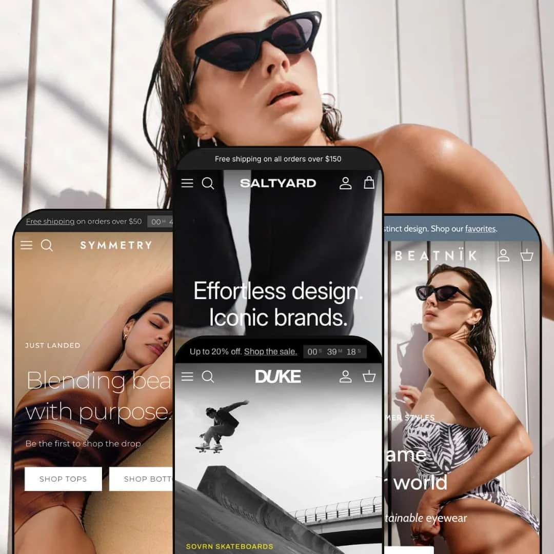
The Symmetry theme is a versatile Shopify theme aimed at fashion, lifestyle and accessories merchants. It offers a rich set of universal features such as quick‑view modals, slide‑out carts, mega menus and immersive storytelling pages. Across presets the theme leans into sustainability and thoughtful design, with hero sections that rely on large imagery or video to draw shoppers in and clear calls‑to‑action that send them to collections or promotions. Colour palettes range from soft neutrals to bold contrasts, and typography creates strong hierarchies so product names and prices remain easy to scan. A first‑time visitor landing on any preset is quickly oriented by a sticky header, an announcement bar and a prominent hero section that anchors the brand narrative.
Pros.
〰️
Pros. 〰️
✚ Interactive merchandising and storytelling
Symmetry stands out for interactive merchandising elements that appear across presets, from hotspot‑enabled hero images to bestsellers carousels, mosaic galleries, Instagram‑style grids and even a “get back on track” 404 carousel. These pieces make the demos feel more like curated magazines than static storefronts. For shoppers, that translates into a sense of discovery as they scroll, with multiple entry points into the catalogue rather than a single linear path.
✚ Quick‑view and quick‑buy flows that reduce friction
Throughout the theme, product cards can trigger quick‑view or quick‑buy panels that slide into view with images, colour swatches, size options, stock status and an Add to Cart button. The panels handle multi‑variant products and pre‑orders, so shoppers can make decisions without leaving their current context. This lowers friction for repeat buyers and encourages impulse additions when customers are browsing carousels or grids.
✚ Cart drawer designed to lift order value
When items are added, Symmetry’s slide‑out cart drawer provides a compact yet informative snapshot of the basket. A free‑shipping progress bar shows how much more a shopper needs to spend to unlock perks, while quantity controls and cross‑sell suggestions encourage them to tweak and extend their order. Because checkout is only a click away, the drawer manages to nudge baskets higher without making the process feel heavy.
✚ Rich product detail and configurability
On full product pages, the theme supports details such as colour swatches, fit sliders, pickup availability and description accordions. In some demos, additional fields like prescription inputs and add‑on checkboxes are surfaced as part of the buying flow. Together these tools make Symmetry comfortable for merchants with complex products, from optical frames to garments where fit guidance and material notes matter.
✚ Mega menus and navigation previews
Across presets, mega menus expand into multi‑column layouts with category groupings and, in some cases, thumbnail previews of presets or featured collections. This lets visitors jump directly into the parts of the catalogue that interest them instead of digging through nested dropdowns. It also allows merchants to spotlight key stories or ranges right from the main navigation, turning the menu into a merchandising surface.
✚ Flexible presets, consistent core
Symmetry offers flexible preset options that maintain core functionality while offering distinct aesthetic approaches. Main leans into bright beachwear, Salty Yard into earthy sustainability, Beatnik into clean eyewear minimalism and Duke into high‑energy skate culture, yet all share the same underlying cart, quick‑view and storytelling capabilities. This makes it easier for merchants to switch presets or draw inspiration from several demos while trusting that the underlying shopping mechanics will behave consistently.
Cons.
〰️
Cons. 〰️
🚫 Quick‑view positioning and extra scrolling
One recurring issue is the way quick‑view panels anchor near the top of the page. After clicking a Quick Buy button, shoppers sometimes need to scroll back up to see the panel, especially on long collection pages. This breaks the illusion of a seamless overlay and may confuse less experienced users who expect feedback immediately where they tapped or clicked.
🚫 Inconsistent quick‑view and quick‑buy entry behaviour
In some demos, clicking a quick‑buy overlay opens an inline panel, while in others the same action routes shoppers to the full product page. This inconsistency in how the entry point behaves can feel jarring when visitors move between collections or product types. Merchants may need to audit their own setup carefully to decide where they want panels versus full page transitions and adjust templates accordingly so that the experience feels intentional rather than random.
🚫 Occasional functional glitches
During testing, at least one pre‑order button failed to add its item to the cart. Issues like this are likely to be fixable, yet they highlight the need for thorough QA before launch, especially for brands that rely on pre‑orders as a core sales model. Shoppers encountering such a failure even once may lose confidence and abandon the purchase.
🚫 Section density demands active curation
Symmetry offers a large number of content blocks, from videos and mosaics to editorial stories and category grids. While this is a strength for creative teams, it also puts pressure on merchants to curate ruthlessly. Leaving everything enabled can make pages feel long and busy, diluting key messages and tiring visitors who just want to find a product quickly.
-
The Main preset targets swimwear and lifestyle brands with an energetic, beach‑ready feel. The home page blends saturated photography, video and playful messaging around a “Salty Bikini Club” to create a community vibe rather than just a product grid. It feels like a glossy lookbook that has been wired directly into a storefront.
What works in this preset
Main’s hero section leans heavily on hotspot‑enabled imagery, which turns atmospheric beach shots into shoppable layouts. When shoppers hover over these hotspots, compact product cards appear and connect the aspirational visuals directly to individual items. This makes “shop the look” feel built in rather than bolted on and encourages visitors to explore products they might not have searched for explicitly.
Beyond the hero, the home page stitches together a wide mix of sections including a video block, trending product carousel, Instagram‑style photo grid, mosaic galleries and blog teasers. In practice this gives merchants many surfaces on which to repeat key products and stories without feeling too repetitive. These sections support editorial storytelling, seasonal campaigns and subtle cross‑selling as shoppers scroll down the page, so the experience stays visually rich from top to bottom.
Where it stumbles
Because so many high‑impact sections appear on a single long home page, the Main preset can tip into feeling busy if merchants leave everything switched on. Hotspots, mosaics, video, sliders and blog snippets all compete for attention, and that can overwhelm first‑time visitors who are just trying to understand the range. Careful pruning and ordering of sections is necessary so that the most important stories and products stay in focus instead of getting buried in visual noise.
-
Salty Yard channels an earthy, sustainable vibe suited to organic clothing lines and slow‑fashion labels. Its muted colour palette and editorial photography create a calm shopping environment that feels more like a print magazine than a typical ecommerce template. The overall impression is soft, tactile and material‑focused.
What works in this preset
The landing section in Salty Yard uses a full‑bleed editorial video paired with bold typography to deliver a strong first impression. Lifestyle footage of garments in motion, combined with simple calls‑to‑action, sets expectations around texture and fit before customers even reach a product grid. This helps shoppers picture how pieces will live in their wardrobe instead of seeing them as isolated items.
Mosaic‑style category grids are used repeatedly to juxtapose new arrivals against core staples like denim, knitwear and accessories. Because these sections live at several points on the home page, customers are nudged to explore different product categories without ever feeling moved away from the editorial flow. It is a quiet but effective way to broaden browsing beyond just “what’s new.”
Salty Yard also foregrounds sustainability by dedicating content blocks to recycled materials, organic cotton and RWS wool. These elements make environmental credentials feel like a core part of the brand rather than an afterthought tucked into a product description. For merchants whose customers care about fibre sourcing and certifications, having those messages baked into the layout is valuable. At the bottom of the page, a combined magazine teaser and store‑location map further blends content marketing with offline retail, encouraging shoppers to read journal posts and visit the physical space.
Where it stumbles
The “Magazine” section in the demo sometimes feels sparse, relying on placeholder content rather than a fully realised editorial lineup. Until merchants invest in articles and imagery to populate it, that area risks coming across as filler rather than a destination worth clicking into. It is a section that will reward effort but look weak if left half‑finished.
As with Main, Salty Yard’s home page runs long, with multiple mosaics, sustainability callouts and journal elements layered together. For some shoppers this can feel contemplative and immersive, but for others it may translate into scroll fatigue before they reach the lower sections. Merchants should be ready to trim, rearrange and hide blocks that do not serve a clear purpose in their own brand story.
-
Beatnik is geared toward eyewear and accessories merchants with a clean, modern design. High‑contrast imagery and tight layouts put the focus on individual frames and details rather than broad lifestyle scenes. The overall feel is contemporary and slightly irreverent, matching brands that want to critique fast fashion while still looking polished.
What works in this preset
On the home page, a horizontal bestsellers carousel brings key frames to the foreground immediately. Shoppers can glide through a tight lineup of styles without leaving the main page, which keeps the experience focused and fast. It is an effective way to anchor the layout around proven performers while still leaving room for editorial blocks elsewhere on the page.
Beatnik’s narrative sections are carefully spaced between product‑heavy areas. Blocks that proclaim messages such as “Flipping the bird to fast fashion” sit alongside explanations of material choices and durability. This alternation between bold copy and product promotion reinforces the idea that the brand stands for something more than trend cycling. It gives merchants a way to talk about values without losing momentum on the selling side.
The preset’s overall aesthetic suits detailed products like glasses or jewellery, where small design decisions carry a lot of weight. Clean lines, generous whitespace and crisp typography keep each item legible even when shoppers are skimming. That makes it easier for visitors to compare frames and notice subtle differences in shape or finish.
Where it stumbles
In the demo, the New Arrivals collection includes only three products, which makes it hard to judge how Beatnik handles larger assortments at a glance. A merchant evaluating the theme will need to click into other collections or imagine how the layout scales when populated with a full range. Until that happens, it is difficult to fully assess how robust this preset feels for stores with deep catalogues.
-
Duke delivers a bold, streetwear‑inspired aesthetic aimed squarely at skateboard and apparel brands. Strong colour choices, gritty photography and punchy typography create a high‑energy first impression. It feels like a mix between a skate zine and a modern online shop.
What works in this preset
The hero section in Duke is immediately striking, with a skateboard video or large static shot paired with oversized yellow typography. This combination grabs attention and communicates attitude in a split second, which is exactly what many skate labels want from their storefront. Clear calls‑to‑action keep that energy pointed toward shopping journeys rather than just spectacle.
Duke divides its home page into obvious pathways, with dedicated blocks for Decks and Apparel near the top. This simple segmentation helps shoppers decide whether they are looking for boards or clothing before they dive into more detailed content. Additional sections then highlight new boards and the latest apparel drops, so both categories get room to shine without stepping on each other.
The preset also features an “Our Story” page that weaves together skate culture, design process and photography. That narrative deepens the sense of brand authenticity for visitors who care about the scene behind the products. Finally, the custom 404 page stands out, with a “Get back on track” carousel linking to Decks, Apparel, Sale and Accessories, plus icons for delivery, store location, gift cards and student discount, so even an error state gently steers people back into the shop.
Niche Suitability
Not Ideal For
-
Fashion, lifestyle and accessories brands that value a balance of storytelling and commerce will benefit most from Symmetry’s layouts and merchandising tools. The theme excels at showcasing products through carousels, hotspots and configurable quick‑views, making it particularly suitable for boutiques and labels with varied catalogues and strong brand narratives.
-
Stores that prioritise extremely minimalist aesthetics or want a very stripped‑back, uniform catalogue presentation may find Symmetry’s visual richness overwhelming. Businesses with a single hero product or a purely functional approach to design may be better served by a leaner theme that emphasises simplicity over storytelling.
-
Medium — Setting up Symmetry means curating numerous sections and configuring quick‑view, menu and storytelling options so that each page supports a clear narrative. Once that work is done the theme delivers a robust shopping experience, but merchants should plan time for content planning, testing and ongoing tweaks as their catalogue evolves.
Final Recommendation
★ 7.6/10
Rating
-
Offers a comprehensive set of features such as mega menus, quick‑views, rich product pages and a well‑equipped cart drawer that rival premium themes; minor issues with quick‑view placement and a pre‑order flow prevent a higher score.
8
-
The wide range of sections gives merchants plenty of flexibility, but it also means they must invest time in curation and organisation; the admin settings themselves are straightforward once merchants learn where key options live.
7
-
Key interactions like quick‑view panels and carousels remain available on smaller screens, although having quick‑view content open at the top of long lists can make the experience feel slightly awkward because shoppers have to scroll back to find what they just opened.
8
-
Pages load smoothly in the demos and carousels respond quickly, yet heavy use of imagery and video can slow initial load on weaker connections if assets are not carefully optimised.
7
-
Multiple presets cover aesthetics from beachwear to streetwear, and merchants can adjust colours, fonts and the ordering of sections extensively without touching code.
8
FAQ
〰️
FAQ 〰️
-
👑 Yes. The Main and Salty Yard presets showcase swimwear and clothing using hotspots, mosaic sections and sustainability stories, which makes Symmetry a strong fit for fashion labels that depend on visuals and narrative.
-
📱Most core interactions, such as quick‑view panels, carousels and the slide‑out cart, function on phones and tablets much as they do on larger screens. The main caveat is that quick‑view content appears near the top of the page, so after tapping from deep in a grid, shoppers may need to scroll back up to see it.
-
🎨 The theme offers multiple presets and extensive section‑level controls. Merchants can adjust colours, fonts, imagery and layout order directly in the theme editor, so it is possible to match a wide range of brand identities without custom development.
-
⚡ Most interactions, such as quick buy and the cart drawer, feel smooth in the demos and do not introduce noticeable lag. Large background videos or dense image galleries can slow the first load on slower connections, so media optimisation remains important.
-
👕 Yes. Quick‑view panels can display colour swatches, size options and stock status, while full product pages add tools like fit sliders, prescription inputs and add‑on checkboxes to capture more detailed choices. This makes variant management workable even for complex products.
-
🔎 Symmetry follows Shopify’s best practices with clean HTML and sensible heading structure. Merchants can edit meta titles and descriptions within Shopify’s admin, but the theme does not ship with a dedicated SEO app of its own.
-
💱 Language and currency behaviour is controlled by Shopify itself, and Symmetry relies on those platform settings rather than adding separate localisation logic. In the demos, selectors appear in the header when they have been configured in Shopify, so what shoppers see will depend on how the store’s Markets and translations are set up.
-
⚙️ The theme is built around standard Shopify sections and app blocks, which means most common apps, such as reviews, subscriptions or live chat tools, should drop in without major conflicts. Merchants should still test key integrations on a staging setup before going live.
-
🛒 You can explore live demos for each preset on the developer’s site. Shopify themes also include a free trial period during which you can install Symmetry on your own store, configure it and test the experience before deciding whether to purchase.
This review is based on hands‑on testing of the publicly available “Main,” “Salty Yard,” “Beatnik,” and “Duke” preset demos of the Symmetry Shopify theme as of 22 November 2025. Theme features, preset availability and performance can change with subsequent updates from the developer.