
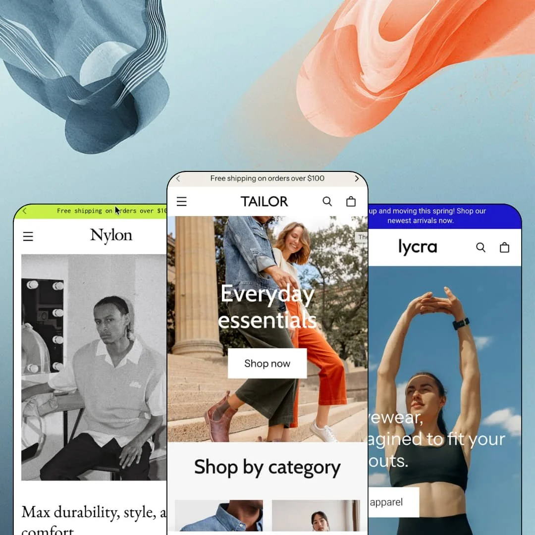
Most premium Shopify themes hedge, bundling a fashion preset next to a furniture preset next to a coffee preset. Tailor commits to clothing three times over. Pixel Union's $360 theme runs on Online Store 2.0 and stages its three presets as three different apparel businesses: a sustainable essentials brand, a streetwear label, and an activewear shop. Whether that focus is worth premium money depends on how closely one of those three businesses resembles yours.
Product cards that argue before the click
Tailor's collection cards go beyond thumbnail duty. Alongside price and color swatches, merchants can attach text badges ("Selling fast!", "Our pick", "Back in stock") and icon annotations, so a card can flag "100% waterproof" with an umbrella glyph or "Sustainable materials" with a leaf while the shopper is still scanning the grid. Dawn, Shopify's free baseline, gives a card an image, a title, a price, and a sale flag; Tailor turns the same real estate into an argument. For apparel merchants running catalogs past 100 SKUs, where most discovery happens inside long collection grids, that per-card persuasion layer is where this theme earns its keep.
Cross-sell built into the buying moment
Every demo product page pairs the item with companions. Cotton stages it as "Style with," Nylon as "Wear with," Lycra as "Complete the Look," and the feature set extends the same cross-selling into the slide-out cart, so the outfit pitch follows the shopper from product page to checkout intent. One mechanism does the personal-stylist work the theme advertises. For outfit-led apparel brands selling to cross-shop-heavy buyers, where the second item carries the margin, native pairing blocks mean the upsell ships with the theme itself.
Still shipping features four years in
Version 4.1.0 landed in October 2025. That release added a dedicated section and template for high-variant products and combined listings, which matters for apparel matrices where one style splinters into dozens of size, color, and fit permutations that a standard product page handles clumsily. A theme launched in March 2022 picking up variant-architecture upgrades three-plus years later signals a developer still investing, not harvesting. Brands running combined listings across fits and washes, with 500-plus variants and evergreen replenishment cycles, get tooling here that the launch-year version didn't have.
Selling into Europe on day one?
Tailor ships its interface strings pre-translated in English, French, Italian, German, and Spanish. Button labels, cart text, and form copy arrive localized, so the storefront chrome reads native while product content translation stays on the merchant's plate where it belongs. That's five launch markets without touching a language file. For single-brand apparel labels running EU storefronts at mid-market price points, it removes one of the quieter blockers between "theme installed" and "store live."
A 2022 chassis at a 2026 premium price
Tailor sits on the Online Store 2.0 generation, not the newer Theme Blocks architecture. That's a 2022 chassis wearing a 2026 price tag. In practice, block nesting stops shallow, so teams that build pages by composing deeply nested custom blocks will hit the editor's ceiling sooner here, and no theme update short of a re-platform changes that. Agencies and holding-company operators standardizing builds across large, 500-SKU-plus catalogs should weigh that ceiling before committing $360 per store.
Three presets, one wardrobe
All three presets dress the same vertical. Jewelry, beauty, and home merchants shopping the premium tier get size charts, lookbooks, and outfit cross-sell staged wall to wall, and none of it maps onto their catalog without reworking every apparel-shaped surface themselves. The feature set travels; the staging doesn't. Considered-purchase categories outside clothing, from fine jewelry to skincare regimens, will spend their first week translating a fashion demo into their own language before they can launch from it.
The conversion kit leans loud
Stock counters, promo banners, in-menu promos, trust badges, product badges, an age verifier: Tailor's marketing toolkit skews toward urgency and reassurance mechanics. Quiet luxury this is not. Luxury-tier apparel houses selling considered purchases can switch most of it off, but what remains is a competent storefront without the theme's distinguishing energy, which raises a fair question about what the $360 bought. The toolkit fits promotion-driven retail far better than restraint-driven retail.
What it takes to launch
Expect a copy and imagery pass across hero, editorial, and lookbook sections, mega menu re-staging for your own catalog structure, and metafield population for size charts and product-card labels before launch. Plan one to two days.
-
What works in this preset
Open the Women dropdown. A small storefront unfolds: three columns of second- and third-level links running from Tops down to Button Downs and Tank Tops, closed out by a promo teaser ("Getting cozy") that routes into a lookbook page. I clicked through Men and Gender-neutral and found the same treatment with different teasers, which turns the navigation itself into a merchandising surface instead of a plain link list.
A complete buy box sits right on the homepage. The featured-product section for the EcoKnit Cropped Thermal carries color and size swatches, live pricing, an add-to-cart button, and even a store-pickup note ("Pickup available at 1221 Broad St, usually ready in 2-4 days") without sending anyone off to the product page. For a brand pushing one hero item per season, that section compresses the entire purchase path into a single scroll stop.
The Shop the Look section stages an eight-image gallery for "The Coastal Edition" with tappable product markers layered over lifestyle photography, each marker resolving to a product tile with price and a details link. It's the outfit-selling move the Theme Store pitch promises. Here it's staged with real catalog items, not placeholders.
-
What works in this preset
"Also available as shorts." That single line under the Verve Moondust legging card links straight to the sibling silhouette in the same print, which is precisely the connection an activewear shopper wants when a print catches their eye but the season calls for a shorter cut. Small detail, real intent capture.
The whole preset runs tighter than its siblings. One announcement line, a three-item main nav, a mission statement set as an oversized pull quote, and an @michi_ny gallery wall where heavier editorial sections would sit. It's a demonstration that the same theme scales down to a focused single-line shop without looking stripped.
Product pages split content into Features, Size & Fit, and Fabric & Care accordions. The fit notes name the cut, the length, and the model's sample size. For stretch fabrics, where fit anxiety drives most returns, that structure answers the deal-breaking questions before checkout does.
Where it stumbles
I went looking for an activity-based way to shop and didn't find one staged. The demo organizes the catalog strictly by garment type (Tops, Bottoms, Collections) even though activewear buyers frequently arrive thinking "yoga" or "running," not "crops." A merchant can fix this with their own collection structure, but for a preset named after performance fabric, the demo skips the vertical's most natural browsing axis.
-
What works in this preset
Streetwear lives on its archive. Nylon treats that seriously: four seasonal lookbooks (FW2020 through SS2022) sit under their own top-level navigation item, staged as a browsable history of drops rather than a single seasonal gallery. A label that ships collections in cadences can mirror that rhythm on the storefront without touching the blog.
I noticed the demo doesn't hide what it can't sell. A $2,280 leather jacket staged as sold out leads the homepage's first product row, keeps its full gallery and description on the product page, and swaps the buy button for a disabled sold-out state. Scarcity stays on display. That's exactly how a drop-model brand wants unavailable inventory to read: as a trophy, not a 404.
Product pages in this preset stack reassurance below the fold. An About accordion answers shipping and pickup questions inline, and short emoji-fronted policy rows ("Easy 30 day returns", "Worldwide shipping") keep the fine print visible without a modal or a footer hunt. It's compact. It also mirrors how a shopper actually evaluates a $200 hoodie before committing.
The presets map business models, not color schemes
Cotton stages a multi-audience essentials brand, Nylon a drop-cadence label with an archive, Lycra a compact single-line shop. Read together, they cover the three ways apparel stores actually operate, not one store painted three ways. A merchant can pick the preset whose commercial rhythm matches theirs and inherit staging decisions that already make sense.
One toolkit, three tones of voice
The same sections read cozy and earnest in Cotton, hyped and scarce in Nylon, and pared back in Lycra. That range comes from typography, imagery, and staging choices alone, which means the theme's identity flexibility lives deep inside a single vertical instead of spread thin across many. Brands with a strong visual voice get raw material that bends to it.
Every storefront lands in the same rhythm
Across all three presets the homepage follows one arc: hero, product rows, editorial proof, social gallery, newsletter. The section library pulls builds toward that shape, and merchants chasing an unconventional storefront structure will feel the grain of the theme pushing back. Distinctiveness here comes from styling, not layout invention.
The differentiators are photography-hungry
Lookbooks, shop-the-look hotspots, gallery walls, and in-menu promo tiles all presume a steady supply of lifestyle imagery. Each demo runs on borrowed brand photography, and a merchant working from plain product shots on white can install the theme but not activate the sections that justify its price. Budget for a shoot, or budget for a plainer store.
Rating
★ 7.8/10
-
Apparel tooling runs deep: size charts, lookbooks, swatch filters, cross-sell blocks, and the 2025 combined-listings addition. Reviews, wishlists, and subscriptions remain app-driven additions.
8
-
Sections and presets make assembly straightforward, but the card-label and size-chart systems need metafield setup before a store looks like the demos.
8
-
The mobile menu stacks submenus with back-button navigation, which keeps three-level browsing usable on a phone; cards and buy boxes collapse into clean single-column layouts.
8
-
Pages stay lean for their section count, with responsive image sizing and progressive loading throughout the demos and no heavyweight page-builder baggage.
8
-
Strong range within apparel via typography, color tokens, and section variety; the single homepage rhythm and one-vertical staging bound how far it stretches.
7
Frequently Asked Questions
-
No. A "View size chart" modal is wired into product pages beside the size selector.
-
Menus run three levels deep, and dropdowns can carry a promo tile with an image, caption, and link alongside the link columns.
-
Yes. When in-store pickup is configured, the buy box renders the pickup location and an estimated ready time.
-
Yes, and each message takes its own link, so a shipping threshold and a sale can share the bar without competing.
-
They stay fully browsable. The card carries a sold-out label and the product page swaps the buy button for a disabled state instead of hiding the listing.
-
Yes. Quick add sits on every product card in collection grids and homepage product rows, so multi-variant items can be added without a full page load.
This review is based on hands-on testing of the publicly available preset demos of the Tailor Shopify theme as of August 2026. Theme features, preset availability, and performance can change with subsequent updates from the theme developer.