
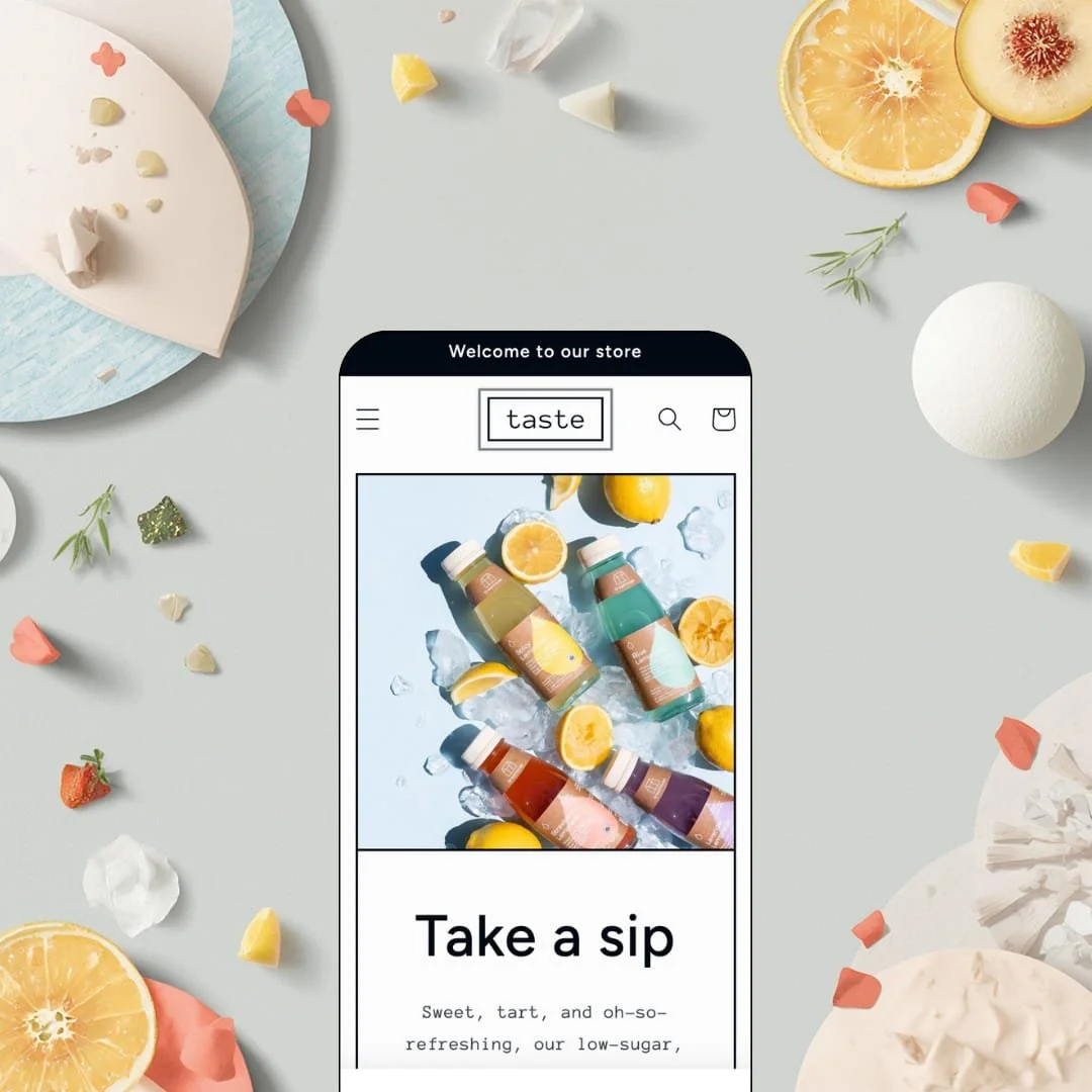
Most free Shopify themes whisper. Taste, Shopify's own free theme for specialty food and drink brands, went the other way: oversized industrial headlines, thin strokes, and a palette built on hard contrast. It's an Online Store 2.0 build, launched in February 2022 and still maintained, with version 15.5.0 landing in June 2026. I spent an afternoon in the demo to see whether the bold surface hides real selling tools or just good typography.
An information kit built for things people ingest
Taste ships dedicated blocks for ingredients, nutritional details, and usage information, plus an FAQ section that can sit directly on the product template. The demo's Fiery Ginger Booster page puts the full organic ingredient list right under the price and closes with shelf-life and nutrition questions answered in an accordion. Label-readers get answers before they buy. For food, beverage, and supplement merchants with catalogs under 100 SKUs selling to ingredient-conscious buyers, this replaces custom page-building work that would otherwise sit between install and launch.
A full buy box, anywhere you want it
Why should a hero product wait for its own page? Taste's featured-product section embeds the complete purchase module on any template, and the demo runs it mid-homepage: pack-size pills, a quantity stepper, an add-to-cart button, and a live sold-out state on the Twelve Pack option, all without leaving the page. One scroll, one click, done. For single-hero-product drink brands and stores selling impulse-priced consumables under $20, that placement collapses the distance between discovery and checkout.
A free theme with an actual design opinion
Brands that want to look loud without hiring a designer are the target here, and the type system delivers: oversized industrial headlines, thin strokes, and hard-contrast color tokens that carry through every template. The demo sets a customer quote at the same display size as the hero headline, which turns social proof into a design moment instead of a gray box. It photographs well on a phone screen. Bold-branding specialty merchants, from beverage startups to kids brands running seasonal drops, get an identity out of the box instead of a blank slate to art-direct.
The design voice doesn't negotiate
The same typography that makes Taste distinctive makes it inflexible. You can swap fonts and colors in the editor, but the layout logic, the oversized headline scale, and the sparse, poster-like spacing assume a brand that wants to shout, and softening any one of them starts to unravel the whole look. There is no quiet version of this theme. Luxury-positioned merchants and considered-purchase categories like fine jewelry, where the Theme Store also markets Taste, will spend real hours fighting the type scale instead of working with it.
The buy button doesn't follow you
I went looking for a sticky add-to-cart bar and came up empty; nothing in the feature list points to one either. The product template stacks ingredients, description, share tools, and an FAQ accordion below the purchase module, so a shopper who reads to the bottom has left the button far behind. On a $3.95 impulse product, that's a long scroll back for a two-second decision. Mobile-heavy stores selling low-priced consumables to impulse buyers should test their own product pages hard before committing.
Underneath the poster paint, it's Dawn
Strip the typography and Taste's working parts mirror Dawn, Shopify's free flagship: same header pattern, same footer block set, same collection template with availability and price filters, same product-page anatomy. The genuinely Taste-specific layer is thin. Standing out then falls on your photography and copy, because the underlying page anatomy is available to every competitor for free, today, in one click. Single-brand beverage startups in crowded DTC drink categories should weigh how much of the differentiation work this theme actually does for them.
What it takes to launch
Expect a one-to-two-day pass covering copy and imagery across all templates, product-level FAQ and ingredient content for each SKU, navigation staging for your catalog structure, and collection descriptions before the storefront reads as finished.
-
What works in this preset
Scrolling the homepage feels like reading a well-paced sales page rather than a stack of sections. A full-bleed hero with a single line of display type hands off to a bestseller row, then a three-tile collection list where each tile carries its own short description, then a customer pull-quote set at headline size. The rhythm is deliberate. Product, proof, values, bundles: by the footer, the demo has made a complete argument for a juice brand without ever feeling busy.
The header runs an announcement bar, a dropdown menu with seven collection links under Drinks, search, and cart, arranged in a centered-logo layout that suits a logo-forward brand. The footer stacks a quick-links menu, a mission text block, an image block, newsletter signup, and social icons, which is more block variety than the minimal page designs led me to expect. Nothing here is flashy. It's tidy, and it holds the industrial look together on every template.
One demo page kept me longer than I planned: the About page. It opens on an image banner, drops into a three-column icon row for the brand's values, then alternates image-with-text sections down to the footer, all assembled from the regular section library rather than a locked page design. That matters for a story-led product. I clicked through expecting filler and found a template a small brand could ship almost as-is.
Where it stumbles
Browsing the catalog is where the demo undersells its own vertical. The All Drinks grid runs 31 products as bottle shots with names like Genius, Wing Man, and Lullaby, and nothing on the card tells you what any of them taste like, so evaluating the range means clicking into products one at a time. For a flavor-driven category, that staging choice leaves the collection page doing less selling than every other template in the demo.
Taste is a launch theme with a graphic designer's temperament.
It hands a zero-budget food or drink brand a finished visual identity and enough product-information depth to sell ingestibles credibly. The trade-off is ceiling rather than floor, since the section library and settings surface are sized for getting a store live, not for the merchandising experiments that come once it's growing.
Its Theme Store standing sits mid-table at 54% positive across 13 reviews, with most of the remainder neutral rather than negative. Treat it as a strong year-one storefront and budget, mentally, for what year two might ask of it.
Rating
★ 6.6/10
-
The ingestibles blocks, product-page FAQ, and embeddable buy box cover a food brand's core selling needs; promo tooling stops at banners and cross-selling, with nothing built for urgency or timed drops.
5
-
One preset, a compact settings surface, and templates that read exactly as they ship keep the learning curve short. The demo's simplicity is honest about what you're actually configuring.
8
-
Collection pages get a dedicated filter-and-sort drawer, and the display type scales down without losing its character. Product pages run long on a phone once FAQ and ingredient content is loaded in.
7
-
Pages stay light: single-image product galleries, restrained section counts, and no heavy media anywhere in the demo.
8
-
Color and typography tokens adjust freely, but the identity is baked into layout and scale. You're choosing Taste's look, not building your own.
5
Frequently Asked Questions
-
No. The Theme Store also files it under jewelry and accessories, and the ingredient and usage blocks are text-driven, so they repurpose readily as materials or care details for other story-led products.
-
Variant options render as pill buttons that each carry their own price, so a 60 mL single, a six pack, and a twelve pack display their costs before anything is selected.
-
Yes. Version 15.5.0 shipped on June 17, 2026, adding storefront event support plus a new product-disclosures section and block, which is directly useful for supplement and wellness merchants.
-
The feature list includes one, though the demo stages navigation as simple dropdowns, so plan to build the mega menu layout yourself rather than inheriting a staged example.
-
Shopify positions it for stores with roughly 11 to 100+ products, and the demo runs 31 products across seven collections with availability and price filtering plus pagination.
-
Quick buy is part of the feature set; the demo stages product cards without it, so it's an editor toggle you'd switch on rather than something visible in the preview.
This review is based on hands-on testing of the publicly available preset demos of the Taste Shopify theme as of August 2026. Theme features, preset availability, and performance can change with subsequent updates from the theme developer.