
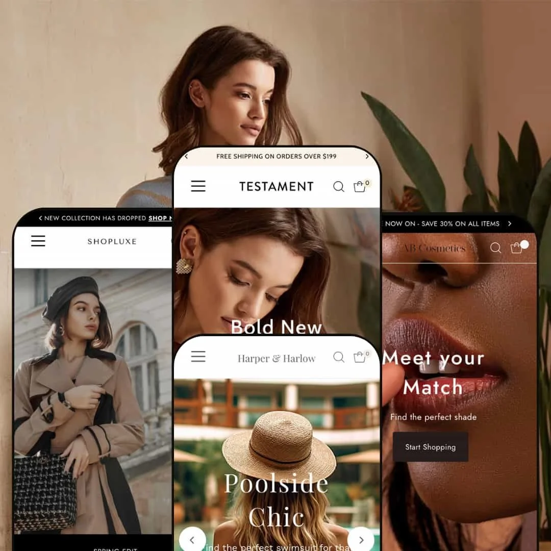
Testament’s four presets reinterpret a common framework of sticky navigation, announcement bars, variant swatches and cart drawers into distinct storefront experiences. Each demo’s home page weaves in merchandising modules ranging from sale countdowns and product‑focus banners to testimonial sliders, blog teasers and Instagram‑style feeds.
Product pages continue the narrative with size guides, cross‑sell sections and sustainability messaging. Collectively, the theme leans into storytelling and variant‑rich shopping with layered content and polished typography.
Pros.
〰️
Pros. 〰️
✚ Flexible presets, consistent core
flexible preset options that maintain core functionality while offering distinct aesthetic approaches. Across Testament, Exodus, Revelation and Genesis, navigation, product layouts and cart behaviour remain familiar, so shoppers do not have to relearn how the store works as they move between campaigns or collections. Each preset simply shifts typography, palette and the balance of editorial content to speak to a different vertical, from fashion to beauty to swimwear and accessories.
✚ Rich merchandising and storytelling modules
Testament leans heavily on a wide range of on‑page modules, including sale countdowns, product‑focus banners, testimonial areas, blog teasers and social‑style image feeds. These pieces can be layered to turn what would otherwise be a generic catalog into something closer to a brand magazine. For merchants, that means plenty of ways to highlight launches, frame promotions and keep home pages feeling current without custom development.
✚ Deep product pages for variant‑rich catalogs
Across the demos, product pages are built to support multi‑variant items rather than single‑SKU products. Colour swatches, size pickers, fit sliders, quantity controls and size‑guide overlays sit close to the main purchase buttons, helping shoppers make confident decisions without hunting for information. Many products also surface details about materials, packaging and sustainability, which is especially useful for apparel, beauty and swimwear brands that need to explain fabric choices or ingredient lists.
✚ Cart drawer and cross‑sell opportunities
In the presets that enable it, quick‑add panels from product grids feed neatly into a slide‑out cart drawer instead of forcing a full‑page reload. The cart surface does more than total up line items, showing progress toward shipping thresholds, suggesting complementary products and accepting customer notes. On product pages, “You may also like”, “Buy it with”, “Selling Fast”, “Most Popular” and “More collections” sections repeat that cross‑sell logic, nudging shoppers toward slightly larger baskets without feeling overly pushy.
✚ Search, navigation and structural polish
Sticky headers keep core navigation, search and account or cart icons visible as shoppers scroll, and at least one preset exposes a multi‑column mega menu for complex catalogs. Search is treated as a first‑class path into the store, with slide‑out overlays and suggestion lists that feel more modern than a basic search field. Together with announcement bars and clear footer menus, these details give the theme a professional backbone that can support mid‑sized and larger stores.
Cons.
〰️
Cons. 〰️
🚫 Potential for overwhelming scroll depth
In the more editorial presets, especially Testament and Revelation, home and product pages can grow very long as carousels, banners and cross‑sell sections stack up. That density is helpful for storytelling but can be tiring for shoppers who arrive with a specific task, such as checking one size or reordering a known item. Important content like size guidance, reviews or newsletter forms may end up buried far below the fold if merchants do not prune sections carefully.
🚫 Hover‑dependent quick‑add behaviour and inconsistencies
Quick‑add panels are often tucked behind hover states on product tiles, which means some shoppers simply never discover them and click through to full product pages instead. In the Exodus demo a few cards break the pattern by bypassing quick add altogether and sending visitors straight to the product page, interrupting the flow when people are building carts from a grid. The Genesis preset swings the other way and omits quick add entirely, so merchants who depend on that pattern will need to decide between modifying layouts or choosing a different preset.
🚫 Pop‑ups and visual busyness
Revelation introduces a newsletter modal early in the session, which can feel abrupt for first‑time visitors who have not yet seen what the brand offers. Exodus shows how dense swatch variations and multiple carousels can make grids feel crowded if merchants enable every section. Without careful restraint, these demos can cross the line from rich to noisy.
-
The Testament fashion demo frames the theme as a multi‑category boutique rather than a single‑product landing page. Its home page blends warm seasonal photography with clear category entry points for rompers, tops and shorts. The overall impression is of a store that encourages browsing and discovery rather than a single fast purchase.
What works in this preset
On the Testament demo, the opening sequence feels like a lookbook for warm‑weather dressing. After the first image set, the “Summer Ready Styles” messaging pulls attention to rompers, tops and shorts as three obvious starting points. Each tile uses simple labels and strong photography, so shoppers can grasp the range at a glance. A dedicated feature on the Willa Playsuit then narrows the story to a single hero item, showing how the preset can spotlight one product without abandoning a broader category view.
Further down the page a short band of customer praise with a five‑star rating sits next to a named product, signalling that the clothes are already being worn and liked. Because the quote points directly to a specific piece, it doubles as subtle guidance on what to try first. Just below, the “There’s more to explore” heading introduces another grid of categories, and the simple layout encourages relaxed browsing instead of a hard promotional push.
Seasonal urgency is handled mostly through visuals and short, time‑sensitive messages. A brief sale reminder appears near the hero area, yet the focus remains on outfits and styling rather than on discount figures alone. This balance will appeal to boutiques that want to promote offers while still keeping the store anchored in editorial fashion imagery.
Where it stumbles
Quick access to buying options depends on noticing subtle hover‑driven states on product cards. It is easy to miss those extra actions if you are not in the habit of moving the cursor over every tile, which means some visitors will click through to full product pages more often than the preset really intends. For shoppers who enjoy browsing that extra step might not matter, but anyone hunting for something specific could find it slows them down.
-
The Exodus beauty demo positions Testament as a home for ingredient‑conscious cosmetics. Its layout moves quickly from a featured lip look into tightly focused rows of lip duos, lipsticks and glosses. Copy about organic and natural formulas threads through the page, making the sustainability message hard to miss.
What works in this preset
At the top of the Exodus home page a bold hero for a single lip product is followed by a simple discount strip and a “Shop the Latest Arrivals” carousel. Category tiles carved out for lip duos, lipsticks and glosses give shoppers three clear paths into the catalog. This mix of promotional banner, arrivals carousel and tightly scoped categories helps visitors understand the range without feeling lost in an endless wall of SKUs.
Storytelling blocks do a lot of work here. A “Premium organic cosmetics” section pairs close‑up lifestyle imagery with short tags that explain what makes the formulas different. Nearby, a testimonial featuring the “Metallic heaven!” quote backs up those claims in a human voice. Further down, a “Beauty Blog” grid surfaces articles that extend the brand’s point of view beyond the product shelf, turning the store into a light content hub as well as a shop.
On product pages Exodus continues that reassurance theme. Clean‑ingredient promises and checkout security cues sit close to the main purchase area, and a short shipping line spells out what to expect after ordering. A newsletter form near the bottom of the page then invites shoppers who have read all the way through to stay in touch and hear about future launches.
A dedicated banner on the home page brings the “planet positive” message together in one place. By summarising commitments to sustainable, toxin‑free ingredients in a single, well‑framed block instead of scattering badges everywhere, the preset keeps the layout clean while still putting values near the top of the experience.
Where it stumbles
In the product grids, quick‑shop behaviour is not entirely consistent. Most tiles open a compact quick‑add panel, but a few still send shoppers straight to the full product page. That jump breaks the rhythm for anyone who is rapidly comparing shades or building a cart directly from the grid.
The same attention to variation and swatching that makes Exodus feel rich can tip into clutter on dense collection pages. Rows of slightly different shades with multiple carousels close together may overwhelm shoppers who prefer a more pared‑back presentation. It is a layout that rewards careful browsing but offers relatively little breathing room.
-
The Revelation swimwear demo treats the storefront like a lifestyle magazine for pool days and beach trips. It stacks bold imagery, campaign slogans and editorial snippets to frame swim pieces as part of a broader warm‑weather mood. Of the four presets, it is the most overtly story‑driven.
What works in this preset
The home page opens on the “Poolside Chic” campaign and quickly moves into “Look What’s New!” carousels that highlight fresh arrivals. A bold #OwnTheOasis banner and free‑shipping or free‑returns call‑outs set a relaxed yet reassuring tone. Category tiles for New Arrivals, Back in Stock and All Swimwear then give clear entry points into the catalog, while a time‑limited sale strip and a “Trending Now” slider keep attention on pieces that are moving quickly.
Revelation’s product pages are among the deepest in the theme, reading almost like mini landing pages. Fit and colour information appears close to the main images, and the copy lingers on fabrics and even packaging details. Further down, lifestyle imagery, gifting cues, short editorial notes from the “editors” and a “Harper and Harlow Giving” message combine to tell a story about values as much as style. Near the bottom, a small band of recently viewed pieces quietly nudges shoppers back to items they were considering earlier.
Near the footer the preset turns into a social hub. A “Follow us” strip name‑checks Instagram and TikTok alongside a row of lifestyle photos, creating a clear bridge between social content and on‑site browsing. A short benefits band repeats promises of free shipping and hassle‑free returns, then a newsletter form closes out the page, making it easy for fans who arrived from social platforms to stay in touch.
Where it stumbles
One of the few real friction points in this preset is a newsletter pop‑up that appears early in the journey. It interrupts the initial hero and makes it harder for first‑time visitors to get a feel for the brand before being asked for an email address. Because the home page is already packed with campaign imagery and editorial sections, that early prompt can feel like one request too many before the brand has earned attention. For audiences already familiar with the label that may be acceptable, but it is likely to put off some cold traffic.
-
The Genesis accessories demo presents Testament in its most pared‑back form. A restrained colour palette, generous white space and the “Elegance in Every Step” hero message set a calm, polished tone. It feels aimed at brands that want their photography to do most of the work.
What works in this preset
Genesis uses a simple slider to cycle through core categories such as handbags, wallets, purses and boots, each presented with clean, full‑bleed imagery. Two prominent promotional panels then isolate Handbags and Boots as hero collections. For labels that divide their business between just a couple of main lines, this is an efficient way to share the spotlight without clutter.
A “Beautifully crafted” section introduces the sustainability angle for leather goods, using a mix of copy and imagery to talk about materials and construction. A new‑arrival call‑out for the Robyn Tote shows how the preset can single out one bag without breaking the calm layout. The “Our Faves” grid that follows offers a small, curated set of pieces rather than a huge catalog, reinforcing that this demo is about focus more than volume.
Midway down the page, logos from Byrdie, Glamour, Vogue and Elle act as strong social proof. They sit directly above a “Join the list” email invite, so visitors see third‑party validation before being asked to subscribe. The footer repeats that invitation and groups navigation into clear About, Explore and Connect columns, which suits brands that emphasise press and storytelling as much as product.
On product pages Genesis keeps the structure straightforward but not bare. Colour options and purchase buttons lead into a detailed specification table that spells out dimensions and materials in plain language, which suits shoppers who want measurements and material information laid out clearly before they commit.
Where it stumbles
Unlike the more merchandised presets, Genesis does not expose a quick‑add panel directly from product cards. Shoppers have to click through to the full product page every time they want to add an item, which slows down cart‑building for people who already know what they want.
The minimalist approach also means there are fewer promotional moments on the page. You will not see countdown timers, dense blog strips or complex bundles here, so brands that rely heavily on sale urgency or editorial content may find the layout too static without extra customisation.
Niche Suitability
Not Ideal For
-
Testament is best suited to merchants with mid‑to‑large catalogs in fashion, beauty, swimwear or accessories who want to pair merchandising with editorial content. If you rely on cross‑sells, storytelling blocks and on‑page value messaging to lift average order value, the theme’s toolkit lines up well with that strategy.
-
One‑product stores, ultra‑minimal brands and merchants who dislike long scrolling pages or hover‑dependent interactions may prefer a lighter theme. If your priority is a bare, almost utilitarian catalog or you want every action visible without discovery, Testament’s layered layouts may feel like more work than they are worth.
-
Medium — configuring the many sections, cross‑sell blocks and editorial areas takes time, especially for the more story‑driven presets. Most of that effort happens inside Shopify’s visual customiser rather than in code.
Final Recommendation
★ 7.6/10
Rating
-
Comprehensive merchandising features like Quick shop, cart drawer, variant swatches, filters and story modules; occasional inconsistency in Quick shop lowers the score.
8
-
Sticky header and mega menu simplify navigation, but novices may need to learn hover‑state interactions and configure numerous options.
7
-
Presets adapted well to smaller screens with collapsible menus and slide‑out panels; however, hover‑dependent Quick shop features become tap‑driven modals.
8
-
Pages loaded smoothly in testing, though content‑rich product pages (especially Revelation) felt heavier and pop‑ups added overhead.
7
-
Four presets cover fashion, beauty, swimwear and accessories; strong colour and typography control plus multiple hero and section options offer room for customization.
8
FAQ
〰️
FAQ 〰️
-
👑 Fashion boutiques, beauty brands, swimwear labels and accessories stores all have tailored demos. Multi‑variant apparel and cosmetics retailers in particular benefit from the quick‑add panels and cross‑sell modules threaded through the theme.
-
📱Yes. Sticky headers, slide‑out search and cart panels and collapsible menus make navigation work well on mobile, and hover‑dependent interactions are exposed as taps so key actions remain reachable on touch devices.
-
🎨 Yes. The Shopify customiser lets you adjust palettes and typography across all presets, so you can match your brand without editing code. The Genesis preset shows how a muted palette shifts the mood compared with the more vibrant Testament fashion demo.
-
⚡ In testing, pages loaded quickly overall, although the numerous images and promotional modules on the Revelation and Testament demos can extend initial load times. Merchants using those presets should pay attention to image optimisation and keep an eye on how many sections they enable.
-
👕 Product cards display colour swatches, and product pages provide size buttons, fit sliders and quantity controls. In the presets that enable it, quick‑add panels require selecting the right variant before anything can be added to the cart, which helps avoid mis‑orders.
-
🔎 The theme outputs semantic headings, alt attributes for images and editable meta fields. Combined with fast navigation, this provides a solid foundation that merchants can build on with their own keyword and content strategy.
-
💱 Yes. In the demos, language and currency switchers sat in the header as simple dropdowns, so international shoppers could change both without leaving the page once those options were enabled in the store.
-
⚙️ Because Testament uses Shopify’s native sections architecture, most apps that respect theme defaults integrate without major conflicts. Merchants should still test key apps, such as reviews or subscription tools, on a staging theme before publishing changes.
-
🛒 Shopify’s theme store provides trial access and live demos for all four presets. That lets merchants preview Testament with their own catalog and content before committing to a purchase.
This review is based on hands‑on testing of the publicly available Testament, Exodus, Revelation and Genesis demos of the Testament Shopify theme as of 2025‑11‑20. Theme features, style availability and performance can change with subsequent updates.