
Tinker feels built for brands that want an uncluttered storefront where imagery and a calm layout do most of the persuasion. In the Default demo, the page composition stays airy, with generous spacing and a clear hierarchy that keeps you moving from hero to collections without visual noise. The overall vibe is modern and editorial, leaning more “curated desk setup” than “flash sale.”
Pros.
〰️
Pros. 〰️
✚ Predictive-style search that keeps shoppers in flow
In the demo, search opens as an overlay rather than forcing a hard page jump, and it updates as you type while also surfacing best-selling products. Mechanically, that reduces dead ends for shoppers who know what they want. The practical impact is a smoother path from “idea” to “product found,” especially on stores where customers return for repeat items.
✚ Desktop quick-add with option-aware behavior
On desktop, product cards reveal a small plus icon and the behavior changes sensibly based on whether the item needs a choice. Simple products add quickly, while products with options trigger a quick-view style selection step instead of guessing. That combination can speed up browsing without increasing variant mistakes.
✚ Product-page buying flow plus a built-in cross-sell moment
Product pages in the demo stage the purchase path with a clear gallery and an obvious buy area, including “Add to cart” and “Buy it now” actions and a quantity stepper. The “Shop The Full Collection” block gives shoppers a natural next step after they’ve evaluated one item. In real use, that pairing tends to support both conversion clarity and larger basket building.
✚ Content and trust-building pages that match the storefront styling
The demo includes styled pages like FAQ and an Our Story-style page, and they visually match the rest of the site rather than feeling bolted on. Combined with the newsletter signup and social icons, the theme encourages merchants to build trust and capture emails as part of the shopping journey. That’s especially useful for smaller brands where story and reassurance drive conversion.
Cons.
〰️
Cons. 〰️
🚫 Mobile shoppers lose the desktop quick-buy shortcut
The quick-add plus icon and the option-selection quick view behavior are surfaced on desktop, but they aren’t available in the same way on mobile in this demo. Mechanically, that means mobile shoppers often need to open the product page to complete an add-to-cart action. If most of your traffic is mobile and your catalog has lots of “easy add” items, this extra step can matter.
🚫 The default demo leans editorial over product-first merchandising
The Default demo prioritizes a curated, story-led homepage instead of putting a dense product grid front and center. That’s a deliberate presentation choice, and it will work well for some brands, but it can slow down product discovery for shoppers who arrive ready to compare items quickly. Merchants who want a product-heavy landing page may need to re-balance the homepage staging.
-
The Default preset demo is staged for a small, curated catalogue, with a quiet colour palette and a “browse-first” structure that pushes shoppers toward collections. It suits brands selling lifestyle accessories, stationery, or home-office products where photography can carry the message.
What works in this preset
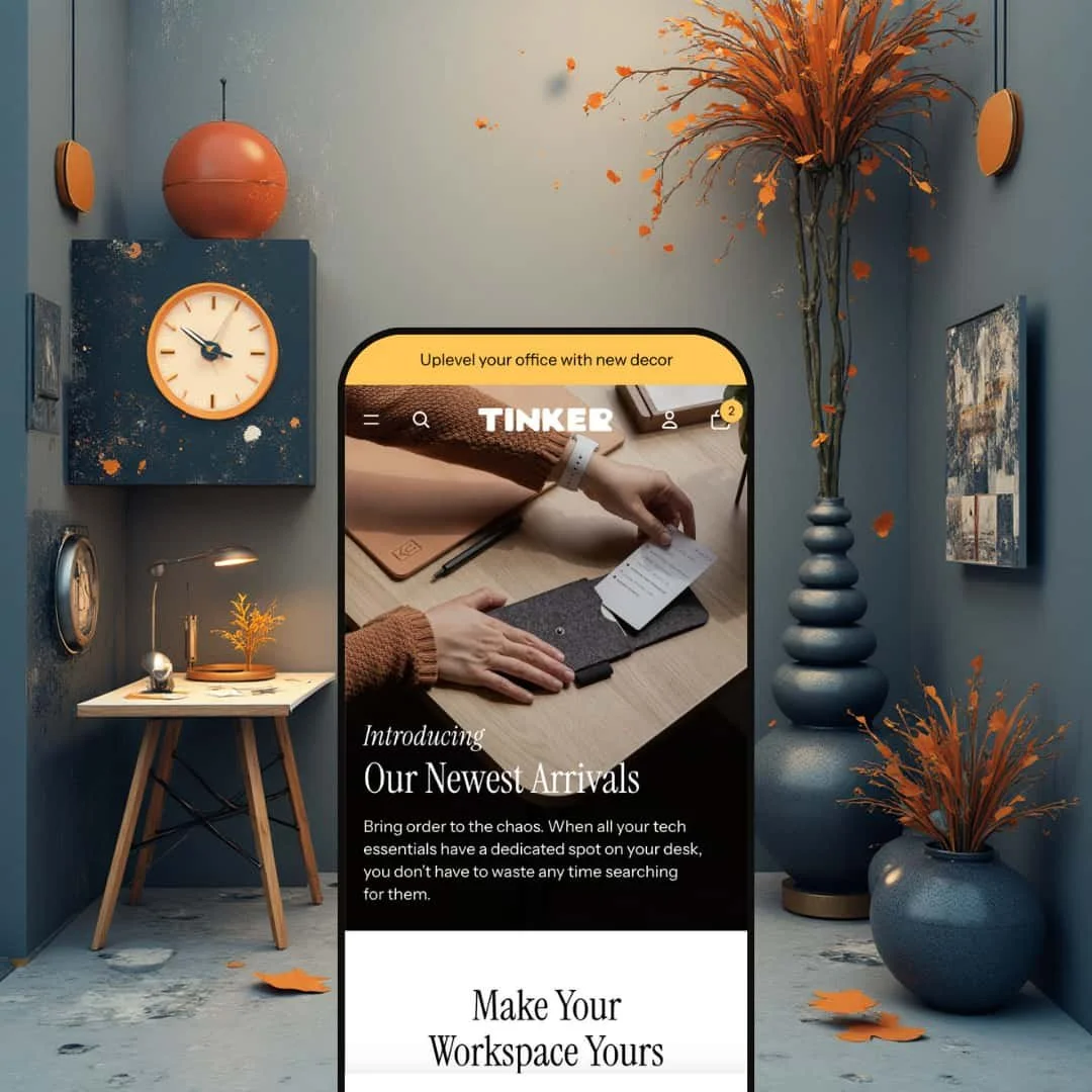
The opening hero sets the tone immediately. It uses a desk-organiser style photo and the headline “Our Newest Arrivals,” which makes the first click feel like a natural continuation of the story rather than a hard sell. Because the palette stays muted and the typography hierarchy is clear, the call-to-action doesn’t have to fight against banners or competing blocks.
The section rhythm is also very intentional in this demo staging. After the hero, the page moves into a “Productivity Essentials” style feature area before guiding you into category exploration. That sequence matters: it frames the products as part of a lifestyle, then transitions into shopping, which can be a strong fit for brands selling small upgrades and add-ons.
On collection browsing, the cards are presented cleanly and with plenty of breathing room. Names and prices are easy to scan, so the grid reads more like a lookbook than a dense catalogue. In this demo presentation, the overall effect is “browse with confidence,” especially for shoppers who prefer comparing items visually before committing to a click.
The product detail experience (as staged) keeps the focus on imagery first and conversion actions second, without feeling buried. The template reads as image-forward and intentionally uncluttered, and the “Shop The Full Collection” area underneath reinforces the curated feel. If your brand relies on a tidy, premium presentation, this demo’s product-page layout supports that tone.
Where it stumbles
In this demo staging, the homepage leans editorial instead of product-heavy. You’re pushed into discovery through sections and collection browsing rather than being handed a big product grid right away. That can be great for brand-building, but if your shoppers are usually high-intent and want products above the fold, you may prefer a more product-first landing experience.
Navigation is also staged in a compact, category-first way here. The menu drawer highlights four product categories (Organizers, Productivity, Chargers, Decor), while informational content like the story and FAQ lives deeper in the site structure rather than being surfaced as a primary path. If your conversion strategy depends on shoppers reading those pages early, this demo presentation may feel slightly tucked away until you adjust your own navigation priorities.
Niche Suitability
-
Brands with a curated assortment and strong photography, especially lifestyle, stationery, organisers, and “desk setup” style products. If your storefront needs to feel calm and considered, the Default demo’s rhythm and palette do a lot of work before a shopper even scrolls far.
Not Ideal For
-
Stores that want a product-grid-first landing page out of the box, or brands that rely heavily on education pages being prominent in the main navigation from the first click. If your buyers come in ready to shop fast, you may want a more direct merchandising approach than the Default demo’s editorial flow.
Final Recommendation
-
Tinker is a strong fit for small to mid-size catalogues where brand photography, calm layout, and a curated shopping flow are core to the pitch. It works best when your products benefit from context and visual storytelling rather than aggressive promotion.
-
If you need a mobile-first, rapid “quick-buy” experience as the default shopping behavior, or you want a storefront that starts with lots of products on the homepage without reworking the staging, you may prefer a different approach.
-
Medium — The Default demo is polished, but you’ll likely want to adjust homepage merchandising and navigation emphasis to match how your customers shop. The core flows are clear, yet aligning the demo’s editorial staging with your conversion strategy takes some setup.
★ 7.0/10
Rating
-
The theme handles core Shopify features well and presents filters and sorting in a clean, intuitive way. Desktop quick‑add and variant selection improve usability, but the lack of mobile quick‑add reduces efficiency.
6
-
Navigation is straightforward with a simple menu and search overlay. Built‑in pages and modular sections make setup easy.
8
-
Responsive layouts scale images gracefully and maintain readability. However, the absence of quick‑add on mobile introduces extra steps for shoppers.
8
-
Pages load quickly, images are optimised and interactive elements (search overlay, menu drawer) respond smoothly.
8
-
Merchants can reorder sections, use full‑width media and customise content blocks, aligning with OS 2.0’s flexible structure.
5
FAQ
〰️
FAQ 〰️
-
👑 Yes, especially if your products sell through photography and a curated vibe. In the Default demo, the hero image and “Our Newest Arrivals” headline set an editorial tone that fits lifestyle and desk-accessory products.
-
📱The layout stays readable and the navigation drawer remains easy to use, so browsing doesn’t feel cramped. The main trade-off from this demo is speed-to-cart: the desktop quick-add shortcut isn’t surfaced the same way on mobile, so adding often routes through the product page.
-
🎨 From the shopper-facing side, the site is built from repeatable patterns like the hero, feature sections, and collection-led browsing, which makes it straightforward to align with your own imagery and tone. The Default demo’s soft neutrals and clean type hierarchy also suggest it can swing either more playful or more premium depending on how you style it.
-
⚡ Interactions in the demo feel quick, especially navigation and search. The search overlay responds as you type, which helps the storefront feel responsive rather than “page-load heavy.”
-
👕 On desktop, quick-add behaves sensibly when options exist by opening a quick-view style selection step rather than adding blindly. On the product page, the buying area includes clear actions and a quantity stepper, which keeps the variant-and-quantity decision readable.
-
🔎 There weren’t any dedicated “SEO widgets” visible in the demo itself, but the theme supports content-forward pages like FAQ and an Our Story-style page. Those pages give you space to add helpful copy that can support on-page SEO while also building shopper trust.
-
💱 This is managed through Shopify Markets rather than the demo’s preset styling. If you enable additional markets and add the appropriate selectors in your storefront setup, the theme will reflect those choices as part of the standard Shopify experience.
-
⚙️ The public demo doesn’t ship with extra app widgets visible by default (for example, there isn’t an obvious review module shown out of the box). In practice, merchants typically add apps for reviews, subscriptions, and upsells as needed, and results depend on the specific app’s integration method.
-
🛒 Yes. There’s a public demo storefront you can click through to test the shopping flow, including search, product pages, and the desktop quick-add behavior. The Default preset is the one covered in this review.
This review is based on hands-on testing of the publicly available preset demos of the Tinker Shopify theme as of 27 December 2025. Theme features, preset availability, and performance can change with subsequent updates from the theme developer.