
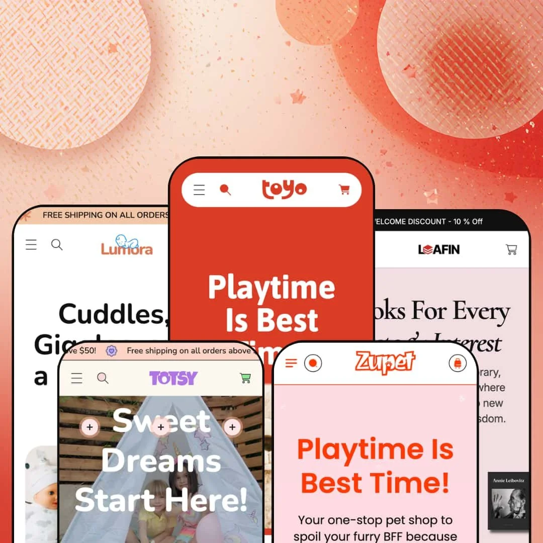
Most theme developers pick one vertical and build deep. MUUP went the other way with Toyo, shipping five fully dressed storefronts inside a single $140 theme, spanning toys, kids' apparel, pet care, a bookshop, and baby personal care. The bet is that breadth beats specialization for a merchant who isn't locked into one niche. Built on Online Store 2.0, Toyo gives each of those verticals a section library deep enough to look intentional rather than recycled.
Five production-ready storefronts for one license
For an operator running more than one storefront, or testing which vertical to commit to before going all in, the five presets do real work. Toyo dresses a toy shop, Totsy a kids' apparel line, Zupet a pet store, Leafin a bookshop, and Lumora a baby personal-care range, and each arrives as a built-out demo rather than a recolor of one layout. One license covers the lot. That spread matters most for multi-brand sellers and holding-style operators who would otherwise buy and configure several themes to cover the same ground.
A merchandising kit that sells on look and feel
The section library leans hard into visual selling. There is an image-comparison slider for before/after or variant contrasts, image hotspots, lookbook blocks, a press-logo strip, tabbed collection rows, and a community gallery, and they render with the same finish across every preset. For catalogs that move on imagery, like apparel, toys, or beauty, these give the homepage somewhere to breathe between product grids. Mid-size visual catalogs in the 50-to-200 SKU range get the most from it.
The product page comes wired for urgency and cross-sell
I clicked through the toy preset's product pages and found the conversion pieces already in place: a countdown component, a stock counter, a size-chart modal, a dual-axis variant picker for size and color, and a slide-out cart that surfaces a "Pair It With" cross-sell row. They operate as one push-to-checkout flow rather than scattered add-ons. Stores selling sized goods on frequent promotions, like footwear and apparel lines, get the most mileage. Repeat-promo sellers especially.
Image-led mega menus and a filter system that bends to the catalog
The mega menu carries image blocks and multi-column link sets, and the same filter chassis stages differently per vertical: By Color for toys and apparel, By Author for the bookshop, plain category lists for baby care. Navigation follows the catalog. Cross-shop-heavy stores with multi-attribute products benefit most, especially mid-size catalogs where customers filter rather than scroll page after page.
There is no quiet version of this theme
Every preset speaks the same dialect: rounded corners, pastel fills, decorative blob shapes drifting behind the content, and a generally playful, family-facing warmth. That is lovely for a toy or baby brand. It fights you everywhere else. A label aiming for restrained, premium, or minimalist styling will be overriding type, color, and shape tokens constantly rather than configuring them, so luxury-positioned or design-forward brands in adult categories should study the demos hard before committing.
Built on the older section architecture
Toyo is an Online Store 2.0 theme, so its editing model is sections and blocks within the standard nesting limits, not the deeper nested-block canvas of the newer Horizon-era themes. For most merchants that is a non-issue in 2026. For teams that restructure layouts often, or agencies rebuilding the same theme across many client stores, the ceiling on how far you can nest and recompose inside the editor is worth knowing up front.
The layouts are hungry for content
These homepages assume you have things to show. Across the presets the demo pages stack a slideshow, a values row, tabbed collections, a comparison slider, a press strip, testimonials, a gallery, and an FAQ before the footer. A founder brand launching with eight products and no press coverage will spend the first setup pass deciding what to cut rather than what to fill. Single-product and sub-20-SKU stores run by solo operators will feel that most.
What it takes to launch
Plan a multi-day pass to replace demo copy and imagery across all sections, populate the metafields and vendor assignments behind the color and author filters, restage the mega-menu image blocks, and localize the bundled EU translation strings for any markets you sell into.
-
What works in this preset
The toy demo is where the theme shows its whole hand. The homepage runs through a featured-product slideshow, an "Our Values" icon row, tabbed favourite collections, a before/after comparison block called "Find the Perfect Match," a press-logo marquee, testimonials, and a community photo wall before you reach the footer. I kept scrolling, expecting it to thin out. It just kept going.
The product page is equally loaded. A size-and-color variant picker sits alongside a size-chart modal, a stock counter, an eight-image gallery, share buttons, and a countdown urgency block, while the slide-out cart adds a "Pair It With" cross-sell row populated with matching items. For a busy toy or gift catalog, that is a lot of selling surface running without bolt-on apps.
-
What works in this preset
Totsy points the same machinery at kids' fashion. The mega menu leads with a By Color filter set and a featured "Trending" image, which is close to how parents tend to shop apparel for small children when they have a palette in mind. A heart-motif free-shipping marquee threads the playful tone through the page without extra design work.
A vendor-based "Brand Collection" filter shows up here too, useful once a store carries more than one label. The cart drawer keeps its cross-sell row, stocked with joggers and shorts that match the apparel framing rather than generic placeholders.
-
What works in this preset
Pets get the warmest copy of the bunch. Zupet opens on a product-forward hero slideshow tied to real items like an adjustable dog leash and a plush pet bed, with the Food, Toys, Accessories, and Holiday taxonomy that a pet store actually needs. The structure is familiar by now, but the category logic fits the vertical cleanly.
Where it stumbles
Zupet leans more on the slideshow and less on the storytelling sections that make the toy demo sing. A pet store selling on trust and repeat consumables, like food and treats, would want to build out the values and testimonial blocks that the theme already includes but this preset stages lightly. The pieces are there in the library; the demo just doesn't deploy them here.
-
What works in this preset
"By Author" is the smartest single idea in the preset family. Leafin repurposes the theme's filter chassis so the mega menu browses by author, Nick Kane and Audrie Joel among them, alongside genre rows for Art, Cooking, Photography, and Music. For a bookshop, that maps directly to how people hunt for titles.
Pricing displays as "From $X" across the catalog, which suits books that carry format options. I went looking for a weak spot in the navigation and mostly found sensible choices. It reads like a bookseller built it.
-
What works in this preset
Lumora is the calmest room in the house. The baby personal-care preset drops the color filter entirely and navigates by Bath and Body, Haircare, Oralcare, and Skincare, which is the right call for consumables where shade isn't the deciding variable. A repeating free-shipping bar and a dedicated gift collection lean into the gifting use case.
Product pricing clusters tightly around a single tier, which reads as a curated range rather than a sprawling catalog. The same cart cross-sell and order-note tools carry over, so the conversion basics travel with the quieter styling.
One section system, restaged five ways
Read across all five presets and the engineering shows through. The same library of sections renders the toy shop, the apparel line, the pet store, the bookshop, and the baby-care range, and the filter system in particular flexes intelligently: the chassis that powers By Color for toys becomes By Author for the bookshop and a clean category tree for consumables. The reuse is real. That breadth is what lets one mid-priced theme credibly cover this much ground.
Polish holds across the family
Visual quality does not sag from the flagship to the others. Whichever preset you start from, the spacing, the imagery treatment, and the section finish stay consistent, which is not a given when a developer spreads attention across five complete demos at once. You are choosing a starting vertical, not a quality tier.
Five skins, one skeleton
The flip side of that reuse is sameness. Lay the homepages side by side and the composition barely moves: hero, marquee, collection tabs, comparison block, press, testimonials, FAQ, in roughly that order every time. The presets differ in palette, type, and content far more than in layout, so a buyer expecting five genuinely different designs is really getting one well-built design in five outfits.
Each preset's information architecture is purpose-built
The navigation and merchandising in each preset are tuned tightly to its vertical, which is a strength right up until you want to cross the streams. A merchant who loves Lumora's calm baby-care look but sells color-variant apparel will rebuild the navigation and filter staging rather than inherit it, because that information architecture is fitted to consumables, not sized fashion. The fit cuts both ways. Picking a preset is closer to picking a foundation than picking a paint color.
Rating
★ 7.6/10
-
The conversion and merchandising library, including a comparison slider, image hotspots, countdown, stock counter, and cross-sell drawer, is broad for the price band.
8
-
Sections and presets give clear starting points, though the vendor and metafield filters need populating before they behave like the demo.
8
-
A slide-out menu, sticky cart, and responsive layouts carry the experience down to small screens cleanly.
8
-
Image lazy-loading and a restrained code footprint help, but the demo homepages are section-dense and lean on large imagery.
7
-
Deep customization within a playful, rounded register; the range narrows sharply the moment you want a restrained or minimalist look.
7
Frequently Asked Questions
-
Toyo, the toy demo, is the densest build, with the fullest set of homepage sections populated. It is the best base if you would rather strip down than add up.
-
Yes. It runs on Shopify's vendor field, so you can repurpose it as By Brand, By Designer, or similar by reassigning vendors to your products.
-
It can be, but you will remove sections rather than fill them. Stores under roughly 20 products should plan to trim the homepage.
-
Yes, it is a configurable urgency component you point at a sale window from the editor.
-
The theme ships interface translation strings for English, French, Italian, German, and Spanish. Your product and page content is still yours to translate.
-
The demos use static testimonial sections, so for verified buyer reviews you would connect a review app such as Judge.me or Loox.
This review is based on hands-on testing of the publicly available preset demos of the Toyo Shopify theme as of June 8 2026. Theme features, preset availability, and performance can change with subsequent updates from the theme developer.