
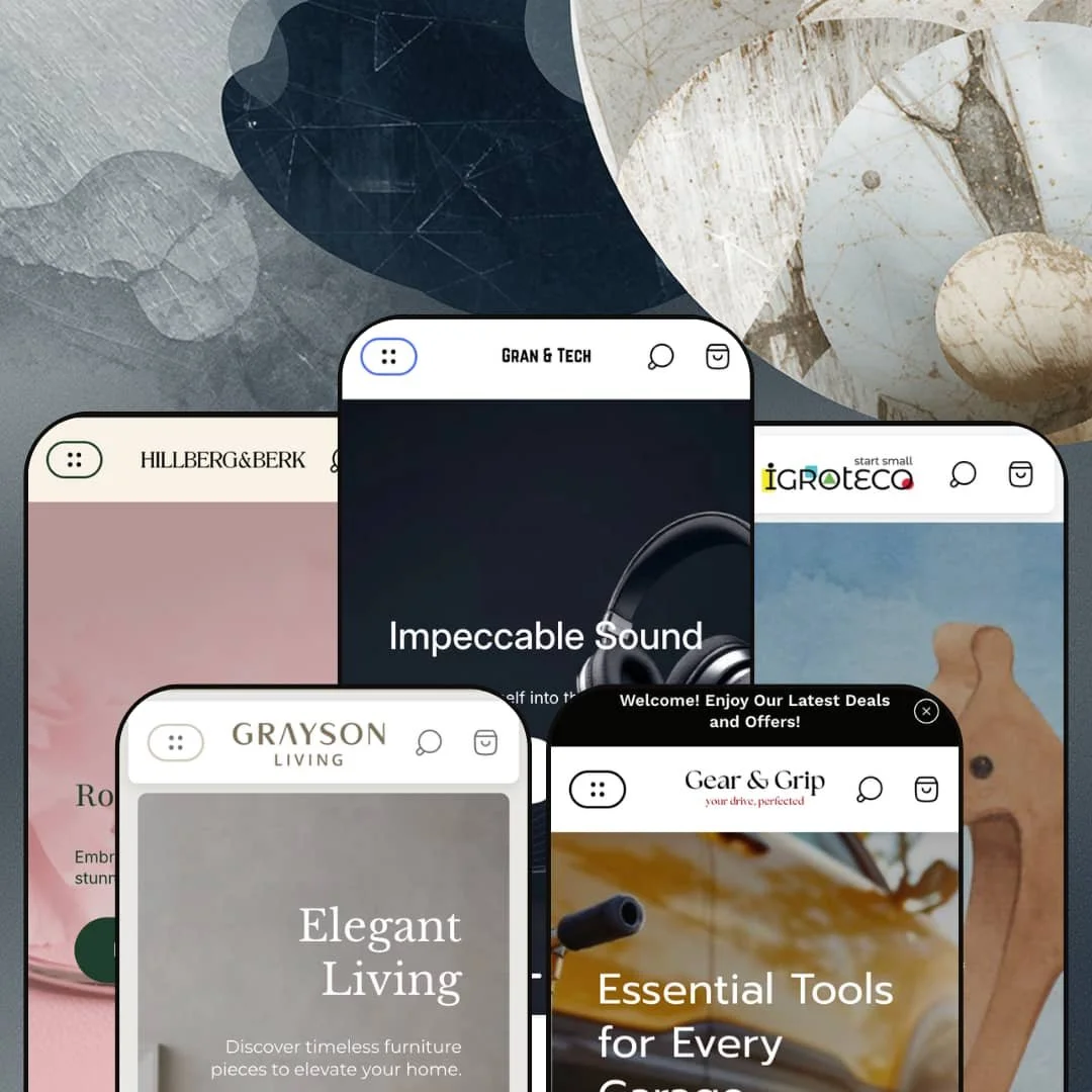
Click through Ultra's preset gallery and you'll land on a wooden toy shop, then a jewelry boutique, then a tire and wheels store. Five presets, five wildly different verticals, one $100 license. That's the entire pitch in one observation, and at that price point it's worth asking whether the breadth holds up once you start clicking. Built by UTD on Online Store 2.0, Ultra is sold on range, and this review answers whether range alone justifies the buy.
Five preset templates from one $100 license
For multi-brand operators running two or three Shopify storefronts in different verticals, Ultra's pitch of five preset templates from one $100 purchase is the strongest argument the theme makes. One license. Five vertical demos to choose between. A small jewelry brand operator who launches a side furniture line can run both stores on the same theme license, with separate preset choices keeping the visual identities distinct.
Mega menu that doubles as a shoppable surface
The mega menu carries three block types in a single panel: text-link columns of category links, featured-product tiles with price and image, and a CTA image with overlay text. This pattern stays consistent. Across all five preset demos, it changes in scale rather than structure. Gran & Tech fills out TV/Mobile/Laptops with 10+ products per category; Sprout lists 4-5 toys per category. For merchants selling 50+ SKUs across 5-7 categories of apparel, jewelry, or electronics, the merchandising-inside-navigation pattern turns the mega menu into a shoppable surface.
Product comparison table wired into metafields
The Ultra preset homepage runs a true product comparison table that pulls metafield-defined attributes for three speaker SKUs side by side, with rows for Power Supply, Output Power, WiFi transmitter power, and Supported audio formats. This is real merchandising infrastructure. The kind of structured surfacing usually comes from a paid comparison-table app, and at $100 it ships in the theme. For electronics merchants with 20+ SKUs in a single category where buyers actively cross-shop on spec, this is the section worth the install.
Cart drawer feature density
The cart drawer ships with a discount-code field exposed by default, a notes textarea, a gift-box add-on visible in Grace's preset, an upsell product strip, and the Shop Pay button placed for thumb-distance on mobile. That's a lot in one drawer. At $100, this density removes 2-3 app installs merchants would otherwise reach for. The audience that benefits most: small DTC brands with under 30 SKUs and average order values in the €50-200 range, where cart-layer conversion lift matters per session.
One architecture generation behind the frontier
Online Store 2.0, not Theme Blocks. Ultra was built before Shopify's Theme Blocks architecture shipped in summer 2025, so block nesting is capped at roughly two levels rather than the eight that newer architectures support, and there's no compatibility with AI-block generation. At $100 the architecture-generation choice is calibrated, since the price tier doesn't carry Theme Blocks expectations. But for merchants planning multi-year customization runways and running an in-house dev team for ongoing tweaks, Ultra is one architecture generation behind the frontier.
Grace ships without jewelry-specific tooling
Grace is staged as the jewelry-vertical preset but ships none of the merchandising tools the vertical depends on: no metal-purity toggle (gold/silver/platinum filtering), no ring-size guide modal, no gift-packaging variant UI, no birthstone or gem-specification metafield schema. Generic Product Options handle these as text-input variants, but the demo doesn't include any preset-specific staging for them. For jewelry brands with 30+ SKUs whose buyers cross-shop on metal type, stone, and size before clicking through, this means building the jewelry-specific UX from scratch in the editor rather than inheriting it from the preset. Dedicated single-vertical jewelry themes will likely require less configuration work for that audience.
Five-vertical breadth means no vertical-specific tooling
Five verticals means each vertical lacks the dedicated tooling a single-vertical theme would ship. Grip has no vehicle-year-make-model fitment selector for tire and wheel matching. Sprout has no age-rating filter for toys. Grace has no ring-sizer. Harbor has no room-style filter for furniture. For merchants who plan to make their store the dominant catalog in a single vertical and want vertical-specific search and filter UX out of the box, the breadth-over-depth trade is real. Specialists in apparel-only or jewelry-only or auto-only verticals with 200+ SKUs will likely find a dedicated theme cleaner.
What it takes to launch
Expect a multi-day copy and content pass across hero captions, mega menu blocks, FAQ entries, product descriptions, brand-naming, and metafield population for structured-data sections like the speaker comparison table. The blog template metadata layer also needs developer attention for the article-author variable rendering, and the six-language demo content in Grace requires either translation work or simplification down to one language at launch.
-
What works in this preset
Gran & Tech is the demo that does the most. The mega menu for TV alone surfaces 16 product models grouped under Premium quality picture, Impressive dimensions, and TV accessories, and the Mobile menu carries another six featured phones with sale-price badges. I clicked through three of the model pages and found multi-axis variant pickers (Color, Memory, RAM, Screen size, Connectivity) wired up for spec-heavy shopping.
The standout merchandising piece is the speaker comparison table that pulls metafield-defined attributes for three SKUs side by side, with rows for Power Supply, Output Power, 2.4G WiFi transmitter power, and Supported audio formats. For an electronics catalog where buyers cross-shop on spec, this section structure does real work. For merchants who'd otherwise install a comparison-table app plus integration work, this ships pre-wired into the theme at install.Mid-page, Ultra ships an image-hotspot section under "Colors that pop" that maps shop-now links onto product imagery, and a six-tile Instagram-style social feed near the footer with hover overlays. Both pull double duty. I'd use the hotspot section for a hero product launch and the social feed for a UGC wall.
Where it stumbles
The trade-off in Gran & Tech is density. The homepage runs 18+ distinct sections from announcement bar to footer, which means the merchant needs to make hard cuts before launch or live with a slow front-page weight. For a tech catalog this isn't fatal, since tech buyers tolerate dense merchandising. But the demo is a starting point to subtract from, not add to.
-
What works in this preset
Switch over to Harbor and the tone shifts hard. The hero stack runs an editorial image-with-text composition ("Sophisticated Serenity", "Fine Dining Redefined") instead of a slideshow, and the New Arrivals grid lists every product with Color, Material, AND Dimensions variants. For luxury furniture catalogs where buyers select pieces by physical size before color or material, exposing dimensions as a variant axis on the homepage carousel keeps the spec-checking inside the shopping flow.
The trust-badge row mid-page (Hand Crafted, Timeless Designs, Top Quality, Helpful Support) reads as a credibility prompt, not a styling flourish. It works. The combination of that row with the Designer Living video section running an interior B-roll loop makes Harbor the most editorial of the five preset compositions, and the closest demo to a finished agency build.
-
What works in this preset
There's a brand-partner row of Honda, Volkswagen, BMW, and Skoda logos sitting a third of the way down Grip's homepage, which is the kind of trust signal automotive shoppers actually look for. The Shop All mega menu carries six tool categories (Wheels, Tyres, Tools, Lights, Pipes, Coilovers), each with 4-5 featured products. This is the deepest categorical organization of any preset.
Grip embeds an FAQ accordion on the homepage rather than tucking it onto a separate page, which for an auto-parts catalog where buyers ask spec questions before clicking PDPs is a smart placement choice. The Tyres collection runs a variant axis of tyre sizes (195/40 V 17, 205/45 W 17, 215/40 Y 18) per product, sometimes with 10+ size options. The pattern is right for the vertical.
-
What works in this preset
A countdown timer runs near the top of Sprout's homepage, and the slideshow underneath rotates through three compositions: Endless Adventures Await, Timeless Treasures in Wood, Nurturing Growth Through Play. Each slide carries its own CTA pair. The trust badge row (High-Quality Items, Eco-Friendly Toys, Boost Creativity, Endless Joy) lands the kid-targeted positioning hard.
Click through any product card and you get Material/Size/Color/Details variants. Details often lists piece counts (60 pcs / 120 pcs / 240 pcs / 294 pcs) for construction toys. This is the right variant model. Parents shop by complexity tier. The homepage FAQ accordion is grouped into About Products and Wooden Toys Care, which keeps the discovery layer organized.
-
What works in this preset
The first thing I notice on Grace is the six-language switcher (English, Nederlands, Français, Deutsch, 日本語, Polski) plus four-currency selector (EUR, ILS, JPY, PLN) sitting in the header. No other preset shows this. The Buy the Look modal, paired with a shoppable lookbook hero, gives Grace the cleanest path from inspiration to PDP among the five.
A horizontal marquee text section (EXCELLENCE / ARTISTRY / UNIQUENESS / LEGACY / ELEGANCE) gives the homepage a flourish other presets don't reach for. Product cards expose the Art (SKU) field above the product title. Collectors track pieces by code. Ring products carry full size variants (5, 6, 7, +3) by default, which is the right merchandising choice for jewelry.
Merchandising vocabulary translates across verticals
The same hero, lookbook, promo-tile, marquee-text, and product-carousel section vocabulary powers the wooden toy shop in Sprout and the luxury furniture spread in Harbor. The merchant who buys Ultra for one vertical and later expands to a second store in a different vertical does not relearn the system. This is invisible from any single preset reading. It only becomes apparent when you switch between Harbor and Grip and notice that the section editor surface stays the same.
Mega menu pattern adapts to each preset's catalog density
Reading all five presets in sequence shows the mega menu doing different work in each. Gran & Tech runs 16 TV models inside one panel for catalog-deep electronics browsing. Harbor surfaces editorial categorical entries for furniture's room-based shopping. Grip carries six tool categories with brand-partner logos integrated. Sprout uses image-tile categories sized for parental browsing. Grace's panel handles a six-language switcher inline. Same theme primitives, different deployment per vertical. The pattern isn't visible from any single preset; it's the cross-preset reading that reveals the mega menu as the theme's most adaptive section.
Footer treatment converges to a thin pattern
Across all five presets, the footer settles into the same 2-3 column menu/text/social/newsletter pattern, with no section-group integration, no trust-badge rows, and no shoppable image tiles distinct from the standard formula. None uses the footer as a secondary conversion surface. The footer is where the five-preset distinction collapses to one template. That's a missed opportunity.
Blog template renders raw Liquid variables
The literal {{ article_author }} placeholder appears unresolved in the blog roll metadata across Harbor, Grip, Sprout, and Grace. This is theme-template-layer rather than per-preset polish. The same bug recurs across all four preset blog rolls, which suggests the template has a fallback issue when the article-author field is absent. Merchants who plan to use the blog at launch will want this addressed in a version update.
★ 7.0/10
Rating
-
Pre-order, back-in-stock alerts, age verifier, EU translations, full cart drawer with notes/discount/upsell/gift-box, and a metafield-driven comparison table all ship at $100. Feature density is the headline.
8
-
Section vocabulary stays consistent across all five presets, so the editor learning curve doesn't restart per preset. Picking between five presets adds a planning decision a single-preset theme skips.
7
-
Mobile-first responsive markup, drawer navigation with accordion category collapse, sticky cart positioned for thumb access, and mobile-specific image assets across presets.
7
-
Homepage section counts run 12-18 across presets, so merchants will want to be selective on launch to keep front-page weight in check. Image lazy-loading attributes are in place across product grids.
6
-
45+ sections and five preset starting points cover most needs. Online Store 2.0 caps block nesting at roughly two levels, which limits the kind of deeply-composable blocks newer architectures ship.
7
Frequently Asked Questions
-
Grace is the only preset that surfaces the international UI in the demo, with a six-language switcher (English, Nederlands, Français, Deutsch, 日本語, Polski) and four-currency selector (EUR, ILS, JPY, PLN) sitting in the header. The underlying Shopify Markets capability is theme-wide; Grace is just where it's staged.
-
A discount-code field exposed by default, a notes textarea, an upsell product strip, a gift-box add-on visible in Grace's preset, and Shop Pay button placement. None of the five presets trims this down to a stripped layout.
-
The mega menu carries three block types: text-link columns, featured-product tiles with price and image, and a CTA image with overlay text. The pattern stays consistent across presets; what changes is depth (Gran & Tech runs 16 TV models in one menu; Sprout lists 4-5 toys per category).
-
Yes, in the Ultra preset (Gran & Tech). The homepage runs a comparison table section that pulls metafield-defined attributes (Power Supply, Output Power, WiFi transmitter power, Supported audio formats) for three speaker SKUs side by side. The feature is theme-layer and tied to your metafield setup.
-
Grip (Gear & Grip) is the most stripped down of the five — fewer mid-page sections, a single hero, FAQ on the homepage, and the deepest categorical organization in the mega menu. Grace is lighter but reads as the least finished.
-
The Theme Store lists 45+ dynamic sections, which checks out across the demos: announcement bar, hero, slideshow, image-with-text, lookbook, comparison table, marquee, FAQ accordion, video, product carousel, image hotspot, promo tiles. The architecture ceiling is the OS 2.0 nesting cap of roughly two levels.
This review is based on hands-on testing of the publicly available preset demos of the Ultra Shopify theme as of May 23, 2026. Theme features, preset availability, and performance can change with subsequent updates from the theme developer.