
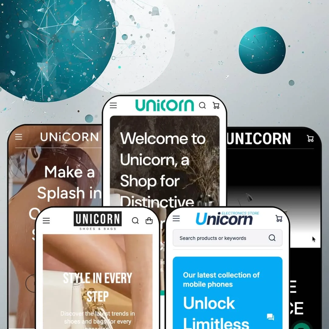
Most Shopify themes pick one kind of store and commit to it. Unicorn ships five preset demos that read like five different businesses: a furniture-and-antiques showroom, a swimwear label, a single-product lamp page, a shoes-and-bags boutique, and a broad electronics marketplace, all on one $100 Online Store 2.0 build. That range is the entire pitch, and it raises a fair question about whether the breadth costs you depth.
Five presets that behave like five different stores
Unicorn's five presets aren't recolors of one layout; they're structurally different storefronts. The span runs from a single-product lamp page with a stripped-down header to a sixteen-department electronics marketplace, with a swimwear label, an antiques showroom, and a fashion boutique in between. For a single-brand operator still testing which vertical fits, or a multi-brand seller running several product types under one Shopify plan, that means one license covers experiments that would otherwise need separate themes. You buy range.
Product comparison built into the theme
For electronics or furniture buyers who cross-shop specifications before deciding, Unicorn does something unusual at this price: it ships a working product-comparison system with no third-party app involved. Every product card carries an "Add to compare" control, the header keeps a persistent Compare link, and a dedicated comparison page holds the shortlist across all five presets. For an electronics merchant carrying 30 to 200 SKUs with multi-attribute variants and considered-purchase, cross-shopping buyers, this section does the job you would otherwise install and integrate a paid comparison app to handle. That is a genuine line-item saving.
A coordinated conversion and reassurance kit
The product pages run a coordinated merchandising kit rather than a single trick. On the armchair page I hit a sticky add-to-cart bar, a countdown for the active sale, a delivery-estimate timer ("order in the next X to get it by..."), a free-shipping progress meter ("Add $500 more"), quick-buy on the grid, and an inline "Ask a question" form that emails the merchant. For a store running flash sales or restock drops to impulse-leaning, mid-market buyers, that stack builds urgency and answers hesitation in one place, without stitching several apps together. It's a lot of conversion surface for one theme.
Merchandising sections with real editorial range
How do you make a plain product grid feel like a curated shop? Unicorn's answer is a section library with genuine storytelling range: a shoppable lookbook that pins products onto lifestyle images with hotspots, a "Reels" band that runs short vertical product videos, and collection-tab modules that let one section flip between several collections in place. For a home or apparel catalog selling considered purchases to browse-heavy buyers, these sections turn the homepage into something closer to a magazine than a catalog dump. Grids alone don't sell lifestyle.
The default posture is conversion-maximalist, and it fights quiet luxury
Unicorn's center of gravity is "turn everything on." The busier presets stack recent-sales popups ("Someone purchased Sneakers 5 minutes ago from Rome"), sticky promotional bars, countdown timers, and email popups until the storefront feels like it's shouting. For a high-end furniture line or a fine-jewelry brand chasing restraint and a considered, luxury feel, that posture works against you, and toning it down is real editorial work, not a switch you flip once. The demo is loud on purpose. If your brand is quiet, this theme starts on the wrong foot.
The standout sections only shine with structured catalog data
The features that separate Unicorn from cheaper themes lean on data you have to supply. The comparison system, the metafield spec tables, and the condition grades are only as rich as the product attributes behind them; on the electronics product page that spec sheet runs past twenty fields (SIM format, refresh rate, processor, camera array, and so on), all metafield-driven. A merchant with a thin catalog under 30 SKUs, or a single-brand operation without the bandwidth to populate structured metafields, gets a noticeably plainer store than the demos promise. The theme rewards catalog work. Without it, much of the differentiation quietly disappears.
Breadth is a maintenance surface, not just a feature list
Everything that makes Unicorn flexible also makes it more to run. With five preset systems, 26-plus sections, multi-level mega menus, and several overlapping timer and popup modules, there's a lot to configure, style consistently, and keep current over time. Dandy alone runs two separate tabbed product engines, one for shoes and one for bags, each with four status tabs to keep stocked and ordered. For a solo operator or anyone who needs a fast, low-touch launch, that surface area is a real cost against a focused theme that does less but asks less. More power means more upkeep.
What it takes to launch
Plan a multi-day pass to reach the demo's polish: rewriting copy across dense heroes, promo tiles, FAQ and About pages; populating product metafields for the spec tables, condition grades, and multi-attribute variants; restaging the mega menu around your real catalog; and deciding which of the timer, popup, and sales-notification modules to keep versus retire. Choosing one preset and stripping the other four is itself part of the job.
-
What works in this preset
The homepage opens on a full-width video hero and then does something most home-goods demos skip: it merchandises aggressively. Three promo tiles push antique jewelry, kitchen silverware, and a "100+ chair models" collection, and below them a "Shop Our Picks" band gives individual pieces editorial spotlights with their own short copy. The mega menu carries image tiles for furniture and jewelry sub-categories instead of plain link lists. It reads like a store that wants you browsing.
What surprised me is how much of the merchandising is structured rather than decorative. Product cards surface color swatches inline (the Vintage Chair offers black, beige, and white), and sale items show the strike-through original price beside the reduced one. I clicked into the Colony Modern Armchair and found a proper spec table listing Style, Time Period, Country of Manufacture, and dimensions, with a condition grade underneath. That is real product-page work.
Where it stumbles
The preset can't decide what it sells. Certified antiques, brand-new "eco collection" furniture, and diamond jewelry all share the same homepage, and the copy swings between those three identities without a unifying story tying them together. A merchant adopting this preset for a focused antiques business would spend time narrowing the merchandising so the storefront commits to one identity instead of three.
-
What works in this preset
Sunkissed swaps the antique showroom for a swimwear label, and the product model changes with it. Cards now carry two axes, color plus size, with runs like XS through 2XL, and pre-order badges sit on the styles that aren't in stock yet. The predictive search panel is staged with a promotional slot ("50% OFF Big Swimsuit Sale") and popular-collection shortcuts, so the search box doubles as a merchandising surface. It's a smart touch.
The cart is where this preset earns its keep. Opening it reveals a free-shipping progress bar ("Add $100.00 more to get FREE SHIPPING"), an order-notes field, and a terms-and-conditions checkbox before checkout. Product tabs on the homepage split inventory into New, Trendy, and Sale, and a 15%-off email popup fires for first-time visitors. I scrolled the whole page and the swimwear framing held together far better than the antiques demo did.
Where it stumbles
Fit is everything in swimwear. The demo leans on bare size letters without building out the guidance a buyer wants before committing, which matters when swimwear carries some of the highest return rates in apparel. The theme does ship a size-chart capability, so the gap is staging rather than absence: a merchant would populate size-guide content and wire it into the product pages themselves.
-
What works in this preset
Illumination breaks the pattern: no catalog at all, just one floor lamp told as a long-form story. It's built in a dark palette and structured like a pitch, a hero price callout followed by stacked sections on design, touch controls, height adjustment, and LED efficiency, with a looping video partway down. The header strips back to a handful of links because there's nothing to browse. One product, one story.
What I noticed here is the restraint. It's a useful counterweight to the busier presets: the same theme that stacks timers and popups elsewhere can go quiet and cinematic when the catalog is a single hero item. For a brand launching one flagship product, this preset is the closest thing to a purpose-built landing page in the set.
Where it stumbles
The trade-off is scope. Illumination shows the least of what the theme does at scale; it's a demonstration of minimalism more than a runnable store template, so a merchant with a real catalog won't get far starting here without rebuilding the structure the other four presets already provide. Start from this one only if you truly sell a single thing.
-
What works in this preset
Turn everything on at once and you get Dandy, a footwear-and-bags store that holds nothing back. The header runs the deepest navigation in the set: Women and Men each open multi-level mega menus that split into Style sub-categories and a full Offers column, and a separate Bags tree lists totes, crossbodies, satchels, and clutches. A "Top Brands" band and shoe-size selectors (6 through 10 with half sizes) round out a fashion-catalog setup. This is the busiest header here.
Below the fold, Dandy keeps stacking, and it does so with content most themes reserve for later. There's a UGC band ("Follow Us @Unicorn") that pins products onto lifestyle shots, a Customer Stories section with named written testimonials, and a four-post blog feed of styling articles. I went looking for the ceiling on this theme's section library, and Dandy is where I found it. Everything the theme owns seems to show up here.
-
What works in this preset
Sixteen departments deep, Cargo is the widest catalog in the set. The category system spans cell phones, laptops, household appliances, car goods, and pet supplies, and the merchandising leans on vendor-branded carousels ("BETTER in Categories," "BEST Smartphones," "They are Buying NOW"). The hero even frames a financing angle, with an "Apply for Credit, Receive Goods" tile beside the main banner. It's built to feel like a department store.
This preset is where multi-attribute products make sense, and the theme handles them cleanly. Phones carry a color axis and a capacity axis together, and the price updates per combination as you move from 128GB to 1TB. Vendor labels sit on every card, which suits a marketplace running many suppliers under one roof. For a broad-catalog seller, the structure is already here.
Where it stumbles
All that breadth assumes a broad catalog. A merchant selling one category, headphones only, say, inherits a sixteen-department navigation and a vendor-carousel layout they would have to pare back toward something focused before launch. The department-store framing is a foundation for a marketplace, not a boutique.
Header and footer construction that outclasses the price
The plumbing is better than the price tag suggests. The version 5.0 footer builder exposes columns, stacked blocks, and inner and outer spacing controls; the header offers separate sticky settings per row plus full-width and repositionable logo options; and icon-based menus are a first-class feature rather than an afterthought. Across every preset, the header and footer never feel like fixed furniture. That depth is where a lot of the $100 goes.
A conversion system that holds together across every catalog
What's striking after five demos is the consistency: the same timers, progress bars, comparison, and popup modules render coherently whether the product is a $2,789 grandfather clock or a $699 smartphone. A merchant switching verticals or running several catalogs gets one predictable merchandising language instead of a patchwork. The theme's conversion layer travels well.
An actively maintained, current build
Unicorn isn't coasting. The 5.0 release in June 2026 rebuilt the search section, added the footer construction system, deepened header customization, migrated the gift-card template to JSON, and cleared out legacy Liquid includes. For a $100 theme, that's a healthier maintenance signal than many pricier ones show.
It's a theme that has to be worked
The through-line on the downside is that Unicorn assumes an active operator. It rewards effort. The payoff scales with what you put in, structured metafields, curated merchandising, and deliberate restraint, so a merchant who installs the theme, adds products, and then leaves it alone ships a store that looks far plainer than the demo that sold them, on every preset rather than one. This is a disposition, not a defect, and it quietly decides who the theme is for.
A mid-tier track record
On the Shopify Theme Store, Unicorn sits at 78% positive across 18 reviews, a mixed rather than glowing signal. The praise centers on features and responsive support; the criticism includes at least one merchant reporting that product-grid and slider alignment issues were treated as outside standard support scope. None of that is disqualifying at this price, but it's worth weighing against themes with longer, stronger histories before you commit. Buy with the reviews open in another tab.
★ 7.8/10
Rating
-
Built-in product comparison, a coordinated conversion kit, metafield-driven spec tables, and editorial sections such as the lookbook and reels add up to a deep, wide feature set for a theme at this price.
9
-
The same breadth is the cost: five preset systems, deep mega menus, and several overlapping timer and popup modules mean more to learn and configure than a focused theme.
6
-
The theme is built mobile-first, with a slide-out cart, collapsible mega menus, and mobile-specific promotion settings added in the 5.0 release; the layouts adapt cleanly across the presets.
8
-
The presets lazy-load imagery and keep initial section counts reasonable, but video heroes and the stacked conversion widgets on the busier demos add weight the leaner presets avoid.
7
-
Five genuinely distinct verticals, a footer builder with column and spacing controls, per-row sticky header options, full-width and repositionable logos, and icon menus give real layout latitude.
9
Frequently Asked Questions
-
Illumination is the one built for that: a dark, long-form landing page for a single item with a stripped-back header. The other four assume a catalog, so a one-product store starts cleanest there.
-
Yes. Variant handling is theme-wide; Cargo just demonstrates two-axis variants (color and capacity) most heavily, and the price updates per combination. Any preset can run the same setup with your own options.
-
It ships pre-translated interface strings for English, French, Italian, German, and Spanish. That covers the theme's own UI text, buttons and labels and form copy; your product content still needs translating separately.
-
Yes, they're configurable per section, so you can dial the urgency features down or off if they don't fit your brand. That flexibility is the counter to how loud the demos run by default.
-
Both are built in. Pre-order badges appear across the swimwear and electronics demos, and in-store pickup is a listed cart-and-checkout feature you can enable per product.
-
Support has boundaries; some layout and customization requests fall outside standard scope according to merchant feedback. Budget for a developer if you need bespoke changes beyond the theme's built-in settings.
This review is based on hands-on testing of the publicly available preset demos of the Unicorn Shopify theme as of July 2026. Theme features, preset availability, and performance can change with subsequent updates from the theme developer.