
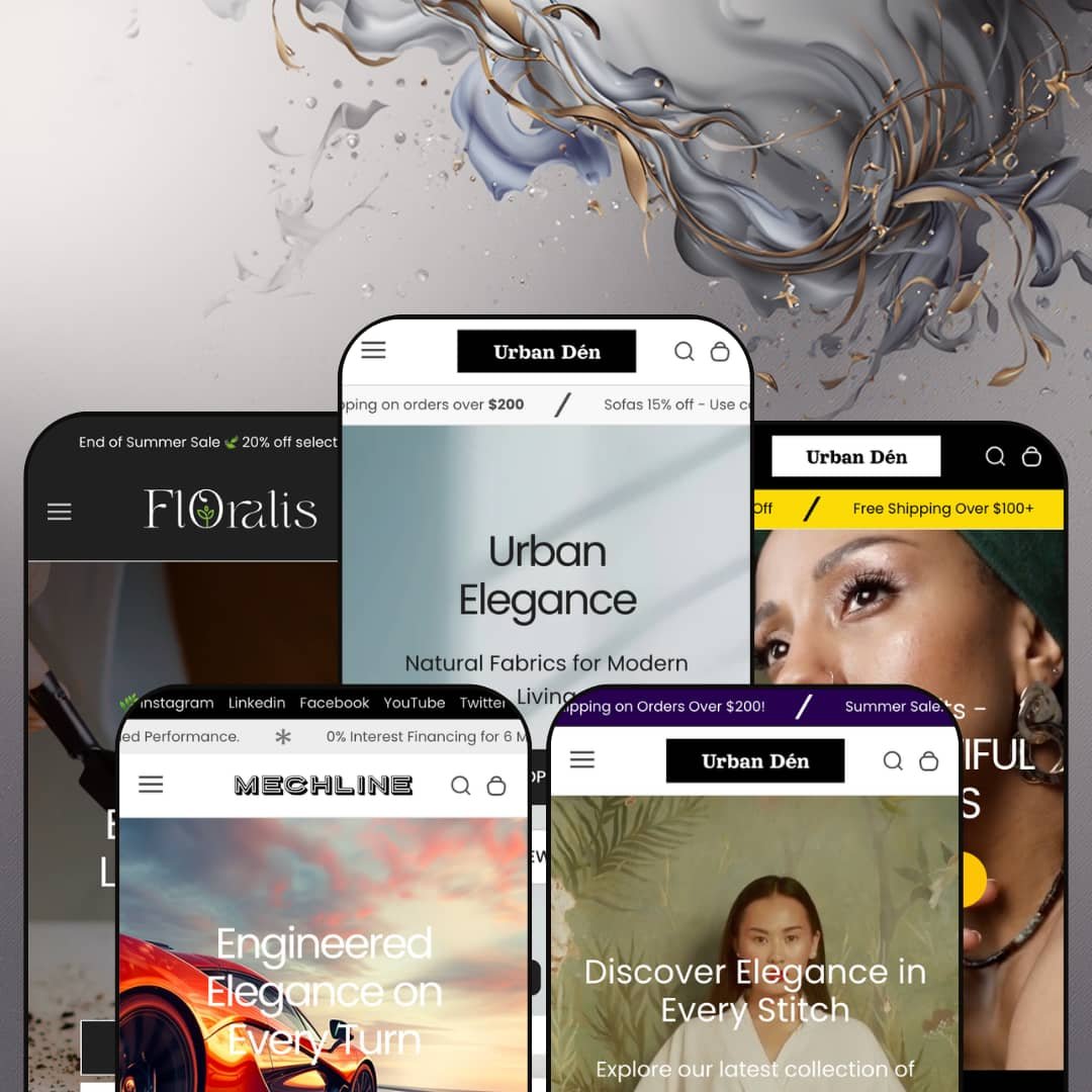
Most premium Shopify themes pick one vertical and commit to it. Urban refuses to choose, shipping five fully built demos that span furniture, jewelry, apparel, automotive parts, and houseplants from a single $320 license. Built on Online Store 2.0 architecture, it leans on one shared section library that each preset stages at a wildly different density. I spent time across all five to see whether that breadth holds up or spreads thin.
Five real verticals from one license
Agencies and multi-brand operators get the most here. The five presets are not recolors of one layout: the furniture, jewelry, apparel, automotive, and plant demos each carry their own navigation pattern, hero treatment, and section mix, so a single $320 purchase can seed several genuinely different storefronts. For an operator launching multiple single-brand stores, or an agency reusing one license across clients, that range is the whole pitch.
A discovery system built for big catalogs
The header pairs a deep mega menu with a predictive search that opens on promotional banners instead of a blank field. It works before the first keystroke. Together they turn a large, deeply categorized inventory into something a shopper can navigate, surfacing submenus and featured tiles before anyone types a word, which matters most when the catalog runs to hundreds of SKUs. For furniture or parts merchants spread across many collections, this is discovery infrastructure that would otherwise mean a separate navigation app.
A portable merchandising library
The standout sections aren't locked to the presets that show them off. The blocks travel. The image-hotspot, lookbook, and product-showcase blocks all live in the shared library, so a plant shop can borrow the styled-scene lookbook the apparel demo leans on, or a furniture store can drop the showcase table onto any page it likes. For merchants who sell on context and styling rather than a bare grid, across apparel, furniture, or plants, that portability turns five demos into one deep kit.
Variant rendering that handles complexity
Three variant axes, no app required. The Mechline demo runs color, size, and width selectors on one product, while the jewelry preset renders color swatches inline on the homepage itself, so complex variant structures display without extra tooling. For automotive merchants, apparel sellers, or any catalog where one product splits into many attribute combinations, the picker holds up without the paid configurator a multi-attribute catalog would otherwise need.
Urgency tooling stamped on considered purchases
The conversion stack is loud. It doesn't always read the room. Product pages pile a countdown timer, a "save 5% per $100" message, sale badges, and a compare button onto items that cost four figures, from leather beds to forged wheels. For high-ticket furniture or automotive buyers making a deliberate, considered purchase, that flash-sale urgency can undercut the premium feel the rest of the design works to build.
Navigation depth outruns small catalogs
The mega menu can outrun the catalog beneath it. The plant preset's collections hold two to four products apiece, yet the same header architecture built to organize a furniture warehouse sits available above them. For a boutique under a few dozen SKUs selling a curated, considered range, much of that navigation capacity goes unused, and the flat-nav staging from the apparel demo would likely serve them better.
Density swings hard between presets
Picking a starting preset is also picking a workload. The furniture demo arrives dense with sections to trim, while Floralis arrives lean with room to add, and the two sit far enough apart that the right preset depends as much on how much building you want to do as on your vertical. A single-brand merchant who loves the furniture look but stocks lightly will spend the first day removing sections, not adding them.
What it takes to launch
Expect a two-to-three-day pass before launch: full copy and imagery replacement across hero, promo, and lookbook sections, metafield population for the product-showcase and feature tables, mega menu rebuilding for the catalog-heavy presets, and a sweep of placeholder pricing, repeated review badges, and missing translation strings. The leaner presets land closer to a day; the furniture flagship sits at the top of that range.
-
What works in this preset
The furniture demo is the flagship, and it shows. A four-message announcement bar rotates shipping offers and discount codes above a header whose mega menu nests a Luxury Sofa Set submenu inside the Collections dropdown and pins two promo image tiles alongside it. For a catalog organized into a dozen-plus collections, that navigation does real work before a shopper ever scrolls.
Below the fold, the merchandising stacks up. A product-showcase block lays specs into a clean ITEMS/DESCRIPTION table, a row of video tiles sits beside an "As Featured On" logo strip, and promo banners push deal-zone and bedroom collections. I counted four homepage video previews, the most motion up front of any preset.
Where it stumbles
The homepage asks a lot of one scroll. Between the slideshow, two video sections, several carousels, and the hotspot feature, the furniture preset is the heaviest of the five, and merchants who keep most of it will want to watch how much loads up front for a first-time visitor.
-
What works in this preset
A full-bleed video hero opens the jewelry demo, trading the furniture preset's slideshow for a single looping clip set under a "Lasting Beautiful Impressions" headline that signals a calmer, more editorial register than the flagship's busier staging. The tone shifts immediately. It reads as jewelry.
What surprised me was the featured-product block sitting right on the homepage. The Luxe Adjustable Cuff Bracelet renders with working color swatches for blue, red, and green, a quantity stepper, and an add-to-cart, so a visitor can buy without ever reaching a product page. That is a genuine conversion shortcut for an impulse-friendly category.
-
What works in this preset
Here the navigation goes quiet. The clothing demo sets aside the deep mega menu the furniture preset deploys and runs a flat Home / Catalog / Contact bar instead, a staging decision that pushes the lookbook imagery forward and lets the structure recede into the background. It is the same theme dressed down.
Attire is also the editorial preset. A lookbook hotspot, a media-with-text block inviting shoppers to book a bespoke fitting, and an eight-post blog grid give it more reading material than any other demo. I scrolled the blog and every post carries a real headline and thumbnail, so the section ships ready to populate rather than as an empty placeholder.
Where it stumbles
The product-showcase table that sells furniture specs so well does less here. It fits objects better than outfits. On a dress, an ITEMS/DESCRIPTION grid listing price, vendor, and stock reads closer to a spreadsheet than a fitting room, so apparel merchants will probably lean on the lookbook instead.
-
What works in this preset
Mechline is the newest build, and it behaves differently. The automotive demo opens on a static image hero, then hands the homepage to a featured product that runs three variant axes at once: color, size, and width, all on a single set of alloy wheels. For a catalog where fitment depends on multiple attributes, that is the variant picker earning its place.
The signature section is a before-and-after comparison slider that wipes between a stock wheel and an upgraded one, the kind of side-by-side proof a parts buyer actually wants before committing four figures. Underneath it, an icon row spells out financing, free shipping, and install support, while a store-locations block lists three addresses with contact details. It sells trust.
-
What works in this preset
Floralis strips everything back. The plant demo is the leanest of the five, opening on a calm image hero and a row of collection tiles that show live product counts, four for Monstera Magic and three for Peperomia Paradise. Where the furniture preset overwhelms, this one breathes.
The lean look is earned, not empty. Each plant card carries a quick-add button and an inventory badge reading low stock or backordered, so shoppers see availability without opening the product, and the whole page stays light enough to feel quick on a phone. I went looking for the newsletter and logo strip that anchor the other demos and found neither, which suits a boutique that would rather keep the page uncluttered.
One shared library, five honest faces
Read all five demos together and the achievement is consistency without sameness. Five faces, one spine. The same section library underpins every preset, yet it flexes from the maximal furniture build to the near-minimal plant one without feeling like a reskin, which is harder to pull off than one polished demo. That range is what a multi-vertical license is supposed to buy and rarely does.
Conversion tooling without the app pile
A merchant assembling Urban inherits countdown timers, stock counters, trust badges, a compare drawer, and quick view already wired into the section library. It is all built in. Because these sit in the theme rather than behind a stack of paid add-ons, the urgency-and-merchandising layer is there to switch on without a row of monthly subscriptions. For a lean operation, that consolidation is real money saved.
One conversion voice for every vertical
The flip side of that built-in tooling is one tone for everything. The voice never changes. Whether the product is a $15 plant or a $2,000 wheel set, the demos reach for the same urgency vocabulary of countdowns, save-more nudges, and sale badges, and that lands very differently on a considered luxury buyer than on an impulse shopper. Reading all five, you start to wish the conversion tone adapted to the vertical the way the layout does.
Two design eras under one roof
The newest presets and the originals don't feel like one release. Two eras sit side by side. Mechline and Floralis, the later additions, run cleaner and more restrained and introduce newer section styles like the before-and-after slider and the collection-count tiles, while Urban and Waverly keep a denser, busier look from the theme's first wave. Read end to end, the family feels accreted over time rather than designed all at once.
Rating
★ 8.0/10
-
A broad theme-wide kit (mega menu, image-hotspot, compare drawer, countdown, before-and-after slider, three-axis variants) covers most merchandising needs without apps.
9
-
Pre-built sections speed launch, but the denser presets need real trimming before they fit a smaller store.
7
-
Responsive layout with a slide-out menu, sticky header, and quick-add cards that carry consistent mobile patterns across presets.
8
-
Leaner presets like Floralis stay light; the furniture flagship stacks several video sections and carousels that add weight up front.
7
-
Five presets plus a shared section library staged at very different densities give wide latitude to restyle.
9
Frequently Asked Questions
-
Yes. The before-and-after comparison, store-locations, image-hotspot, and product-showcase sections all live in the shared library, so you add them to any preset rather than being locked to the demo that shows them off.
-
Every preset header carries a Compare drawer, and product cards include an add-to-compare control, so shoppers can line up several items side by side without an extra app.
-
The product pages show a review placeholder and a star area rather than a built-in review engine, so you would connect an app like Judge.me or Loox to populate real ratings.
-
Product pages include a WhatsApp inquiry button that opens a pre-filled message; in the demo it points to the developer's own number, so swapping in your business line is an early setup step.
-
Floralis ships the fewest sections (a hero, collection tiles, a lookbook, and a quick-add grid), which makes it the quickest demo to populate if you would rather not strip a denser layout down first.
-
Yes. The Mechline wheels run color, size, and width together on one product, so multi-attribute catalogs render natively without a separate configurator.
This review is based on hands-on testing of the publicly available preset demos of the Urban Shopify theme as of June 3 2026. Theme features, preset availability, and performance can change with subsequent updates from the theme developer.