
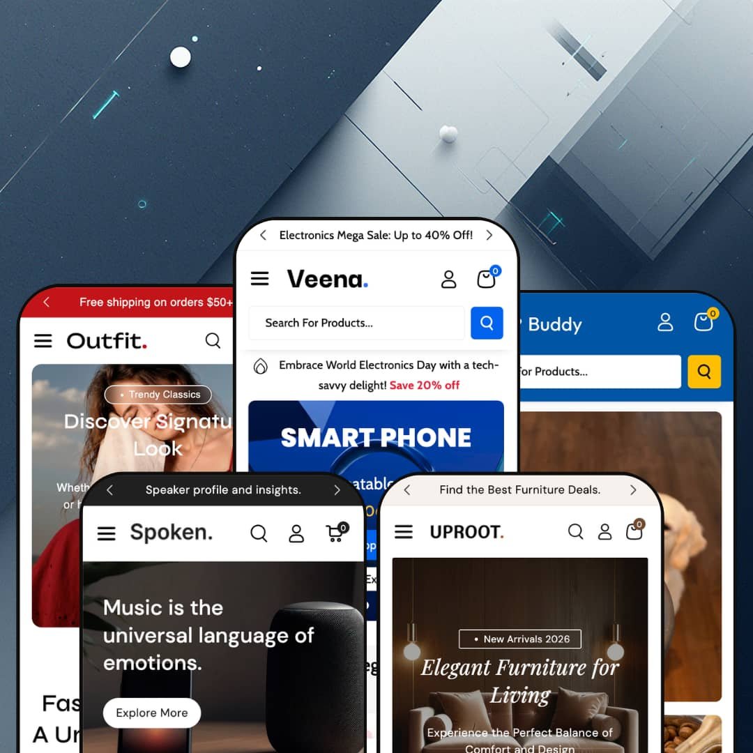
The hardest-working surface in Veena isn't a homepage hero; it's the navigation. Webibazaar's $240 Online Store 2.0 theme treats menus, search overlays, and cart drawers as selling floor rather than plumbing, and it ships five preset demos (electronics, fashion, audio, furniture, pet supplies) to prove the point across very different catalog shapes. You're not really choosing a look when you buy this theme; you're choosing how much salesmanship you want baked into your store's chrome. That question runs through everything below.
The mega menu is a merchandising surface, not a link tree
Menus here do work. A single dropdown can hold full product cards with prices, sale badges, and rollover images, and the electronics demo's Gaming Sale entry does exactly that with five of them before you've touched a category page. Dawn, Shopify's free baseline, stops at text columns in its navigation, and the distance between the two approaches is the distance between routing traffic and selling to it mid-route. For multi-category merchants with 200-plus SKUs and cross-shop-heavy buyers, the most-hovered element on the site becomes a conversion surface instead of a signpost.
Search opens as a discovery panel
What does a search box owe you before you've typed anything? Veena's answer is a full panel: trending-search chips, a popular-products carousel, a category strip, and recent blog posts, all staged the moment the field takes focus. It's a storefront in a dropdown. Shoppers who arrive without a specific model in mind get a curated starting point instead of a blinking cursor, which suits impulse-leaning browsers in large catalogs, think 500-SKU electronics or pet-supply stores, far better than a bare input field would.
A coordinated urgency kit, native to the theme
Countdown timers, stock counters, flash-sale sections, promo popups, and a free-shipping progress bar ship together as one conversion kit rather than five separate problems to solve. Everything talks to everything. The cart drawer that tracks your shipping progress also runs a cross-sell carousel and its own deal clock, so the final screen before checkout keeps selling instead of going passive. For merchants running flash-drop calendars or budget-to-mid-market electronics catalogs, this replaces what would otherwise be several separate app installs plus the integration work of making them feel like one system.
Five verticals on one license
Agencies and multi-brand operators get the clearest win here. That math favors them. One $240 purchase carries five maintained preset demos spanning electronics, fashion, audio, furniture, and pet supplies, each with its own staged taxonomy and homepage architecture, so a single theme license and one settings vocabulary can serve a client roster that stretches from considered-purchase furniture to impulse-driven pet treats. For a holding company running storefronts in even two of these verticals, the shared engine cuts the learning curve to a single theme's worth.
Urgency is the house style
Strip out the countdowns, marquees, stock counters, and deal blocks and you've removed most of what separates Veena from a plainer theme, because the salesmanship isn't decoration here, it's the architecture. The demos are loud. You can stage the theme quiet, the furniture preset proves that, but then you've paid for a conversion kit you're deliberately not running. Luxury-positioned brands and considered-purchase stores, premium jewelry or design-led furniture with curated sub-50-SKU catalogs, will fight the theme's instincts at every staging decision.
The navigation system assumes a catalog to feed it
Dual menu rows, multi-level dropdowns, a search panel with curated slots: every signature surface in this theme wants inventory volume and ongoing editorial upkeep to justify its existence. A single-product DTC brand or a drop-model store cycling fifteen SKUs ends up with a header built for a department store and very little to hang inside it. Small stores can technically run Veena. They'd just be paying for the part of the theme they can't use.
The menus travel heavy
Every page carries the complete contents of every mega menu, product tiles, banner images, and article teasers included, and the navigation renders a second time for the mobile drawer. That adds up. On the electronics demo, the menu's embedded product cards rival what some homepage sections display on their own. Merchants planning image-stuffed menus over large catalogs, especially 500-plus-SKU stores with mobile-heavy traffic, should build out their real menu and test it on a mid-range phone before committing.
What it takes to launch
Expect a multi-day pass covering menu-link architecture for every preset you deploy, market and currency configuration, cross-preset copy replacement, footer and contact placeholder content, and demo-product cleanup before launch.
-
What works in this preset
Landing on the flagship demo feels like walking into a discount electronics floor on a Saturday. It's loud. A scrolling text strip chants the sale, a Deal of the Day block runs its own clock, and a Flash Sales row pairs every product card with a live inventory readout, from a comfortable "In stock (45 units)" down to a nervous "Only 4 units left" on a tablet. A perks band underneath (daily deals, returns, secure payment, round-the-clock help) keeps all that urgency from tipping into chaos.
The header borrows the big-marketplace pattern: an account row with sign-in messaging, a separate all-categories bar, and a search field holding the center. It scans instantly. For a catalog that genuinely spans electric kettles, gaming laptops, and foldable phones, that triple-decker structure is the right call, because shoppers can route by category, by search, or by promo banner without ever opening the main menu.
Four dated article cards with thumbnails sit inside the Blogs menu entry. That's a small thing. But it turns a navigation afterthought into a content surface, and for an electronics store doing comparison-guide content, putting articles one hover away from every page on the site is a quietly clever placement decision.
Where it stumbles
All that marketplace styling cuts both ways. The account row and category bar make a single-brand store read like a reseller, and a boutique brand selling its own devices would spend its first week of customization dialing the marketplace energy down rather than building anything up.
-
What works in this preset
Fashion menus have one job: get someone from "Men's" to a product they can picture wearing. Outfit handles this by skipping link lists entirely for the gendered entries and dropping five shoppable product tiles straight into the dropdown, prices included, from a pullover hoodie down to leather lace-up shoes. The Trends entry takes the opposite approach with a four-column taxonomy running from bomber jackets to crew necks. Both read fast.
Browsing the catalog, I noticed the range planning more than the design: hoodies, office shirts, bucket hats, hair bands, handbags, and shoes give this demo the spread of an actual mid-market apparel brand rather than ten T-shirts repainted in different colors. That matters. For a multi-category clothing merchant, Outfit is the most honest template of the five for judging how a real assortment will sit.
Where it stumbles
Outfit stages the same promotional grammar as the electronics flagship, just in softer tones. A fashion brand built on editorial storytelling will be restacking the homepage toward that register rather than swapping its own images into the demo's arrangement, because the demo doesn't model the quieter, narrative-led approach at all.
-
What works in this preset
Radio Speakers, In-Ground Subwoofers, Ceiling Mounted Speakers: Spoken carves a single product type into a four-branch menu taxonomy that single-category demos rarely bother building. One product, twenty variations. This is the preset to study if your entire store is depth rather than breadth, because it shows exactly how the navigation behaves when there are no other categories to lean on.
The product page is the family's best single screen, and Spoken stages it fully: a fifteen-image gallery with modal zoom and a thumbnail rail, named color swatches (DimGray, CornflowerBlue, Thistle), a unit-level stock counter, and a quantity stepper that displays how many of the item already sit in your cart. That last detail is rare and genuinely useful.
Scrolling to the very bottom, the footer earns a mention too. Nothing feels crowded. Four content columns, a newsletter block, contact details, and locale selectors come together as a working small-business footer rather than the link dump that catalog-heavy stores usually settle for at this point on the page.
Where it stumbles
The buy box earns one complaint: between the offers panel, the delivery promise, the stock line, and the trust-icon row, the add-to-cart button ends up a long way from the price. Density sells, but only up to the point where the buy button starts competing with its own supporting cast.
-
What works in this preset
Furniture buyers don't respond to countdown clocks, and Uproot seems to know it. Restraint, finally. This is the quietest preset in the family, with a Journal where the deal rows would be and staging that lets large photography do the persuading, and it proves something important about the whole theme: the urgency machinery is a staging choice you can decline, not a personality you inherit with the install.
One lifestyle image, four clean link groups: the Furniture menu pairs an indoor, outdoor, table, and sofa taxonomy with a single promotional photo, which is the right mega menu recipe for showroom-style shopping. I went looking for the hard sell here and didn't find it, and for a considered-purchase vertical that absence is exactly the review you want.
-
What works in this preset
Eight column groups, five links each, plus a promo image: the Dog menu alone in Buddy is a bigger navigation build than some entire demos. It's the deepest build here. Species, life stage, diet type, and use case each get their own axis, and small icons sit beside top-level entries like Healthy Living and Daily Essentials, which gives a sprawling taxonomy some visual handholds.
Shopping it the way a dog owner would, the menu answers real questions: grain-free wet versus dry, senior formula versus puppy, training treats versus dental chews. For a pet retailer carrying hundreds of SKUs across species, this preset reads closer to an information architecture document than a demo, and that's a compliment.
Where it stumbles
Depth this deep is a commitment. Every one of those forty-plus Dog links needs a populated collection behind it before launch, and a merchant who installs Buddy with thirty products will own a menu that promises five times the store they actually have. Plan the catalog first and the preset second.
Every transitional surface sells
Read all five demos side by side and one philosophy emerges: the spaces most stores treat as plumbing, the menus, the search overlay, the cart drawer, even the footer, are treated here as selling floor. No single feature announces this; it's the pattern that only appears once you've watched five different verticals make the same bet. Merchants who already think of navigation as retail real estate rather than wayfinding will feel like this theme was built by someone who agrees with them.
The presets teach as much as they sell
The demo family doubles as five catalog-structure case studies: marketplace breadth, gendered apparel trees, single-category depth, showroom calm, and a species-by-life-stage taxonomy. Studying how one engine was staged five different ways is genuinely useful pre-purchase homework, and all of it is verifiable for free before you spend anything. Few theme purchases come with this much built-in instruction.
Five costumes, one body
Move between presets and the sameness surfaces fast: identical card anatomy, the same section rhythm, the same header logic in different palettes. The verticals differ in taxonomy and tone, not in design system, so a merchant hoping each preset is a different theme in disguise will find one theme wearing five outfits. What changes across the family is the staging, never the bones.
Built for the first visit
Across all five demos, the design energy concentrates on acquisition: discovery panels, deal surfaces, impulse triggers. Nothing in any preset's staging speaks to the returning customer, which is a curious asymmetry for a family that includes pet food and consumables, verticals that live or die on the second purchase. Veena gets people in the door brilliantly and then treats visit two exactly like visit one.
★ 7.0/10
Rating
-
Age verifier, before/after slider, lookbooks, size chart, pre-order, and promo popups form an unusually complete native kit at $240, deployed through a 27-plus section library.
8
-
Five staged starting points shorten the big design decisions, but the sheer number of surfaces to populate (menus, search slots, promo blocks) makes the demo-to-launch distance longer than the screenshots suggest.
7
-
The mobile drawer reproduces the full category tree with accordion stacking and product cards keep their quick-add controls; the deepest preset taxonomies mean real thumb travel.
7
-
Image handling is disciplined, with sized and lazy-friendly assets throughout, but the ever-present mega menu content gives every page a heavy baseline that grows with menu ambition.
6
-
Five preset directions and a deep section library span registers from deal floor to showroom, though the underlying card and section anatomy stays constant whichever you pick.
7
Frequently Asked Questions
-
Yes. Countdowns, popups, marquee strips, and stock counters are all section and toggle staging, and one of the five official demos runs the same theme with almost none of them visible.
-
The theme ships pre-translated interface strings for English, French, Italian, German, and Spanish. Your product titles, descriptions, and content still need translating through Shopify's own localization tools.
-
Size chart, pre-order, color swatches, and rollover product imagery are all native, which handles the typical clothing-store checklist out of the box.
-
Version 2.0.7 shipped in April 2026 on a theme that launched in December 2024, and Webibazaar maintains a dedicated Gitbook documentation site plus its own support portal.
-
Yes: gift wrapping, cart notes, and an order-instructions field are native, and in-store pickup display is supported for merchants running Shopify locations.
-
Buddy maps most directly, since its life-stage and diet-type structure translates naturally to food and beverage catalogs, though the visual staging would need a full re-skin.
This review is based on hands-on testing of the publicly available preset demos of the Veena Shopify theme as of June 2026. Theme features, preset availability, and performance can change with subsequent updates from the theme developer.