
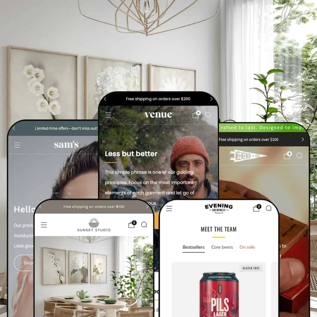
Venue is a flexible Shopify theme designed for brands that highlight products through compelling imagery and smooth shopping flows. Across its presets the theme consistently delivers quick-add carts, a slide-out cart drawer, pre-order support, and engaging product cards with hover image rollovers and a discreet plus icon. First-time visitors are greeted by large hero images with crisp typography that guide them toward a call-to-action, setting the stage for a considered shopping journey.
Pros.
〰️
Pros. 〰️
✚ Seamless quick-shop and variant handling
Product cards invite interaction and open a quick-shop with variant selection before adding to cart. Enforcing a choice reduces mis-orders and keeps shoppers focused on the page they’re exploring.
✚ Cart drawer with motivating incentives
The slide-out cart shows a clear path to checkout and surfaces line items, gift-wrap, and related products. A free-shipping progress bar—and celebratory confetti when thresholds are met—adds friendly momentum that nudges order value upward.
✚ Predictive search and navigational polish
A search overlay suggests queries and products before shoppers commit, while page-level niceties like measured scroll behavior and optional back-to-top affordances keep wayfinding simple. Shoppers can bounce between discovery and checkout without losing context.
✚ Trust and storytelling building blocks
“Shop with confidence” messaging, benefit bullets, and tasteful icon strips sit alongside video heroes and optional map embeds. Together they help newer brands communicate reliability while established labels elevate narrative without reaching for extra apps.
✚ Pre-order support for launches
Pre-order states flow through cards, quick-shop, and cart so availability is transparent. That makes Venue a practical fit for drops, small-batch runs, and made-to-order workflows.
Cons.
〰️
Cons. 〰️
− Single-variant quick-shop adds a step
Even single-option items open the quick-shop instead of adding directly to cart. The extra tap can feel unnecessary for straightforward purchases.
− Urgency and pre-order defaults can feel heavy-handed
Countdown timers and frequent pre-order states are powerful but easy to overuse. If left on broadly, they may create pressure where a calmer presentation would convert just as well.
− Occasional demo instabilities
In testing, some demo routes and pages were thin or unreliable. These issues appear demo-specific but can distract evaluators who expect stable previews.
-
The Default preset presents a clean, modern canvas ideal for fashion or general lifestyle shops. A neutral palette and generous white space put the focus on products while maintaining a welcoming feel.
What works in this preset
The palette is deliberately restrained, allowing product photography to provide most of the color and contrast. This keeps the storefront calm and merchandising-first, especially for brands with varied SKUs that need a cohesive frame.
Typography is crisp and legible, with ample line spacing and measured headline sizes. The combined effect supports long-form product storytelling without visual clutter, so feature highlights read quickly on both desktop and mobile.
Hero imagery receives generous breathing room, which helps seasonal campaigns and new-arrival announcements land with clarity. The restrained decoration makes promotional assets feel premium rather than pushy.
-
Evening channels the ambience of a craft brewery or beverage brand. Dark tones, bold type, and product photography create an inviting taproom feel with a clear tasting-room narrative.
What works in this preset
The darker palette deepens mood and contrast, letting bottle labels, merchandise prints, and pour shots feel luminous against near-black backgrounds. It helps tasting notes, seasonal drops, and merch capsules stand out.
Editorial sections are sequenced like a short tour: origin story, team, and merch moments interleave with featured products. This rhythm invites casual scrolling and encourages dwell time without overloading the page.
Subtle UI flourishes—measured transitions, crisp dividers, and confident headings—lend an upmarket tone. The overall composition suits brands that sell both a product and a place.
Where it stumbles
The 404 page in this demo is sparse, offering little context beyond header and footer. Hitting a dead link can briefly disorient visitors who expect guidance back to collections or the home page.
-
Weekend is styled for rugged lifestyle and grooming brands. Natural textures, earthy colors, and product spotlights suit leather goods, grooming kits, and artisan accessories.
What works in this preset
Photography sits on tactile backgrounds with warm neutrals, giving leather grains, brushed metals, and wood props a believable presence. This texture-forward framing helps small accessories feel substantial.
Sections are paced to spotlight a single hero product before moving into compact collections. The result balances craft storytelling with clear paths to key items, supporting seasonal bundles and giftable sets.
Iconography and headings echo utility gear and workshop cues without feeling heavy. The tone reads practical and trustworthy, which pairs nicely with care instructions and kit contents.
-
Sunset is tailored for art and photography shops. Its elegant hero section, muted colors, and emphasis on print sizes create a gallery-like backdrop for fine-art prints and triptych collections.
What works in this preset
Grid spacing and typographic restraint make images feel like framed pieces rather than thumbnails. This museum-quiet approach keeps attention on composition, scale, and finish.
The layout treats series and sets with care, so triptychs and cohesive collections read as curated bodies of work. That framing helps shoppers understand how pieces relate without exhausting copy.
Product detail pages place benefits and material notes where they support a visual decision. It’s an elegant match for limited editions and made-to-order prints, and it encourages careful attention to size and framing choices during browsing.
Niche Suitability
Not Ideal For
-
Brands that sell visually—fashion, lifestyle, beverage, art, and photography—where imagery carries the pitch, variants matter, and pre-orders are part of the plan.
-
Single-SKU landers seeking extreme minimalism or catalogs that depend on dense, technical comparison tables may prefer a leaner, spec-driven theme.
-
Medium — Most configuration happens in the theme editor, but you’ll want strong photography, considered copy for trust sections, and time to tune pre-order and quick-shop behavior to your catalog.
Final Recommendation
★ 7.8/10
Rating
-
Robust quick-shop, slide-out cart, and discovery tools. Standard capabilities are presented cleanly, and small touches like confetti and trust badges enhance the experience.
8
-
Many configurable options; merchants must manage tabs, pre-orders, and modals thoughtfully. The persistent quick-shop for single-variant items adds an extra step for customers.
7
-
Pages adapt smoothly to smaller screens with touch-friendly carousels and steady navigation. Quick-shop drawers are easy to navigate on mobile devices.
8
-
Animations and panels load promptly; navigation feels fluid. Some demo pages showed routing glitches that likely don’t reflect final store performance.
8
-
Four distinct presets cover aesthetics from brewery to art gallery, and merchants can refine color, type, and section layouts. Features like age verification and map embeds support niche needs.
8
FAQ
〰️
FAQ 〰️
-
👑 Yes. The Sunset preset is tailored to prints and series, with layouts that foreground imagery and size selection while reinforcing quality through trust messaging.
-
📱Across presets, layouts adapt smoothly to mobile screens. Sticky navigation keeps key actions close, and quick-shop drawers remain easy to use on touch devices.
-
🎨 Merchants can configure color schemes, typography, grid layouts, tabs, and cart behavior in the theme editor. Age verification is available as an optional module.
-
⚡ In testing, quick-shop drawers and cart interactions responded promptly and images loaded quickly. Occasional glitches in the demo environment appear unrelated to final store performance.
-
👕 Yes. Cards and quick-shop flows encourage explicit selection for color, size, or scent before adding to cart, reducing the chance of incorrect orders.
-
🔎 Venue doesn’t add bespoke SEO apps, but it structures content cleanly and supports standard Shopify SEO settings. Merchants should provide alt text and meta fields for best results.
-
💱 Yes—this is handled at the Shopify platform level via Shopify Markets. Venue exposes selectors for shoppers, while the actual setup and availability are configured in the Shopify Admin.
-
⚙️ Venue is built to work with Shopify’s app ecosystem. Reviews, subscriptions, and bundle apps operated alongside quick-shop and cart interactions during testing.
-
🛒 Yes. Each preset has a live demo, and the theme supports a free trial so you can test fit before purchasing.
This review is based on hands-on testing of the publicly available Morning, Evening, Weekend, and Sunset preset demos of the Venue Shopify theme as of 8 November 2025. Theme features, preset availability, and performance can change with subsequent updates from the theme developer.