
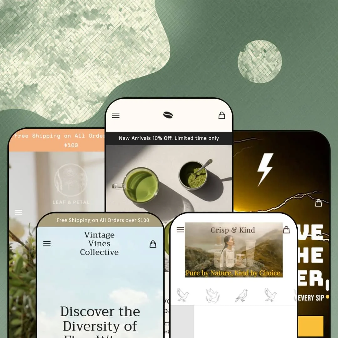
Scroll into Vincent's flagship preset and you hit a Reserve Your Cake & Pastry section: store pickup only, 24-hour preparation window, real workflow staging for an actual café. That's café-workflow staging usually built as a custom Liquid section or via a third-party pre-order app integration. Vincent is built on Online Store 2.0 and ships five preset designs covering coffee shops, wineries, skincare lines, craft breweries, and florists, so the real question for $340 is whether any one of them goes deep enough to serve a merchant in that vertical.
Five-vertical preset coverage from one $340 license
Five-preset coverage spans coffee, wine, skincare, beer, and florals. For multi-brand operators running 2-3 Shopify stores at the Premium tier, that's three theme licenses bundled into one purchase, and the verticals aren't superficial demos: Oakland ships wine-cellar staging with age verifier and gift sets, Pint runs a brewery preset with three-level seasonal menu and dual taproom and brewpub blogs, and Bouquet's florist preset uses four-axis filter navigation. For merchants in the food-and-drink-plus-gifting space planning multi-brand expansion or a single-brand pivot, the variance is real.
In-Store Pickup as homepage merchandising, not a checkout afterthought
For cafés and bakeries selling prepared goods that need lead-time staging, Vincent's In-Store Pickup capability (declared as a Cart and Checkout feature on the Theme Store page) is wired as a homepage merchandising surface, not just a checkout-stage option. The pickup workflow lives upstream. Across Vincent and Pint presets, the workflow stages on the homepage with lead-time language and pickup-only framing. For brick-and-mortar food businesses bringing Shopify online for the first time, this is the kind of staging that usually triggers a custom Liquid section commission.
Mega menu architecture scales preset-to-preset
The mega menu scales hard preset to preset. Bouquet runs four parallel filter axes (Occasion, Type, Color, Price) under one Flowers panel, with the Occasion axis stocked eleven items deep and merchandising banners for promoted sub-categories like Under $50. Pint runs three-level nesting (Shop, then Seasonal, then Spring/Summer/Autumn/Winter), while Nurture keeps it flat at one level for routine-based skincare. For florists with under 100 SKUs that need occasion-driven navigation, or breweries with seasonal release cycles needing menu-level visibility, the depth does merchandising work that usually requires a mega-menu app.
Featured Product section as a hero-product launch surface
For DTC brands at the under-30-SKU tier building homepage as a single-product hero rather than a catalog page, Vincent's Featured Product section behaves like an embedded mini-PDP, with variant selector, quantity, and add-to-cart all firing from the homepage without a click-through. The Nurture preset stages it on the Dew Mist. It's a hero-product launch mechanic. For brands building homepage as a single-product hero rather than a catalog page, this is the launch surface that usually requires a custom Liquid section.
Online Store 2.0 architecture at Premium-tier pricing
Vincent launched in November 2024 on Online Store 2.0. That predates Horizon. For Premium-tier theme buyers betting on AI block generation, deep-nested customization beyond two levels, or future-proof architecture for the next 3-5 year stretch, this is an architecture-generation gap at a price where buyers expect frontier capability. For multi-brand operators with long theme retention plans or DTC brands planning aggressive preset evolution post-launch, it's a forward-looking constraint.
No subscription staging on the skincare preset
Nurture stages a clean, polished skincare brand demo but doesn't surface any subscription-toggle, refill option, or recurring-purchase merchandising anywhere on the preset homepage or in the product page architecture. That's a real gap. For DTC skincare and personal-care brands with under-30 SKU catalogs that rely on subscription LTV economics built around replenishment cycles for serums, moisturizers, and consumables, the omission is structural. Plan to install Recharge, Bold, or Appstle and pay for the integration.
Light advanced merchandising bench at the price tier
At $340, the feature list shows core merchandising (quick view, product badges, image hotspots, recommended products) but no native bundle builder, no comparison tool, no upsell engine beyond cross-sell sections, and no loyalty staging. For mid-market food-and-drink and beauty brands with established AOV targets and built-out conversion stacks, the bench reads thinner than the tier suggests. At this price, more should be in the box.
What it takes to launch
Expect a multi-day copy pass across hero captions, FAQ entries, About-page narrative, location and hours blocks, and age-verifier messaging for the regulated-vertical presets. Plan for currency-default configuration, metafield population for product detail pages, and brand-naming alignment per chosen preset. If you plan to use Bouquet's filter-menu architecture or replicate it in another preset, budget category and product metafield setup time on top.
-
What works in this preset
The Reserve & Pickup block is Vincent's standout move. It commits to a 24-hour pre-order window for store pickup, with separate cake and pastry views and "View all 3 items" / "View all 2 items" counters baked into the demo. That café-workflow staging (pre-order with lead-time and store-pickup framing) is the feature cafés often build via custom Liquid or appointment apps. Here, it ships as part of the preset.
Tab patterns do real work here. The Caffeinated/Decaf tab switch on the coffee carousel and the Cake/Pastry tab pattern on the bakery section let merchants surface two adjacent SKU families in one section without splitting them across separate homepage rows. Demo product depth is light: 4 caffeinated, 2 decaf, 3 cakes, 2 pastries. But the section is sized for thicker catalogs without breaking layout.
Newsletter, testimonials, and a real store-location block (Our Location, 301 Front St W Toronto, with Monday-to-Friday and Saturday-to-Sunday 8am-to-4pm hours) anchor the bottom half of the homepage in a way that reads café-credible. It feels lived-in. The "Step into a world of matcha and balance" image-with-text section adds editorial breathing room that Vincent's other presets often skip.
Where it stumbles
The Vincent flagship preset commits hardest to café-bakery character but ships with the lightest section depth and product count of the five Vincent presets. A buyer arriving from the Theme Store coffee-and-bakery positioning gets a preset that's more minimal than they might expect at $340. And the deeper section work happens in Pint, Bouquet, and Oakland.
-
What works in this preset
I clicked into the Wine Gifts sub-item under the Shop mega menu and found a third-level entry for Seasonal Sales: menu-level cross-product-line merchandising that signals how Oakland's section library was built. The preset treats every block as a chance to route shoppers between wine categories, occasion-led gift sets, and seasonal promos. Newest Arrivals tabs into Wine Gifts. The image hotspot on Elegant White Wine surfaces Velvet Oak Chenin Blanc and Reserve Sauvignon Blanc as add-to-cart targets. Even the Trilogy of Reds gift set is staged as a sale item with a $160 to $120 SALE crossover.
The age-verifier modal fires on entry with "Are you of legal drinking age? Please come back and visit us when you're 19." That's regulated-product compliance baked into the preset, not a placeholder. The FREE GIFT ON ALL ORDERS OVER $75 marquee strip lands as a free-shipping-bar equivalent for promotional thresholds, different mechanic but similar conversion lift. The Recipes blog and A Guide to Wine blog stage dual editorial tracks for content-marketing-heavy wine brands.
The Our Happy Customers testimonials block stages three customer quotes. The store info block lists hours (Mon to Fri, 8:30am to 10:30pm and Sat to Sun the same) and address (301 Front St W Toronto). A multimedia logo-grid section hints at press-mention or supplier-partner badge usage, useful staging for wineries with vineyard partnerships or distribution recognition.
-
What works in this preset
One section into Nurture's homepage you hit a full mini-PDP for the Dew Mist Hydrating Mist, complete with size selector (100 ml / 3.4 fl oz), quantity stepper, and an Add to Cart button that fires inline. This isn't a quick-add tooltip; it's a Featured Product block treated as a hero-product launch surface. For skincare brands with one or two SKUs carrying brand recognition, that's the launch mechanic baked into the preset.
The Shop by Routine mega menu (Cleanse & Prep, Treat & Repair, Moisturize & Protect) is the routine-led navigation that skincare brands often commission custom. Here it ships as the default. The Kind Face Ritual and Bare Ritual tabs on the product carousel double down on routine-grouping, surfacing 4 products per routine, with each product anchored by size variants like "50 ml / 1.7 fl oz" and "30 ml / 1.0 fl oz".
A three-column image-with-text block stages brand values (Vegan, Clean Formulas, Gentle/Effective/Earth-Friendly) with photography for each, the kind of soft-pillar block most beauty brands install. The marquee dove-image scroll section adds visual texture without slowing the homepage. The Kind Edit blog stages 2 long-form posts (one titled "Why Your Skin Deserves a Little Kindness Every Day") that lean into the brand's editorial positioning.
-
What works in this preset
Shop, then Seasonal, then Spring/Summer/Autumn/Winter. Pint's mega menu nests three levels deep, and the collection page counts (8 Lagers, 9 Ales, 6 Dark, 3 IPAs, 8 Mixpacks) match the menu's promise of breadth. For breweries with double-digit SKU counts across multiple beer families and seasonal rotations, the menu architecture is the navigation backbone. I'd steal this trick (three-level seasonal nesting under one top-level category) for any brewery client.
The Locations dropdown ships two sub-pages: Taproom and Brewpub. Each is a separate page template with venue-specific copy. Pint treats venues as first-class merchandising real estate, not just a footer address line. The slideshow hero rotates between "Brewpub Dining" and "Taproom Adventures" with mobile-specific banner files for each. For breweries running on-premises plus DTC retail, this is the hybrid-commerce staging the preset is built for.
A blog tabbed across "Brewpub Events" and "Taproom Events" with 2-3 articles each shows how the dual-blog pattern from Oakland gets re-applied for hospitality-event marketing. The Year Around Favorites section runs as a 5-product compressed list, a tighter merchandising surface than the full Core Mixpack carousel that sits above it. The "Lightning" repeating marquee text and image-with-logo scroll add brand-density without conversion noise.
-
What works in this preset
Click through Bouquet's Flowers mega menu and you'll find four parallel filter axes: Occasion, Type, Color, Price. The preset runs the deepest mega menu of the five Vincent presets, with the Flowers panel surfacing 11 occasions (Birthday, Sympathy/Get Well, Thank You, Friendship, Just Because, Congratulations, Anniversary, Miss You, Self Send, Wedding, Get It Fast!), 5 types (Mixed Seasonal, Roses, Sunflower, Alstroemeria, Florist's Choice), 4 color filters, and 4 price brackets, all under one Flowers parent. For florists with under 100 SKUs but high cross-shopping behavior across occasion lines, this is the navigation architecture that drives discovery rather than blocking it.
The PDP architecture commits to vertical specifics. The Everyday Joy product page surfaces metafield-driven About Product details: Ingredients (Alstroemeria, Spray Mums, Carnations, Seasonal Greenery), Best For (Just Because, Friendship, Thank You), Color (Assorted), Type (Mixed Seasonal Long-Lasting), Size Options (Single | Double). A Care Instructions accordion ships with stem-trimming guidance. That's florist-specific PDP staging baked into the theme's metafield model, not an app-driven afterthought.
The on-page FAQ section runs 9 question-answer pairs on flower-shop specifics: delivery scheduling, gift notes, same-day delivery cutoff, no-recipient-home protocol, vase add-ons, flower lifespan, plant care, problem resolution. That's an unusually deep on-page FAQ block, written specifically for a florist business with same-day delivery and gift-note workflows.
Where it stumbles
Bouquet has the most ambitious section depth of the five, but the four-axis menu architecture only works if your catalog can populate it. For florists with under 30 SKUs total, the menu reads as over-built; a 4-axis filter pointing at 4-6 actual products per occasion isn't merchandising, it's empty navigation.
Two-tab carousel as theme-wide layout DNA
Every preset leans on the same two-tab paired-collection carousel pattern. Coffee preset shows Caffeinated and Decaf tabs. Oakland pairs Newest Arrivals with Wine Gifts. Nurture splits Kind Face Ritual and Bare Ritual. Pint runs Core and Seasonal. Bouquet runs Florist's Choice and Everyday Plants. Once you read all five presets, you realize the section is doing the same merchandising job in every vertical: pairing a discovery collection with a focus collection. That consistency means merchants moving between presets can rebuild the same homepage rhythm without learning new section configurations.
Section library survives the vertical jump
The same blocks (image hotspot, image with text, multi-section hero with video, marquee text, testimonials) render convincingly in a coffee shop, a wine cellar, a skincare line, a brewery, and a florist. I went looking for sections that broke when re-purposed across verticals; none of them did. That's not trivial. Sections often look polished in their native preset but fall apart when re-staged. Vincent's library holds shape across all five, which signals the section work is more thoughtful than the preset count alone implies.
Physical-store context treated as merchandising real estate
Vincent ships a location and hours block in the café preset. Pint runs a Locations dropdown with separate Taproom and Brewpub pages. Bouquet stages a same-day-delivery hero and a store address. Oakland surfaces an events section for tastings. Across four of five presets, physical-store context isn't a footer afterthought; it's a homepage merchandising block. That treatment makes Vincent unusually well-suited for hybrid brands running both Shopify and brick-and-mortar.
Theme Store positioning and preset reality don't line up
Vincent is listed in Shopify's Theme Store as a coffee, matcha, tea, café, bakery, and restaurant theme. The flagship Vincent preset commits to that positioning. The other four don't: Oakland sells wine, Pint sells beer, Nurture sells skincare, Bouquet sells flowers and plants. A buyer searching specifically for a coffee or bakery theme arrives at the lightest preset of the five, while the deepest merchandising work goes into the verticals furthest from the Theme Store category.
Preset distinctness lives in imagery, not section architecture
Reading all five presets in sequence shows the differentiation strategy: image and copy swap, not section restructuring. Same hero pattern, same bestsellers carousel, same image-with-text content blocks, same testimonials section, same newsletter footer. What varies is the photography, the vertical-specific copy, and the color treatment. For brands wanting visual distinction from the demo crowd, this means the structural similarity across presets carries forward into the live store: switching presets later in the theme's lifetime gives a new aesthetic, not a new architecture.
No preset pushes into editorial density
All five presets ship a conventional commerce rhythm: hero, bestsellers, multi-collection, image hotspot, testimonials, newsletter, footer. None of them commits to magazine-style layout, long-form storytelling sections, or editorial density. For Premium-tier brands wanting visual gravitas closer to a publishing aesthetic than a catalog aesthetic, none of the five Vincent presets is the answer.
Rating
★ 7.4/10
-
Core merchandising tools covered (quick view, image hotspot, mega menu, countdown, badges) plus age verifier and in-store pickup. No native bundle builder, comparison tool, or subscription staging at a Premium-tier price.
7
-
Online Store 2.0 section editor is mature, and the consistent section library across presets lowers the learning curve when switching from one preset starting point to another.
8
-
Mobile menu handles deep nesting with a back-button stacking pattern, hero banner images switch to mobile-specific versions across all five presets, and cart icons sit in thumb-reach positions. Bouquet's four-axis menu gets cramped on smaller screens.
7
-
Homepages run lean overall: images load as you scroll, video heroes don't autoplay aggressively, and the lighter Vincent café preset feels quicker than image-heavy ones like Bouquet.
7
-
Five presets covering wildly different verticals (café, wine, skincare, brewery, florist) plus a section library that survives the vertical jump. Mega menu architecture scales preset-to-preset, from one level (Nurture) to four axes (Bouquet).
8
Frequently Asked Questions
-
Essentially yes. The Vincent preset is the one built for cafés, and it's the lightest of the five in section variety. You'd treat the other four as inspiration libraries to pull section ideas from rather than primary starting points.
-
No. Neither the theme feature list nor the Nurture skincare preset surfaces any subscription, refill, or recurring-purchase merchandising. Plan to install a subscription app (Recharge, Bold, Appstle) and budget integration work.
-
It matters if you're planning aggressive section-level customization beyond two levels of nesting, or if you're committed to a 3-5 year theme retention horizon and want AI block generation compatibility. For merchants doing standard preset customization, Online Store 2.0 is fully functional.
-
The block itself is a homepage section with a 24-hour preparation window framing, so you could re-purpose it for any product category that needs lead-time staging (custom-made jewelry, cake bakers outside the café context, made-to-order goods). The In-Store Pickup capability is a theme-level toggle, so you can wire it to any product.
-
Yes. Mega menu configuration is a theme-level capability, not preset-locked. You can build a four-axis filter menu (occasion, type, color, price) in Vincent or Pint if your catalog supports it. The Bouquet preset is the demo that shows what's possible.
-
The age verifier ships with Oakland and Pint as a configurable theme feature. You can adjust the age threshold and modal copy per market (the demo uses 19 for Canada-based defaults), but you'll need to verify legal compliance for your specific jurisdiction before launch.
This review is based on hands-on testing of the publicly available preset demos of the Vincent Shopify theme as of May 25 2026. Theme features, preset availability, and performance can change with subsequent updates from the theme developer.