
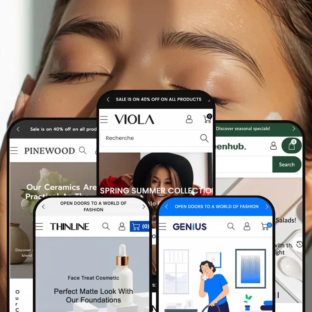
Viola is a multi-purpose Shopify theme with a cohesive design language, attractive typography, and polished micro-animations. Across presets you’ll see a consistent header system, predictive search, quick-add flows, and a responsive cart drawer that keeps shoppers in context. The first impression is upscale: spacious hero sections, high-contrast headlines, and decisive calls-to-action invite a fast track into discovery.
Pros.
〰️
Pros. 〰️
✚ Cohesive, premium visual system
Across presets, spacing, typography, and tasteful motion read as one brand. The store feels expensive—without feeling slow—so merchants can lean on perception as much as price.
✚ Merchandising that keeps momentum
Predictive search, quick-add, a responsive cart drawer, and optional combined variant lists shorten paths to purchase and reduce context switching. Shoppers stay in flow; clicks feel purposeful.
✚ Multi-industry range (including services)
Fashion, grocery, beauty, home décor, and services each slot in convincingly. Sections like plan cards, testimonials, and explainers flex from products to bookings without custom code.
✚ Conversion-friendly micro-interactions
Free-shipping progress, trust badges, testimonial sliders, and short “how it works” narratives nudge visitors from curiosity to commitment. They add persuasion without shouting.
Cons.
〰️
Cons. 〰️
− Inconsistent quick-view and search behavior
We observed quick-view icons that sometimes did nothing, redirected to product pages, or loaded with a noticeable first-use delay. Search overlays also proved unreliable in some presets. These inconsistencies break rhythm and can dent trust.
− Desktop-first navigation moments
Mega menus lose rich imagery on mobile, trimming guidance when thumbs need it most. It’s not a deal-breaker, but merchants should stage mobile menus carefully to preserve wayfinding.
− Variant-before-cart friction on cards
On product grids, clicking Add to Cart without a required variant can fail silently instead of prompting a choice. That tiny gap creates confusion right where momentum is highest.
-
What works in this preset
Main dials in a premium, editorial feel through neutral backgrounds, serif headings, and generous white space that lets photography breathe. A rotating hero slider pairs art-directed imagery with concise headlines to steer shoppers toward newness or curated collections without noise.
The homepage cadence favors short, purposeful sections: collections, a product rail, and a full-width image with overlapping copy. The result feels modern and calm—ideal for lifestyle positioning.
Where it stumbles
On desktop, the search field sits at the far right of the header and can read as secondary. Stores that live or die by search may prefer a more central treatment in this preset’s header composition.
-
What works in this preset
Greenhub leans into a fresh palette, friendly iconography, and produce-forward photography to signal “grocery” at a glance. Category discovery uses horizontal sliders and image cards that make large assortments feel approachable.
Its homepage framing—perks in a slim top bar, a hero that pushes “Browse All Categories,” then rails—keeps navigation simple for list-oriented grocery shoppers.
Where it stumbles
No unique structural weaknesses beyond theme-level items
-
What works in this preset
Thinline targets beauty with a pastel scheme and thin sans-serif typography that feel airy. Editorial hero photography and a short scroller for promos create momentum without heavy pop-ups.
The page composition blends category grids with promotional banners and testimonials, supporting breadth without overwhelming the shopper.
Where it stumbles
Carousels emphasize click arrows rather than fluid drag on desktop; some shoppers will expect swipes. Mobile still behaves well, yet the desktop feel is a touch rigid.
-
What works in this preset
Pinewood frames home décor with warm, earthy tones and subtle linear textures. Its signature numbered category carousel (“01”, “02”, “03…”) adds editorial curation and a tactile, crafted mood.
Product cards can surface shape/colour options inline, maintaining pace while shoppers compare forms like conical vs. round—well-suited to ceramics.
Where it stumbles
Those numerical labels, while stylish, may confuse some shoppers when category counts climb; clarity can take a small hit.
-
What works in this preset
Genius reimagines Viola for services: plan cards (Basic/Standard/Premium) with checklists, a tidy “How it works” explainer, and service cards that add to cart like products. It proves the theme can present intangible offerings cleanly.
A “Request a Quote” form—with map and contact fields—supports inquiry-based sales alongside direct purchase. It’s a credible framework for local pros.
Where it stumbles
A shipping progress bar in the cart drawer makes little sense for services and may confuse customers unless disabled.
Niche Suitability
Not Ideal For
-
Merchants seeking a polished, flexible theme that can merchandise hard—fashion, specialty food, beauty, home décor, or services—will find Viola a strong starting point.
-
Stores with a very small catalog or a single hero product may feel the rails, sliders, and editorial staging are more than they need.
-
Medium — achieving the showroom look demands quality imagery and thoughtful section order; a few inconsistent interactions may need extra QA.
Final Recommendation
★ 7.8/10
Rating
-
Advanced modules (quick-view, combined variant lists, mega menus, cart drawer) are built in, but inconsistent quick-view/search behavior costs points.
8
-
Many sections and presets; setup is straightforward, though merchants must curate imagery and mind a few edge-case interactions.
7
-
Layouts adapt well and the cart drawer behaves smoothly; mega menus and some overlays still feel desktop-led.
8
-
Smooth overall, yet image-heavy blocks and the first quick-view call can add a small delay. Careful media prep helps.
7
-
Multiple presets and a broad section library make it easy to replicate or remix looks without custom code.
9
FAQ
〰️
FAQ 〰️
-
👑 Yes. The demos span fashion, grocery, cosmetics, home décor, and services; sections adapt across use cases.
-
📱Yes. The layouts are responsive and the cart drawer works well on phones; some menu/search elements still read desktop-first.
-
🎨 Very. You can adjust colours, fonts, and imagery across heroes, carousels, testimonials, FAQs, and more without coding.
-
⚡ Pages load promptly and animations feel smooth; initial quick-view and heavy media can introduce minor lags.
-
👕 Yes. Swatches, pill buttons, dropdowns, and even combined variant tables are available.
-
🔎 The theme outputs clean markup and provides meta fields. For advanced features, you’ll still want apps.
-
💱 Language and currency selectors are available to configure as needed through Shopify settings.
-
⚙️ Yes. We observed built-in sections for reviews/testimonials and a cart drawer suited to upsell apps.
-
🛒 You can preview all presets and use a 14-day free trial when installing the theme.
This review is based on hands-on testing of the publicly available Main, Greenhub, Thinline, Pinewood, and Geniuspreset demos of the Viola Shopify theme as of 13 September 2025. Theme features, preset availability, and performance can change with subsequent updates from the theme developer.