
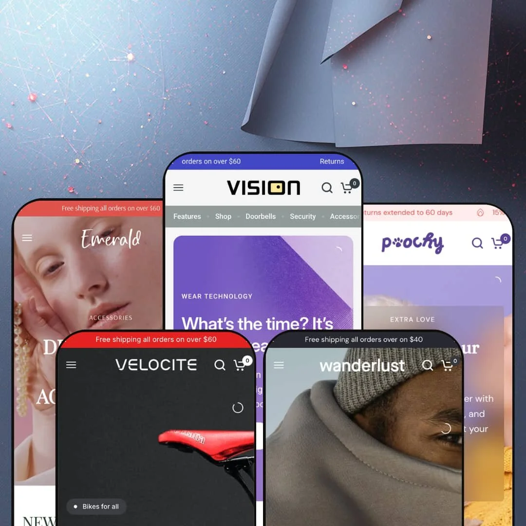
Open the main demo's navigation and the first dropdown isn't a product category at all; it's a menu literally named Features, with entries like Pre-Order and Gift Card pointing at the theme's own machinery. Vision, Fuel Themes' five-preset system built on Online Store 2.0, wears its conversion tooling on the outside, and at $430 it charges accordingly. Across smart home, jewelry, pets, bikes, and winter apparel, the real question isn't whether it has enough sections; it's whether you can tame them.
The collection page argues the sale
Filters cover brand, price, color, and stock in one drawer, and each product card carries a Compare checkbox feeding a tray that holds up to five products side by side. Dawn, Shopify's free baseline, gives you filtering and sorting; it doesn't hand you a compare tray. That matters. For electronics and appliance merchants with 50 to 500 SKUs and buyers who weigh three thermostats before committing, this replaces what would otherwise be a paid comparison-app install plus the integration work.
A product template that answers objections
How much persuasion can one product page carry before you reach for apps? Vision's answer is a lot: the template hosts tech-spec tabs split into general, installation, and package details, a native pros-and-cons content block, and a per-product FAQ accordion, all populated from the editor. Objections get handled in-layout. For considered-purchase catalogs, think appliances, furniture, or outdoor gear at mid-market prices, that shifts real work off your support inbox.
Variant handling built for image-heavy catalogs
I clicked from black to blue on the demo speaker and the gallery regrouped on the spot, each of four colors carrying its own three-image set while the picker ran color and material axes at once. A buy bar with its own selectors follows you down the page. Siblings get separate-listing treatment too. For apparel and gadget stores with multi-axis variants and restock-driven catalogs, this is the difference between a gallery that helps and one that confuses.
A promotion kit that works as one system
Drop-model and seasonal sellers courting impulse buyers get a coordinated promotion kit: countdown sections, promo tiles, in-menu promo slots, ticker bands, and per-card stock counters that read "9 in stock" next to the price. Each piece reinforces the others. Urgency compounds fast here. Staged together, they let a flash sale take over the entire storefront rather than one lonely banner at the top of the page.
Restraint is not on the menu
Every layout choice pushes toward density: badge chips, counters, video panels, promo slots inside the navigation itself. Quiet isn't in its vocabulary. I went looking for a single becalmed stretch across five homepages and never quite found one. For luxury single-designer labels with under-30-SKU catalogs and considered buyers, the work here is subtraction, and a large share of the purchase price goes toward sections you'll immediately disable.
Top-shelf price, single-engine product
The $430 sticker puts Vision at the very top of the Theme Store range. What it buys is one deep section library staged five ways, not five structurally different builds, and there's no additional layer, no builder module or merchandising engine above that library, to justify the ceiling price on its own terms. I kept doing the math per preset. Mid-market merchants running under 100 SKUs on a single storefront will realistically deploy a fraction of the 36-plus sections they're paying for.
A 2023 architecture at a 2026 flagship price
Vision runs on Online Store 2.0, the JSON-template generation, which remains fully supported but predates Shopify's Theme Blocks era with its eight-level block nesting and AI-assisted block generation. Nothing breaks. But single-brand merchants with evergreen catalogs planning agency-built customizations are committing flagship money to the older of the two modern architectures, and deep custom block work will hit the roughly two-level nesting limit sooner than they'd like.
What it takes to launch
Expect several days of work before launch: a full copy pass across hero captions, section descriptions, newsletter and footer blocks, social-profile and utility-link wiring, brand-naming alignment, and metafield population for spec tabs and guide modals in whichever preset you start from.
-
What works in this preset
Hovering over Shop drops a twelve-product grid with prices and quick-view triggers, while the Accessories entry swaps in four captioned image panels for cameras, doorbells, speakers, and watches. It's navigation doing merchandising work. A browser can effectively window-shop the catalog without ever leaving the header, which suits gadget stores where discovery is half the purchase.
Three pinned storytelling panels anchor the lower homepage: a smart lock, smart lighting, then a video doorbell, each holding its image in place while the copy scrolls past. The pattern gives a tech catalog an editorial spine. It rewards products that need explaining, which is exactly what a $249 doorbell is.
The bestseller grid runs on tabs, flipping between doorbells and thermostats without a page load, and further down an accordion pairs four swapping images with expandable copy about base stations, keypads, sensors, and security. Both patterns compress a lot of catalog into very little vertical space. Neither feels like filler.
-
What works in this preset
Jewelry sells on context, and Onyx knows it. A full-bleed editorial image sits beside a purchasable rail, necklace, ring, and bracelet listed with prices and direct product links, so the styled look itself becomes the merchandising unit rather than any single piece. That beats a plain grid.
Under the custom-design pitch sits a before-and-after slider, and a press-quote carousel rotates pull-quotes above a row of jeweler logos. Together they carry the trust argument for higher-ticket pieces, where a $365 necklace needs more reassurance than a phone charger ever will.
Even the product grid gets edited here: the tabbed New Arrivals section embeds a sale promo card directly among the product cards, turning the grid itself into campaign space instead of a passive listing.
-
What works in this preset
Scroll far enough and you hit an entire product page embedded in the homepage: gallery thumbnails, a color and size picker, a sizing-table link, and an add-to-cart button for a $16 pet hat, all working in place. No click-through required. For impulse-priced pet goods, collapsing the distance between browsing and buying like this is a genuinely sharp piece of staging.
Five circular category tiles for foods, toys, beds, bowls, and treats sit right under the hero, and a single-article feature gives one blog post a full-width stage instead of burying it in a three-up grid. Small choices, but they keep a discount-tempo store feeling organized.
-
What works in this preset
This is where Vision goes dark. The near-black build gives bikes and gear a showroom mood the brighter siblings can't fake, and the emoji-led review cards, thumbs and grins as headlines, keep the whole thing from tipping into self-seriousness.
I sat up at the spec section: six labeled bars for power, acceleration, grip, control, brakes, and durability, rendered like a review magazine's scorecard right on the homepage. For considered hardware, that's persuasion in the buyer's own language, and it's the single most vertical-specific piece of staging in the whole preset family.
Where it stumbles
The hero sells handcrafted bikes from $1,290, but the shoppable grid beneath it holds jerseys, a saddle bag, and a helmet. The core product never gets a shelf. Bike merchants picking this preset for its positioning will still need to stage the actual bike-shopping experience, model lineups, geometry content, size guidance, using the theme's existing sections before the store matches its own promise.
-
What works in this preset
Gift shoppers get the smartest piece of staging here: five collection tiles sliced purely by price, from Under $100 up through Under $500. Budget-first browsing fits winter gifting exactly. It's a merchandising idea none of the sibling demos repeats, which makes it worth stealing regardless of your vertical.
Between the image slides sits a full video slide, and the overall section count runs noticeably shorter than the siblings', which hands Solstice the calmest scroll of the family while still fitting a promo grid and a trio of tall campaign panels into the page. Calm is relative here. It still sells hard.
Where it stumbles
Solstice's identity is a season, not a store. Every headline, image, and collection frame assumes snow, which makes for a coherent campaign and an awkward permanent home, because an apparel merchant with year-round drops inherits a January-shaped storefront that needs re-theming by spring. The other presets sell verticals; this one sells a quarter.
One engine, five accents
Read all five demos back to back and the same building blocks keep resurfacing in different clothes: tabbed grids, icon strips, video panels, trust rows. That repetition is the point. The presets function as a proof of range for a single recombinable system, which means the real purchase decision is about the engine, not about whichever demo happens to match your industry.
Video is the native language
Every preset treats Shopify-hosted video as a first-class layout material, in hero rotations, in mid-page feature panels, even down in footer tiles. No preset ships a video-free identity. Merchants with strong motion assets will feel at home immediately; merchants holding a static photo library should budget for producing footage, because the layouts visibly expect it.
Each vertical gets its own pacing
The presets don't just recolor; they re-tune rhythm. One slows into editorial spreads, another talks in specifications, a third moves at discount-store tempo. That tonal stretch, visible only when you read the family as a whole, is the strongest evidence that the system bends further than any single demo shows.
Five verticals, one shopper psychology
Underneath the tonal range, every preset models the same buyer: someone responsive to urgency, social proof, and stacked offers. There's no demonstration of slow, consultation-led selling, nothing modeling a service-heavy jeweler or a wholesale-enabled brand taking considered orders. If your customers buy on trust built over weeks, you'll be repurposing conversion furniture rather than working with the grain.
Depth is also the onboarding tax
A 36-plus section library where each section carries its own settings panel means the theme editor becomes a study project. First-week momentum suffers. Solo operators and lean teams should plan a real orientation phase, because the distance between installing Vision and staging a homepage that looks like the demos is measured in days of deliberate choices, not hours.
★ 8.0/10
Rating
-
Pre-order flows, compare trays, variant image sets, and spec-driven product templates leave few obvious feature gaps for a promotion-led store.
9
-
The editor exposes deep per-section settings; powerful once learned, but the first staging pass demands patience and a plan.
7
-
Presets ship dedicated mobile hero crops and a slide-out menu; the long homepages translate into long thumb-scrolls.
8
-
Lazy-loaded imagery is consistent, but the demo homepages stack multiple videos and long section runs, so speed discipline falls to the merchant.
7
-
The family runs from near-white jewelry styling to a full dark bike build on one token system, with card and gallery variations multiplying the looks.
9
Frequently Asked Questions
-
Yes. The main demo flags a robotic vacuum as pre-order right on the product card and routes it through a native flow, with no third-party install involved.
-
A dedicated digital gift card product is staged in the main preset, so gifting can go live on day one.
-
Theme UI strings ship in English, French, Italian, German, and Spanish; translating your own product content remains your project.
-
Yes, as modals: the pet demo opens a sizing table for apparel, and the main demo attaches a material guide beside the variant picker.
-
Unlikely. The main demo runs about twenty products and still fills a very long homepage, so a 15-to-30-SKU store has plenty of surface to work with.
-
The stars on demo product cards are staged display; live reviews and wishlist functionality come from apps, with Vision supplying the layout hooks rather than the features themselves.
-
Yes. The demos rotate three offers in the top bar, alongside a country selector and social icons.
This review is based on hands-on testing of the publicly available preset demos of the Vision Shopify theme as of July 2026. Theme features, preset availability, and performance can change with subsequent updates from the theme developer.