
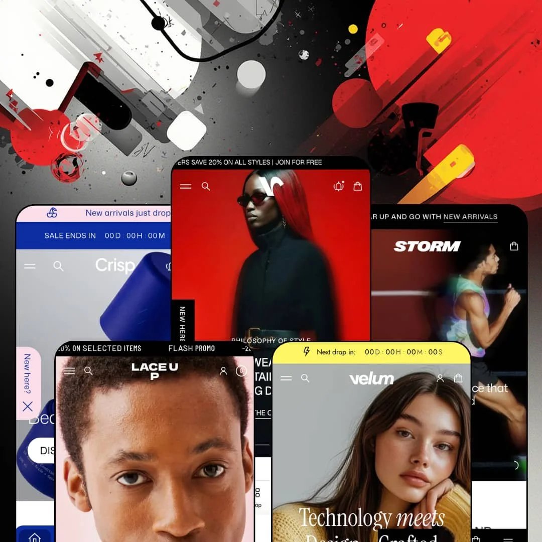
You're buying a theme that renamed its own flagship eight days ago. Staylime's Volume, a $290 Online Store 2.0 theme launched in April 2025 and now at version 8.0.0, swapped the Volume and Velum preset designs in its September release and added a fifth preset, Storm, on the same day. Five demos across editorial fashion, sneakers, skincare, a multi-department concept store, and running gear now sit behind one purchase, and every one of them runs the same custom-options, store-selector, and story-slideshow toolkit. The question is whether that toolkit still holds together after eight major versions in seventeen months.
Custom product options ship in the theme, not an app
Text fields, dropdowns, checkboxes, body-measurement inputs, file uploads, and date pickers render as native product options; the Storm demo stages it as a "Free gift packaging" checkbox pair sitting between the size picker and the add-to-cart button. Selections travel with the line item. For made-to-order apparel brands and gift-led catalogs under 100 SKUs, that removes the personalization app from the launch list.
The homepage is the lookbook
The Stories slideshow section lays out tappable circular chapters, each opening a sequence of full-screen slides, and every slide can carry a rail of purchasable product cards so a campaign image or a material story lands next to an add-to-bag path without leaving the homepage. It's the theme's signature section. Drop-model fashion labels and launch-driven skincare brands with a steady flow of campaign imagery get a format that matches how their customers already scroll.
Store selector with availability on every card
A regional store switcher sits in the header, and once a shopper picks a location the product cards and product pages carry that store's stock state, so a customer in one city never falls for inventory that only exists in another. Multi-location sneaker and apparel retailers with click-and-collect traffic, especially where a considered in-person try-on closes the sale, get pickup logic without a locator app.
A cart drawer that merchandises instead of just totaling
A side panel beside the line items shows recommendations and recently viewed products, while a discount-code field, a free-shipping progress bar, cart notes, and gift wrapping live in the same panel, so the last screen before checkout keeps selling. Nested cart lines are supported too. For impulse-buy accessory catalogs and repeat-buyer beauty brands with orders built from two or three items, that panel is where the extra unit gets added.
Social proof is scenery
The "What our clients say" carousel on every demo is hand-typed copy with a name and a country, and the single "4.0 / 5.0, 1 review" line on Velum's Knitted Cardigan comes from a third-party review app, not from the theme. Volume has no review engine. A skincare brand that lives on testimonials, or a multi-brand store with 500-plus SKUs that needs star ratings in the grid, budgets for an app on day one. The quotes are props.
Performance is a contested record, and the defaults lean into effects
Two merchant reviews from early 2026 report stores slowing down; the developer's replies attribute both to app load and custom code. Version 7.0.0 then added a custom cursor, scroll-reveal animation, magnetic icon effects, and hover sliders, and 8.0.0 added WebGL shader transitions. Every effect is a toggle. Mobile-heavy impulse-buy stores and catalogs past 500 SKUs should plan a tuning pass that switches those defaults off before judging speed.
Online Store 2.0 at a 2026 price
Volume runs on Online Store 2.0 templates, the same generation as Dawn, Shopify's free default, and the release notes through 8.0.0 show no move to the nested-block architecture newer themes are built on. Its block nesting stops where Dawn's does. That matters for agencies and multi-brand operators who expect to rebuild layouts with deeply nested blocks over the next two years, and less for a single-brand apparel store that configures once.
Kits are products, not builders
Crisp sells its Balm & Mask Kit, Radiance Night Trio, and Shampoo & Conditioner Duo as fixed products at a single price, because the theme has no bundle or set-builder section that lets a shopper compose a routine from individual SKUs. Bundles need an app here. Subscription-driven beauty brands and replenishment CPG catalogs where the routine is the product will find the front-end builder missing.
What it takes to launch
Expect a multi-day copy pass across hero captions, testimonial carousels, story-chapter captions, product tabs, and offer tiles, plus store-locator and contact sections to populate, stale promotion dates to retire, and shared demo copy to replace in every preset before launch.
-
What works in this preset
I sat up when the homepage scrolled past the hero into something that behaves like an Instagram profile. Five story chapters (Runway Edit, Leather, Icons, Core Layers, The Atelier) sit in a row of circular covers, and tapping one opens a full-bleed slide sequence where each frame carries a "Products from promotion" rail with live prices and sale badges. It's a lookbook without the lookbook page. The chapter that sells the SS26 runway links three looks to three product cards inside the slides, so the path from campaign image to variant page is a single tap, which is unusual on a homepage that otherwise reads as a magazine spread.
"Hurry, only 7 items left in stock!" That line sits inside a buy module embedded on the homepage for the Baggy jeans, beneath color and size pickers, a Size Guide link, and two gift-packaging checkboxes (Archival presentation box, Signature monolithic wrap) that render as part of the product form. A shoppable reels rail titled "Find your Inspiration" runs under the description, five short clips, each one linked to a product. The whole thing is a product page transplanted into the scroll.
The header stacks a members-discount announcement bar, a three-column mega menu (Type, Material, Collections) with three promotional banner tiles beside the links, and a News drawer holding a copyable BFCM2026 code, the latest journal post, and a New In product rail. On mobile a fixed dock pins Home, Account, Shop, Search, Cart, and Menu to the bottom edge. Navigation depth is real here.
Where it stumbles
The positioning and the staging argue with each other. The journal's lead post explains why the brand "doesn't run seasonal sales," yet roughly a third of the 36-product catalog carries a -23% to -25% sale badge, the Archive Edit banner pitches "exclusive archive pricing," and a countdown block pushes a pre-order. For a preset built around premium tailoring that copy conflict is a positioning gap merchants will need to resolve, not a typo.
-
What works in this preset
This demo sells the store first. A "Select your store" control sits in the header, every product card ends with "Select a store to check pickup availability," and the pickup modal lists two locations (Kicks District in San Francisco, SneakLab in Boston) with hours, a one-line store blurb, and a Get directions link. A Google Maps embed anchors a store section further down the page. For a footwear retailer with physical doors, that's the retail layer done before any app install.
Color swatches on the Casual Sneakers buy module are photographs, not dots. Four colorways (Black and white, Black, Total black, White) render as thumbnail tiles beside sizes 40 to 43 and a Size Guide link, with a native option group underneath that lets the shopper pick up to two presents from a gift box, a linen bag, and a shoe deodorizer. The same product carries a pre-order badge and a -17% badge at once, which is a useful test of how the theme stacks labels.
I clicked through the mega menu expecting link lists and found a featured-product tile in each department column, a Casual Sneakers card under Men and a Low Boots card under Women, each with image and price. Tabbed New In and Outlet grids sit under the hero trio, and an "Event starts in" countdown block bridges into the featured product. It's a compact, promo-driven layout.
Where it stumbles
Colorways are catalogued as separate products. Casual Sneakers appear as White, Grey, Total Black, Deep Blue, and Black & White listings with their own item codes, while only the featured trainer uses the theme's swatch picker. For a sneaker retailer with 20 styles in six colorways each, that staging choice hides the variant machinery the theme actually has and models the catalog the wrong way.
-
What works in this preset
"1% Caffeine + Acetyl Tetrapeptide-3." That's the subtitle under the Fortifying Treatment Shampoo card, and every card in the grid carries a formula line like it (11% Vitamin C + Silk Tree Extract, 0.5% Hyaluronic Acid + Chamomile Extract) rendered as card metadata beneath the title, so ingredient-led brands get their proof point at grid level, before the click. Prices show "From $25.00" wherever a 500 ml and a smaller size split the variant. Formula is the merchandising here.
I went looking for the routine logic and found it on the product page. The Tinted Serum runs six shade swatches and two sizes, a stock counter, an Ingredients tab, a How to use tab, an Ask a question form, a certification badge strip (B Corp, FSC, USDA Organic), and a "Complete your ritual" reels rail where each clip links to a companion product. A before/after slider with a copyable CLEARSKIN10 code sits on the homepage above three benefit tiles. The page teaches the regimen.
The "More" mega menu column is image tiles rather than text: Journal, New In, FAQ, and a featured blog post each get a thumbnail. A countdown runs inside the announcement bar beside a Shipping link. Story chapters here are Curated Kits, The Formula, Just Dropped, Top Picks, and Skin notes, and The Formula chapter uses ingredient photography (aloe, honeycomb, argan) as the slide art.
Where it stumbles
The Top Picks story leads with a product it can't sell. The Even-Complexion Serum sits sold out at the front of that chapter, and the Scalp Scrub is the third card in the Body & Hair grid, also sold out. Skincare buyers arriving on a "Top Picks" promise land on a dead end.
-
What works in this preset
What does a 120-brand concept store need from a header? Velum answers with a department switcher (Clothing, Shoes, Bags) that swaps the entire mega menu per department, and inside Clothing the tree runs three levels deep: Tops, then Shirts, then Elbow-length Sleeve Shirts. A country picker covering roughly thirty markets and an English, Polish, and Arabic language menu share the bar with a "Next drop in" countdown. This is the preset the theme's tagline about high-volume stores was written for.
"S / EU 36 / UK 8 / 88-66-92 cm." The Cardigan Lollipop's Size Guide opens inline to a body-measurement table with EU and UK conversions and a one-line explanation of what the numbers mean, right beside a picker that stacks New, -5%, and Pre-order badges on one product. A Shipping Details tab spells out thresholds and delivery windows under the buy button. Fit anxiety gets handled where it happens.
Category tiles for Shirts, Cardigans & Sweaters, Bottoms, Dresses, and Linen run as image rows, an Offers grid stages six promo tiles (gift cards, a linen discount, a first-order code, a weekend flash sale), and a "First Order Discount" copy-code block anchors the brand story section. The collection grid can switch between three layouts.
Where it stumbles
The Offers grid promises things the theme doesn't do. A "Shop Now, Pay Later" tile pitches ten interest-free installments for Loyalty Club members, and two more tiles gate discounts behind that same club, but installments live at checkout and loyalty tiers need an app. For a multi-brand concept store with 500-plus SKUs those tiles are copy waiting on integrations, not features.
-
What works in this preset
Storm arrived on September 2, 2026, and it reads as the loudest of the five. High-contrast blacks, rainbow-gradient variant names (rainbow-purple, rainbow-pink, rainbow-azure) on the Graphene tank top, and a hero pairing "Built to Perform" with a stadium video set the tone. Sale and NEW badges stack on the same card. The Curated edits chapters (Newest Collection, Promo & Sales, Top Products, Fabrics we use) reuse the story format for a training-gear audience.
This kept bugging me, in a good way: the before/after slider isn't a skincare gimmick here. Storm uses it to drag between a relaxed training layer and a stripped-down race kit on the same runner, with copy about recovery days versus seconds that count, which turns a comparison widget into a product-line explainer. A pre-order countdown block does the same job for the Cap 2.0.
Tabbed grids split Shorts, Tank tops, and Long sleeves, with autoplay video on the 2-in-1 Shorts and Marathon Shorts cards. The Shorts 2.0 buy module runs White and Purple swatches, XS to L, a Size Guide link, and a three-unit stock counter. A Line share icon joins Facebook, X, and Pinterest on the product page.
The release cadence is part of the product
Eight major versions since April 2025 have each shipped something a merchant can see: a new preset in 3.0, 6.0, 7.0, and 8.0, B2B quantity pricing and a quick order list, back-in-stock alerts, and an account menu that keeps customers on the storefront. Buying Volume means buying the trajectory. For a one-time price that pace changes the calculation more than any single feature does.
Motion is treated as merchandise
Video isn't decoration in these demos; it's card inventory. Product cards autoplay clips, reels rails link short videos to buy buttons, hero banners run loops, and the same clip reappears in the news drawer, the story slides, and the product gallery. A brand that produces motion assets gets a storefront that finally uses all of them.
International UI without the app layer
Right-to-left rendering, interface strings in English, French, Italian, German, and Spanish, a regional store switcher, and country and language menus in header and footer are theme-level work, and three of the five demos already stage Arabic. The theme's share of cross-border selling arrives configured rather than bolted on.
Five presets, three skeletons
Read Volume and Storm back to back and the section order is identical: video hero, category row, story chapters, tabbed grids, archive banner, countdown pre-order, homepage buy module, before/after slider, testimonials, journal, store, contact. Crisp follows the same spine with beauty imagery. Only Laceup and Velum break the pattern, so the family's variety is more palette than plan.
The listing and the presets describe different stores
The Theme Store files Volume under Jewelry & Accessories and Food & Drink with a catalog size of "Some (11-100+)," while the demos stage fashion, footwear, skincare, a department concept store, and running gear, and the Velum meta copy still pitches high-volume stores. Neither listed industry has a preset. A jewelry or food merchant starts from a fashion skeleton and restages everything.
The demos assume a content pipeline you may not have
Every homepage here runs on AI-generated campaign imagery and looping video, disclosed in the footer, and the story chapters, reels rails, and before/after sliders are empty frames without that flow. A brand with a packshot folder and no video will see half the section library sit idle.
★ 8.0/10
Rating
-
Native custom options, a store selector with per-card availability, B2B quick order list, back-in-stock alerts, an age verifier, and a 45-plus-section library cover the bulk of launch needs without apps; reviews and bundles remain app work.
9
-
Every animation, cursor mode, and slider transition is a setting, which means a long settings tree; the swapped Volume/Velum naming in 8.0.0 adds a moment of confusion for anyone following older documentation.
7
-
A fixed bottom dock, collapsible mega menus with image headers, a blurred mobile search field, and sticky add-to-cart keep the phone flow short; video-heavy heroes need mobile-specific assets to stay light.
8
-
Picture-tag image rendering, lazy loading, and link preloading on hover are in place, but the demos ship autoplay video on cards and heroes plus shader transitions, and the merchant record disputes real-world speed.
7
-
Five presets across three skeletons, per-section custom grid controls, extra corner-radius sizes, custom cursor modes, and color blending on cards give a wide range without code.
9
Frequently Asked Questions
-
Since version 8.0.0 (September 2, 2026) the editorial fashion design that used to be called Velum is the default Volume preset, and the multi-department concept store that used to be Volume is now Velum; the demo store URLs and footers still carry the old names.
-
Version 8.0.0 added quantity-based price breaks and a quick order list for bulk buyers; both are flagged Shopify Plus on the feature list.
-
The 3.0.0 release lifted support to 2048 variants per product, and the Tinted Serum demo runs six shades across two sizes with a shared stock counter.
-
Yes. A store selector in the header changes the active location and updates stock indicators on product cards and product pages.
-
Yes, opened from a link beside the size picker; the Velum demo fills it with a body-measurement table including EU and UK conversions.
-
No. Every demo footer states that all imagery and video were AI-generated by the developer's team, with an IP notice page linked.
-
A sticky mobile dock, a slide-out news drawer for announcements and promo codes, a parallax footer reveal section, an images-only slideshow with shader transitions, an account menu, and back-in-stock alerts.
This review is based on hands-on testing of the publicly available preset demos of the Volume Shopify theme as of September 10 2026. Theme features, preset availability, and performance can change with subsequent updates from the theme developer.