
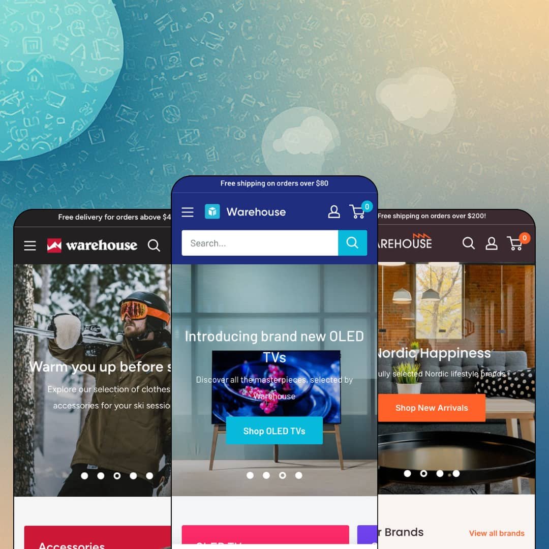
Most premium Shopify themes are built to make a thin catalog look generous. Warehouse is built for the opposite problem: too many products, too many brands, and shoppers who need to narrow rather than browse. Maestrooo's $320 theme has been in the Theme Store since July 2019, now runs version 7.0.1 on Online Store 2.0 architecture, and ships three preset demos covering electronics, Nordic home goods, and outdoor gear. If your store operates like a distribution business, this is one of the few themes designed around your actual day.
A collection page built like store infrastructure
The Metal demo's headphones collection runs 75 products behind a sidebar that does real work: a category tree with live counts for Audio, Hi-Fi, and TV & Entertainment, twelve brand checkboxes, color and price filters, and an availability toggle. Shoppers then set their own density at 24, 36 or 48 items per page, flip between grid and list, and pick from eight sort orders including best selling and relevance. Nothing here needs an app. For multi-brand electronics or tools retailers with 500 or more SKUs and comparison-heavy buyers, this page is the product, and it's the most complete version of it I tested this year.
Inventory truth as a selling tool
Stock displays go down to the unit. Product pages print lines like "In stock (69 units), ready to be shipped," while cards on the Metal homepage flag a $3,198 OLED TV with only one unit left, all pulled from real inventory data rather than a fake scarcity widget. The same mechanism reassures on deep stock and pressures on thin stock, and it does both automatically as inventory moves. Restock-driven merchants selling considered purchases, where a buyer hesitates for days, get a nudge that's honest by construction.
Where do pre-checkout doubts go?
On Warehouse product pages, they get answered in place. A shipping estimator with country, province and zip fields sits directly on the page, flanked by tabs for delivery windows, returns terms, and a payment block with a slot for an uploadable security badge. A buyer eyeing a $2,198 television can price the freight and read the return terms without ever committing to a cart, which is precisely the moment high-ticket purchases die on lesser product pages. Cross-border sellers of high-value electronics or furniture will feel this one directly in abandoned-checkout numbers.
A coordinated retail-promo kit
Warehouse treats promotion as a set of connected surfaces rather than one banner setting. A promo link lives inside the mega menu itself, deep-linking a brand-filtered speaker collection; offer tiles pair a product image with inline links; promo banners span collections; and a stacked popup engine lets the Metal demo run a newsletter bar, a giveaway popup and a 15%-off exit offer simultaneously. That's a lot of firepower. For discount-led dropshipping and clearance operations cycling weekly campaigns, the whole kit means launching an offer is a content task, not a layout rebuild.
Online Store 2.0 economics in 2026
Warehouse predates the current theme generation and remains on Online Store 2.0 architecture, the same base Dawn provides free as Shopify's default. The $320 buys the retail feature layer and seven years of refinement, not an architectural head start, and it doesn't include the nested theme-block editing that newer-generation themes are built around. Agencies assembling client stores and evergreen single-brand shops planning years of heavy in-editor customization should weigh that they're buying deep retail tooling on a 2019 foundation.
The social proof on display isn't in the box
Review counts appear on nearly every demo card and product page, and none of that ships with the license. The screenshots write a check the license doesn't cash. Those stars come from a separate review app the demo stores are wired into, and the official feature list contains no review entry of its own, so matching the demos means budgeting an extra app install plus a styling pass before launch. Impulse-driven dropshipping stores that live and die on visible social proof should plan for that gap on day one rather than discovering it during setup week.
Spec-hungry positioning without a spec table
The listing promises bold tech merchandising, yet the Sony TV product page renders its technical data as long marketing prose under small headings. I went looking for a structured specification table across all three demos and found none staged anywhere, and the feature list doesn't name one either. That leaves formatting comparison data as manual description work for every product. Electronics and appliance merchants serving considered-purchase buyers who compare model numbers side by side will feel this gap on exactly the products this theme claims as its home vertical.
What it takes to launch
Expect a multi-day pass covering full copy replacement across up to three menu taxonomies, popup and offer-tile campaign content, brand index pages, FAQ and policy tab text, third-party app configuration, and real inventory data entry before the availability displays mean anything.
-
What works in this preset
Walking into this demo feels like entering an actual A/V superstore, which is exactly the point. I clicked through a mega menu spanning four columns for Audio, Hi-Fi, TV & Entertainment, and a curated selection row, all sitting under a utility strip that puts a support phone number and email above the shopping experience itself. It's dense. The layout communicates competence before a single product loads, the way a well-organized retail floor does when you walk in and immediately know where the receivers live.
The homepage closes its pitch with a fully transactional featured-product module: gallery, color swatches, a live stock line reading forty-four units ready to ship, quantity stepper, and add to cart, all without leaving the page. Further down, a store locator section lists two physical locations with opening hours and Get Directions links. Homepage and point of sale stop being separate ideas.
The search bar has an opinion. A category dropdown scopes queries to one of fifteen product types before you type a letter, and clicking into the empty field serves six curated inspiration links to specific products and collections instead of a blank overlay. For a store where a shopper might want "sound bars" and nothing else, that scoping choice removes an entire round of wrong results before it happens.
Where it stumbles
The flagship homepage stacks a slideshow, a promo trio, offer tiles, two featured collections, collection link lists, the buy module, blog cards, the locator, and a newsletter block into one very long scroll. Brand storytelling gets a single short About paragraph in the lower third. The structure says everything about this theme's priorities: it merchandises the shelf first and narrates the brand almost as an afterthought, which is a real trade-off for anyone whose margins depend on story rather than selection.
-
What works in this preset
"Re-stocking soon." "Back in Stock." Those two card badges, staged across the featured grids here, show a theme thinking about availability as a lifecycle rather than a binary. A shopper learns not just what's gone but what's coming back, which quietly converts a dead end into a return visit. Few product cards say this much.
I noticed the brand layer carries this preset more than any hero image does. A Popular Brands grid presents six Nordic labels as tappable tiles, a dedicated brand index page sits one click away, and every product card prints its vendor as a link into that brand's own collection, so a shopper who trusts House Doctor can live entirely inside House Doctor without ever touching the main menu.
Offer tiles here run gift mechanics instead of flat discounts. One tile promises a free double-walled thermo bottle at a $100 spend and links the exact product; its neighbor ties a pendant lamp purchase to 50% off all lighting. Small image, two lines of copy, inline product link. The format turns promotions into little editorial units a merchant can rotate weekly without rebuilding a section.
Where it stumbles
Even under the softest Nordic staging, the retail grammar never relaxes: a $35 porcelain teapot carries an SKU line and the same shop-floor signals as a pallet of televisions. Merchants choosing Wood for a design-store atmosphere will spend their settings time dialling the warehouse down, and the preset gives them a head start on tone but not on structure.
-
What works in this preset
How many ways can one storefront slice a catalog? Mesh answers with three parallel menus running side by side: a category tree for Clothing, Bags and Shoes, a Shop by Activity menu covering Bike, Camp, Climbing, Hike, Run, Ski, Photography and Travel, and a Shop by Brand list of eleven labels. Three entry points, one inventory. Gear shoppers genuinely think in all three of those modes depending on the day, and this preset is the clearest demonstration in the whole family of the theme letting navigation carry that load.
Card buttons adapt to the product underneath them, and the difference is easy to miss until you scan a full grid: single-variant items get an instant Add to cart, multi-variant items switch to Choose options, and both carry a Quick view trigger alongside. No dead-end buttons. The grid quietly sorts impulse purchases from configuration purchases before the shopper has to discover the difference on a product page.
A Product of the month module anchors the homepage with the Barrage Cargo bag staged across twenty-four gallery images in four colorways, plus a live stock readout of thirteen units. It's a monthly editorial ritual built straight into the section library, and the naming alone nudges merchants toward refreshing it.
Where it stumbles
Apparel staging inherits wholesale instincts it can't quite hide. A women's running shoe announcing 1,211 units in stock reads like a distributor feed on a fashion floor, and the card anatomy stays identical to the electronics preset, so sizing-led shoppers get color chips and unit counts where a fashion-native layout might spend that space differently. The preset proves the theme stretches to apparel; it doesn't prove apparel is home turf.
One machine, honestly re-skinned
Across electronics, Nordic homeware and outdoor gear, the three demos never pretend to be three different themes. The same navigation logic, card anatomy and promotional surfaces reappear in every vertical, only re-dressed. That gives buyers an unusually honest preview: whichever preset you start from, you already know exactly how this engine will behave in yours.
Demos stress-tested at real volume
Reading all three storefronts back to back, the depth of the demo catalogs stands out. Hundreds of SKUs, real brand rosters, genuine variant spreads: every layout claim gets demonstrated under load instead of staged around a dozen hero products. For the exact merchant this theme targets, that removes the biggest leap of faith a demo usually asks for.
Seven years of shipped maintenance
A July 2019 launch carrying a version 7.0.1 release in March 2026 tells its own story. This is actively maintained software with a seventh major version line, not a legacy catalog theme coasting on old installs, and that trajectory matters more for a store's third year than any single feature does.
The retail identity is non-negotiable
All three presets, including the softest one, speak shop-floor: counters, badges, offers, density. A brand-led store can quiet those signals through settings, but it will always be resisting the theme's instincts rather than riding them, and the resistance never fully ends because every new section arrives speaking retail again.
The machine runs on data you must supply
Live unit counts, brand rosters, layered menus, rotating campaign tiles: each distinctive surface assumes an operation that continuously produces inventory numbers, offers and assortment depth. A thin or tightly curated catalog won't break anything. It will simply leave the theme's best features idling, visible in the settings but with nothing to say.
★ 7.6/10
Rating
-
Catalog navigation, filtering, inventory display and promo surfaces run unusually deep for the price; social proof and structured spec formatting fall to apps and manual work.
8
-
Settings follow clear retail logic and the presets arrive complete, but the sheer number of menus, offers and popup surfaces demands real staging discipline before launch.
7
-
The slideshow ships dedicated mobile image assets rather than cropped desktop art, and the menu drills down through a back-button stacking pattern suited to deep category trees.
8
-
Product and collection pages stay lean and image-led with sized asset variants; the homepage recipes stack many modules, so section pruning pays off.
8
-
Color, layout and section options reach far within the retail identity but not outside it, as three near-identical preset skeletons demonstrate.
7
Frequently Asked Questions
-
Yes, theme UI strings come pre-translated in English, French, Italian, German and Spanish; your product content still needs its own translation workflow.
-
The Theme Store listing showcases live shops including Tefal's Australian store, Tennis Giant, Garage Grown Gear and Appliances Club.
-
A slide-out drawer opens with a free-shipping progress message at the top, and the feature set includes cart notes and gift wrapping.
-
Two entries carry Plus flags on the feature list: quantity pricing and combined listings.
-
Yes, images offer rollover magnification plus a click-to-open enlarged view on every demo product page.
-
The flagship Warehouse preset, since its staging assumes the widest catalog and the most aggressive offer surfaces; Wood and Mesh show how far the same settings travel toward calmer verticals.
This review is based on hands-on testing of the publicly available preset demos of the Warehouse Shopify theme as of August 2026. Theme features, preset availability, and performance can change with subsequent updates from the theme developer.