
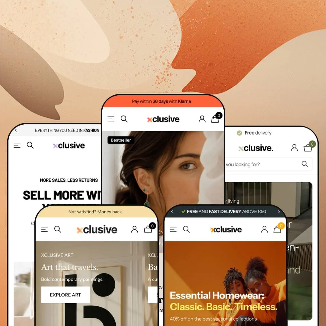
Most premium Shopify themes pick a vertical and commit. Xclusive spends $500 of your money proving it can be five stores at once: a jewelry boutique, a sneaker retailer, a family homewear brand, an outdoor-furniture showroom, and an art label. Built on Online Store 2.0 by Dutch developer Someone You Know and live since August 2023, it sits in the Theme Store's top price band, which changes what counts as impressive. I went in asking whether the breadth is real or just five coats of paint.
Shoppable imagery is the theme's native language
Xclusive treats every image as a potential point of sale. The image-hotspot and lookbook machinery runs through all five demos, and the social-feed sections take it furthest: editorial tiles labeled with item counts and armed with add-to-cart buttons, so an Instagram-style grid converts without leaving the page. For apparel, jewelry, and accessories brands that market through lookbooks and feed-style content to impulse-buying audiences, this is the closest a theme gets to matching how their customers already shop.
The product page ships a coordinated conversion kit
Buy-box hesitation gets attacked from several angles at once, as one coherent unit. An order-cutoff timer answers "when will it arrive", a stock counter answers "should I wait", trust badges and a Shop Pay marker answer "is this safe", pickup availability answers "can I skip shipping", and a cross-sell row catches the add-on. Mid-market fashion and footwear merchants selling fit-sensitive, return-prone categories get the reassurance layer pre-built instead of assembled from three apps.
Considered-purchase selling is genuinely supported
Can a conversion-focused fashion theme sell a €9,000 garden set? Deck's template argues yes, with an embedded contact form directly on the product page, a "make a showroom appointment" button beside the wishlist, and metafield-driven specification tables. Those are pre-sales tools, not checkout tools. Furniture and other high-ticket retailers running physical showrooms for considered-purchase buyers usually have to bend a theme sideways to get this flow; here it's staged and working.
Five real stores for one license
Dawn, Shopify's free baseline, ships one neutral preset you shape yourself; Xclusive ships five fully built storefronts across unrelated verticals, each with its own demo catalog, navigation logic, and homepage architecture. The presets encode genuinely different retail strategies, from quick-add family shopping to appointment-based furniture sales. Agencies and multi-brand operators running stores across unrelated verticals can standardize on one theme license and one settings model instead of relearning a new theme per client.
Image-led to a fault
The merchandising toolkit is built almost entirely around photography: hotspots, rollovers, galleries, before/after sliders, lookbooks, video. Scan the feature list and you'll find no comparison tables, no spec-first card layouts, no data-dense catalog views. Electronics, tools, and parts merchants running 500-plus-SKU catalogs where buyers compare specifications before they compare photos will find the theme's best weapons pointed at the wrong target.
Translations stop at five languages
The interface strings come pre-translated in English, French, Italian, German, and Spanish, and that's the list. Dutch itself didn't make the cut, a strange omission given the developer's own demos lean on Dutch-language brand catalogs. Cross-border merchants targeting storefronts outside those five languages will be translating button labels, form text, and notice strings themselves and should price in the localization pass.
Support access has a documented wobble
A June 2026 Theme Store review reported that registration for the support forum failed and the listed support email bounced as a nonexistent domain; the developer resolved it by reaching out directly and says live chat is coming. Credit for the recovery. But for a $500 theme, a bouncing support address is not a good look. Solo founders launching on tight flash-drop timelines should test the support channel before the week they actually need it.
What it takes to launch
Expect a multi-day launch runway: cross-preset brand renaming, a bilingual content cleanup across product data, collection handles, and metafield labels, replacement of placeholder contact details, metafield population for specification tables and size charts, and full copy passes across hero, menu, and social-feed sections.
-
What works in this preset
The mega menu here is doing three jobs at once. One dropdown runs image tiles for jewelry sub-collections, another runs multi-column text lists that fold down to a third level for lingerie, and a third mounts full promotional banners with headline, subline, and call-to-action inside the menu panel itself. Navigation doubles as a campaign surface. For a boutique that rotates seasonal edits, that means the menu can sell before a single page loads.
Curated "looks" get their own place in the information architecture rather than being bolted on. The Looks menu carries named outfit collections such as Festival, Wedding Guest, and Tenue de Ville, each with its own landing collection and menu imagery. It's a merchandising angle you rarely see promoted to top-level navigation. Boutiques that sell styling as much as product can build the whole store around it.
Product pages sweat the fit question hard. There's a size chart that converts across EU, US, FR, IT, and UK sizing in one table, a model-fit note under the gallery telling you the model's height and size, and a reader-facing fit indicator running from "runs small" to "runs large". Returns start in the size picker, and this template clearly knows it.
-
What works in this preset
Shoe shoppers filter before they browse, and Pace respects that. The collection page ships a filter drawer with size, color, availability, vendor, and price-range facets, each carrying live product counts, plus nine sort orders. Twelve products is a small demo catalog, but the filtering surface is built for hundreds.
There's also a detail on the collection grid I haven't seen elsewhere: a Single/Pair toggle that switches product imagery between one shoe and the pair. Small thing. It signals that someone designed this preset while actually thinking about footwear photography instead of recycling a generic apparel grid. The press section underneath pairs magazine logos with full campaign imagery, and the header carries a dedicated slot where the demo mounts a Trustpilot badge.
-
What works in this preset
Who buys pajamas for one person? Families shop in batches, and Cozy's whole structure admits it: the main menu splits Homewear into Women, Men, Kids, and Babies, each folding down to a third navigation level, so a parent can get from the homepage to kids' shorts in two moves. The same segmentation repeats across the sale menu and the print-based collection rows.
Speed to cart is the other theme. Product cards expose size buttons directly under the add-to-cart control, so a returning customer who knows their kid wears a 104 never opens the product page at all. Combined with the announcement bar's review-score line and a sustainability icon row covering CO2, fair trade, water, and skin certifications, the preset reads like a working direct-to-consumer playbook rather than a design showcase.
-
What works in this preset
I spent the longest time on this preset. It reframes the product page as a consultation surface for five-figure purchases: a specifications block pulls dimensions from metafields, a warranty and money-back list sits under the buy box, a wood-certification tab documents sourcing, and the page closes with showroom opening hours. A €5,059 lounge set gets sold differently than a t-shirt, and Deck's template understands the difference in its bones.
The navigation and brand sections carry the same considered-purchase logic. Every menu entry runs a small icon thumbnail beside its label, which turns a deep outdoor-furniture taxonomy into something scannable, and a brand-gallery section pairs supplier logos with full-width campaign imagery. A featured-project section tells a hospitality case study, The Dunes Club, in editorial form. That's portfolio thinking, not catalog thinking.
-
What works in this preset
There's a thin orange strip between two homepage sections that most visitors will scroll straight past, and it's quietly one of the better conversion ideas in the whole preset family: a promo-code banner carrying a live discount code, placed mid-scroll where purchase intent actually forms rather than in the header where banner blindness kills it. Voyage also leans hardest on badge merchandising, running LIMITED EDITION labels across its David Martin bag collection and its canvas art line.
The navigation goes the other way from every other preset. Two shop categories, a journal, an about page, done. It demonstrates that the same header engine that carries Deck's furniture taxonomy can be stripped down to a gallery-brand minimum, which matters if your brand identity depends on restraint.
Where it stumbles
The art half of the store is staged with the same product-card vocabulary as the bags. Nothing in the demo speaks the language an art buyer expects: edition sizes, certificates of authenticity, framing options, artist provenance. This kept bugging me, because the preset's own name and hero copy promise "art that travels". Merchants launching a genuine gallery operation will be building that presentation layer themselves through metafields and custom section work before the store reads credible to collectors.
One engine, five personalities
Reading all five demos back to back reveals how much of the differentiation comes from the same configurable slots wearing different clothes. The header's extra-image slot carries a Trustpilot badge in Pace and a GOTS certification mark in Cozy; the announcement bar plays USP ticker in one store and rating banner in another. That's the real proof of flexibility, more convincing than any feature list: identical architecture producing a boutique, an outlet, and a showroom.
Reassurance follows you through the whole store
Across all five presets, trust and urgency messaging lives well beyond the product page: USP announcement bars up top, delivery notes and stock states on the product cards themselves, trust rows down in the footer. The pattern holds whether the store is selling kids' pajamas or five-figure garden furniture. Few buying decisions in any of these demos happen more than one glance away from a reason to feel safe.
The demos carry production weight
Every preset is staged with real brand catalogs from actual Dutch retailers, credited on the demo pages, with genuine product photography, live pricing spreads, and working blog content. You're not judging the theme against lorem ipsum; you're watching it hold up under something close to a production content load, across five different content shapes at once.
Adaptation is aesthetic more than functional
The presets diverge in styling, staging, and navigation shape, but the underlying mechanics stay constant across all five. Whatever vertical you pick, category-specific machinery like ring sizing, shoe-fit finding, or art-edition management still arrives via apps and custom work. The theme adapts its face to your industry faster than it adapts its hands.
Photography carries everything
Full-bleed imagery is the load-bearing wall in every preset. Strip away professional photo assets and the layouts have little text-first fallback to stand on, so brands without a real photography budget or strong supplier imagery lose most of what the price buys. The theme assumes you look expensive before it makes you look expensive.
★ 8.0/10
Rating
-
The sheet runs from age verification to image hotspots to Plus-only quantity pricing, and the demos stage most of it in earnest rather than as checkbox filler.
9
-
Depth cuts both ways: cards, headers, and product templates carry many content slots that all want decisions, so first-time merchants should budget real configuration time.
7
-
Slide-out navigation, a sticky cart, and back-to-top affordances are all in place, and the dense card layouts stack cleanly at narrow widths.
8
-
Homepages run long and image-dense with slideshow, feed, and gallery sections stacked deep; lazy-loading is present, but keeping every demo section will cost weight.
7
-
Five unrelated retail identities come out of one settings surface. That range is the entire argument for the price.
9
Frequently Asked Questions
-
Yes, an age verifier is part of the marketing feature set, which matters for alcohol, tobacco-adjacent, and other 18+ catalogs that need a compliance gate before browsing.
-
Two features carry a Plus flag: quantity pricing and combined listings. Everything else on the sheet works on standard plans.
-
Yes. The Pace demo shows pre-order badging on out-of-stock products alongside a delivery-window message ("delivered within 2 weeks"), so the sold-out state keeps selling.
-
Right-to-left rendering is listed as supported, which covers the theme-side requirements for Hebrew and Arabic storefronts.
-
There is, in the merchandising set. It's an obvious fit for beauty, skincare, and restoration-style product stories where the transformation is the pitch.
-
Version 3.6.0 shipped on June 23, 2026, adding functionality and fixes, and the release history shows a steady update cadence since launch.
This review is based on hands-on testing of the publicly available preset demos of the Xclusive Shopify theme as of July 2026. Theme features, preset availability, and performance can change with subsequent updates from the theme developer.