
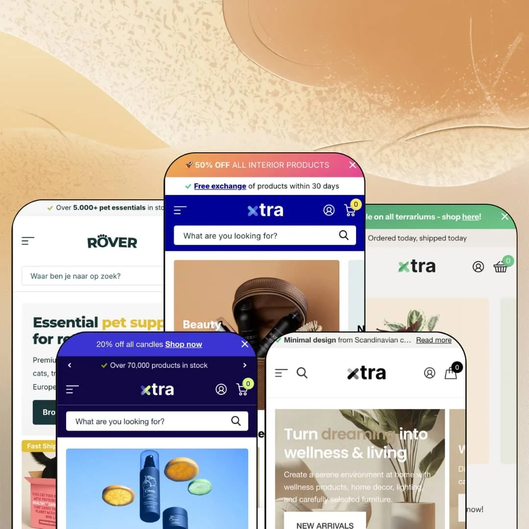
Most multipurpose Shopify themes stretch one demo across every industry and hope you squint. Xtra builds five separate stores instead: a department-store warehouse, a DIY terrarium brand, a Scandinavian interior shop, and two full wholesale operations. It runs on Online Store 2.0 architecture, lists at $150, and claims more than 50 built-in features on its Theme Store page. The real question is whether one engine can wear five different shops without the seams showing.
The product template answers questions before they're asked
Specification lists, product tabs, usage information, size charts, before-and-after sliders, and product-level FAQs are all native sections on the product page. No app install is needed for any of them. A buyer comparing a €599 chair or reading a supplement's ingredient panel gets structured answers on the page instead of a wall of description text, which changes how the page converts. For furniture, electronics, and supplement merchants selling considered purchases at mid-market and premium price points, this template does real conversion work out of the box.
How much reassurance can one product card hold?
Xtra's answer: quite a lot. Stock counters, per-product delivery promises with expandable policy notes, vendor lines, review counts, and custom promo flags all render at grid level, which moves trust-building forward to the moment of browsing instead of leaving it for the product page. For restock-driven stores with 100-plus SKUs in pet, food, or beauty, where buyers already know the product and only need confidence in availability and speed, the card-level messaging is the feature.
Two of the five presets talk to businesses
Vault and Rover come with the same $150 license. Both are staged as wholesale operations with partner registration, dealer entry points, and trade-first navigation, which turns a single purchase into a consumer storefront and a B2B channel built from one shared section library. For wholesale-enabled operations running large multi-brand catalogs alongside a retail arm, that dual coverage is the strongest argument on the listing page.
Accessibility is treated as a feature, not a checkbox
Every preset ships an accessibility mode plus single-key skip navigation baked into the page. The toggle is one keypress away. Compliance-minded merchants get visible, testable accommodations rather than a vague line in a feature list, and the behavior is identical across all five demos, so it survives preset choice. For stores selling to institutional or public-sector buyers, and for consumer brands with older or accessibility-reliant audiences, this shows up favorably in procurement reviews.
There is no quiet setting
Every preset speaks in the same voice. USP bars, badges, counters, promo flags, and service blocks form the default register across all five demos, and while each element can be switched off individually, the theme's identity is assembled from them, so a restrained build means working against the grain rather than with it. I went looking for one understated read across five storefronts and never found it. The theme always wants to close. For single-brand luxury sellers with small catalogs and considered-purchase buyers, that instinct is a mismatch rather than a bonus.
The headline B2B mechanics need Shopify Plus
Quantity pricing and combined listings carry a Shopify Plus label on the theme's own feature list. Vault and Rover build their entire pitch around trade buying, yet a wholesale merchant on a standard plan loses exactly the tiered-pricing mechanics that make a dealer portal worth the login. The presets still work as B2B storefronts without it. But buyers should price the plan requirement into the decision, because part of the wholesale value on display assumes platform features the $150 theme cannot supply on its own. For B2B operations with large catalogs that aren't on Plus, this is the first thing to verify.
Built for big menus, oversized for small ones
The navigation identity assumes catalog scale. Three menu levels, image thumbnails per entry, promotional panels inside flyouts, and pre-staged search suggestions all reward stores with hundreds of products and deep category trees, and they hand a small shop machinery it will spend its setup time dismantling instead of using. A boutique with under 30 SKUs and a single product line inherits a department store's chassis. That's a deliberate identity choice, and it closes the door on merchants who need their navigation to disappear.
What it takes to launch
Expect a multi-day pass across demo copy, language-default and translation alignment, mega menu re-staging with per-category imagery, and metafield population for specification and tab content before any preset reads as your store.
-
What works in this preset
Open the demo and you land in a department store. The mega menu runs three levels deep with image thumbnails on nearly every entry, and it goes further than that: full promotional panels sit inside the flyouts, with a headline, supporting line, and call-to-action staged for the hair-care and gifts categories. In-menu promos appear on the feature list, and this preset shows what that actually means in practice. Navigation here is merchandising surface, not just wayfinding.
The header stacks reassurance in layers. A rotating announcement bar carries the discount message, a second row lists service promises (free 30-day exchanges, pickup in sixteen stores, brand products at accessible prices), and a dedicated image slot holds a verified-company badge beside the customer-service link. There's even a social flyout and a wishlist entry point before you reach the logo. I clicked around expecting filler and found configured intent instead.
Press "a" and an accessibility mode switches on. The preset wires single-key skip navigation into the page itself, with "s" jumping to search, "c" to content, and "f" to the footer, which is a level of keyboard support that goes past the usual skip-to-content link and reads like it was built for actual audits rather than a checklist.
-
What works in this preset
One vertical, one story. Seed narrows the same engine to a terrarium brand, and the product cards do most of the selling: recycled-material badges, per-product shipping promises like same-day dispatch, review counts, and vendor lines all render directly in the grid before anyone opens a product page. The card is the pitch.
Campaign tooling is staged throughout. A half-price sale block anchors the page, a discount code sits inside a lifestyle banner, a countdown section is set up for a coming sale event, and a community gallery presents customer builds as living social proof. For a brand that runs on seasonal pushes, the promotional sections are already assembled and waiting for real dates.
Where it stumbles
For a make-it-yourself vertical, the demo tells a mostly transactional story. The craft angle lives in copy and photography, while the section deployment mirrors a standard promotional storefront, so merchants whose business is workshops, kits, and process will need to carry that identity themselves through blog and page content rather than inherit it from the staging.
-
What works in this preset
The label says minimal; the cards say otherwise. Stock counters, last-stock flags, absolute-value sale badges, custom promo labels, and expandable delivery-policy notes all live on the product grid, and at four-figure furniture prices that density earns its place, because a €1,249 table sells on certainty rather than whitespace. It works. Just not quietly.
The product page is the deepest template in the family. I counted a specification list, a pros-and-cons block, a product-level FAQ, an embedded message form beside the buy area, an image-hotspot styling section with inline add-to-cart, and a recently-viewed row, all on a single chair listing. Pickup availability renders right under the variant swatches. For considered purchases, this template front-loads every answer a hesitant buyer might otherwise leave the page to find.
Where it stumbles
Calm's name promises a temperament the staging never adopts. The preset re-colors the family's conversion register instead of demonstrating restraint, and a Scandinavian interior brand shopping specifically for quiet, image-led presentation will see its own aesthetic argued against on the demo's homepage.
-
What works in this preset
Vault swaps the consumer skin for a trade one. "Become a partner" and a dealer login replace the usual account links, an outlet channel joins bestsellers in the navigation, and the search overlay comes pre-staged with popular collections and popular products so a buyer restocking known items gets there in two clicks. Positioning copy claims seventy thousand products in stock. The demo is built to feel like a supplier, and it does.
This is also where the feature list's quick order list earns its place. Repeat trade buyers ordering by SKU count instead of browsing benefit from list-based purchasing, and Vault is the preset that gives that capability an obvious home. Catalog scale is the identity here.
-
What works in this preset
A founder quote, a retailer testimonial, a partner logo wall, stat counters for products and retailers, and a dropshipping pitch: Rover reads like a B2B landing page that happens to have a catalog attached. These narrative sections carry the sales conversation a trade site needs before a dealer ever registers, and they're staged as ordinary homepage sections rather than custom work. I kept scrolling and the pitch kept building.
Localization gets a live demonstration. The header renders a country selector spanning more than a dozen markets and a flag-based language switcher between Dutch and English, showing how the theme presents the selector interface a merchant configures through Shopify Markets.
The footer goes full trade register: company address, chamber-of-commerce number, VAT line, opening hours, and a newsletter incentive, arranged like a business document rather than a link dump. For European wholesale, that block is what dealer procurement teams check before opening an account. Small detail, real signal.
One engine, five believable registers
Reading all five demos back to back, the striking thing is how little strain shows. The same section library re-dresses from department store to craft brand to trade portal through staging, color tokens, and copy alone, which says the sections themselves have unusual range. That range is the real product; the presets are the proof.
Service reassurance is the house style
Across every preset, customer-service surfaces recur at each layer of the page: service links in headers, policy notes on cards, contact channels and support photos in footers, dedicated help pages in navigation. That consistency is a character trait you only see by reading the whole family, and it fits merchants whose brand is reliability. This theme was clearly built by people who think returns policies belong above the fold.
An Online Store 2.0 ceiling
Xtra sits a generation behind the newest Theme Blocks architecture, which caps block nesting depth and keeps it outside the latest editor workflows. That's a function of its 2022 launch era rather than neglect, and the ongoing release rhythm shows continued investment, but buyers comparing against current-generation themes should weigh the architectural position alongside the feature count.
Breadth has a complexity bill
Fifty-plus features means fifty-plus decision points. Every card, menu entry, and banner across the five demos carries several configured elements at once, and that option surface is the hidden cost of the theme's flexibility: getting a store to look intentional takes real time in the editor, not just content swaps. The power is real. So is the learning curve.
★ 7.8/10
Rating
-
Native product-page depth (specs, tabs, FAQs, size charts), card-level merchandising, B2B staging, and an accessibility mode cover ground well beyond the $150 list price.
9
-
Sections edit conventionally, but the number of configurable elements per page means the first build takes longer than the preset polish suggests.
7
-
Slide-out cart and sticky cart ship natively, and the mobile menu keeps the image-tile navigation intact instead of amputating it.
8
-
Media lazy-loads and pages stay responsive to navigate, but the image-heavy menus and layered cards mean asset discipline falls on the merchant.
7
-
Five preset directions and wide section variety, all inside one conversion-forward design language that sets the outer limits.
8
Frequently Asked Questions
-
The theme interface comes translated in English, French, Italian, German, and Spanish; product and page content still needs merchant-side translation through Shopify Markets or a translation app.
-
Yes. Version 8.1.0 shipped on July 21, 2026, continuing a steady release rhythm since the theme's September 2022 launch.
-
Presets are starting configurations of the same theme, so moving from Calm to Vault later is a matter of re-staging sections and content, not a new purchase.
-
The product page surfaces pickup availability alongside the buy area once store locations are configured in Shopify, with a link to the relevant shop.
-
It gates the storefront behind an age-confirmation popup, which matters for supplements, alcohol-adjacent goods, and other age-restricted catalogs.
-
Yes: image-hotspot sections let you pin products onto lifestyle imagery with purchase actions attached, no lookbook app required.
-
Someone You Know, a theme studio based in Eindhoven, with support running through its own help desk and a documentation library hosted on Intercom.
This review is based on hands-on testing of the publicly available preset demos of the Xtra Shopify theme as of July 2026. Theme features, preset availability, and performance can change with subsequent updates from the theme developer.