
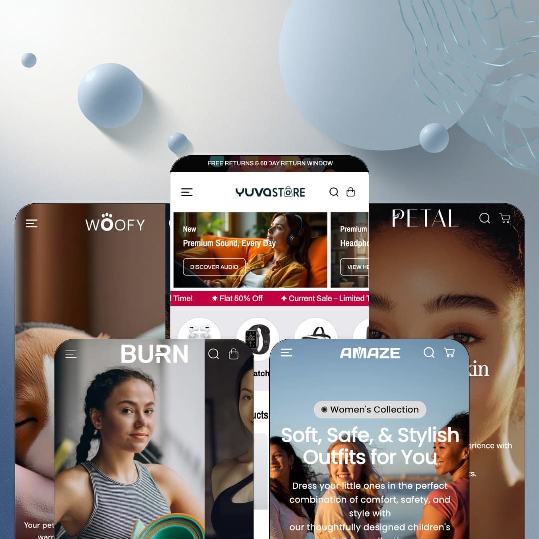
Most premium Shopify themes pick one vertical and build everything around it. Yuva, a $320 Online Store 2.0 theme from Shine Dezign Infonet, goes the other way: five presets spanning electronics, pet supplies, fashion, fitness gear, and skincare, all drawing on the same library of 35+ sections. The theme has lived in the Theme Store since August 2022 and reached version 13.0.4 in January 2026, so this is a mature product rather than a fresh experiment. The real question is whether one engine can carry five industries without any of them feeling like a costume.
Five verticals from one license
Agencies and multi-brand operators get the clearest win here: one $320 purchase yields staged starting points for electronics, pets, apparel, fitness, and skincare that genuinely read as different stores. The presets aren't palette swaps. Header architecture, card design, and section deployment shift per vertical, which shrinks the discovery phase for anyone who builds Shopify stores repeatedly across client industries rather than living inside a single niche.
Product cards that sell before the click
Grid cards in the flagship staging carry three spec bullets apiece ("5-port USB", "Fast Charging", "300 Grams") alongside swatch dots and badge logic. Shoppers filter by attribute at the grid, not the product page. That compresses the compare-and-decide loop for spec-driven electronics and appliance merchants running 100 to 500 SKUs, where buyers weigh battery life and connectivity across a dozen candidates before opening a single listing, and where every avoided click-back keeps momentum alive.
A coordinated promotion kit
Countdown timers, marquee tickers, promo popups with coupon fields, live stock counters, and back-in-stock alerts ship together and function as one conversion bundle rather than scattered toggles. Everything speaks the same visual language. For flash-drop apparel and gadget brands at mid-market price points selling to impulse-oriented buyers, that coherence means a sale event can be staged across the homepage, cards, and popups in an evening instead of being stitched from mismatched parts.
Product pages built for media-heavy selling
The product template carries a "Product Short Videos" carousel with multiple video slots directly on the page, a specifications block listing availability, vendor, and collections, a savings callout that names the discount percentage, and a sticky add-to-cart bar. Video where the decision happens, not buried in a gallery. Brands selling demonstration-dependent products, from audio gear to beauty tools at mid-market prices, get the show-it-moving layout without page-builder surgery.
The design voice is discount-loud
Quiet, this theme is not. Every preset demo runs ticker tape, and even Petal's luxury-skincare staging loops "Flat 25% Off on All Skin Care Products" endlessly above the footer, which kept bugging me the longer I scrolled. Merchants positioned as full-price luxury, think fine jewelry or high-ticket furniture sold to considered-purchase buyers, will spend real setup hours removing urgency furniture and will still feel the theme leaning toward promotion at every staged decision.
No comparison layer for its own flagship vertical
I went looking for a product-comparison section and came up empty. The features list covers tabs, videos, hotspots, and size charts, but nothing that lets a shopper line up two smartwatches attribute against attribute, which is a notable gap for a theme whose flagship preset is a spec-heavy electronics store. Multi-attribute electronics merchants with 100 to 500 SKUs either improvise with image and table blocks or bring in a third-party comparison app on top of the $320 theme spend.
Five packaged locales set the ceiling
Theme interface strings ship translated in English, French, Italian, German, and Spanish. That's it. Shopify Markets handles product-data localization regardless of theme, but button labels, cart text, and form strings beyond those five languages are the merchant's own translation project. Cross-border sellers targeting Dutch, Nordic, or Polish-speaking customers should budget a string-translation pass into launch, because the demos' polished multilingual selectors don't extend the packaged interface languages themselves.
What it takes to launch
Expect a multi-day pass: full copy replacement across five differently flavored demo narratives, market and currency configuration, menu re-staging to match your catalog depth, spec and attribute population so the product cards have real data to display, and a translation review for any locale outside the packaged five.
-
What works in this preset
Land on the demo and a full-width product video carries the opening screen before a single product card appears, with a header stacked three layers deep above it: a category quick-link bar (MOBILES, SPEAKERS, WATCHES), an announcement row cycling shipping and sale messages, and the main navigation beneath. It reads like a busy electronics retailer, on purpose. For a preset built to anchor the whole theme family, that density is a statement of intent, and the demo commits to it from the first pixel down to the five-column footer with its own brand paragraph.
I clicked through the menu panels expecting link lists and found small storefronts instead. The Catalog panel renders full product tiles with prices and sale strikethroughs, the Shop panel splits into collections, a product grid, and a "Fresh looks" rail with imagery, and the New Products panel nests sub-collections with their own product lists. Navigation here does actual selling work. Shoppers can compare speaker prices without ever leaving the header, which shortens the path from "browsing" to "carting" in a way most of this preset quietly optimizes for.
The lower homepage takes an unexpected editorial turn. A scroll-driven timeline walks year markers from 2010 to 2026, pairing each era with an image and a short story block about personal audio, smartwatches, and connected living. It's a history lesson inside a gadget shop. I also noticed the theme wires a small confirmation sound to the add-to-cart action, an audio cue you almost never see in this market, and one that gives the buying moment a tactile edge.
-
What works in this preset
A grooming brand lives or dies on transformation shots, and Woofy stages the theme's before/after slider exactly there: a scruffy pet on one side, the post-bath glow-up on the other, with a draggable divider between them. That's persuasion in a single interaction. It sits among split lookbook blocks that pair one large lifestyle image with a four-product rail, so the emotional image and the purchasable items share one screen instead of living in separate sections the shopper has to connect mentally.
The countdown block earns its place here because it's staged with a purpose rather than as decoration. It frames a ten-percent first-order incentive around the code WOOFY10, ties the urgency to a concrete action, and drops a Buy Now path directly beneath the timer. Simple, coherent, copyable for any pet brand running acquisition offers.
Merchandising gets organized through a tabbed product section that flips between Nutrient Rich, Cozy Sleep, Pet Comforts, and Fresh Meals without a page reload. One section, four selling angles. For a store whose catalog naturally splits into food, sleep, play, and apparel, that single block does the sorting work a shopper would otherwise do through the menu, and it keeps the homepage from ballooning into four separate grids.
Where it stumbles
The theme's own features list includes an ingredients and nutritional information section, and a raw-food and kibble vertical is precisely where that content wins trust, yet Woofy's demo stages plain product grids in the slots where that section would shine. Merchants launching a nutrition-led pet brand will be deploying and populating it themselves rather than adapting a staged example.
-
What works in this preset
Why make a shopper open a product page just to pick a size? Amaze's product cards print tappable size chips (S, M, L, XL) that deep-link straight to the matching variant URL, so a tap on "M" lands on the product page already configured. Color swatch names sit right below. For apparel, where size availability decides the purchase more often than price does, that's grid-level friction removal.
Mid-homepage, the preset embeds a featured-product block that behaves like a compact product page: a full three-axis variant matrix across size, color, and material, sold-out states marked per combination, a quantity stepper, and a stock warning reading "Hurry, only 5 items left in stock!" wired to the live inventory figure. It demonstrates how far the theme's variant rendering stretches when a catalog runs deep option sets, and it doubles as a hero-product conversion play for drop-style launches.
Social proof and brand voice get their own machinery here. The testimonial carousel attributes each quote to a named storefront, and an editorial tab block rotates four brand-story registers (Timeless Style, Style Statements, Iconic Wear, Latest Trends) inside one section. Fashion brands get a voice box, not just a grid.
Where it stumbles
For a catalog that spans menswear, womenswear, outerwear, and activewear, the demo stages a five-link header with no category depth at all. The theme's fuller menu build exists, as the flagship preset shows, but here the re-staging toward it is day-one merchant work rather than a starting point you inherit.
-
What works in this preset
Burn flips the header register entirely: navigation collapses into a side drawer behind a single trigger, leaving the logo, search, and cart alone on the bar. Same theme, opposite temperament. That range matters, because it means a merchant choosing between a dense retail header and a stripped boutique one is choosing a setting, not a different theme, and Burn is the proof staging for the minimal end.
Deal merchandising is this preset's loudest muscle. A card grid stamps percentage badges (40% OFF, 60% OFF, 30% OFF) onto category imagery, a tabbed "Today's Hot Deals" block rotates rails for Active Essentials, Flex Fit Tops, and Sweatproof Tops, and a seasonal countdown anchors the mid-page. For sale-driven fitness retail, the staging hands you the whole promotional playbook pre-assembled.
The preset also fires the theme's popup machinery hardest: a newsletter overlay with its own imagery and a coupon hook greets the session, stacking an email capture on top of the on-page offers. Aggressive, yes. But it demonstrates the popup and coupon tooling in live context rather than leaving it to the feature list.
Where it stumbles
Count the urgency devices on this one homepage: repeated marquee tickers, a countdown, percentage badges on nearly every card, plus the entry popup. Gyms sell intensity, but premium technical-apparel brands selling full-price performance gear to considered buyers will spend their first afternoon thinning this staging rather than building on it.
-
What works in this preset
Petal opens with a bento-style image grid: five tiles of unequal sizes, each carrying its own headline (Nourish Your Skin, Glow Up Sale, Treat Your Skin Like Royalty) and linking out to campaigns. It's the most editorial hero in the family. Skincare shoppers browse by mood and concern more than by category tree, and the grid format maps to that behavior better than a single banner ever could.
Right under the hero, a brand-logo marquee loops five press-style logos across the screen, the classic "as seen in" trust pattern staged as a native section rather than a custom build. It's a small thing. It's also exactly the credibility furniture a new beauty brand usually hacks together with an image block and hopes nobody inspects too closely.
Collection merchandising takes a trio format here: Glow Serums, Hyper Glowy Skin, and Hydration Heroes each front their own product carousel, while a separate tabbed "Fresh Face Finds" block flips between Brightening Boost and Glow Serums line-ups. The staging shows the same product data cut three different ways, which is a useful preview of how much mileage a compact skincare catalog can get from the section library without repeating itself visually.
One engine, five believable identities
Read all five demos back to back and the impressive part isn't any single section, it's the range of the same machinery. The header alone swings from a triple-decked build with product tiles inside its panels to a bare side drawer, and card anatomy reshapes itself from spec bullets to size chips to clean minimalism depending on the vertical. That chameleon quality, visible only across the full preset family, is what separates a real multi-vertical theme from one demo re-skinned four times.
Maturity without stagnation
Four years in the Theme Store, thirteen major versions, and a January 2026 release that still adds sections signal a developer treating this as a living product. The demos themselves carry recent asset updates rather than 2022-era staging. For a buying decision that locks you into a codebase for years, that maintenance trajectory is worth as much as any individual feature.
Mobile assets are staged, not shrunk
Across the presets, hero and banner slots ship with dedicated mobile image variants uploaded separately from their desktop counterparts, and the demos consistently use them. Small detail, meaningful signal. It shows the intended workflow treats the phone screen as its own composition, and the drawer-based menu patterns across the family back that up.
The engine has one temperament
Beneath five palettes sits one recurring spine: hero, ticker, product rail, countdown, testimonial carousel, value-prop row, footer. Differentiation between presets comes from imagery and typography more than from page architecture. Brands wanting an editorial-led structure, where longform storytelling drives the page and commerce interrupts it rather than the reverse, will keep meeting the same conversion skeleton no matter which preset they start from.
Density is the default
The demo homepages routinely stack fifteen-plus sections, with the same product carousels reappearing under different headings down the page. The theme's natural gravity is always toward more, and nothing in the staging models restraint. Restraint is entirely the merchant's job, and merchants who don't exercise it will ship heavy, repetitive homepages that bury their own best sections.
★ 8.2/10
Rating
-
35+ sections, a full promotion toolkit, and Plus-tier extras like quantity pricing and combined listings; the missing comparison capability costs it the top bracket.
9
-
Staged presets shorten the start, but the sheer section count and the promotional defaults demand active curation decisions from day one.
8
-
Dedicated mobile banner assets per slot and drawer-based navigation across presets; touch-friendly card chips carry variant selection to small screens.
8
-
Image lazy-loading is in place, but the demos favor long, media-dense homepages with multiple videos and looping tickers that reward merchant-side trimming.
7
-
Five visually distinct registers from one settings layer, with header, card, and section deployment all reshaping per vertical.
9
Frequently Asked Questions
-
Online Store 2.0. It launched in August 2022 and reached version 13.0.4 on January 28, 2026, with the release notes still adding new sections and settings.
-
Yes, the license covers one store and the presets are alternative starting configurations of the same theme. Switching presets later means re-staging your content, not buying again.
-
Two features: quantity pricing and combined listings are flagged Plus-only on the feature list. Everything else runs on standard plans.
-
Dawn gives you one neutral preset and a compact section list at no cost; Yuva's $320 buys 35+ sections plus five pre-staged vertical builds you would otherwise assemble and style by hand. The trade is money for staging time and promotional tooling.
-
Yes, at theme level. That matters for supplement, CBD-adjacent, or other age-sensitive catalogs that would otherwise need an app just to gate entry.
-
Shine Dezign Infonet, with support through their contact portal and hosted documentation at shinedezigninfonet.com. The developer has multiple themes in the Shopify Theme Store.
This review is based on hands-on testing of the publicly available preset demos of the Yuva Shopify theme as of July 2026. Theme features, preset availability, and performance can change with subsequent updates from the theme developer.