
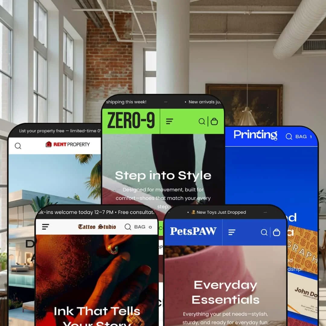
The Zero theme is marketed as a versatile Shopify template with a clean aesthetic and rich merchandising options. Across its five presets it supports quick‑view modals, slide‑out carts, product tabs, video and before/after sliders, and a wide range of content blocks. During testing the theme’s universal framework proved flexible: announcements can appear across the top, navigation can be vertical or horizontal, and the same quick‑add logic adapts to single‑SKU and multi‑variant products. Built‑in components such as testimonial sliders and blog teasers help merchants tell their brand story.
Pros.
〰️
Pros. 〰️
✚ Flexible presets, consistent core
flexible preset options that maintain core functionality while offering distinct aesthetic approaches. Across the demos, the framework supports different navigation orientations, including vertical and horizontal patterns, without forcing merchants into a single storefront shape. That makes it easier to start from a preset that matches a niche, then keep building with a consistent underlying structure.
✚ Merchandising options built around quick shopping choices
Zero’s buying flow is designed to support quick interaction from product grids, with a quick‑add logic that can work for both single‑SKU and multi‑variant products. In presets where the modal experience is fully expressed, shoppers can make selections like colour and size before adding to the cart, which reduces the need to bounce in and out of product pages. The net effect is a storefront that can feel more “browse and buy” than “browse then research.”
✚ Cart drawer that stays close to the shopping moment
The slide‑out cart is treated as a central part of the experience. Adding an item opens a cart drawer that keeps key controls nearby, including item thumbnails, quantity adjustments, remove actions, cart notes, and checkout options. Because it stays accessible across the storefront, it supports a faster loop between browsing and checkout, especially for shoppers adding multiple items.
✚ Tabbed merchandising sections that keep browsing lively
The theme supports product tab structures that let merchants spotlight multiple groups in a compact space. In the Default demo, the tab interaction updates the grid without requiring a full page reload, keeping attention anchored in the section. This pattern can make the home page feel more interactive, while still keeping the shopper inside a predictable browsing rhythm.
✚ Storytelling blocks that go beyond static imagery
Across the demos, the theme leans into content blocks that support narrative selling, including video sections and before and after comparisons. It also includes components such as testimonial sliders, blog teasers, and on‑page FAQ structures, which help merchants add trust and context without immediately turning to apps. For shoppers, these sections can make the storefront feel like a brand site, not only a product list.
✚ A preset that demonstrates service and lead‑capture adaptation
The Property preset shows that Zero can be styled into a service‑oriented marketplace experience. Listing cards emphasize comparative details, and the product page structure can replace purchase intent with inquiry intent through a contact and booking form. For merchants who sell services, rentals, or high‑consideration offerings, that flexibility can matter as much as product merchandising.
Cons.
〰️
Cons. 〰️
🚫 Cart drawer dismissal behavior can create friction
In multiple presets, the cart drawer’s “Continue shopping” action does not close the drawer. Shoppers have to use the small close control instead, which is a minor but repeated interruption during browsing. When the cart is meant to be a fast waypoint, that extra step can make the flow feel less polished.
🚫 Some demo pages appear mis‑linked or incomplete
During testing, some preset navigation to informational pages returned a 404‑style failure rather than a working page. That does not necessarily reflect the theme’s capability, but it does raise the practical need to verify optional pages during setup. Merchants should treat page integrity as part of launch readiness, not as an assumption.
🚫 Quick view consistency varies by preset
The quick view experience is not uniform across all demos. In one preset it behaved more like a route to the product page, and in another it showed noticeable loading delay before the modal appeared. For shoppers, that inconsistency can weaken trust in the “quick peek” promise, especially when they expect the same interaction across the storefront.
-
The Default preset is positioned for sportswear and athleisure, leaning into a vibrant colour palette and an energetic merchandising rhythm. Its layout is built around a left‑side vertical navigation, supported by multiple product grids and dynamic promo sections that keep the home page feeling busy and commercial.
What works in this preset
The first thing this preset gets right is tone. The vibrant palette and athletic styling communicate “performance” quickly, which helps the storefront feel aligned with sports categories and fast‑moving seasonal drops. It looks like it is meant to sell active products, not just display them. That clarity can help shoppers understand what kind of brand they are in within the first scroll.
The left‑side vertical navigation is the other defining choice. Instead of tucking categories into a standard top header, the preset keeps navigation oriented to the side, which creates a more catalogue‑like browsing posture. For shoppers, that can feel structured, especially when the store is carrying multiple lines and sub‑categories. For merchants, it also gives the page a distinctive silhouette compared with more typical horizontal headers.
This demo also leans into density. Multiple product grids and promo sections create a strong sense of merchandising momentum, with enough “surface area” to highlight different collections and campaigns without forcing shoppers into a single hero narrative. The overall result is a home page that behaves like a storefront wall: lots to look at, and plenty of cues that browsing is encouraged. That can be a good match for stores that win on range and variety.
-
The Wag preset is designed for pet supplies, with playful typography and warm colours that push it toward lifestyle branding rather than strict catalog utility. It swaps the vertical menu for a standard horizontal header and leans more heavily on imagery that sells the feeling of ownership, not only the products.
What works in this preset
Wag’s strongest preset‑specific advantage is its friendliness. The playful typography and warm colour choices make the store feel approachable, which fits categories that are often emotional purchases. It reads less like a warehouse and more like a brand with personality. That kind of tone can help shoppers stay engaged, even before they have a specific item in mind.
The shift to a standard horizontal header also changes the shopping posture. It feels more familiar than the vertical navigation used elsewhere, which can reduce the amount of “learning” required for first‑time visitors. In a category where browsing can be casual and gift‑like, this conventional structure can help the storefront feel immediately navigable. It also supports the preset’s broader goal of keeping the page light and lifestyle‑led.
Finally, this demo emphasizes imagery that frames products in context. The lifestyle focus helps position items as part of daily routines and pet moments rather than isolated SKUs. That presentation can work well for brands that rely on visual storytelling and emotional cues. It also fits merchants who want the home page to feel more like a lookbook than a strict product directory.
Where it stumbles
In the demo experience, most products are marked sold out. That makes it difficult to get a complete sense of how a shopper would move from discovery to purchase, because the store repeatedly signals that the inventory is unavailable. It also leaves the overall page feeling thinner than the layout intends, since the grid is dominated by unbuyable items. Even if this is only a demo content issue, it affects how confidently the preset can be evaluated from the public storefront.
The home page also repeats the newsletter sign‑up mid‑page and again in the footer. On a short landing page, that duplication can feel repetitive rather than supportive, especially when the shopper has not yet been given a strong reason to subscribe. The result is a minor friction point where the page feels slightly over‑prompted. It is not a structural flaw, but it does interrupt the otherwise easygoing presentation.
-
The Printing preset is designed for on‑demand printing services, with bright colours, clear pricing cards, and multiple section headings that frame the store as a service catalog. It emphasizes breadth of offering and category clarity, which helps it fit businesses selling print types rather than a narrow set of consumer products.
What works in this preset
This preset does a strong job of presenting variety as a selling point. Categories such as business cards, flyers and brochures, stickers, packaging, apparel prints, and wedding essentials are highlighted with images and visible product counts. That approach makes the store feel like a menu of services rather than a single product line. For shoppers who arrive with a general need, it helps them self‑select the right starting point quickly.
The visual system is also tuned to practical decision‑making. Bright colours and pricing‑oriented cards create a storefront that feels transactional, not purely editorial. Multiple section headings reinforce the idea that the store is organized into clear offerings, which suits printing where shoppers often compare formats and use cases. The overall page structure reads as “choose what you need,” rather than “discover a brand story.”
Navigation is also treated as a functional tool in this preset. The hamburger menu reveals a slide‑out panel, and the header design supports easier access to categories through a multi‑row feel. The navigation pattern fits stores that expect repeat customers or frequent category switching. It positions the preset as a working storefront for service buying, not just a visual template.
-
The Tattoo preset is built around a bold, edgy aesthetic, using black backgrounds, red accents, and line‑art illustrations to frame the brand as a studio first and a shop second. It combines service‑style messaging with product presentation, which makes it feel closer to a portfolio site that also sells items.
What works in this preset
The preset’s biggest differentiator is its atmosphere. The dark background and sharp red accents create a high‑contrast, nightlife‑adjacent tone that fits tattoo culture and art‑driven brands. The line‑art illustration styling reinforces that identity, making the site feel curated rather than generic. If your brand depends on edge and attitude, the design decisions here are aligned from the start.
It also blends two modes of communication in a way that feels intentional for the niche. The preset does not present products in isolation; it situates them alongside service‑oriented content, which helps the store read like a studio presence rather than only an online shop. That mix can support artists who sell flash sheets or prints while still needing to communicate studio expectations. It turns product browsing into part of a broader brand narrative.
Product pages in this preset are structured with service messaging in mind. Sections for booking and deposits, touch‑ups and longevity, refund policy, and shipping policy are presented in collapsible panels, so detailed information is available without turning the page into a wall of text. For shoppers, that can reduce uncertainty because key policies and expectations are surfaced in a predictable structure. For a studio, it also supports fewer “what should I expect” questions before a customer commits.
-
The Property preset shifts the theme into a real‑estate and rental marketplace presentation. Unlike the other presets, it focuses on listings rather than traditional add‑to‑cart commerce, which makes it a functional departure rather than a simple restyle.
What works in this preset
The listing cards are the clearest preset‑specific win. Each property card displays a photo, price, bedrooms, bathrooms, and square footage, so shoppers can compare options directly from the grid. Categories are organized into Residential, Commercial, and Plots and Shops, which helps the catalog feel segmented and purposeful. The overall experience reads like browsing a marketplace rather than a product collection.
Property pages are also designed as lead‑generation endpoints. Instead of an add‑to‑cart module, pages use a contact or booking form with fields for name, a service dropdown, phone, email, and message. That structure supports inquiries and follow‑ups, which fits the reality of rentals and services where checkout is not the goal. It makes the preset workable for agencies and service‑based merchants who need leads more than transactions.
This preset also gives informational depth a dedicated structure. Collapsible panels cover description, amenities, application and viewing, and policies, and the page uses icons to reinforce ideas like verified listings, instant tours, and transparent pricing. That pattern supports shoppers who need reassurance and detail before they reach out. It also helps the page feel complete even without a cart flow, because the content does more of the persuasion work.
Where it stumbles
As configured in this preset, there is no shopping cart or checkout flow. That is consistent with the real‑estate positioning, but it makes the preset unsuitable for merchants selling physical goods or expecting direct transactions. If your business needs standard ecommerce purchase steps, this preset’s structure is the wrong starting point. It is best treated as a lead‑capture template, not a product storefront.
Niche Suitability
Not Ideal For
-
Zero is best suited to merchants who prioritize immersive visuals, strong merchandising presentation, and a theme that can flex across niches without rebuilding the entire storefront concept. It is a natural fit for brands selling fashion, print services, and creative products, and it also has a clear path for service and lead‑generation use cases as demonstrated by the Property preset.
-
If your store depends on highly complex product options, or if you require a perfectly consistent modal shopping interaction across every preset without additional verification, you may want a theme with a tighter, more uniform implementation. Merchants who need custom form handling as a primary conversion mechanism should plan for additional setup and testing during launch.
-
Medium — The built‑in sections cover most needs. Merchants should test forms, verify optional pages, and tailor each preset’s styling to their brand.
Final Recommendation
★ 8.0/10
Rating
-
Strong quick view, cart drawer behavior, and rich content blocks, with some demo pages appearing mis‑linked.
8
-
Navigation is intuitive and product grids are clean, but quick view behavior is not consistent across the demos.
7
-
Icons and buttons remained accessible on smaller screens, and key browsing elements stayed usable, although some overlays took time to load.
8
-
Pages loaded quickly and animations were smooth, with a noticeable delay appearing at times when opening quick view in the Tattoo demo.
8
-
Multiple presets cover very different industries, and the theme’s section and block approach supports broad styling variation.
9
FAQ
〰️
FAQ 〰️
-
👑 Yes. The Default preset uses vertical navigation and tabbed merchandising with colour swatches, which fits fashion and sports gear presentations.
-
📱Overall, the demos adapted cleanly to smaller screens, with key interactions remaining usable. In the Wag preset, the search overlay and product cards remained workable when viewed on mobile.
-
🎨 Very flexible. Sections support image, colour, and typography changes, and the presets offer different layouts, from clean sports styling to bold tattoo graphics.
-
⚡ In testing, pages loaded quickly and animations were smooth. The main lag observed was a delay when opening quick view in the Tattoo preset.
-
👕 Yes. In demos where quick view is fully modal, shoppers can select options such as colours and sizes directly from the grid before adding to the cart.
-
🔎 Zero follows Shopify SEO best practices with editable meta fields and semantic headings. Built‑in blog and FAQ sections also support content publishing without changing the theme structure.
-
💱 Yes. Shopify’s native language and currency switchers can be enabled, and the theme’s header and footer layouts have space to accommodate those elements.
-
⚙️ Yes. As a Shopify theme, Zero supports standard app integrations, and merchants can add review apps or booking plugins as needed.
-
🛒 Yes. The draft notes that the official demos for each preset are publicly available to explore, and it also states that the Shopify Theme Store allows merchants to trial the theme on their store before purchasing.
This review is based on hands‑on testing of the publicly available preset demos of the Zero Shopify theme as of 11 December 2025. Theme features, preset availability, and performance can change with subsequent updates from the developer.