
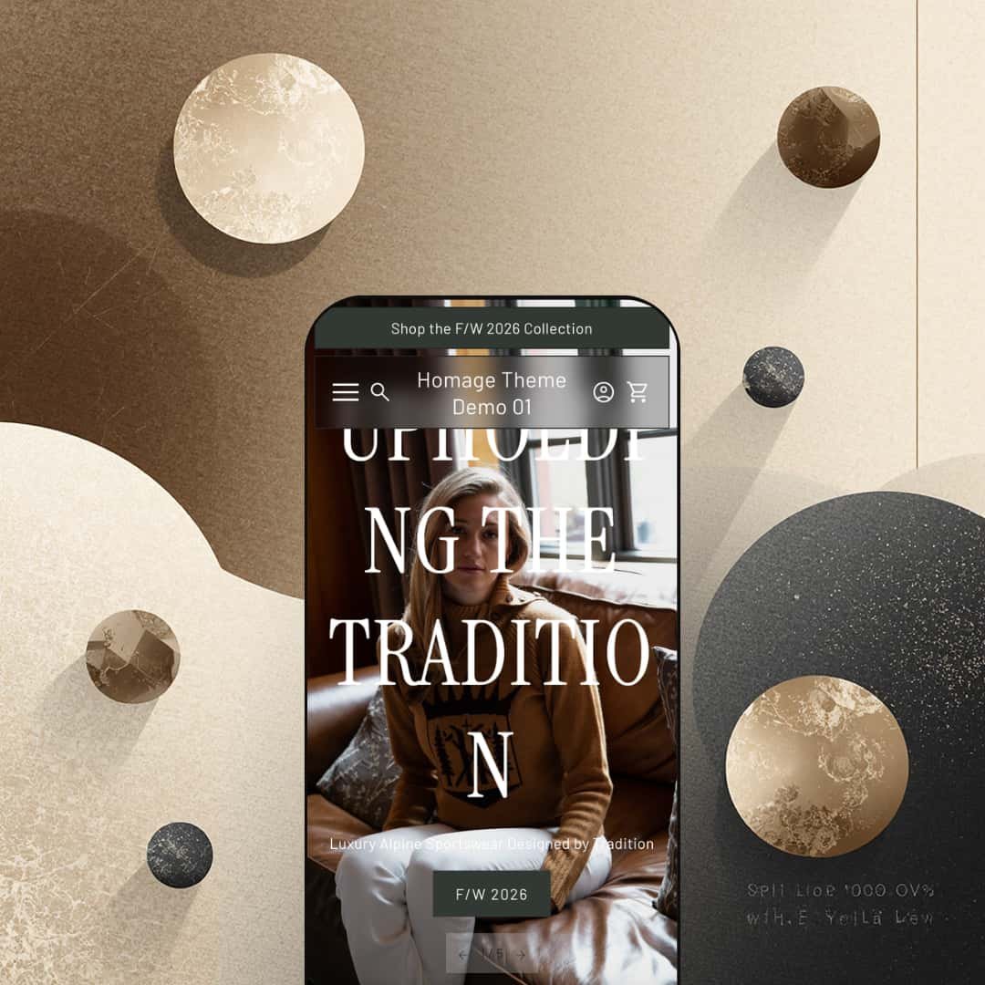
Homage costs $250 and it wants you to forget you're shopping. Built by the London-based studio Ourselves, this editorial-first Shopify theme leans so heavily into full-bleed photography, cinematic video, and lookbook layouts that the browsing experience feels closer to paging through a fashion magazine than scrolling through an online store. Quick buy with inline variant pickers, image rollover, color swatches, a press coverage block, an accordion FAQ builder, and in-store pickup support are all baked in. The product page goes further still, layering customer testimonials with names and locations between accordion spec tabs and embedded video. It ships with a single preset, which puts more upfront work on the merchant but also signals a clear design point of view: Homage isn't trying to be everything to everyone.
Pros.
〰️
Pros. 〰️
✚ Quick buy that doesn't break the editorial flow
Most themes force a trade-off: either the shopping experience is fast and transactional, or it's atmospheric and editorial. Homage sidesteps that. Hover over a product card and a bolt icon appears. Click it, and color swatches plus size buttons expand right on the card. No modal, no page redirect. Shoppers who already know what they want can add to cart without leaving the grid, while first-time visitors still get the full visual presentation. It's a smart piece of interaction design that lets the editorial pacing breathe without sacrificing conversion speed.
✚ A product page built for storytelling
The Ascent Shell product page is the best example of what Homage does differently. Eight zoomable images. Accordion tabs that collapse Features and Benefits, Care Instructions, and Shipping and Returns into clean sections. A customer testimonial wedged between spec blocks, complete with the reviewer's name, city, and a lifestyle photo. Then a full-width video. Then a secondary brand story section titled "About our clothing." It reads like a product editorial, and it gives merchants a serious toolkit for building purchase confidence without relying on third-party review apps or custom code.
✚ Editorial sections that reduce app dependency
Where most themes stop at grids and slideshows, Homage ships with purpose-built storytelling sections. The press coverage block lets you drop in publication logos and pull quotes, which is instant credibility for any brand with media mentions. There's a dedicated retail locations page template with a partner logo grid. A horizontal image marquee for visual pacing. Lookbook-style collection reveals. Full-width video blocks. Taken together, these aren't just layout options; they're an editorial toolkit that handles brand-building tasks merchants would normally need apps or custom development for.
✚ Product cards that earn their keep
Image rollover across the grid reveals a second product shot on hover, which helps shoppers evaluate items at a glance. Sale badges show the exact discount percentage rather than just a strikethrough price. Color swatches sit on the card for multi-variant products. Individually, none of these are unique to Homage. But combined, they make the product cards surprisingly information-dense for a theme that prioritizes aesthetics. Shoppers get real buying signals without the grid ever feeling cluttered.
Cons.
〰️
Cons. 〰️
🚫 One preset, more setup work
At $250, most Shopify themes ship with two to four presets covering different color palettes, industries, or layout approaches. Homage gives you one. The theme editor has plenty of flexibility, but there's no second starting point to reference, remix, or fall back on. Merchants who prefer to pick a preset close to their vision and tweak from there will find the initial setup slower than expected.
🚫 The search overlay tries to do too much
Clicking the search icon doesn't open a focused search bar. It opens a full-screen overlay that displays the complete site navigation alongside the search input. For brands with small catalogs and simple menus, that's fine. But for stores where search is a primary discovery tool, showing the entire nav structure alongside the search field adds noise. Shoppers who just want to type a product name and see results have to mentally filter out everything else on screen.
🚫 A buried link on the featured product section
The homepage's inline featured product block packs in a full description, size selector, and add-to-cart button. Useful. But the "View full details" link sits at the very bottom, below the entire description. Shoppers who want to see the full gallery or read more about the product have to scroll past content they haven't committed to yet. A link near the product title or image would make that path more obvious.
🚫 Footer links hidden behind accordions
The footer tucks its three link columns behind accordion toggles. On mobile, that's reasonable. On desktop, where there's plenty of room to show all three columns at once, it adds a click to every footer interaction. Visitors looking for policy pages, support links, or collection shortcuts have to expand each group individually. It's a small friction point, but it's the kind of thing that's noticeable once you start looking for specific information.
-
The Homage preset is staged as a luxury alpine sportswear brand. Every section of the homepage reinforces editorial storytelling: cinematic hero banners, full-width collection reveals, and an unusually long scroll that reads more like a brand lookbook than a product catalog. It targets premium apparel, heritage goods, and lifestyle brands with high average order values.
What works in this preset
The homepage opens with something you rarely see in Shopify themes: five full-width hero banners stacked in sequence, each dedicated to a single collection. Ascent gets its own cinematic moment. So do Originals, High West, and American Alpine. Each banner pairs a large lifestyle photograph with a headline, a short tagline, and one CTA. The effect is closer to a brand campaign than a conventional product feed. Visitors scroll through what feels like a curated editorial before they ever hit a product grid, and for premium brands that want to control the narrative arc of a first visit, that pacing is the entire point.
In this preset demo, the product grid is staged as a curated "Staff Picks" section rather than a standard collection layout. Product cards surface a bolt icon that reveals inline color swatches and size buttons right on the card. Hover over an item and the image swaps to a flat-lay product shot while sale items show calculated discount percentages alongside the original price. The overall card presentation manages to feel editorial without sacrificing buying convenience, which is a tricky line to walk.
The palette and typography in this preset are doing a lot of the heavy lifting. Headings, taglines, and CTA labels all use a refined serif face that reinforces the heritage-luxury positioning, while the color story stays restrained: ivory, stone, charcoal, with the occasional warm accent. The photography carries the visual weight, and the type and color choices know to stay out of the way. For fashion, heritage outdoor, or artisanal brands, this preset's mood would work with minimal customization.
Between the collection hero stack and the category cards, a looping horizontal image marquee repeats a brand tagline across multiple lifestyle photos. It's a small touch, but it breaks up the vertical scroll rhythm nicely and introduces a sense of motion without relying on autoplay video. It acts as a visual divider between the campaign-style upper homepage and the product-focused lower sections, which helps with scroll fatigue on a page this long.
The About page opens with a full-width video hero followed by long-form brand narrative prose, embedded journal articles, and a secondary video block. The Locations page presents retail partners as a clean grid of logos, city names, and store names staged below a large hero image. Both pages show what Homage can do beyond commerce: give brands a magazine-quality content hub that sits right alongside the shop.
Where it stumbles
The homepage is long. Really long. Five hero banners, a marquee, category cards, a Staff Picks grid, a featured product module, a press section, a masonry gallery, a testimonial carousel, a newsletter signup, a blog feed, and a full collections grid all sit between the header and the footer. For a brand with deep collections and a rich content library, that density makes sense. But merchants with smaller catalogs or less editorial material will struggle to fill every section meaningfully. And because the layout's rhythm depends on that fullness, pulling sections out to shorten the page isn't as simple as toggling them off.
Niche Suitability
-
Homage is ideal for premium apparel brands, heritage goods companies, luxury lifestyle labels, and brands with strong editorial photography and media coverage to showcase. If your brand story is as important as your product catalog and you have the visual assets to back up a long-scroll homepage, this preset's staging will feel natural.
Not Ideal For
-
It's not ideal for high-SKU stores that need dense product grids and rapid browsing, discount-oriented shops, or merchants who don't have the kind of lifestyle photography this theme's full-width sections demand. The editorial density of the homepage requires a deep content library, and not every store will have that at launch.
-
Merchants selling premium, story-driven products who want their Shopify store to feel like an editorial destination rather than a transactional catalog. Fashion brands, heritage outdoor labels, artisanal goods companies, and luxury DTC brands will find the most value here.
-
Stores with large, commodity-style catalogs, budget-focused brands, or merchants without access to professional lifestyle photography will struggle to fill this theme's visual framework. If speed of setup matters more than narrative depth, a theme with multiple presets and a shorter homepage structure would be a better fit.
-
Medium-High. You'll need strong photography, thoughtful copy, and a clear brand narrative before you start building. The single preset means more manual customization than themes that let you pick a look and refine from there.
Final Recommendation
★ 7.0/10
Rating
-
Quick buy with inline variant selection, image rollover, accordion product tabs, press coverage blocks, FAQ builder, in-store pickup, and video support provide a comprehensive toolkit. Shopify's standard filtering and sorting is presented cleanly on collection pages.
8
-
One preset and a content-heavy homepage mean merchants need strong photography and copy ready before setup. The building blocks are flexible, but the initial effort is higher than average.
6
-
Navigation collapses into an accordion-based mobile menu, images scale well, and the layout translates to smaller screens. The homepage's length becomes more noticeable on mobile where scrolling is the primary interaction.
7
-
Pages loaded with smooth transitions and no noticeable lag during testing. The heavy use of full-width images and embedded video means image optimization will matter in production.
7
-
Video, image galleries, lookbook layouts, testimonial carousels, press sections, FAQ accordions, and multiple product grid styles are all available. The single preset and strongly editorial default aesthetic may take more work to adapt for non-lifestyle use cases.
7
FAQ
〰️
FAQ 〰️
-
👑 That's exactly what it's designed for. The editorial layouts, lookbook sections, and inline color swatches on the Staff Picks grid are tailor-made for brands that want to present clothing through lifestyle storytelling. If you're selling fast fashion on price alone it's probably overkill, but for brands with a visual identity to protect, it fits.
-
📱Well. The navigation switches to an accordion-based mobile menu, and the full-width hero images scale down without breaking the layout. During testing on the Ascent Shell product page, the image gallery, variant selectors, and accordion tabs all stayed functional and properly spaced. The main caveat is page length: that long editorial homepage requires a lot of thumb-scrolling on mobile.
-
🎨 Yes, though it takes more effort than average. The theme editor gives you control over typography, colors, section order, and layout blocks. You can swap in your own video, photography, and copy across every editorial section. The catch is there's only one preset to start from, so you won't have a second design direction to reference while building.
-
⚡ Page transitions felt smooth during testing, and interactive elements like the quick buy variant selectors responded without any noticeable delay. That said, the demo leans heavily on high-resolution imagery and embedded video. In a real store, your load times will depend on how well you optimize your media assets.
-
👕 Confidently. On the homepage Staff Picks grid, color swatches and size selectors appear directly on each product card, so shoppers can pick a variant without leaving the page. On the product page, variant options display as clickable buttons with clear visual feedback when selected. During testing on the Ascent Shell, switching between colors updated the images immediately.
-
🔎 Homage follows Shopify's standard SEO structure with clean heading hierarchy, proper URLs, and meta field support. The breadcrumb navigation helps search engines understand site architecture, and the built-in blog (staged as "The Journal" in the demo) supports long-form content marketing right out of the box.
-
💱 Language and currency switching is handled by Shopify Markets, not the theme itself, so that works the same way regardless of which theme you install. What Homage does contribute is right-to-left layout support, which is listed in its official feature set. The demo footer cleanly integrates the language and currency selectors without disrupting the editorial design, so the presentation holds up even with those extra elements visible.
-
⚙️ Homage runs on Shopify's Online Store 2.0 architecture, so it supports app blocks and section-based app integrations. The demo already uses native features like Sign in with Shop and in-store pickup. You can place app blocks through the theme editor the same way you would with any 2.0 theme.
-
🛒 Absolutely. Shopify lets you install and customize any theme in your store without paying until you publish. You can also explore the live demo to get a feel for the layouts, interactions, and overall pacing before committing the $250.
This review is based on hands-on testing of the publicly available preset demos of the Homage Shopify theme as of March 15, 2026. Theme features, preset availability, and performance can change with subsequent updates from the theme developer.