
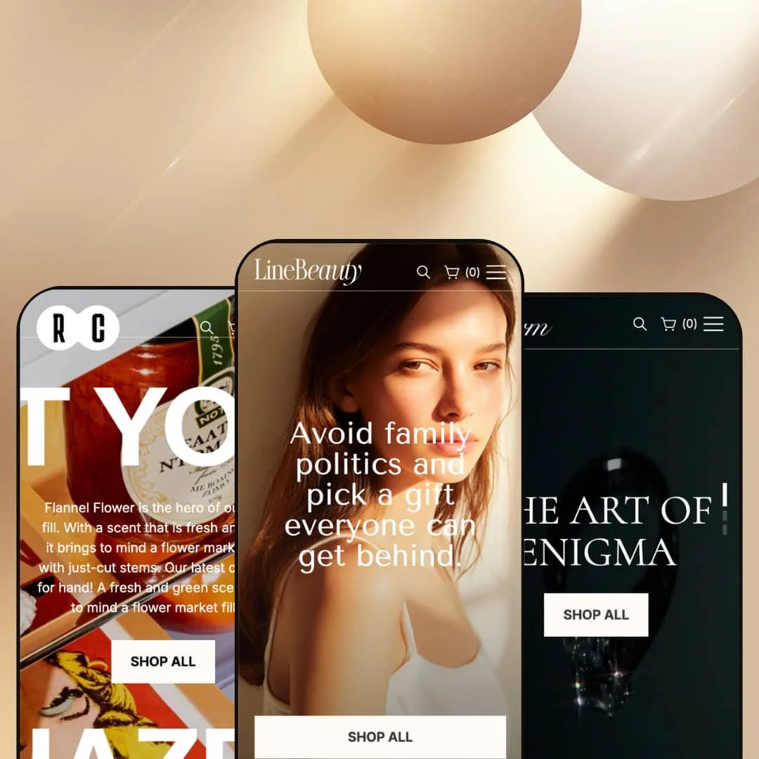
Line is built around big visuals and section-based storytelling, but the demos don’t lose the shopping journey in the process. Across Default, Charm, and Snacks, the first screen tends to push a single primary action, then quickly hands shoppers a collection or featured-product context so they can start browsing without hunting. The presets feel intentionally different in mood, yet they follow a familiar rhythm: hero, product discovery, then supporting content like promos, brand context, or editorial links.
Pros.
〰️
Pros. 〰️
✚ Merchandising sections that support campaigns
Line shows a wide range of promotional and storytelling modules across the presets, including time-based promotions, benefit-led blocks, and visual merchandising sections. The practical upside is flexibility: you can stage a homepage for launches, seasonal pushes, or brand storytelling without relying on a single “best practice” layout. It also makes the theme feel suited to stores that change messaging often.
✚ Structured product detail presentation
The demos consistently keep deeper product information organized, so pages can be long without feeling messy. Important details are staged in a way that encourages scanning, which helps reduce hesitation on higher-consideration purchases. When the product page stays readable, it’s easier to convert shoppers who are comparing multiple options.
✚ Search that behaves like navigation
Search is treated as a real browsing surface, not a bare input field. The results layout is organized so shoppers can separate product discovery from other site content, which supports stores that publish editorial or informational pages alongside products. It’s a small detail that can make a store feel easier to explore.
✚ Flexible presets, consistent core
Flexible preset options that maintain core functionality while offering distinct aesthetic approaches. The three demos demonstrate distinct moods while keeping the underlying shopping journey familiar. That matters if you want to start with a preset that matches your niche today, then re-style later without rebuilding the store from scratch. In practice, it reduces the risk of “pretty preset, wrong workflow.”
Cons.
〰️
Cons. 〰️
🚫 Layered UI needs disciplined merchandising
The theme leans into overlays, drawers, and section stacking, which can be a conversion advantage but also increases the cost of clutter. If too many sections compete for attention, the site can start to feel busy, and the shopper’s next step becomes less obvious. Merchants will get the best results by curating sections rather than copying the demo density.
🚫 Non-product business models are not showcased in these demos
These demos stay focused on direct product sales and content. If your main journey is built around memberships, bookings, events, or gated access, you’ll likely be leaning on apps and custom page builds to create that experience. The theme may still support it, but the demos don’t present it as a default path.
-
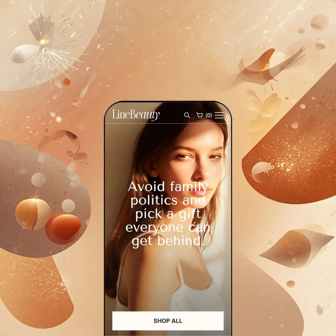
Default is staged like a modern personal-care or wellness storefront, where shoppers are expected to browse by feeling and routine rather than SKU codes. The page mix leans into product discovery first, then layers in supporting content that answers “why this brand” without forcing a deep click path.
What works in this preset
The opening sequence is designed to get a visitor into shopping mode fast. The hero area keeps the call-to-action simple, so the first decision is straightforward rather than a menu puzzle. That’s useful when your traffic is cold and you want the homepage to behave like a landing page, not a catalog index.
Mid-page merchandising is where this demo shows its personality. A flash-sale style section is staged as a time-boxed promotion, which makes the offer feel concrete and anchored to actual products instead of floating as generic urgency copy. It’s the kind of layout you can reuse for launches, seasonal campaigns, or short discount windows without rebuilding the entire homepage.
Default also spends more time than the other demos on reassurance and education. Value-prop style blocks and an article-style section appear as part of the core scrolling experience, which supports brands that sell through ingredients, routines, or before-and-after expectations. The result is a homepage that can do double duty: conversion-oriented, but still capable of feeding content-led discovery.
Where it stumbles
In this demo staging, the homepage is section-dense. If a merchant copies the structure as-is, it can be easy to dilute the “one next step” clarity that the hero sets up. The fix is more curation than redesign, but it’s worth planning for.
During this testing run, I didn’t hit repeatable usability breaks in the Default demo’s main shopping flow. Any friction felt more like “too much on the page” than something failing to function.
-
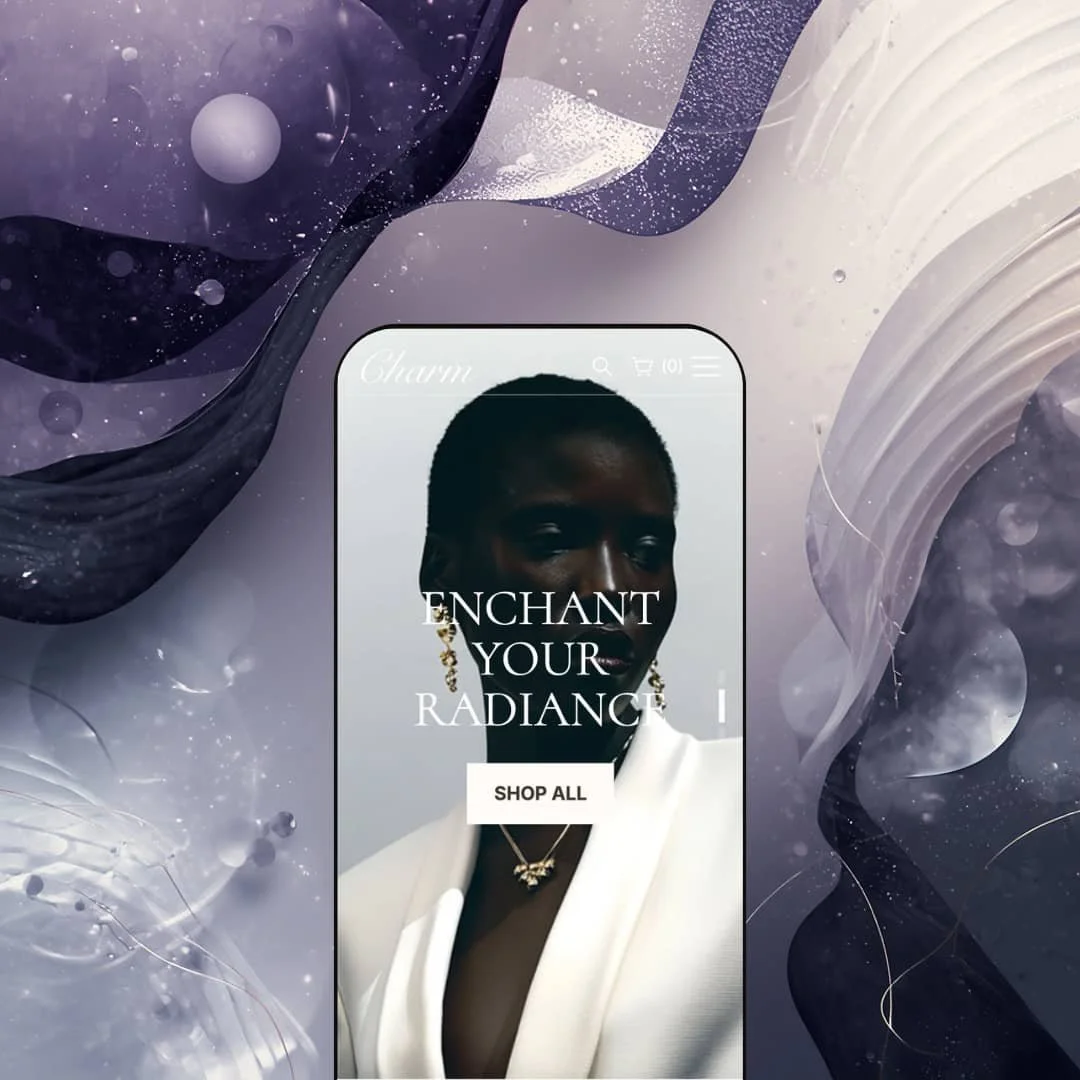
Charm is staged as a jewelry-first storefront with a premium tone and a browsing pattern that encourages shoppers to start with a curated category, then narrow down from there. The overall presentation feels more “collection-led” than “search-first,” which suits jewelry shopping where style and context drive the click.
What works in this preset
This demo is built around guided browsing. Instead of throwing a shopper into a long grid immediately, Charm uses a structure that nudges visitors toward category choices early in the experience. That’s a practical approach for jewelry because the first decision is usually type or style, not a specific product name.
Charm’s no-results experience is staged clearly and reads like a helpful dead-end rather than a broken page. When a query doesn’t match the catalog, the messaging is direct and the layout still feels consistent with the rest of the site. For stores where customers type very specific stone cuts or style terms, that clarity can prevent drop-offs.
Trust-building is also more visible here than in the other demos. Testimonials are surfaced as part of the homepage flow, reinforcing the premium positioning without needing a separate “reviews” destination page. It’s an example of how the same theme structure can feel more luxury-leaning just by choosing which sections to emphasize.
Where it stumbles
Charm’s presentation assumes shoppers are willing to browse, compare, and refine rather than instantly search for a single SKU. If your store depends heavily on search-led discovery, you’ll likely invest more time in product naming and merchandising so searches return the right matches.
I didn’t find repeatable functional issues during this pass, so the main risk here is strategy: this demo rewards curation, and it’s less aligned with “type a part number and buy.”
-
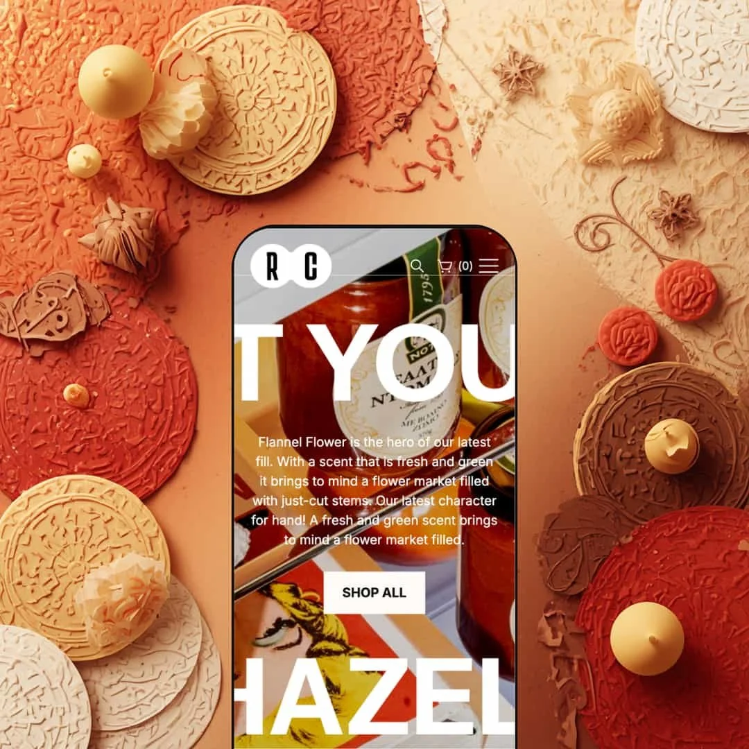
Snacks is presented like a campaign-driven food or consumables storefront, where benefits and promos sit close to the shopping journey. The vibe is more energetic and bold than the other presets, with sections that feel designed to support bundles, seasonal pushes, and repeat-buy behavior.
What works in this preset
This demo leans heavily into benefit-forward merchandising. The page content repeatedly frames “why buy” alongside the product journey, which is helpful in food and consumables where trust and positioning can matter as much as flavor. It creates a storefront that feels more like a brand pitch and less like a plain product list.
The homepage is staged in a campaign style, with banners and calls-to-action that push shoppers toward broad browsing rather than a deep, slow scroll. That makes the demo feel suited to paid traffic or social campaigns where you want to get visitors into a category quickly. In practice, it’s a structure you can reuse for launches and promos without constantly changing templates.
Snacks also shows how to keep the visual energy high without losing the basics. Even with large imagery and promotional emphasis, the layout still reads in a predictable order, so shoppers can move from story to products without feeling stuck in a slideshow.
Where it stumbles
If your brand identity is quiet, minimal, or editorial, this preset’s default presentation may feel too loud. You’d likely tone down banners and promo-forward sections to keep the site from feeling like a constant campaign.
No persistent UI failures showed up during this run. The tradeoff is more about taste and pacing than about broken mechanics.
Niche Suitability
-
![Line Main Preset from the Line Shopify Theme]()
Line Preset
Brands in personal care, wellness, and lifestyle categories that benefit from mixing shoppable sections with light editorial support. The preset’s rhythm works well when customers need a reason to trust the product, not just a price and photo.
-
![Charm Preset from the Line Shopify Theme]()
Charm Preset
Jewelry, accessories, and premium goods where shoppers browse by style, then narrow down by fit or details. The preset’s curated feel supports higher-consideration purchasing.
-
![Snacks Preset from the Line Shopify Theme]()
Snacks Preset
Snack brands, packaged food, and consumables that sell on benefits, promotions, and repeat purchase habits. The preset’s emphasis on “why this product” fits catalogs where shoppers compare options quickly.
Not Ideal For
Final Recommendation
-
Line fits brands that rely on strong imagery and want a storefront that can shift between storytelling and shopping without feeling like two separate experiences. It’s a strong match for catalogs where customers compare variants or respond to promotional campaigns.
-
If your store needs an ultra-minimal experience out of the box, or if your primary revenue model is booking or membership-first, you may prefer a theme whose demos are already staged around that journey.
-
Medium — The building blocks are strong, but the best results come from curating sections and aligning the homepage with a clear merchandising strategy. Expect some setup time to tune the pacing, not just the visuals.
★ 7.2/10
Rating
-
The demos show a strong browse-focused shopping loop, supported by promotional modules and structured product information. The theme feels designed for discovery, comparison, and quick decision-making.
7
-
The presets suggest a modular approach that can be adapted without rebuilding templates, but the section-heavy staging means you’ll want to curate what stays on key pages.
7
-
The core shopping journey relies on overlay-style interactions and clear calls-to-action. Preview your own catalog on a phone to confirm spacing and pacing match your audience.
7
-
Based on perceived responsiveness during a browsing-heavy session. No lab metrics were captured, so treat this as a practical “felt speed” score rather than a benchmark.
8
-
Default, Charm, and Snacks show noticeably different presentation styles while keeping a consistent shopping rhythm. That’s a strong sign you can re-stage the look without rewriting the store’s flow.
7
FAQ
〰️
FAQ 〰️
-
👑 It’s a strong fit for visual brands that want to mix storytelling sections with a browsing-first shopping experience. In the Default and Snacks demos, the homepage rhythm is clearly built to move a visitor from a hero CTA into product discovery quickly.
-
📱The demos use interaction patterns that are typically comfortable on smaller screens, but the exact feel depends on your catalog and imagery. Before publishing, preview your own products on a phone so you can confirm the layout pacing feels right.
-
🎨 The three presets show very different moods, from wellness to jewelry to food, while keeping the structure recognizable. That’s useful if you want a theme that can be re-staged over time without changing your store’s fundamentals.
-
⚡ In hands-on browsing, the demos felt responsive during typical shopping actions and page transitions. Since no lab testing was run, treat performance as something to validate with your own media and app stack.
-
👕 In the Charm demo, the shopping experience is staged around choosing details, which makes sense for jewelry. The overall structure supports comparison-style browsing where shoppers evaluate options before committing.
-
🔎 SEO is largely about content structure and performance, and Line’s demos clearly support content alongside products. The Default and Snacks demos both stage editorial-style sections, which can be useful if you plan to publish supporting content.
-
💱 Yes, as long as you enable additional languages and markets in Shopify. The theme’s job is to surface the selectors you choose to display, so the setup happens in Shopify settings and your header configuration.
-
⚙️ Yes. Most apps integrate through standard Shopify insertion points on product pages, the cart, or dedicated landing pages. Because the demos use familiar storefront structures, you should be able to add apps without needing custom theme development in most cases.
-
🛒 The public demos used in this review act as a practical “try before you buy.” The best next step is to run a theme preview with your own products so you can validate the look and pacing with real inventory.
This review is based on hands-on testing of the publicly available preset demos of the Line Shopify theme as of February 26, 2026. Theme features, preset availability, and performance can change with subsequent updates from the theme developer.