
Most $250 Shopify themes give you a polished layout and a handful of useful sections. Metro gives you that, plus a bundle builder, a product comparison table, lookbook hotspots, a store locator, and a countdown timer, all without a single app install. It's the kind of theme that makes you wonder what you've been paying monthly subscriptions for.
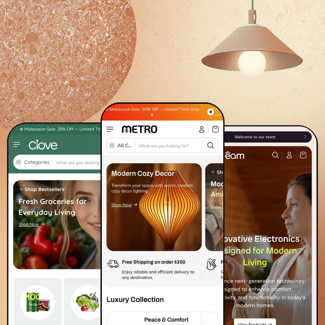
The three presets span home decor, consumer electronics, and grocery, which is an unusually wide range. That alone signals something about the underlying layout engine: it's flexible enough to look credible selling handcrafted furniture and fresh vegetables in the same week. Over 30 configurable sections sit behind the editor, and the presets feel less like colour swaps and more like genuinely different storefronts.
Pros.
〰️
Pros. 〰️
✚ Deep mega menu with hierarchy and inline previews
This is where Metro earns its $250 price tag. The mega menu supports everything from simple two-level dropdowns to three-tier hierarchies with inline product cards, promotional banners, and collection item counts inside the navigation layer. Shoppers can preview products, spot active promotions, and drill into subcategories without ever loading a collection page. For large catalogs, this navigation depth surfaces products earlier in the journey than a standard dropdown and meaningfully reduces the clicks between "browsing" and "buying."
✚ Built-in bundle builder with live pricing
The dedicated bundle builder section lets shoppers select multiple products from a curated grid, choose variants through dropdowns, and add the bundle to the cart with a running total that updates in real time. This is functionality that typically requires a paid app at $5-15 per month. Because it's native to the theme, it loads without third-party script overhead and integrates visually with the rest of the storefront. It's one of those features that pays for a chunk of the theme's cost in saved app fees within the first year.
✚ Product comparison table and lookbook with hotspots
Two more features that usually live behind app paywalls. The comparison table stacks up to five products side by side across attributes like title, price, vendor, and weight. The lookbook overlays clickable product tags onto lifestyle photography, turning editorial imagery into direct shopping paths. Neither is groundbreaking on its own, but finding both included in a $250 theme, alongside the bundle builder, feels like genuine value rather than marketing padding.
✚ Conversion-focused promotional modules
Countdown timer, store locator with map and hours, featured product embed, trust badge strips, testimonial sections: each one targets a different conversion lever, from urgency to social proof to physical credibility. They're all native sections that can be mixed across pages without app conflicts. Not every store needs all of them, but having the option to deploy urgency on one page and trust signals on another, without installing anything, gives merchants a tactical advantage during launches and seasonal campaigns.
✚ Enhanced product cards and search experience
Across all three presets, product cards support image rollover, inline colour swatches for variant preview, and dynamically calculated sale-percentage badges. The search overlay surfaces popular products with images and prices, collection shortcuts, and category filter pills. Unit pricing and stock-level indicators show up in search results, which matters most for grocery and consumables merchants but adds useful transparency in any catalog. The product cards do more work than you'd expect at this price tier.
Cons.
〰️
Cons. 〰️
🚫 New theme with a limited track record
Metro launched in early 2026 at version 1.0.3 with two reviews on the Shopify Theme Store, both positive. That's encouraging but not conclusive. The long-term update cadence, bug-fix responsiveness, and support quality haven't been stress-tested by a large merchant community yet. If you prioritize a theme with years of proven stability, it's worth monitoring Metro's release history for another quarter before committing.
🚫 Comparison table placeholder state needs refinement
The comparison widget renders with "Example product title" placeholder columns even when no products have been added, creating a cluttered first impression when the drawer opens empty. Shoppers encountering this expect either a clean empty state or a prompt to add products, not dummy text. Merchants will want to pre-load products or hide the section until populated, which adds a small but avoidable setup step.
-
The Metro preset is a dark, editorial storefront built for home decor, furniture, and premium lifestyle brands. A wide lifestyle photograph sits next to two stacked promotional tiles in an asymmetric hero grid that feels deliberate rather than template-driven.
What works in this preset
The first thing you'll notice in the header utility bar is a dark/light mode toggle. Click it, and the entire storefront flips between a deep, moody palette and a bright, open alternative. It sounds like a small detail, but for a home decor brand it changes the browsing context entirely. A customer shopping for bedroom lighting at 11pm gets a dark backdrop that mirrors their actual environment. Someone browsing at lunch gets a clean, bright view. It's a thoughtful feature that most competing themes at this price don't bother with.
Scroll past the hero banners and you'll land on something genuinely impressive: a full lookbook section with clickable product hotspots spanning at least five lifestyle scenes. Each image carries floating tags with product name and price. Click a tag, and you're on the product page. No collection detour, no search required. Editorial photography becomes a direct sales channel. If you've ever priced a standalone lookbook app, you'll appreciate that this comes built in.
The tabbed collection browser labeled "Furnish Every Corner" is worth pausing on. Collections are stacked in a numbered vertical list (01 Art Deco Revival, 02 Best Sellers, 03 Luxe Glam, and so on), and clicking a tab swaps the large preview image beside it. The numbering adds a subtle editorial quality, like you're flipping through a curated magazine index. It surfaces five or more collections without horizontal carousels or endless scrolling, and for a store with a broad catalog, it rewards the kind of browsing that leads to discovery.
What surprised me most was the featured product embed sitting right in the homepage scroll. Full variant selector, image thumbnails, Add to Cart button. A visitor can discover, examine, and purchase a highlighted product without leaving the homepage once. Combine that with the lookbook and the bundle builder, and Metro's homepage functions less like a landing page and more like a self-contained mini-store.
There's also a "Deal of the Month" section that pairs a promotional banner with a secondary product grid underneath. The dual-layer approach lets you spotlight a time-sensitive campaign at the top while surfacing related products below, creating a natural upsell path within a single scroll segment. The warm accent colours keep it visually consistent with the rest of the dark palette without feeling repetitive.
One detail that breaks up the product density nicely: an About Us rich-text section appears mid-page, anchored by a decorative SVG line graphic and flanked by two lifestyle images. It catches you at a scroll point where another product grid would feel monotonous. Instead, you get a brand story moment, and then the selling resumes. Placement matters, and this one is well-judged.
Where it stumbles
The Metro homepage is dense. Really dense. It stacks a hero, two banner rows, a lookbook overlay, a featured product embed, a countdown section, a deal-of-the-month grid, a bundle builder, a video block, testimonials, a blog feed, trust badges, a newsletter popup, and a store locator. That's a lot of vertical content for a single landing page, and if you're on a slower connection, you'll feel it on the initial load. Most merchants will want to prune several sections in the editor rather than run all of them simultaneously. The toolkit is impressive, but deploying every piece at once works better as a demo showcase than a real-world storefront.
The newsletter popup also appears without an obvious progressive delay. On a first visit it risks overlapping with the hero before anyone has had time to engage with the content. It's a staging issue more than a theme flaw, but merchants keeping the popup enabled will want to adjust the trigger timing to avoid that awkward "I just got here" interruption.
-
Beam strips away the editorial ambiance and replaces it with a tech-forward, product-first storefront aimed at consumer electronics, audio gear, and gadget retailers. The mood is clean and commercial.
What works in this preset
Open the "Catalog" or "Smart Devices" dropdown and you'll see what sets Beam apart: product cards with images, prices, and sale badges embedded directly inside the mega menu, next to a promotional banner with headline copy. It's not a list of links. It's a browsable storefront inside the navigation layer. The "Smart Devices" panel, for example, surfaces watches, headphones, speakers, and earbuds in one view, functioning like a curated mini-collection you can shop before ever reaching an actual collection page. For electronics merchants whose customers usually arrive knowing the category they want, this shaves an entire click out of the journey.
The navigation depth goes further than most themes dare. Beam stages a three-tier category hierarchy: Audio branches into Earbuds, which branches into True Wireless TWS, Noise Cancelling, and Sports Series. That's the kind of organizational depth a store with hundreds of audio products needs to stay navigable. Each tier connects to the inline product cards, so drilling deeper into the tree always leads to either a narrower collection or a specific product, never a dead end.
What's refreshing about Beam's homepage is what it doesn't have. Compared to Metro's section marathon, Beam's overall layout is lean: fewer blocks between the hero and the footer, more breathing room around the product grids, a focused browse-and-buy rhythm. If your customers search or navigate by category rather than scroll through editorial content, this tighter staging removes friction. The path from homepage to product page is short, and nothing gets in the way.
That restraint carries into the footer and supporting sections, which stay clean and understated. Trust badges and policy links are present but they don't compete with the product imagery above. Information density belongs in the navigation and on the product pages, not in decorative homepage modules, and Beam's staging respects that principle.
Where it stumbles
The Smart Devices dropdown does have a ceiling. It loads more than a dozen product cards into a scrollable panel, and at desktop widths below roughly 1440 pixels, the cards start crowding each other. The scroll area becomes less intuitive, and what started as a convenient shortcut begins to feel as dense as the collection page it was meant to replace. If you're running a large catalog, curation matters here. Auto-populating the full collection into the mega menu will undermine its purpose.
-
Clove does something the other two presets don't even attempt: it makes Metro look like a grocery store, and a convincing one. Bright greens, warm whites, custom category icons, and a layout that mirrors the mental model of walking through supermarket aisles. This isn't a furniture theme with different pictures. It's a genuinely different storefront.
What works in this preset
Below the main header sits an icon-based horizontal category bar where each top-level category (Home, Vegetables, Dairy, Fruits, Sales, All Collections) gets its own custom SVG icon and clickable tab. It looks simple, but the design choice is smart. Grocery shoppers think in categories, not keywords. A vegetable icon registers faster than the word "Vegetables," especially on repeat visits. The bar mimics the aisle structure of a physical supermarket, and it makes the storefront feel purpose-built for food retail rather than adapted from a general template.
Hover over one of those icons and the dropdown reveals a two-column layout: one side lists collection-level links (Fresh Vegetables, Seasonal Vegetables, Organic Vegetables, Farm Fresh Vegetables) while the other shows direct product links (Farm Fresh Brinjal, Fresh Green Cabbage, and so on). This dual-purpose structure is quietly effective. The browsing shopper who wants to explore a category uses the left column. The returning customer who already knows what they need uses the right column and lands on the product page in two clicks. Both paths are served without cluttering the interface.
There's also a secondary text-based navigation row sitting below the icon bar, linking to Grocery, Fruits, Confectionery, Pages, Contact, and Demos. Two navigation rows might sound redundant, but they serve different intents. The icons are for category browsing. The text links are for quick jumps to high-traffic pages. Together they ensure the most important entry points are always one click away, regardless of how someone prefers to navigate.
The green-and-white colour palette deserves its own mention because it isn't a coat of paint over the same layout. It genuinely changes the emotional register of the browsing experience. Where Metro's dark tones signal luxury and Beam's contrast signals tech precision, Clove's greens signal freshness and health. It's exactly the trust cue a grocery brand needs on first arrival, and it demonstrates that Metro's design flexibility extends well beyond swapping hero images.
The search overlay is where Clove gets especially clever. Category shortcut pills (Baby Care, Bakery, Cleaners, Confectionery, Dairy, Fruits, Grocery, Meat & Poultry, Nuts, Vegetables) appear directly inside the search field. Tap a pill to scope your results before typing anything. For a grocery store where customers often know the category but not the exact product name, this turns search from a guessing game into a guided browse. Combined with popular product previews and collection suggestions, the search field in this demo feels less like a search bar and more like a mini-catalog.
Where it stumbles
The icon-based category bar is Clove's strongest visual feature, but it comes with a practical requirement: custom SVG assets for each category. The demo ships with grocery-specific icons (shopping bag, vegetables, bread, fruit, snack, snowflake for frozen goods), and these won't work for other verticals without replacement. Grocery merchants can use them as-is. Anyone adapting Clove's navigation for a non-food store should budget time and possibly design cost for icon production.
The mega menu's product listing also creates a visual challenge for smaller catalogs. When you have dozens of items per category, the dropdown looks full and inviting. With only three or four products, you get sparse columns next to long ones, and the dropdown starts to feel half-empty. For smaller grocery stores, careful curation or section adjustment will be needed to avoid undercutting the sense of abundance the icon bar is designed to create.
Niche Suitability
Not Ideal For
Final Recommendation
-
Home decor retailers, electronics shops, grocery stores, and any merchant with a medium-to-large catalog (20-200+ SKUs) who wants a loaded storefront out of the box. If you're currently paying monthly for bundle, comparison, or lookbook apps, Metro consolidates those costs into a one-time purchase. The three presets prove it can credibly serve very different industries, which also makes it a solid pick for agencies building stores across niches.
-
Single-product brands, ultra-minimalist storefronts, or merchants who prefer building from a near-blank canvas. Metro's density is its strength, but if you only need five sections and a clean checkout flow, you'll spend more time removing features than using them. Stores with very small catalogs (under 10 SKUs) will find the deep navigation and section library more infrastructure than they need.
-
Medium. Setup involves configuring and pruning rather than building from scratch. Image asset preparation, particularly for the lookbook scenes and Clove's icon navigation bar, will take the most time. Budget a weekend for a polished launch if your photography is already done.
★ 7.4/10
Rating
-
An unusually deep built-in toolkit for the price tier. Bundle builder, comparison table, lookbook hotspots, store locator, and countdown timer all come native. Shopify's standard sorting is presented in a clean, well-styled manner.
8
-
The volume of available sections means the editor has a lot to navigate. Merchants comfortable with Shopify's theme customizer will manage fine, but beginners may feel overwhelmed by the option density.
7
-
Layouts adapt to mobile widths and the mega menu collapses into a standard mobile drawer. The icon-based category bar in Clove translates to a scrollable row. The overall mobile experience is clean and functional.
7
-
The Metro preset's image-heavy homepage with video sections, multiple carousels, a bundle builder, and a comparison table loads a significant amount of content. Perceived speed was acceptable but not snappy on initial load. Interactive elements responded without noticeable lag once the page was fully rendered. Beam and Clove, with lighter staging, felt noticeably quicker.
7
-
Three presets that look and feel genuinely different (luxury dark, tech-clean, grocery-bright) demonstrate strong flexibility. With 30+ sections and meaningful layout variation, merchants can push this theme in directions well beyond the three demos.
8
FAQ
〰️
FAQ 〰️
-
👑 Yes. The Beam preset is staged as a full electronics store with three-tier category navigation and inline product card previews in the mega menu, while Clove runs as a grocery market with icon-based category tabs and unit pricing in search results. The section library is industry-agnostic, and the three presets demonstrate how differently the same core engine can present.
-
📱All three presets collapse their mega menus into standard mobile drawers, and product grids reflow into single- or two-column layouts. The Clove category icon bar scrolls horizontally on smaller screens, maintaining its core navigation utility without stacking vertically.
-
🎨 The theme supports logo uploads, a dark/light mode toggle visible in the Metro preset's utility bar, custom SVG icons for the category bar as staged in Clove, and fully configurable section ordering. Typography is self-serve through Shopify's font picker, and the deep section library means merchants can rearrange, add, or remove homepage blocks to match their brand narrative.
-
⚡ Interactive elements like the mega menu dropdowns, cart drawer, search overlay, and image rollovers responded promptly during hands-on testing across all three presets. The Metro preset's dense homepage loads a significant amount of media, so merchants should optimize their images. Beam and Clove, with lighter default staging, felt noticeably quicker on initial page load.
-
👕 Colour swatches appear directly on product cards in the Metro preset grid, letting shoppers preview variant images without opening the product page. The bundle builder section uses variant dropdowns for multi-option products. On the product page itself, variants display as selectable swatches alongside a variant-specific dropdown for quick selection.
-
🔎 The theme outputs clean heading hierarchies, includes breadcrumb navigation, and supports customizable meta fields through Shopify's standard SEO tooling. Blog functionality is built in and visibly staged across presets, with the Metro homepage featuring a "Latest Insights" blog feed section. Nothing blocks standard on-page SEO work.
-
💱 Language and currency switching is handled by Shopify Markets, not by the theme itself. Metro's header utility bar provides a clean, accessible placement for the Shopify Markets selector, and the Metro demo stages it with a comprehensive country list in a localization drawer. The theme store listing also notes EU translations in English, French, Italian, German, and Spanish, but the underlying functionality is a platform feature that works the same way across any Shopify theme.
-
⚙️ Metro supports Shopify's app embed architecture and is listed as compatible with Sign in with Shop. Given the built-in bundle builder, comparison table, lookbook, and store locator, merchants may need fewer third-party apps than usual, which also reduces potential script-loading overhead.
-
🛒 Shopify's standard "Try theme" option lets you install Metro on your development store and customize it before committing to the $250 purchase. All three preset demos (Metro, Beam, Clove) are publicly accessible for hands-on evaluation at any time.
This review is based on hands-on testing of the publicly available preset demos of the Metro Shopify theme as of March 2026. Theme features, preset availability, and performance can change with subsequent updates from the theme developer.