
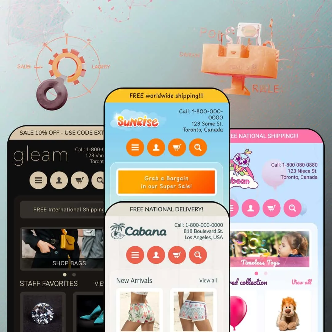
Can a sidebar-driven Shopify theme still work in 2026? Sunrise makes a strong case. Instead of the full-width, top-nav layout every other theme defaults to, it anchors a persistent left-hand sidebar on every page, packed with multi-level menus, tag filters, and product thumbnails. Four presets stretch from toy shops to luxury jewelry, all running on the same $240 framework with schema.org data baked in. I tested all four.
Pros
Sidebar-first navigation architecture
This is the feature that defines the theme. A persistent left-hand sidebar holds multi-level navigation, a newsletter signup, a "Popular Products" thumbnail shelf, tag-based browsing links, and recent blog-post previews, all in one vertical column. For stores with deep category trees and dozens of product types, it delivers browsing depth that top-nav themes can't touch. The sidebar stays visible across every page type, so customers never lose their bearings even three subcategory levels deep.
Rich homepage section library
Every preset draws from the same pool: a flexible slideshow with optional caption overlays, a featured product-collection grid, a collection-list tile row, a customer testimonials carousel with attributed quotes, a brand-logos strip, a rich-text storytelling block, and a dedicated announcement bar. All rearrangeable through the Sections editor. No code required. The testimonials support location-attributed quotes across all presets, and sale/out-of-stock badges appear automatically on collection grid cards wherever compare-at pricing or zero inventory is configured.
Schema.org structured data and SEO foundation
Product data ships with schema.org structured markup, so search engines parse pricing, availability, and product attributes directly from the page source. That structured data sits alongside Shopify's native SEO fields (editable title tags, meta descriptions, clean URL handles) to build a technical SEO baseline that doesn't require a third-party app.
Flexible presets, consistent core
Four presets, four industries, one theme. From toy stores (Sunrise) to luxury jewelry (Gleam), the same underlying sections adapt convincingly through color, typography, and content configuration alone. The core interactive behaviors stay identical everywhere: variant selection with thumbnail swatches, social sharing buttons on product pages, the sidebar's Popular Products widget. Merchants can preview multiple directions during setup and choose the closest match without worrying they'll lose functionality.
Variant handling with thumbnail swatches
Product pages support multi-option variants with thumbnail image previews. On the Party Balloons product in the Sunrise demo, five color options display as clickable thumbnails that swap the main gallery image, and a second "Pack Size" selector offers three text-button choices. Selecting a combination updates the displayed price instantly. It's visual, it's intuitive, and it works particularly well for products where color drives the purchase decision.
Cons
No quick-add or quick-view on product grids
This is the big one. Across all four presets, every product card links to a full product page. No hover overlay. No quick-view modal. No inline Add to Cart. For stores where customers browse and add multiple items per session (gift shops, accessory retailers, party-supply stores), that's an extra page load every single time. It interrupts the shopping rhythm and adds friction exactly where you want the opposite.
No product recommendations on product pages
The product page ends after the description and sharing buttons. No "You may also like." No "Recently viewed." No related-products grid. The moment of highest purchase intent, when a customer is already looking at something they want, has zero cross-selling support. Merchants who care about average order value will need a third-party app to fill this gap.
Translation-string errors visible in variant selectors
The Sunrise demo's product page displays raw Liquid template strings ("Translation missing: en.products.product.variant_sold_out_or_unavailable") beside each variant option. It's a template-level string issue, likely an incomplete language file rather than a per-preset problem. It won't break anything functionally, but it looks unfinished, and merchants should verify their language editor settings before going live.
Minimal blog presentation
The blog index uses a basic list layout with no featured images, no excerpt cards, no visual hierarchy. The sidebar shows at most two truncated headlines. For merchants investing in content marketing (gift guides, seasonal roundups, product stories), this bare-bones blog experience limits discoverability. You'll likely need a supplemental blog app or custom template work to compete with content-rich competitors.
-
Warm yellows, oversized toy photography, and a three-slide hero carousel. The Sunrise preset is staged as a playful gift shop where families browse by product type, and its golden palette channels the energy of a store you'd wander into on a Saturday afternoon with kids in tow.
What Works in This Preset
The first thing I noticed was the color. That saturated golden-yellow header hits hard against the white content area, pulling your eye simultaneously toward the sidebar's category links and the hero slideshow. It's not subtle, and it shouldn't be. For a toy store or party-supply retailer, this palette signals fun before a visitor reads a single product name. A more neutral theme couldn't do this.
The slideshow stages three lifestyle images with bold, uppercase caption overlays linking directly to collections and products. "SHOP BALLOONS!" and "OUR TOP TOYS" aren't clever, but they're effective. Within seconds of landing, you know exactly where to click. Even on a smaller laptop screen where the sidebar compresses the main content area, those captions are impossible to miss.
I spent time clicking through the sidebar navigation, and it's genuinely deep for this price range. In this preset demo, Toys branches into Animals (Bears, Monkeys), Vehicles, Dolls, and Puzzles, while Accessories covers Footwear and Sunglasses. Three levels. Below that, a separate "Shop by tag" section lists every product tag as a clickable filter. So you get two completely different ways to browse on every page, which is exactly what a catalog-heavy store needs.
A rich-text "Passion for toys" block sits between the featured collection and testimonials, and it actually reads well. It's warm, it's personal, it links to the About page, and it breaks up the grid-after-grid rhythm that makes so many homepages feel like spreadsheets. The collection tiles underneath (Animals, Vehicles, Dolls) add a visual browsing path for shoppers who'd rather scan images than click through menu trees.
Where It Stumbles
Here's an odd one. On the product page, every variant option displays a raw Liquid template string: "Translation missing: en.products.product.variant_sold_out_or_unavailable." That's developer-facing code output sitting right next to the color swatches a customer is supposed to click. The variant selector itself works fine, prices update correctly, but the visual clutter from those untranslated strings undermines an otherwise clean product page. Merchants will want to check their language editor immediately.
-
Sandy tones and lifestyle beachwear photography replace the toys. Cabana repositions the Sunrise framework as a casual fashion store, and the shift is convincing. Board shorts, hats, sunglasses. It feels like a different theme until you notice the sidebar structure is identical.
What Works in This Preset
The featured collection is titled "New Arrivals" and links to a specific collection (Shorts). Small choice, big difference. Where other presets use a generic label, Cabana's framing signals freshness. For a beachwear brand that refreshes inventory by season, this gives returning customers a reason to check the homepage every few weeks. I'd steal this trick for any fashion store.
Clearance gets two entry points: a "Clearance" link in the top-level menu and a "Big Sale Now On" banner placed after the testimonials. That banner positioning is smart. By the time a visitor scrolls past three customer quotes, they've built some trust. Then the sale prompt hits. It doesn't feel pushy because the social proof has already done its work.
Cabana is the only preset that puts an FAQ link in the header navigation. For a fashion brand fielding sizing and shipping questions, that's one click from every page instead of a footer scavenger hunt. It's a small staging decision that saves real support tickets.
The three "Popular Collections" tiles (Hats, Footwear, Sunglasses) are well-cropped and category-specific. Each image fills its space cleanly, and the three-column grid creates a balanced visual rhythm between the slideshow above and the product cards below. I also noticed the sidebar's "Latest posts" section previews two blog entries instead of one, which gives content-forward brands more surface area for seasonal editorial (packing lists, vacation guides, that sort of thing).
Where It Stumbles
The slideshow images have no text captions. None. Unlike Sunrise's bold overlays, Cabana's two hero slides are just lifestyle photos that link somewhere. I had to guess where each one would take me. If you're going to dedicate that much screen space to a slideshow, tell people what they're clicking on.
The brand-story section uses the same "Inspired by you" template paragraph that appears in other presets. For a fashion retailer, this is a missed staging opportunity. The copy reads fine in isolation, but it doesn't sound like a beachwear brand. Merchants will need to rewrite this block entirely rather than tweaking a few words.
-
Muted pastels, soft product photography, and a nursery-calm atmosphere. Jellybean stages the Sunrise framework as a children's clothing and toy boutique where parents browse by color and material rather than scrolling endless grids.
What Works in This Preset
Only four products in the featured grid. That restraint is deliberate and it works. While other presets pack in six or eight items, Jellybean gives each product image room to breathe. For a children's boutique targeting parents who value curation over volume, fewer cards actually says more. The grid doesn't overwhelm, and that's the point.
A "Shop Our Specials" call-to-action banner with a linked button sits between the testimonials and brand logos. It's positioned after the social-proof section, which means shoppers see parent reviews first, then the sale prompt. That sequencing feels natural rather than aggressive, like a friend mentioning a deal after you've already decided you like the store.
The testimonials here are genuinely well-staged. Quotes reference children by name ("My daughter loves her unicorn hoodie!"), include city and state attributions, and read like actual parent reviews rather than marketing copy. I've seen dozens of themes use placeholder testimonials that sound like they were written by the same chatbot. These don't.
In this preset demo, the sidebar's "Shop by tag" section lists colors (blue, green, yellow) and materials (wood) alongside product categories. That's how parents actually shop for kids' stuff. You don't search "toy" when you're buying for a toddler. You search "wood" because you don't want plastic, or "blue" because that's their favorite color. The sidebar filtering is accidentally perfect for this audience.
The "Warm & Heartfelt" rich-text block doesn't read like filler. Its language ("thoughtfully made, high-quality pieces designed with comfort, style, and childhood in mind") matches the pastel tone, and the link to the About page invites parents to learn about the people behind the brand. It's one of the few preset story blocks across all four demos that actually sounds like someone wrote it for this specific store.
Where It Stumbles
The sidebar's "Popular Products" widget displays a sold-out item ("Bear with Sweater") with a small text note that says "Sorry, this item is out of stock." That text is the same weight, same size, same color as the in-stock prices around it. I almost missed it. A grayed-out thumbnail or a subtle badge would take three seconds to implement and save parents from clicking into a dead end, especially on return visits where they expect fresh inventory.
-
Dark header. Cool tones. Refined typography. Gleam transforms the Sunrise architecture into a luxury jewelry and accessories storefront, and it's the preset that proves this theme's design range isn't just marketing talk.
What Works in This Preset
The announcement bar pulls double duty here. "SALE 10% OFF - USE CODE EXTRA10" creates urgency, and a secondary "FREE International Shipping" banner sits right below it. Two promotional messaging zones before the shopper even reaches the slideshow. Cabana and Sunrise use one. Gleam uses two. For a luxury merchant, that layered approach lets you communicate both a coupon and a trust signal (free shipping) simultaneously.
I clicked through the sidebar navigation, and the hierarchy is tight. Jewelry breaks into Rings, Bracelets, and Necklaces. Accessories splits into Badges and Sunglasses. Clothing branches into Footwear, Shirts (with color sub-filters), and Hats. This structure suits a store where customers shop by product type, and the subcategory depth signals a catalog worth exploring rather than a handful of items dressed up.
The homepage grid is titled "STAFF FAVORITES." Not "Featured collection." Not "Our Products." Staff Favorites. That label implies tastemaking, curation, someone behind the counter who picked these out. It's a small editorial choice that shifts perceived value upward, and it costs nothing to configure.
The brand-logos section shows custom wordmark-style logos (Orryn, Emmure, Caelus, Vellore, Brevan, Noirel) instead of the generic placeholder icons in the other presets. For a jewelry store, this is the difference between looking like you have trade partnerships and looking like you forgot to upload your images. The wordmarks communicate credibility that placeholder icons never will.
Gleam's testimonials use italic formatting for the quote text with city and state attributions. It's a subtle styling choice, but it elevates the quotes from functional to editorial. They look like pull quotes from a magazine, not customer-service feedback forms. That matches the premium positioning everywhere else in this preset.
Where It Stumbles
"SHOP BAGS." That's the entire slideshow caption. Two words. For a store selling $7,000 diamonds and $4,100 gemstones, that's lazy. A luxury shopper expects language that conveys craftsmanship, exclusivity, or heritage. A short value proposition beneath the CTA ("handcrafted in limited editions" or even "new collection") would give the hero section actual persuasive depth without cluttering anything.
The product grid shows items at $4,100 and $7,899 sitting right next to "Out of stock" labels in plain text. No waitlist. No notify-me email capture. No visual suppression. Just "Out of stock" in the same font as everything else. For a jewelry store, a sold-out $8,000 ring is a customer willing to spend $8,000 who just walked away with nothing. That's money left on the table, and even a simple email-capture prompt would recover some of it.
Niche Suitability
Not Ideal For
Final Recommendation
-
Merchants with large, category-heavy catalogs who value structured sidebar navigation and a homepage packed with browsable sections. Toy stores, gift shops, party suppliers, accessory retailers. It's also a solid pick for international sellers who want schema.org data baked in from day one. The four presets lower the startup barrier, letting you choose a design direction that's already close to your brand without starting from scratch.
-
Single-product brands, DTC fashion labels that live on full-width imagery and editorial layouts, or any merchant who considers quick-add and product recommendations essential to their conversion funnel. If you're selling luxury goods and need trust badges, gift-wrapping options, or waitlist capabilities at the theme level, keep looking.
-
Medium. The Sections editor handles homepage layout, colors, fonts, and content blocks without code. But you'll need to rewrite the placeholder copy (the brand-story sections reuse similar language across presets), source and crop sidebar-friendly images, and configure tag-based filtering to match your actual inventory. Budget a few hours of setup, not a few minutes.
★ 6.6/10
Rating
-
Covers core commerce competently, with native schema.org data and a versatile sidebar system. But the absence of quick-add, product recommendations, and advanced product-page interactions leaves it behind more feature-rich competitors.
6
-
Sections editor makes homepage changes accessible. Color, font, and layout swaps require no coding. The sidebar logic clicks once you understand it, but merchants will rebuild placeholder content from scratch.
7
-
Sidebar collapses into an off-canvas hamburger menu. Grids stack single-column. The core layout translates, but the overall interaction model is desktop-oriented.
6
-
Pages load fast. No heavy JavaScript frameworks or render-blocking animations. Images use responsive srcset attributes. The theme feels snappy on desktop.
7
-
Four distinct presets prove real cross-industry adaptability. Google Fonts, full color control, background images, and section-level customization provide meaningful flexibility. The main constraint: you can't escape the sidebar-locked layout for a full-width, top-nav design.
7
-
👑 All three, convincingly. The Sunrise preset stages a toy catalog with deep sidebar categories, Cabana pivots to beachwear with seasonal "New Arrivals" framing, and Gleam showcases luxury jewelry with subcategory filtering for rings, bracelets, and necklaces. The sidebar layout particularly suits stores with many product types, because every category stays one click away.
-
📱The sidebar collapses into an off-canvas mobile menu, and product grids stack into a single column. Navigation works well on touch screens. On the Cabana demo, I noticed the slideshow images scale cleanly without cropping issues, and the collection tiles rearrange into a vertical stack that's still easy to scan.
-
🎨 Yes. The editor exposes controls for background colors, header colors, fonts (via a curated Google Fonts dropdown for headings and body), logo upload, and background images. The four presets range from Sunrise's warm gold to Gleam's cool dark palette, all achieved through settings alone.
-
⚡Pages loaded quickly across all four demos. No heavy animations, no JavaScript-heavy features slowing things down. Images use responsive srcset attributes to serve appropriately sized files, and interactive elements like variant selectors respond without noticeable delay.
-
👕 The Party Balloons product on the Sunrise demo offers a Color selector (five options with thumbnail images) and a Pack Size selector (three text buttons). Selecting a combination updates the price instantly. The thumbnail approach makes variant selection visual and intuitive, especially for products where color drives the purchase decision.
-
🔎 Product data ships with schema.org structured markup, so search engines can parse pricing, availability, and product attributes directly. The theme supports Shopify's native SEO fields, including editable title tags, meta descriptions, and clean URL handles. No third-party SEO app needed for baseline optimization.
-
💱 Yes. All four presets include a country/region selector in the footer that localizes currency display for dozens of countries. The theme also supports multi-language app translations natively, so merchants using Shopify's translation apps can serve content in multiple languages without code changes. The Jellybean demo, for instance, lists Australia (AUD $) and Japan (JPY) alongside USD markets, confirming multi-currency presentation works across presets.
-
⚙️ It supports Shopify's standard app integration points. The Sunrise product page includes a subscription/recurring-purchase notice, confirming compatibility with subscription apps. Standard app blocks for reviews, upsells, and marketing tools should integrate through Shopify's native app-embed system.
-
🛒 Yes. Shopify lets merchants install and fully customize the theme before publishing. You only pay the $240 when you're ready to go live. All four preset demos (Sunrise, Cabana, Jellybean, Gleam) are also publicly accessible for hands-on browsing before you commit.
This review is based on hands-on testing of the publicly available preset demos of the Sunrise Shopify theme as of April 2026. Theme features, preset availability, and performance can change with subsequent updates from the theme developer.