
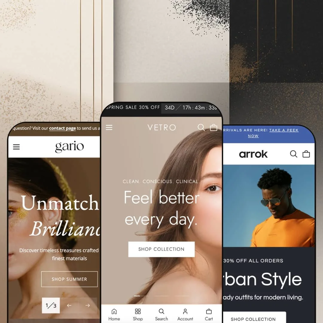
At $280, Vetro isn't cheap. But within minutes of clicking through its three presets, you'll see where that money goes: built-in product bundles with clickable hotspot images, a before/after comparison slider, a slide-out cart packed with upsell tools, and a mega menu that doubles as a merchandising surface. Built by The4, this theme ships with over 36 customizable sections and targets beauty, fashion, and jewelry brands through three distinct preset demos (Vetro, Arrok, Gario). Each one leans into a different product vertical, yet they all share the same underlying engine.
Pros.
〰️
Pros. 〰️
✚ Conversion-focused section library
Here's where Vetro earns its price tag. The built-in product bundle builder uses clickable image hotspots so merchants can curate multi-product sets on the homepage, and shoppers can explore each item and add the entire bundle to cart in one step. A native before/after image slider gives skincare and cosmetics brands a trust-building tool that typically requires a paid app. Tabbed product grids organize featured collections into switchable tabs (Best Sellers, Hot Deals, New Arrivals in the Vetro demo) that load instantly without a page reload, trimming homepage length while surfacing more of the catalog. Collectively, these sections replace functionality that would otherwise cost merchants both money and page-load performance through plugin dependencies.
✚ Feature-rich slide-out cart
Most theme cart drawers are an afterthought. This one isn't. Vetro's slide-out cart includes a visual progress bar toward a free-shipping threshold, a built-in gift-wrap toggle, a coupon code field, an order note area, and a full shipping estimator with country, province, and zip code inputs. When the cart's empty, it doesn't just sit there blank; it surfaces curated collection links to nudge the shopper back to browsing. That level of cart functionality normally requires a dedicated app, and having it native means fewer scripts, faster performance, and a design that actually matches the rest of the store.
✚ Merchandising-grade mega menu
Across all three presets, the mega menu supports nested category hierarchies, promotional image cards with headlines and CTAs, and collection-image grids right inside the dropdown. Navigation becomes a visual merchandising surface, not just a list of links. Merchants get promotional real estate inside the menu itself, which is prime territory for seasonal campaigns, featured collections, or new arrivals. The Gario demo proves the system's flexibility by organizing the entire menu around gifting occasions rather than product categories, something most mega menus can't handle gracefully.
✚ Comprehensive product page modules
Product pages get their own conversion toolkit. A sticky add-to-cart bar pins a compact purchase strip to the viewport as shoppers scroll, keeping the buy button visible on long product templates. A built-in "Ask a Question" form captures pre-sale inquiries directly from the product page, auto-populating the product name and URL. Accordion tabs collapse supplementary details (materials, delivery, returns) into expandable sections that keep the layout scannable. Breadcrumb navigation aids orientation and internal linking for SEO. Together, these modules give product pages the depth that high-consideration purchases demand.
✚ Versatile homepage section toolkit
Beyond the conversion sections, Vetro offers over 36 section types. That number sounds like marketing, but it's real. A scrolling rich-text marquee with inline images, a multi-location store finder with tabbed address cards, a press and testimonial carousel pairing customer quotes with product photos, video-ready content blocks playing hosted video inline, an Instagram gallery, secondary image on hover for product cards, rotating announcement bars with multiple message slots. These building blocks give merchants enough variety to construct distinctly different storefronts from the same theme, whether that's a content-dense beauty magazine, a lean fashion lookbook, or a restrained luxury showcase.
Cons.
〰️
Cons. 〰️
🚫 Countdown timer zero-state fallback
When no active sale end date is configured, the announcement bar countdown timer just sits there showing "00:00:00:00." It doesn't hide itself. It doesn't swap to static text. It just looks broken. If a merchant forgets to update the end date after a promotion wraps, the result is a permanent row of zeros at the top of every page. A simple auto-hide or text fallback would solve this, and its absence is surprising in an otherwise polished theme.
🚫 Uneven demo quality across presets
Vetro's namesake preset showcases nearly everything the theme can do. Arrok and Gario don't come close. Many sections go unused in those demos, which means merchants evaluating only one of the secondary presets could easily walk away thinking the theme is less capable than it is. A visible spelling error in the Arrok navigation ("Acessories") doesn't help. For a $280 theme, the demos are the sales pitch, and the secondary presets need tighter staging to represent the full toolkit.
🚫 Featured product section cart-state bleed
A small but unnecessary quirk: the homepage featured product section displays "0 in cart" next to the quantity selector. On an otherwise clean product card embedded in the homepage scroll, this leaking cart state adds visual noise without adding useful information. A conditional display rule, only showing the count when items are actually in the cart, would clean this up easily.
-
Soft pastels, rounded imagery, lifestyle photography everywhere. Vetro's namesake preset is staged as a premium skincare and clean beauty storefront, and it looks the part. Cream and beige tones paired with serif-accented headings give the entire experience a spa-like calm that high-end personal care brands can build on immediately. Of the three presets, this one activates the most homepage sections, making it the fullest showcase of what the theme can do.
What works in this preset
You feel the aesthetic direction before you've scrolled a single pixel. Warm, muted earth tones run through backgrounds, buttons, and accent elements, creating a visual language that screams "clean beauty" without actually screaming. Serif-accented headings layered over sans-serif body text strike that editorial register, refined but approachable. For skincare and wellness merchants, this palette and type hierarchy offer a genuine head start on brand alignment before a single setting has been changed.
Scroll down and the homepage unfolds like a beauty magazine. Before/after sliders, product bundles, tabbed grids, a testimonial carousel, a multi-location store finder, a scrolling text marquee, an Instagram gallery, and multiple video sections are all activated on a single page. It's dense. Intentionally so. Merchants who want to present a rich, layered brand narrative will find this staging demonstrates exactly how far the section library can stretch when everything's turned on.
Midway through the scroll, a featured product section stops you. It's not a simple card; it's a mini product page embedded in the homepage, complete with a full image gallery, variant selector, video clip, stock count, and add-to-cart button. The demo spotlights a single body cleanser here, but the real takeaway is the mechanic: merchants can pin a seasonal hero or bestseller directly into the homepage flow without sending shoppers to a separate page.
Social proof gets serious visual treatment too. Rather than tucking customer quotes into a plain text block, the testimonial section pairs each review with a product photo and an avatar, all styled to match the page's editorial tone. Press logos from recognizable sources sit alongside the quotes. It's the kind of social proof presentation that actually builds trust instead of just checking a box.
Where it stumbles
Density is a double-edged sword. Stacking slideshows, tabbed grids, before/after comparisons, bundles, collection grids, testimonials, a store locator, and an Instagram gallery into one continuous scroll creates a page that takes real commitment to browse top to bottom. Merchants who want a fast, lightweight storefront will need to disable several sections before the homepage feels manageable. Every section is individually removable, but the out-of-the-box volume can feel overwhelming during initial setup, especially for first-time Shopify users who may not immediately realize how much they're supposed to prune.
-
Arrok shifts gears entirely. Where Vetro whispers "spa day," Arrok says "street style." Staged as a contemporary fashion storefront for men's and women's apparel, this preset swaps warm pastels for cooler greys and blacks, giving the whole presentation a sharper, more urban edge. The vibe is editorial lookbook, not product catalog.
What works in this preset
Forget the standard hero slideshow. Arrok opens with something different: a typographic rich-text statement ("Born from a love for timeless...") with small floating product images drifting between the words. It's a lookbook entrance, not a sales pitch, and it immediately signals a fashion brand with a point of view. Neither Vetro nor Gario attempts anything like this, which makes it genuinely unique to this preset's staging.
Just below, a more conventional two-slide banner picks up where the text hero leaves off. Full-width lifestyle photography, bold overlay headlines ("Urban Style," "Fresh Looks"), clear CTAs. Having both a conceptual opener and a standard promo slideshow on the same page gives merchants two storytelling registers without either feeling redundant. The contrast between text-driven and image-driven sections creates a visual tempo that keeps the scroll engaging rather than repetitive.
Navigation tells you exactly who this preset is for. Top-level entries for Men, Women, and Accessories open into subcategories like Refined Layers, Everyday Tops, Activewear, and Outerwear, mapping directly to how fashion shoppers think about their wardrobe. Inside the mega menu, a promotional image card is staged with a lifestyle fashion photo and the tagline "Elevate your everyday look." It's nav as merchandising, not just wayfinding.
Compared to Vetro's kitchen-sink approach, Arrok keeps the homepage leaner. Fewer sections are activated, and the page moves briskly from the hero statement through featured products and collections without layering in testimonials, store locators, or before/after sliders. For fashion brands that prefer to let the clothing speak through photography and concise copy, this sparser staging feels intentional. It's a quicker scroll to the footer, but the brand identity comes through clearly.
Where it stumbles
One small thing that shouldn't be there: the navigation label "Acessories" is misspelled (it should be "Accessories"). It's demo staging content, not a theme bug, but it's visible on every page and might leave merchants questioning the attention to detail. For a $280 theme, the demos are the showroom, and a typo in the showroom matters.
There's a subtler issue with Arrok's demo strategy. Because so few sections are activated compared to Vetro, merchants evaluating only this preset could easily underestimate the theme's full capabilities. Features like the before/after slider, product bundles, and testimonial carousel all exist in the theme but aren't surfaced here. If Arrok is your first impression, you might walk away thinking the theme does less than it actually can.
-
Gold accents, serif typography, generous white space. Gario takes the luxury route, positioning itself as a fine jewelry storefront where restraint is the point. Everything about this preset says "considered purchase," from the product-first layout to the gift-occasion navigation structure. If Vetro is a beauty magazine and Arrok is a lookbook, Gario is a jeweler's velvet display case.
What works in this preset
Warm gold runs through headings, buttons, and decorative elements, immediately separating Gario from its siblings. Paired with clean serif type and generous white space, the visual language signals luxury without heavy ornamentation. That restraint matters for jewelry brands, where the product is often small and detailed. You need the surrounding design to step back and let each piece shine. These aesthetic choices are hard-coded to Gario's identity and aren't easily replicated by tweaking colours in Vetro or Arrok.
Where Gario really distinguishes itself is navigation. The mega menu is organized around gifting intent: "Gifts Under $100," "For Someone Special," "The Luxe Pick," "Just Because," "Celebration Edit." For jewelry retailers, gift shopping is a primary purchase driver, and this navigation directly mirrors how gift buyers actually think, by occasion and budget rather than product category. It's a staging choice that demonstrates just how flexible the mega menu system is when you break away from the standard collection list.
The homepage takes a product-first approach, stripping away much of the editorial density you'll find in Vetro. Collection imagery and featured product grids take priority over long-scroll storytelling. Shoppers arrive, see curated photography, and move toward a product page without being asked to wade through brand narratives or interactive sections first. For small-catalog merchants with fewer than 50 products, this lighter approach feels proportionate rather than empty. Less isn't laziness here; it's positioning.
On the product page, everything a considered buyer needs is within reach. A sticky add-to-cart bar, an "Ask a Question" form, and accordion tabs for Details and Delivery & Returns all appear on the same template. Shoppers can review materials, fire off a pre-sale question, and add to cart without losing their scroll position. For fine jewelry, where customers often need reassurance before committing to a higher price point, this combination of tools on a single page makes a meaningful difference.
Where it stumbles
One navigation label undercuts the thoughtful staging elsewhere. "Category" sits as a top-level menu entry, and compared to evocative labels like "The Luxe Pick" and "Celebration Edit," it reads like a placeholder that was never swapped out. It's a demo content issue, not a theme limitation, but it weakens the mega menu's showcase at a glance. Vetro and Arrok don't have this problem because their top-level labels all carry editorial weight.
Niche Suitability
Not Ideal For
-
Beauty, skincare, fashion, and jewelry brands that want a visually polished storefront with built-in conversion tools and enough section depth to tell a layered brand story. Vetro rewards merchants who are willing to invest time configuring sections to match their catalog and voice.
-
Minimalist single-product stores, ultra-lean dropshipping operations, or anyone who wants a simple, low-configuration setup. Vetro's strength is its breadth of sections and tools, which can feel overwhelming if all you need is a lightweight storefront.
-
Medium. The block-based editor is intuitive and the section library is extensive, but getting real value from this theme means enabling, configuring, and populating a significant number of sections. Expect a few hours of setup to move beyond default staging and shape the experience around your brand.
Final Recommendation
★ 8.2/10
Rating
-
Outstanding built-in toolset including bundles with hotspot images, before/after slider, sticky cart with shipping estimator, tabbed product grids, and product page accordion tabs. Standard Shopify filtering and sorting is presented cleanly. Feature density ranks among the highest at this price point.
9
-
Shopify block support makes editing visual and code-free, but the sheer number of sections and settings can feel overwhelming at first. Moderate learning curve, especially for merchants new to feature-dense themes.
7
-
Navigation collapses into a well-organized drawer, product grids reflow cleanly, and the slide-out cart stays fully functional on smaller viewports. The sticky product bar adapts to mobile context without crowding the screen.
8
-
Page transitions feel snappy across all three presets. Tab switches, the cart drawer, and mega menu respond without perceptible delay. Vetro's image-heavy homepage is the heaviest load, but sections render progressively so perceived speed holds up.
8
-
Three distinct presets covering beauty, fashion, and jewelry prove the theme's range. With 36+ sections, full block editing, and broad typography and colour controls, merchants can build substantially different storefronts from the same foundation.
9
FAQ
〰️
FAQ 〰️
-
👑 It's one of the strongest options in that space. The Vetro preset is staged specifically for clean beauty, and the theme ships with a native before/after slider that lets skincare merchants showcase visible product results without installing a separate app.
-
📱Yes. The mega menu transforms into a layered mobile drawer that keeps deep category navigation accessible without cramming the screen. On Gario's product page, the sticky add-to-cart bar adapts to smaller viewports so the purchase button stays within thumb's reach during long scrolls.
-
🎨 Very. With 36+ section types and native Shopify block editing, merchants can add, reorder, or remove content visually. The Arrok preset is a good proof point: it demonstrates how different the same theme can look when staged for fashion instead of beauty, using only built-in configuration options and a shifted colour palette.
-
⚡ Interactions feel fluid throughout. Switching between tabbed product grids on the Vetro homepage is instantaneous, and the slide-out cart opens without delay. Image-heavy pages load progressively rather than blocking the viewport, so perceived speed stays solid even on the densest homepage configurations.
-
👕 Multi-variant products display colour swatches directly on product cards in the Vetro preset, with a "+3" overflow indicator when options exceed the grid's display limit. On product pages, variant selectors update the gallery and price in real time. Linked product support is also available for combined listings.
-
🔎 Clean URL structures, breadcrumb navigation (visible on Gario's product pages), meta field access through Shopify's native editor, and structured heading hierarchies are all present. Blog support is included across every preset, giving merchants a content marketing channel alongside their product pages.
-
💱 Right-to-left CSS layout support is built into the theme, listed as a feature on the Shopify Theme Store page. Language and currency selection itself is handled through Shopify's own Markets configuration. All three preset demos display a working country and language selector in the header, and the Arrok demo shows Arabic alongside English, confirming that RTL layout renders correctly when activated.
-
⚙️ Vetro is built on Shopify's native block architecture, making it compatible with the standard app embed and section ecosystem. Product templates include structured areas like accordion tabs where app-injected content sits cleanly alongside the theme's own modules.
-
🛒 Shopify's "Try theme" option lets you install Vetro on your store and customize it fully before committing to the $280 purchase. You only pay when you publish. All three presets are also available as live demos on the Shopify Theme Store, so you can click through everything before even installing.
This review is based on hands-on testing of the publicly available preset demos of the Vetro Shopify theme as of March 2026. Theme features, preset availability, and performance can change with subsequent updates from the theme developer.