
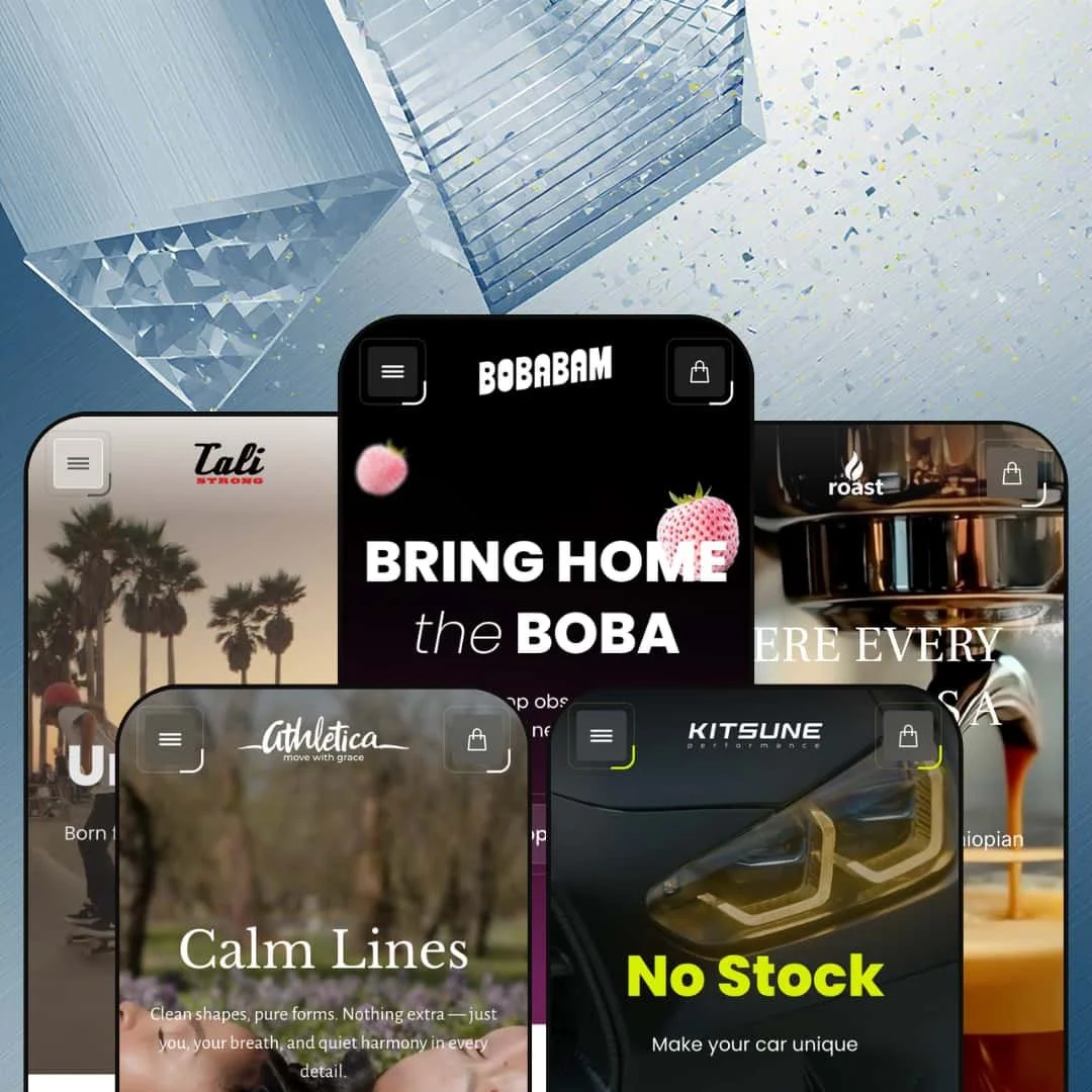
Victory costs $320, ships with five presets, and tries to be everything to everyone. That sounds like a recipe for mediocrity, but UTD's debut Shopify theme actually pulls it off. The same codebase powers a neon boba tea shop, a gritty skate brand, a refined coffee retailer, a women's activewear label, and an automotive performance parts store. Each one looks like it was built from scratch. That alone makes Victory worth a serious look.
Pros.
〰️
Pros. 〰️
✚ Versatile mega menu system
This is the feature that makes Victory. Across five presets, the mega menu took on five completely different personalities: Victory filled it with product cards and lifestyle imagery, Flip built a magazine layout mixing blog teasers and shop links, Roast used clean category columns, Athletica turned it into a sale-event showcase, and Nitro ran three parallel browsing paths through a single menu. Most themes at this price point give you a basic dropdown or a rigid mega menu template. Victory gives you a toolkit, and the range of what you can build with it is the single strongest reason to consider this theme.
✚ Conversion tools that work out of the box
The slide-out cart drawer, quick view, image rollover, and product badges all perform consistently across every preset. Together they create a low-friction shopping layer where customers can preview products, add items to the cart, and continue browsing without constant page reloads. None of these features are unique to Victory, but the execution is clean and the consistency across presets matters. When every interaction works the same way regardless of which preset you started from, shoppers build confidence faster.
✚ Deep section library replaces paid apps
Before/after sliders, image hotspots, countdown timers, FAQ accordions, lookbook layouts, Instagram feeds, scrolling marquee banners, featured-product embeds, size chart modals, age verification. All built in. For a merchant who would otherwise install three or four paid apps to cover this ground, the performance benefit and cost savings of native sections add up quickly. The section variety also means wildly different homepage layouts are possible without touching code.
✚ Visual drawer navigation
The drawer menu supports collection thumbnail images beside each label. It was most effective in Flip's skate categories and Athletica's activewear collections, where visual previews helped shoppers identify what they wanted faster than text-only lists. It's a theme-level option, not preset-locked, and it's one of those small touches that punches above its weight in multi-category stores.
✚ Genuine design range across presets
Five presets spanning boba tea, streetwear, premium coffee, women's activewear, and automotive parts. That's not a colour swap. The palettes, typography, hero compositions, and navigation structures are fundamentally different, and each preset feels tailored to its niche. This range is the best evidence that Victory's underlying framework is genuinely flexible, not just superficially reskinnable.
Cons.
〰️
Cons. 〰️
🚫 Homepage defaults are content-hungry
Victory's homepages run long by default, stacking product grids, lookbook panels, content sections, and Instagram feeds into dense scrolling experiences. If you're a content-rich brand with strong photography and plenty of products, that's a feature. If your catalogue is small or your brand assets are thin, the empty sections will feel conspicuous. You can trim them in the editor, but the default staging sets expectations that not every merchant can meet.
🚫 Version 1.0.0 with a thin track record
Victory launched in November 2025 and has two reviews on the Shopify Theme Store. That's not a red flag, but it is a reality check. More established themes have been through years of bug fixes, performance optimisations, and feature iterations. UTD offers direct support through a contact form, and early reviews are positive, but merchants who value a proven track record should weigh this accordingly.
-
A playful boba tea brand on a deep black canvas, bursting with colour and scroll-triggered animation. Of all five presets, this one pushes Victory's visual ambition the hardest.
What works in this preset
The hero is a production. Floating fruit splashes, soap bubbles, and leaf graphics layer over product packshots with parallax depth, while bold italic type ("BRING HOME the BOBA") sets a Gen-Z tone that's playful without being childish. It's the kind of opening that makes you scroll, and that's exactly the point.
Further down, the homepage stages a flavour-switching module that goes beyond a typical carousel. Clicking on Strawberry, Mango, Matcha, or Brown Sugar swaps the product image, description, and shop link inline. Each flavour gets its own copy and visual treatment. For a brand with ten variants of the same product, this section does more selling work than a standard grid ever could.
There's also a full purchase module embedded directly on the homepage: the BOBABAM product, complete with flavour swatches, size selectors, a quantity stepper, countdown timer, and an Add to Cart button. No product page required. Shoppers can buy the flagship product without leaving the homepage. That's a short path to checkout.
The blog section pulls recipe articles into the homepage with visible tag badges. It's staged as a recipe discovery tool rather than a blog feed, which is a natural fit for any food brand investing in content. The "Refreshers" line gets its own multi-panel scrolling story section below the grid, mixing large backgrounds with floating product cutouts and descriptive copy. It reads like an inline lookbook.
Where it stumbles
The homepage is long. Really long. Three separate product grid sections show overlapping sets of the same items (Flavors, Refreshers, New Refreshers), and because the demo catalogue is small, the repetition is hard to miss. If you've got thirty products, this layout sings. With ten, it echoes.
Those decorative floating elements that make the hero so eye-catching? On narrower desktop windows, they start competing with the actual products for attention. The layered bubbles and splash graphics that add depth at full width can become visual noise when the viewport shrinks.
The mega menu's "Kids" tab is a missed opportunity. Where the "Recipes" tab uses lifestyle imagery and category descriptions to guide shoppers, "Kids" just drops in bare product cards with no context. For a brand trying to reach parents, that panel needs editorial framing.
-
Victory as a streetwear shop. Flip stages skateboards, apparel, shoes, and accessories for an action sports brand. The feel is urban, editorial, and product-dense.
What works in this preset
The mega menu here is the standout. It opens into a magazine-style layout where lifestyle photography, blog article teasers, and inline product cards with pricing and Quick View buttons all share the same dropdown panel. You can read about longboard safety and then click straight to the product from inside the navigation. For a brand that publishes content alongside selling gear, this is the navigation format that justifies the effort.
The announcement bar opens with "Strength You Can Wear" rather than a discount code. It's brand-first, not promotion-first, and that sets a tone that suits streetwear culture better than a generic 10%-off banner would.
The drawer menu handles deep catalogue organisation well. Skateboards, Longboards, Skate Shoes, Flat Bill hats, and half a dozen other categories each branch into individual products. For a store with hundreds of SKUs spread across genuinely distinct product types, the hierarchy keeps things navigable. Flip's demo earns this depth because it has real variety to fill it with.
Policy pages (Shipping, Returns, Privacy, Terms) sit under a single expandable "Policy" node in both the footer and the mobile drawer. It's a small thing, but it keeps the footer clean without hiding legal content.
Where it stumbles
The navigation is text-heavy. Categories like Skate Shoes dump eleven-plus product links directly into the mega menu, and the sheer volume of text crowds out the visual elements sharing the panel. A brand with fewer items per category would strike a better balance. Here, the menu leans hard on reading.
-
The quiet one. Roast dials Victory's maximalism way back and stages a premium coffee and tea retailer with espresso machines, loose-leaf teas, bundled gift sets, cups, and accessories. If Victory is the party, Roast is the morning after, in the best possible way.
What works in this preset
Colour does most of the work. Warm greys, soft whites, and muted gold accents create a tone that feels genuinely premium. Hold it next to Victory's neon palette or Flip's urban grit and you'd never guess it's the same theme. That range, more than any single feature, is what validates Victory's $320 price tag.
The hero is the anti-Victory: one espresso machine, a light grey background, generous negative space. It lets the product do the talking. For any store where the product itself is the centrepiece, appliances, furniture, high-end kitchenware, this approach works better than layered animations ever could.
The mega menu takes a structured, column-based format. Machines, Tea, Bundles, Accessories, and Cups each get their own column with an "All" link at the top. No lifestyle imagery, no blog teasers, just clean product navigation. It suits a store where shoppers arrive knowing what category they want and just need efficient access.
The blog tab is clever, though. Five coffee preparation types (Espresso, Cappuccino, Americano, Iced Coffee, Affogato) appear with lifestyle images and short descriptions. It turns the blog navigation into a mini coffee education portal. For any store where product knowledge drives purchase confidence, this is how you stage the blog-in-menu capability.
Bundled gift sets get their own navigation section ("Specially Curated Bundled Sets"), surfacing cross-sell opportunities at the navigation level instead of burying them on product pages. Gift shoppers see them before they start browsing.
Where it stumbles
There's nothing broken here. Roast is the most polished preset in the lineup precisely because it's the most restrained. The only caveat worth mentioning is that the demo catalogue is small, six to eight products per collection, and the structured navigation would feel sparse without more products to fill it. That's not a theme problem. It's a staging limitation.
-
Victory in sale mode. Athletica stages a women's activewear label and puts discounts, free shipping, and price-threshold collections front and centre. If your business model runs on promotions, this is the preset to study.
What works in this preset
The mega menu opens with four product cards showing crossed-out original prices and current sale prices. Before a shopper even reaches a collection page, they can see what's discounted and by how much. For a promotion-driven fashion brand, that kind of pricing visibility at the navigation level creates urgency early.
The announcement bar takes a different approach than other presets. Instead of a sale or a brand tagline, it leads with "Free UAE Delivery | International Shipping | Free Returns." It addresses purchase hesitation before the shopper even starts browsing. For an international fashion retailer, leading with logistics reassurance is a smart trust signal.
A dedicated "Under 200" value collection sits in both the main navigation and the drawer menu. Price-threshold collections are nothing new, but staging one as a top-level navigation item rather than a filter makes it visible before browsing begins. For price-conscious shoppers, that's the entry point.
Category segmentation runs deep. Actives, Core & Stretch, Elevated Essentials, Loungewear Sets, Sports Bra, T-Shirts & Tops, Tank Tops, Sweatshirts & Hoodies, and more all exist as distinct collections. The drawer menu pairs each with a product thumbnail, making navigation visual rather than text-only. It's well-organised for a real fashion catalogue with dozens of SKUs.
A Store Location page is linked from the About section, which is a useful addition for brands with physical retail or pop-up presence.
Where it stumbles
The primary navigation label "More" is doing too much. It's the first and most prominent link in the top nav, but a first-time visitor has no idea what's behind it. New arrivals? All collections? Sale items? It could be anything. The mega menu content behind it is strong, but the label undercuts discoverability. Yes, a merchant can change it. But the staging choice shows how a vague label can bury good content.
-
The wildcard. Nitro stages an automotive performance parts store selling intake systems, exhaust components, suspension kits, and alloy wheels for cars like the BMW M3, Ferrari SF90, and Lamborghini Aventador. This is the most ambitious demo in the Victory lineup, and it's the one that tests the theme's structural limits.
What works in this preset
Navigation is everything in an auto parts store, and Nitro nails the structure. The drawer menu organises products by car make and model (A45 AMG, AMG GT, Audi, BMW, Ferrari, Ford), which is how enthusiasts actually shop. Alongside the model-based structure, a separate "Products" branch offers category-based browsing (intake systems, exhaust, suspension, wheels). And a third "Producers" branch groups by manufacturer (Eventuri, KW Suspensions, Z-Performance, Fi Exhaust). Three parallel browsing paths in one store. That's impressive depth, and it shows Victory's mega menu can handle real complexity.
The announcement bar links to a contact page ("Get in touch with Kitsune") instead of pushing a promotion. That's the right tone for a high-ticket niche where customers often need pre-purchase advice. It positions the brand as a specialist, not a discount retailer.
The "News" mega menu tab presents five automotive articles (carbon fibre manufacturing, suspension quality, intake system reviews) with photography and teaser text. The blog navigation reads like a technical resource library. For a parts retailer, that kind of content builds credibility before the shopper ever reaches a product page.
Renaming the collections index as "Garage" in the top nav is a small touch, but it works. It signals that this store speaks the customer's language.
Where it stumbles
Product names are a problem. Part numbers and full model designations like "KW Suspension V5 LAMBORGHINI Aventador SVJ LMS(30911012)" appear directly in the navigation menus, and they wrap awkwardly when they exceed the column width. The detail is accurate and necessary for the niche, but shorter navigation labels linking to fully detailed product pages would keep the menus cleaner.
Auto parts shoppers typically expect a Year/Make/Model fitment checker to confirm compatibility before buying. Nitro approximates this with manual collection grouping by car model, and it works, but it doesn't provide the same purchase confidence as a dedicated fitment tool. For products where the wrong part costs hundreds, that gap matters. A third-party app could bridge it, but it's worth noting.
The blog article teasers in the mega menu show titles and descriptions but no publication dates. In a niche where product compatibility changes with model years and specifications evolve, date context helps shoppers judge whether the information is still relevant.
Niche Suitability
Not Ideal For
-
Food and drink brands, lifestyle DTC companies, activewear labels, specialty retailers with deep catalogues, and niche technical merchants who need rich navigation and conversion-ready homepages. Victory rewards brands that bring strong visual assets and real editorial content to the table.
-
Minimalist brands, merchants with very small catalogues, and store owners who want a quick, low-maintenance setup. Victory has depth, and depth takes time to configure well.
-
Medium to High. The section library and mega menu configurability unlock a lot, but getting to demo-level quality takes genuine effort and strong brand assets. Day-to-day management after setup is straightforward.
Final Recommendation
★ 7.4/10
Rating
-
Quick view, mega menus, countdown timers, before/after sliders, image hotspots, age verification, and more. The built-in section library covers functionality that typically requires paid apps.
8
-
Steep initial learning curve due to the number of sections and configuration options. Once set up, daily product management is simple, but building out the homepage to demo quality takes real work.
6
-
Drawer menus with collection thumbnails work well, the slide-out cart is accessible, and announcement bars adapt text length between viewports. Long homepages do require significant scrolling on mobile.
7
-
Animations and interactive elements ran smoothly during testing. Image-heavy hero sections and multiple product grids per page carry substantial page weight, though. Perceived speed was acceptable but not snappy on first load.
7
-
Five presets across five unrelated industries. The mega menu alone adapts to radically different navigation needs. Typography, colour, and layout options are extensive.
9
FAQ
〰️
FAQ 〰️
-
👑 It was built for them. The Victory preset stages a flavour-switching product showcase, recipe blog integration on the homepage, and a scrolling trust-badge marquee for claims like vegan, nut-free, and non-GMO. If you sell consumable products with multiple flavours or variants, this theme handles that use case naturally.
-
📱Yes. Drawer menus opened smoothly with collection thumbnails visible, the slide-out cart responded without delay, and the Roast preset's announcement bar shortened its text automatically on smaller viewports. The main consideration is that content-heavy presets like Victory and Flip require a lot of scrolling on phones.
-
🎨 Very. The five presets range from neon boba to muted coffee to dark automotive, all on the same theme. The mega menu can show product cards, blog articles, lifestyle images, or plain text depending on what the brand needs. Typography is fully self-serve through Shopify's font picker, and colour settings offer wide latitude across every section.
-
⚡ Quick View modals, cart drawers, and mega menu dropdowns all responded without noticeable delay during testing. Scroll-triggered animations on the Victory preset played smoothly. The main performance consideration is page weight: presets with layered hero images and decorative overlays load heavier than simpler layouts, which can affect first-load speed.
-
👕 Yes. The Victory preset showed colour swatches and size selectors (1-Pack, 6-Pack, 8-Pack) on both the homepage featured-product embed and individual product pages. Changing a variant updated the product image. The Athletica preset confirmed variant support on apparel products within the mega menu's sale cards, so this works across product types.
-
🔎 Victory uses Shopify's standard SEO framework: title tags, meta descriptions, URL handles, and image alt text are all editable in the admin. The theme adds breadcrumb navigation for internal linking structure and search engine crawling. Blog functionality is deeply integrated, as the Victory preset's recipe pages show, so content-driven SEO strategies work out of the box.
-
💱 Language and currency functionality is managed through Shopify Markets at the platform level, so Victory supports whatever you configure in your admin. During testing, the Victory preset displayed a language selector with seven options and a region/currency selector with twenty-eight entries. The theme's header and footer accommodate these selectors cleanly without layout issues.
-
⚙️ Victory runs on Online Store 2.0, so it supports app blocks and section-based integration. Worth noting: the theme already includes built-in alternatives to several commonly purchased apps, among them a countdown timer, age verifier, stock counter, back-in-stock alerts, and a before/after slider. That could meaningfully reduce your app costs and improve page performance.
-
🛒 Yes. You can install and customise Victory in your theme editor before publishing. You only pay the $320 one-time fee when you go live. All five preset demos (Victory, Flip, Roast, Athletica, Nitro) are freely accessible through the Shopify Theme Store.
This review is based on hands-on testing of the publicly available preset demos of the Victory Shopify theme as of March 2026. Theme features, preset availability, and performance can change with subsequent updates from the theme developer.