
Athora ships with two presets that have nothing in common. One sells activewear in bright daylight. The other sells headphones in the dark. Both run on the same section library underneath, and that is the part worth paying attention to. Here is what holds up, what does not, and who should buy it.
Two presets, one engine
Athora and Quantum look like different themes, but they share the same blocks, the same cart drawer, and the same product templates. That means the section library has been proven against two very different verticals, and merchants get consistency under the hood no matter which preset they start from.
Sections that replace apps
Countdown timers, a four-column comparison block, image hotspots, a before/after slider, an animated stat counter, a featured product section that drops onto the homepage, and a shoppable video grid with multi-product hotspots. Each one is a job most merchants install an app for. Having them as native sections cuts both the app stack and the maintenance overhead.
A cart drawer that earns its keep
The drawer carries a free-shipping progress bar, a gift wrap toggle, an order note, a live shipping estimator, a discount code field, and a top-collections upsell rail. That is several apps in one surface, and shoppers never leave the page they were on.
A wide product template library
Default, variants, linked product, group media, pickup, gift card, customizable, zoom hover, and external/affiliate. That covers nearly every shape of catalog, including affiliate-only and dropshipped models. Color-swatch overflow indicators on cards keep multi-color SKUs scanning cleanly even when a product carries more variants than the card can show.
A predictive search drawer with merchandising depth
The search drawer surfaces top categories with imagery and a best-seller column with full product cards. Shoppers who know what they want get a direct path. Shoppers who are browsing get curation built into the search experience itself.
The default homepage is overstuffed
Both demos cram in every section the theme can do, and several of them say the same thing. You will prune before you launch. Plan for it.
No native review or rating slot on the PDP
Neither preset shows star ratings, review counts, or a customer reviews block. Quantum tries to fill the gap with templated quotes and stock-photo headshots ("Alexander V.", "Sophia Nguyen"), but the copy is generic enough to fit any product. That looks more like placeholder content than social proof, and it can mislead shoppers if a merchant launches without replacing it.
Marketing blocks crowd the buy box on the PDP
Athora repeats the homepage's "Move strong, feel stronger" and "Push harder, last longer" promo cards on the product page, then drops the full homepage FAQ accordion below. Quantum carries its own product-themed promo modules in the same slot. Either way, full-width marketing competes with the buy box and pushes the rest of the page far down.
What it takes to launch
The section library is powerful, but the default homepages are deliberately maximalist. Expect to spend time cutting redundant sections (the comparison strip, lookbook carousel and shoppable video grid all do similar jobs), swapping demo media, replacing the placeholder testimonial copy with real customer reviews, and tightening the comparison and hotspot blocks before launch.
-
A bright activewear store built around lookbook storytelling and editorial merchandising. The homepage is long, image-heavy, and clearly designed for shoppers who scroll.
What works in this preset
The mega menu does more than list links. Hover over Shop and you get a "Most popular" column with live product cards, color swatches, a Quick view label, and a "+1" overflow chip when a product carries more colors than the card can show. Shoppers can essentially pick a product before they even reach a collection page. For a fashion catalog where browsing is the whole game, that shortcut earns its place.
The homepage anchors itself with a full Featured Product block. The Breezeflow midi jumpsuit dress takes the floor with its own gallery, swatches, quantity selector, urgency copy ("only 9 items left"), and an inline pickup module. It is basically a product page sitting on the home page. If you have a hero SKU for the season, this is the slot for it.
There is a clever category-switcher block called "Our science-backed products" that puts three editorial tabs above a single product carousel. Sports bras, Swimwear, and Trending now share one row instead of stacking three full grids. It saves vertical space on a page that already runs long, and it works.
The lookbook section is where the preset shows off. Portrait imagery sits in an asymmetric collage, mixed with shoppable thumbnails. Add the horizontal "Flexibility / Confidence / Always" marquee that breaks the page in the middle, and the homepage starts to read like a brand site rather than a Shopify store.
Shop the Feed deserves a callout. Most fashion themes throw an Instagram embed at the bottom of the page and call it shoppable. Athora actually layers multiple product hotspots onto each video tile. Click a hotspot and a quick-view card pops up with price and a link to the PDP. For a brand whose discovery happens on Reels, that matters.
Where it stumbles
The homepage repeats itself. There are three sections doing the same "shop the look" job: a comparison strip, a lookbook carousel, and the shoppable video grid. They sit close together and the page starts to feel padded. You will need to prune.
The testimonial section pairs each quote with a linked product card, which sounds great until you read it. Every quote runs the same length and the same tone, so the whole strip turns into a wall of paragraphs instead of quick social proof. Quotes need contrast to land, and these have none.
The image hotspot block is a strange one. Each pin sits next to a fully visible card with the same description below it. The hover-reveal becomes ornamental, because the content it reveals is already on screen. The section uses a lot of vertical space for very little payoff.
The "Find your perfect activewear" comparison block tries to call out fabric attributes with small chips like "Sweat-wicking" and "Breathable." Good idea, but the chips share styling with regular text, so they fade into the card instead of standing out.
-
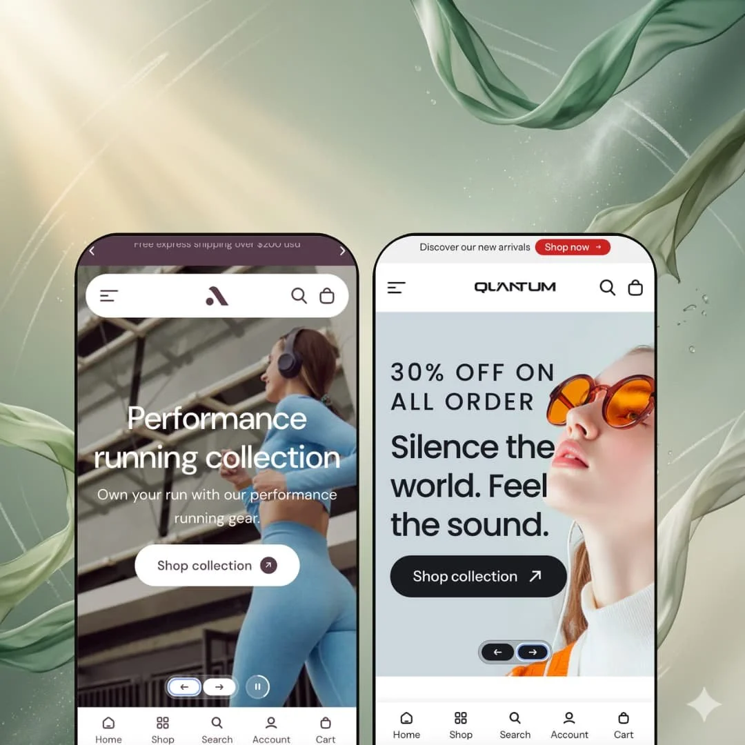
A dark electronics store built around specs and trust signals. Where Athora sells you on a vibe, Quantum sells you on numbers.
What works in this preset
The defining move is the spec chip. Every product card carries a vertical stack of features right under the image: Dolby Atmos, Rapid charging, 30 hours of battery, Bluetooth, Works with Apple and Android. For headphones and gadgets, where shoppers cross-shop on numbers before aesthetics, this puts the comparison work at the grid level. You do not have to click into a PDP to find out what a product can do. That alone makes Quantum the obvious starting point for any tech catalog using this theme.
The top utility bar carries About us and Help and FAQs links next to the country switcher. Small thing, but it gives Quantum a clean route to support content without cluttering the main menu. For electronics, where pre-purchase questions are heavier, that matters.
The hero is more aggressive than Athora's. A discount overlay sits right on top of the slide image: "30% OFF ON ALL ORDER" stacked above "Silence the world. Feel the sound." It is a sale-first presentation, not a brand-first one, and for a tech catalog whose conversion rhythm runs on flash sales, it fits.
The product comparison block earns its name here. Each card lists connectivity (Wired 3.5mm and Bluetooth 5.2), noise profile (ANC, Transparency), battery (30H or 40H, Fast Charge), and IP rating (IPX4 or IPX7). The same theme block exists on Athora, where it carries soft fabric chips. The contrast shows how flexible the section actually is.
The featured product block on the homepage carries a multi-location pickup module, with both a Melbourne and a New York address listed. Hybrid retailers running a brand store and a warehouse will recognize the setup immediately.
Where it stumbles
The testimonial block pairs a tall portrait photo with three stacked quote cards. The heights do not line up cleanly, so there is a strip of awkward whitespace running down the right side of the row. Small thing on a preset that is otherwise tightly composed.
The hero copy hierarchy on slide two stacks "30% OFF ON ALL ORDER" above "Silence the world. Feel the sound." That puts the discount above the brand line. Good for a sale push, but it buries the emotional hook beneath the price hook.
The spec chip list has no truncation. The QuietDot S3 card displays nine chips in a single column, which makes that card noticeably taller than its neighbors and breaks the grid's vertical rhythm. The mechanic is right; the cap is missing.
The brand logo row stuffs several partner SVGs into a single strip without normalizing their sizes. Larger logos dominate, smaller ones disappear, and the row stops reading as a balanced lineup.
Niche Suitability
Not Ideal For
-
Mid-sized merchants in apparel, activewear, athleisure, and consumer electronics. Anyone who wants a wide section library, native blocks that replace several apps, and the option to swing between editorial and spec-driven looks without changing themes.
-
Brands chasing a minimalist, short-homepage aesthetic. Single-product DTC launches. Anyone who wants to install on Friday and launch on Monday without pruning.
-
Medium. The section library is powerful, but the default homepages are deliberately maximalist. Expect to spend time cutting sections, swapping demo media, and tightening the comparison and hotspot blocks before launch.
Final Recommendation
★ 7.4/10
Rating
-
Wide product templates, strong cart drawer, countdown, comparison, shoppable video, hotspots, and a full predictive search drawer all ship as native sections.
8
-
Rich section library, but the default homepage is overloaded and merchants need to actively cut to get a focused layout.
7
-
Responsive nav, collapsible mega menu, and touch-sized cards in the markup; full mobile interaction verification would need a live device pass.
7
-
Image-heavy homepages with multiple video tiles. Responsive image sizing helps, but hero and lookbook assets need optimizing before launch.
7
-
The gap between Athora and Quantum proves the section library stretches across very different verticals without looking like one theme in two colors.
8
-
👑 The two presets cover apparel and consumer electronics, but the section library stretches well to adjacent verticals like sporting goods, home tech, wearables, and beauty tools. Quantum's spec chips fit electronics best. Athora's lookbook and shoppable video lean fashion.
-
📱The markup uses responsive image sizing and a collapsible mega menu that reflows to a drawer on smaller screens. The cart drawer, predictive search, and featured product block are all wired for mobile widths.
-
🎨 Very. The contrast between Athora's bright editorial palette and Quantum's dark tech palette shows the theme does not box you in. Typography and color are fully self-serve through the editor.
-
⚡The demos carry a lot of media. Image URLs use width parameters for responsive serving, which helps, but the Athora homepage in particular benefits from optimization given how much it stacks.
-
👕 Yes, with more flex than most themes. Dedicated templates exist for variants, linked products, and group media. Cards display color swatches with a "+1" or "+2" overflow chip when a product carries more colors than the card can show, visible on the Aerochill half-zip top in Athora and the AeroSound X7 Ultra in Quantum.
-
🔎 SEO metadata handling is Shopify-native, so you get title, description, and handle fields. The theme contributes clean heading hierarchy and descriptive alt text on demo images, and the featured product blocks carry their own structured product markup.
-
💱 Yes. Both demos expose a switcher with seven currencies (AUD, EUR, GBP, JPY, USD) and English plus Arabic. Note that the actual switching is handled by Shopify Markets at the platform level. The theme contributes the selector UI and Arabic RTL presentation.
-
⚙️ Standard Shopify app compatibility applies. The bigger point is that Athora's built-in blocks already cover countdown timers, gift wrap, shipping estimator, comparison tables, and shoppable video, which cuts the app stack you would otherwise carry.
-
🛒 Yes. Both presets are fully browsable at the demo URLs linked in each preset section above, and the Shopify Theme Store offers the standard free preview-in-your-store option.
This review is based on hands-on structural testing of the publicly available preset demos of the Athora Shopify theme as of April 13, 2026. Theme features, preset availability, and performance can change with subsequent updates from the theme developer.