
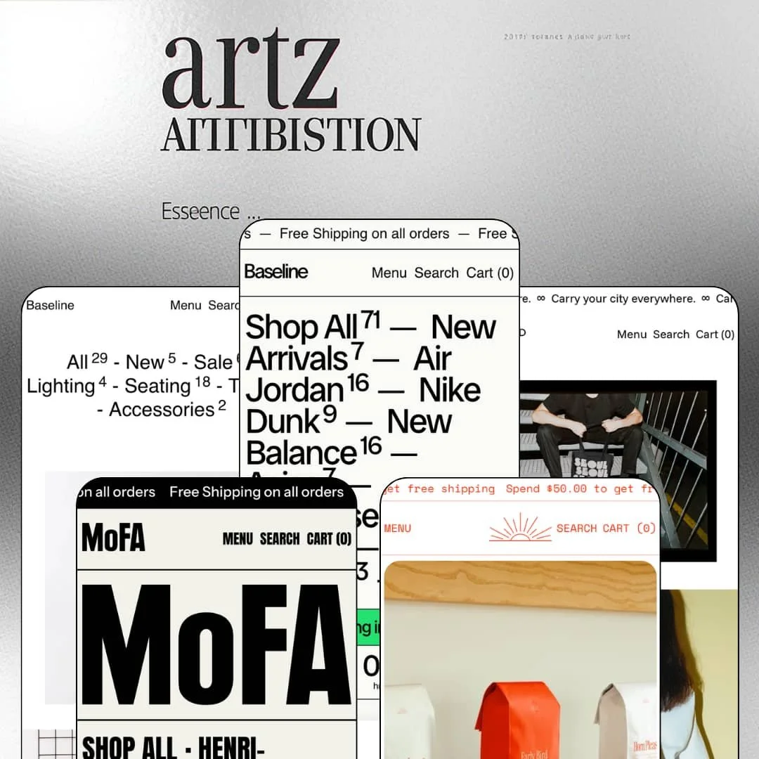
Most premium Shopify themes sell you a photography showcase. Baseline sells you typography: scrolling ribbons, mono grids, graphic dividers, and product lists set like gallery placards. Switch has kept this Online Store 2.0 theme in continuous development since May 2021, with version 5.4.0 landing in August 2026, so the $420 asking price buys a mature design system rather than a young one. Five presets stage that system across sneaker resale, designer furniture, art prints, city totes, and specialty coffee.
Sortable catalog tables with custom columns
Collection sections can render as sortable index tables whose columns come from the merchant's own product data. The Brutalist demo sorts artwork alphabetically by Artist; the same section elsewhere sorts by region, roast or style code. That turns a collection into a comparison surface. For single-origin roasters and print sellers with 20-100 SKUs whose buyers weigh attributes before price, it's a browsing mode that picture grids alone can't provide.
Would your customers buy without leaving the homepage?
Baseline bets that many will. Featured-product sections carry a live variant picker and an add-to-cart button straight into homepage flow; the Press demo stages its Brew of the Month with size and grind selectors, a short description, and a working buy button in one block. Repeat purchases skip the product page entirely. For small-catalog brands under 30 SKUs selling impulse-priced repeat consumables, that removes a full step from every single reorder.
Typography carries the store
Set type is the primary design material: announcement ribbons, looping text tickers, split-flap countdown digits, and index lists that let product names function as graphics. The practical consequence is a lower photography bill. A homepage here holds attention with copy and product cutouts where photo-led layouts would demand a campaign shoot, which suits copy-strong, single-brand operations in food-and-drink or print verticals getting to market before a full asset library exists.
Metafield rows turn product pages into spec sheets
Product data renders as labeled reference rows beside the buy box. The sneaker demo prints Model, Style code and Year next to the description, and the same row treatment reappears across presets wherever products carry verifiable details. Buyers get answers where the answers belong. For merchants selling spec-driven goods like resale sneakers, collectibles or coffee to detail-checking, considered buyers, that presentation does verification work that a paragraph of description can't.
The aesthetic is the contract
This kept bugging me as I moved between demos: there is no neutral setting. The identity doesn't switch off. Brutalist grids, graphic dividers and looping type define every preset, and softening them doesn't yield an elegant minimal store, it yields a diluted Baseline. Photography-led beauty and skincare brands aiming for a serene, luxury presentation are working against the grain from day one and should treat the mismatch as disqualifying rather than adjustable.
No sticky add-to-cart on long product pages
The theme builds product pages that scroll: spec rows, recipe panels, recommendation lists. Yet the buy button stays at the top, and neither the demos nor the published feature list include a sticky add-to-cart bar following the customer down the page. At $420, that's an odd corner to cut. Drop-driven sneaker and streetwear stores with flash-sale patterns, where mobile buyers scroll, decide and purchase within seconds, will feel this gap in every phone session.
2021 architecture at a 2026 flagship price
Baseline runs on Online Store 2.0, the generation Shopify introduced in 2021, and Dawn, Shopify's free default, sits on that very same generation. What $420 buys is the design system, the section library and five staged verticals, not newer capabilities like nested theme blocks. That's a fair trade for many. Evergreen, single-brand stores planning to hold one theme for years should simply make the trade knowingly, because the platform has moved a generation past this foundation since launch.
What it takes to launch
Expect a multi-day pass across ribbon and marquee copy, editorial and guide content, and store-identity naming, plus metafield population before the spec rows and sortable table columns display anything, and market and currency configuration for your own region.
-
What works in this preset
A full size run, printed on the card itself. I sat up at that: each tile in the arrivals row lists sizes seven through thirteen under the title, so a shopper hunting a size 12 knows whether the Sashiko Dunk is worth a tap before ever leaving the grid. Rare restraint, used well.
The drop choreography is the preset's real argument. A ticker announces the next release, a countdown runs high on the page, and the launch banner routes to a notify-me page instead of a dead product link, which turns the waiting period itself into a merchandisable moment for a store whose inventory arrives in waves. Limited and percentage-off badges do the rest quietly.
Colorways behave like a family instead of strangers. On the Dunk Low product page, sibling releases render as image swatches under a single Color label, each linking to its own listing, so five separate products read as one shoppable line. For resale catalogs assembled from one-off pairs, that stitching is the difference between a collection and a pile.
-
What works in this preset
The whole range sits on the homepage as a text index. Seating, Tables, Lighting and an Etc. column list every product as a plain link, twenty-nine items laid out flat, and the effect lands closer to a printed line sheet than a web store. It's confident. It also loads like nothing.
The featured furniture piece takes orders without a click-through. The Hurdle Tray Side Table appears mid-page with eleven named colour options and a working add-to-cart button, so a returning buyer who already knows the piece can finish the purchase in a single scroll of the homepage. Price sits right beside the button.
Where it stumbles
Furniture persuasion is spatial. Buyers want rooms, scale and context, and the preset's typographic register asks photography to do less work in the one vertical where imagery closes the sale; a merchant staging sofas here will re-weight the homepage toward image sections and hand back some of the identity that made the preset distinctive in the first place.
-
What works in this preset
Navigation is organized like a museum wing. The Artists menu groups twelve names under Japan and Europe/USA headings two levels deep, Hokusai beside Hiroshige, Mondrian beside Munch, which lets a print catalog present its curation as a product in its own right. The store is called MoFA. The joke lands.
I spent time at the bottom of the page, where "Exit through the Book Shop" swings a catalog of four-figure prints into ten-euro mugs and forty-euro art books with instant add-to-cart on the tiles. That sequencing mirrors how an actual museum monetizes footfall: the considered purchase up front, the impulse purchase on the way out. Smart retail thinking, expressed in sections.
-
What works in this preset
I went looking for a menu and found three links. Shop, Lookbook, Guides is the entire header, and the preset makes that austerity work by letting the homepage do the browsing: city totes scroll past as set type, continents anchor the collections, and the featured Buenos Aires bag sells with a size picker plus a paragraph of travel writing where studio photography would normally sit.
Content and catalog feed each other here. A "New guide" ticker leads into the London city guide, the guide links back into product, and the testimonials reference reading the blog before buying, which sketches a believable acquisition loop for a brand whose products literally are its editorial subjects. The demo doesn't just show a store. It models how the store finds customers.
Where it stumbles
Three links only stretch so far. Discovery leans entirely on the homepage scroll, and a catalog growing past today's twenty-five cities will need the header rebuilt around the continent collections the demo already maintains further down the page. That is future work the preset's minimalism quietly defers to the merchant.
-
What works in this preset
Coffee is a spec purchase, and the product page treats it that way. Copacabana lists tasting notes, region, process and brewing intent as clean data rows, then follows with recipe panels for espresso machine, stovetop, plunger and Aeropress, each carrying dose, yield, ratio and water temperature. That's genuinely useful. A roaster gets a brew-guide surface without ever leaving the product template.
Shipping thresholds get worked like a campaign. The $50 free-shipping line loops in the header ribbon and returns again before the footer, keeping basket math in view for a store where the average item costs $25. Small mechanic. Correctly aimed at consumables economics.
One grammar, five believable stores
Walking all five demos back to back reveals the actual product: a single typographic vocabulary restaged into sneaker resale, furniture, a museum shop, travel totes and a roastery. The stagings differ in structure, tone and merchandising logic rather than palette, which is the strongest available evidence that the section library has genuine range instead of one good demo and four echoes.
Commerce that assumes you publish
Every preset wires editorial into the selling loop somewhere: journals, city guides, brew pages, museum essays. Read together, they describe a theme built for merchants who write, one that keeps converting published words into storefront interface. Brands running content-led acquisition will find the connective tissue already in place rather than bolted on.
Built for the edited shelf
Across all five demos, catalogs stay small and tightly curated, and the index lists and text columns presume every product earns its own printed line. Nothing visibly breaks at scale. But nothing is designed for depth-first discovery either, and the theme's whole grammar rewards editing a range down rather than expanding one out.
The moving parts do the brand work
Motion is the default state everywhere: ribbons scroll, tickers loop, countdown digits flip. Switch those off and what remains is a competent, quiet mono-grid theme with far less of a face. Merchants wanting stillness aren't just adjusting a setting; they are removing the layer that makes Baseline recognizable.
★ 7.6/10
Rating
-
Countdown timers, quick buy, lookbooks, mega menus, promo popups and sortable table sections cover launch and discovery work; the absent sticky add-to-cart is the one visible hole in the conversion kit.
8
-
Staging the signature sections is straightforward editor work, but the spec rows and custom sort columns only earn their keep after real metafield setup in admin.
7
-
Slide-out navigation and a quick-buy drawer handle small screens, and the August 2026 update specifically refined drawer spacing for devices with bottom system controls.
8
-
Text-first sections keep pages light; the signature motion is set type rather than video, and demo product imagery ships as cutouts rather than heavy campaign files.
8
-
Deep configuration range inside the brutalist register, and five distinct stagings prove it, but very little of that range travels outside the register.
7
Frequently Asked Questions
-
Yes. The feature set pairs a countdown timer with promo tiles, promo popups and quick buy, which covers the core toolkit for launch-driven selling without additional apps.
-
The vertical and the staging, not the capability. All five draw on the same section library, so any preset can be rebuilt toward another's vertical if the aesthetic fits your catalog better.
-
Yes. Demo products run two variant axes side by side as stacked button groups, size plus grind for example, with no app involvement.
-
Yes. Single-variant products take an add-to-cart button directly on the tile, while multi-variant products open a quick-buy drawer for option selection.
-
Version 5.4.0 shipped on August 4, 2026 and added a standalone newsletter section, a footer newsletter block and more configurable discount display on product tiles, which is meaningful feature work five years after launch.
-
Yes. Menu panels render collection preview images with live product counts beside each entry, so the dropdown itself becomes a visual browsing surface.
This review is based on hands-on testing of the publicly available preset demos of the Baseline Shopify theme as of August 2026. Theme features, preset availability, and performance can change with subsequent updates from the theme developer.