
Fullframe is a $260 premium Shopify theme by Xotiny, and it has a very specific opinion about how an online store should feel. Every section of the homepage scrolls into view like a deliberate frame in a lookbook, not a feed. It's structured, editorial, and unapologetically image-forward. The first time you land on any of its three presets, you'll notice the bold typographic hierarchy and generously sized hero imagery doing most of the talking, pulling your eye straight toward a call-to-action before you've consciously decided to browse. Color palettes range from moody neutrals to warm pastels and earthy Mediterranean tones, and yet the three presets share the same deep feature set underneath their very different surfaces.
Pros.
〰️
Pros. 〰️
✚ Deep built-in conversion toolkit
Most $260 themes make you choose: native features or app compatibility. Fullframe doesn't ask. The mega menu with promotional images, quick view, quick buy, slide-out cart drawer, countdown timers, promo popups, product badges, before/after image slider, and shop-the-look hotspots are all built in. That's a feature density that competes with themes priced $100 to $150 higher, and it means fewer apps to install, fewer compatibility headaches, and less monthly subscription cost stacking up alongside the one-time theme price.
✚ Versatile product page and content architecture
Three product page templates give merchants real choices. The collapsible-tab layout works for detail-heavy products, the line-separated version suits cleaner presentations, and the specifications template handles technical products well. Collapsible detail tabs keep care instructions and shipping info accessible without cluttering the buying flow, and the built-in installment messaging ("Pay in 4 interest-free installments") adds a conversion nudge without a third-party app. The testimonial section goes a step further than most, supporting reviewer names and social media handles for stronger social proof. Beyond product pages, merchants get standalone section types for collapsible content, image banners, image-with-text blocks, multi-column layouts, and shoppable hotspot pages. That's enough building material to assemble full landing pages, about pages, and campaign pages without ever leaving the theme editor.
✚ Predictive search with curated suggestions
Open the search overlay on any preset and you're immediately offered popular search terms before you type a character. Florence suggests "Product, About, Page, Collection." Merida suggests "Marble, Vase, Candle, Bowl." It's a small touch, but it solves a real friction point: visitors who know roughly what they want but can't remember a specific product name get guided toward the right content instantly. First-time shoppers also get a quick read on what the store carries, which reduces the "what do you even sell?" bounce.
✚ Color swatches and variant previews on product cards
On the Merida homepage, the Diaspro Bowl card shows small circular swatch images for each color variant right there in the grid. Shoppers can see what's available without clicking into the product page. It sounds minor, but it meaningfully reduces page loads and keeps the browsing flow moving. Most themes force you onto the product detail page before you discover variant options; Fullframe surfaces them earlier, which respects the shopper's time.
✚ Multiple homepage templates per preset
Each preset comes with three homepage layouts (Home 1, Home 2, Home 3), each with a different section arrangement and visual emphasis. That's nine total starting points from one theme purchase. Merchants can swap homepage templates for seasonal refreshes or A/B test different page flows without building from scratch. It's the kind of flexibility that pays off over months, not just during initial setup.
Cons.
〰️
Cons. 〰️
🚫 This theme demands real photography
There's no hiding behind text blocks here. Every preset features large hero sections, full-bleed promotional banners, and product cards where the image is the primary visual element. If your product photography is mediocre, Fullframe will amplify that, not mask it. The dependency extends to collection-level assets too: homepage sections across multiple presets pull directly from collection imagery, so merchants need polished collection cover photos and descriptions alongside their product shots. Strong photography is the price of admission.
🚫 The settings panel is dense
Three product page templates. Three homepage layouts per preset. A configurable mega menu with tabs, images, and subcategory lists. Promo popups, countdown timers, announcement bars, testimonial blocks, hotspot sections. It adds up. Experienced Shopify merchants will appreciate the granularity, but complete beginners may feel overwhelmed by the sheer number of toggles and options when they first open the theme editor. Budget an hour or two just to orient yourself before making real customizations. The tradeoff is control, but the learning curve is real.
-
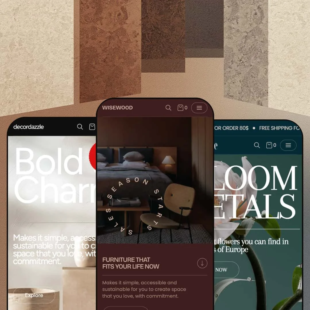
Dark, modernist, and deliberately restrained. The Fullframe preset is staged for high-end furniture, lighting, and home decor brands. Deep-toned backgrounds and serif-accented typography push product imagery to the foreground, and the overall effect is closer to walking through a design gallery than scrolling an online shop.
What works in this preset
A mega menu that thinks in rooms, not categories. Open the navigation and you're greeted by six tabs: Living Room, Dining Room, Bedroom, Outdoor, Decor Accessories, Office Room. Each one unfolds into subcategories with direct product links and a promotional image thumbnail tucked alongside. It mirrors the way people actually shop for home furnishings. Nobody searches "SKU-4429." They think "I need something for the bedroom." That mental model is baked right into the menu, and for a store with 40-plus products spread across rooms, it turns navigation into genuine discovery rather than a chore.
Deep blacks, bright product shots. The dark palette is the defining visual choice here, and it earns its keep. A white floor lamp or a pale oak chair leaps off the screen when there's nothing competing behind it. The contrast gives the store a premium, showroom-like weight that subtly reinforces higher price points. If you're selling minimalist or modernist homewares, this preset speaks your visual language right out of the box.
Navigation that leads with breadth. The top-level nav opens with "All products" and "All collections," which is a small choice that sends a big signal: this store has range. The collections submenu branches into named groupings like Arcata Vintage, Soft Brutalism, and Audo Copenhagen, each reachable in a single click. For merchants sitting on a deep, well-organized catalog, that structure conveys authority from the first interaction and invites exploration instead of funneling visitors too quickly.
Where it stumbles
Six tabs is a lot of tabs. The mega menu is staged at maximum density here, and stores with fewer than 30 to 40 products will feel it. Empty or thin tabs undercut the very authority the menu is trying to project. Merchants can absolutely simplify the structure through the theme editor, but anyone starting from this preset should budget time to trim it down if their catalog is modest. The feature isn't the problem; the demo's aggressive staging is.
-
Same engine, completely different mood. Florence wraps Fullframe's feature set in soft pinks, creams, and botanical branding designed for florists, gift shops, and boutique lifestyle brands. Where the Fullframe preset whispers "gallery," Florence says "welcome in."
What works in this preset
Free shipping, before you scroll. A "FREE SHIPPING FOR ORDER 80$" announcement bar stretches across the top of every page. You haven't moved a finger and the store is already framing your purchase psychology. The Fullframe preset doesn't surface an announcement bar by default, so Florence is a clear example of how turning on this configurable feature can anchor a promotional message right where it matters most, especially for gift-driven purchases where hitting a free shipping threshold nudges order values upward.
Shopping by mood, not by SKU. The mega menu here is organized around seasons and feelings: Pastel Perfection, A Colourful Summer, Autumn Hedgerow, Midsummer Night's Dream. Within each tab, sub-columns split into Fresh Flowers, Occasions, Arrangements, and Extras and Gifts, each with a promotional image sitting alongside the text links. It's a navigation scheme that speaks the language of someone buying flowers for an anniversary or decorating for a garden party. No one walks into a florist and says "show me products 12 through 24." This menu understands that.
A palette that gets out of the way. Light pinks, creams, soft greens. None of them fight for attention against the product photography. That matters more than it sounds, because floral and candle imagery already tends to be color-rich. A busy background palette would compete; Florence's pastels simply frame. The overall atmosphere is warm and approachable, the kind of color story that makes a visitor feel like they've walked into a thoughtfully curated boutique rather than a generic storefront.
Collections right where you'd expect them. "Best sellers" and "New arrivals" sit in the top-level nav as direct links, alongside "Shop all" and "Blogs." Themed collections like Blooming Marvelous and A Colourful Summer are one click away in the submenu. For seasonal or occasion-based stores, reducing the click depth to curated groups keeps the browsing momentum alive. Shoppers who land with a vague "I need anniversary flowers" can get to the right collection without detours.
Where it stumbles
Tiny images inside the mega menu. The promotional thumbnails within the mega menu are noticeably compact relative to the text columns surrounding them. For an industry where color, shape, and arrangement style drive purchasing decisions, those small images don't do the collections justice. The menu works fine as navigation, but it leaves visual storytelling on the table. A larger image ratio would let the mega menu sell, not just direct.
The homepage leans hard on your collection work. Several homepage sections pull directly from collection imagery and titles, which means the landing experience is only as polished as your collection curation. Merchants who haven't invested in strong collection cover photos, descriptive names, and organized descriptions will find those sections looking thin. Florence stages collection presentation more prominently than the other two presets, so the curation bar here is slightly higher. The theme gives you the tools; you just need to fill them well.
-
Merida trades Florence's softness for sun-warmed stone and Mediterranean luxury. This preset is built for artisanal homewares, marble goods, and curated decor brands. The homepage hero opens with a "Bold and Charm" headline, a -10% discount badge, and earthy warm tones that make you think of travertine countertops and terracotta. Letterspaced headings ("F e a t u r e d," "B e s t s e l l e r") give the page a deliberate, gallery-like rhythm.
What works in this preset
Deals are the first thing you see. Before you even reach the product grid, the hero is already showing a -10% OFF badge. Scroll down, and the Diaspro Bowl card carries a "FLASH SALE" label with crossed-out original pricing right there on the homepage. For stores built around frequent promotions, this is exactly right: the value proposition hits on the first scroll instead of hiding behind a product page click. The urgency is visual, immediate, and woven into the design rather than bolted on.
Three banners, three campaigns, one scroll. The homepage stacks three consecutive promotional banners (Heritage Collection, Best Seller, Sophisticated), each paired with its own lifestyle image, descriptive text, a "View all" link, and an "Up to 10% Off" badge. The effect is a scrolling editorial spread where each section feels like its own mini-campaign. Merchants running multiple promotions simultaneously don't have to choose which one gets the spotlight, they can feature all of them without the page feeling cluttered. The alternating rhythm of full-bleed images and product grids keeps the browsing cadence engaging.
Navigation organized by material. The "Inspiration" dropdown doesn't list generic categories. Instead, it speaks in stone: Alabaster Venato, Arabescato Bluette, Calacatta Viola, Nero Marquina, Roman Travertine. If your shoppers think in materials and finishes rather than product types, this navigation pattern meets them where they already are. Someone who arrives wanting a marble bowl can find it without first figuring out whether "marble" lives under "bowls" or "kitchen" or "decor." The menu speaks the product's own language.
A Sales link that doesn't hide. Right there in the top-level nav, between "Inspiration" and "Journal," sits a direct link to the Sales collection. No hunting, no filtering. Deal-seeking visitors land exactly where they want to be in one click. For stores that run seasonal clearance or regular promotional events, that prominent placement captures price-sensitive traffic before it bounces.
Where it stumbles
Those letterspaced headings slow you down. "F e a t u r e d." "B e s t s e l l e r." "W h a t o u r c l i e n t s s a y." It looks undeniably elegant, like gallery signage. But when you're scrolling quickly, your brain has to work harder to piece each word together. The style choice prioritizes aesthetics over scanability, and for shoppers who browse at speed, that's friction. Merchants can dial this back in the theme editor, but the Merida default stages it at maximum letterspacing throughout, which means the demo's first impression trades readability for atmosphere.
Niche Suitability
Not Ideal For
-
Fullframe is built for visual-first brands with mid-to-large catalogs: furniture retailers, artisanal homewares, florists, luxury gift shops, and lifestyle brands that have strong photography and want an editorial shopping experience. If you'd rather not rely on third-party apps for features like quick view, color swatches, or promotional timers, the built-in toolkit covers a lot of ground.
-
Stores with very small inventories (under 10 to 15 products), text-heavy or service-based businesses, or merchants who don't have access to professional product and lifestyle photography. It's also not the strongest pick for stores that need heavy checkout customization, since Fullframe, like all Shopify themes, relies on Shopify's native checkout.
-
Medium. The preset system gives you a strong head start, but you'll need quality photography and should plan to spend real time configuring the mega menu and curating your collections. The payoff is a store that looks custom-built, but the "just install and go" bar is higher than with simpler themes.
Final Recommendation
★ 8.2/10
Rating
-
Exceptionally feature-rich for its price. Native quick view, mega menu, color swatches, image hotspots, before/after slider, countdown timers, and three product page templates cover most merchant needs without apps. The implementation is polished and conversion-focused throughout.
9
-
The presets and homepage templates offer a strong starting point, but the number of configurable sections and menu options creates a real learning curve. Experienced Shopify merchants will adapt quickly; beginners should expect an orientation period.
7
-
Navigation collapses into a well-organized drawer with back-navigation and nested category support. Product cards, images, and the cart flow render cleanly on smaller viewports, and the large hero images scale down gracefully.
8
-
Pages loaded responsively during testing with no noticeable lag on transitions or hover effects. Real-world speed will depend on merchant image optimization, but the theme itself doesn't introduce unnecessary bloat.
8
-
Three distinct presets, three homepage templates per preset, three product page layouts, and extensive section types add up to a theme that can serve very different brand identities from a single codebase. Few themes at this price offer comparable range.
9
FAQ
〰️
FAQ 〰️
-
👑 It's one of the strongest options in its price range for those categories. The Fullframe preset stages a complete furniture store with room-based mega menu navigation, and Merida demonstrates material-based categorization for artisanal goods. Both approaches reflect how home decor shoppers actually think and browse.
-
📱Well. The mobile nav drawer supports multi-level nested menus with clear back-navigation, and product grids reflow to single-column layouts that keep images and pricing legible. During testing on Florence, the announcement bar, search, and cart all remained accessible and functional on narrower viewports without any layout breakage.
-
🎨 Very. Each preset demonstrates a radically different color palette, typography treatment, and navigation structure, all running on the same underlying theme. Fonts, colors, section ordering, and mega menu content are all adjustable through the Shopify theme editor without touching code.
-
⚡ Page transitions and section loads felt snappy across all three presets during testing. Even the Merida homepage, which is the most image-dense of the three, loaded its multi-banner sections and testimonial carousel without visible delay. That said, real-world speed will always depend on how well merchants optimize their own images.
-
👕 It does. The Lagoon Lantern product page on Merida demonstrates color swatches and size selectors with clear visual feedback, and color swatch thumbnails appear directly on product cards in the homepage grid. Simple and multi-variant products each get distinct, appropriate UI treatment.
-
🔎 Fullframe supports Shopify's native SEO infrastructure: customizable title tags, meta descriptions, clean URL structures, breadcrumb navigation, and blog/journal functionality for content marketing. The breadcrumbs and structured navigation help search engines parse site hierarchy cleanly.
-
💱 Yes. The theme is compatible with Shopify's built-in translation and multi-currency systems. Merchants can configure additional languages and currencies through Shopify's standard localization settings, and the theme handles locale switching without breaking layout or navigation.
-
⚙️ Fullframe follows Shopify's standard theme architecture, so apps that inject into product pages, cart drawers, or checkout flows work as expected. Given the depth of native features (quick view, swatches, countdown timers, popups), you may find you need fewer apps than with other themes.
-
🛒 Shopify's "Try theme" option lets you install and customize Fullframe in your store's theme editor before paying the $260 one-time license fee. The three preset demos linked throughout this review are also publicly accessible for hands-on browsing anytime.
This review is based on hands-on testing of the publicly available preset demos of the Fullframe Shopify theme as of March 10, 2026. Theme features, preset availability, and performance can change with subsequent updates from the theme developer.