
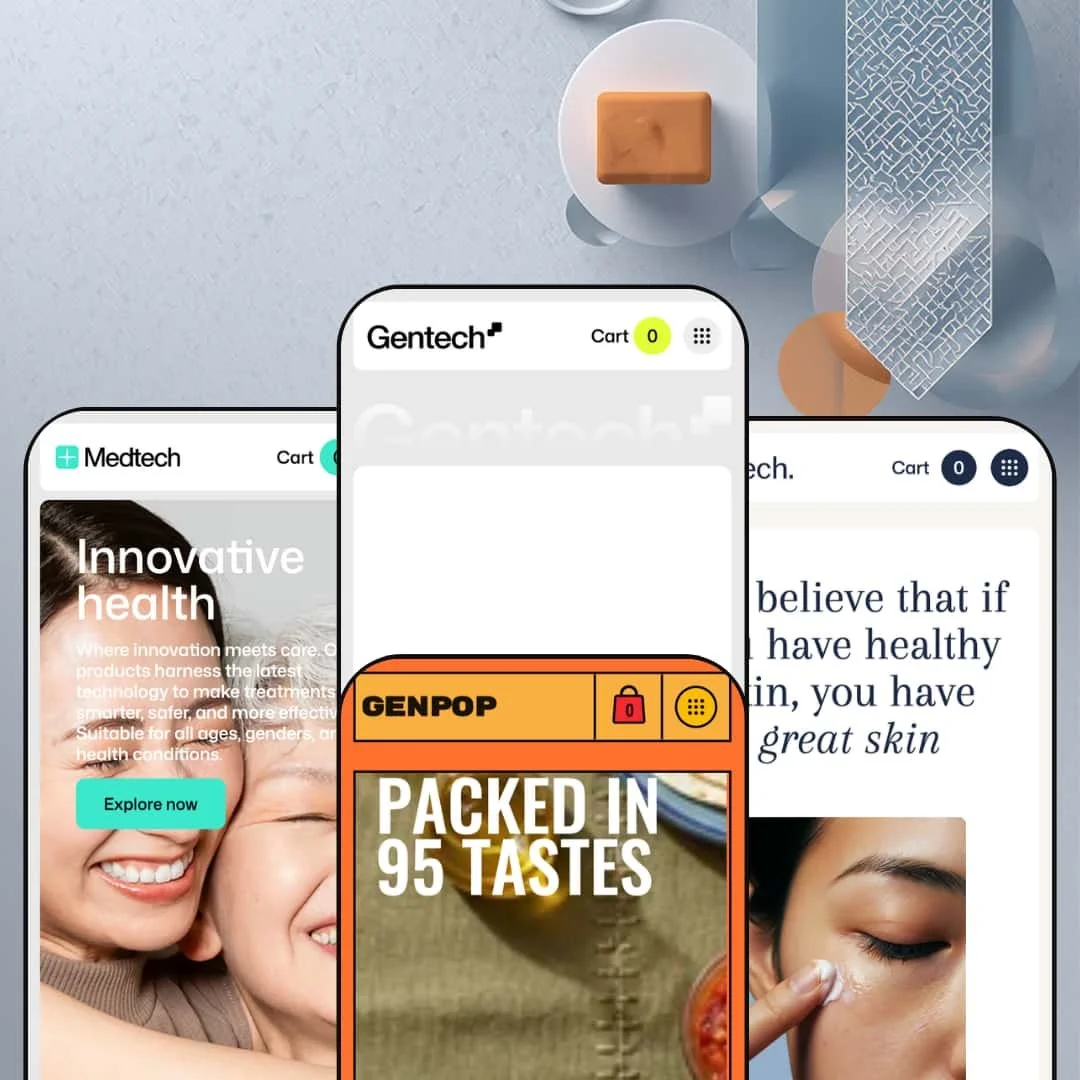
You're selling bottles, supplements, serums, or canned food - and every Shopify theme you've tried either looks generic or needs a developer to make it yours. That's the gap Gentech is built for. It's a $360 theme with four presets that each target a specific product vertical, all sharing the same drag-and-drop section engine underneath. I tested every one of them, clicked every menu, added products to cart, broke things on purpose. Here's what I found
Pros.
〰️
Pros. 〰️
Block-based section flexibility across all presets
Gentech's architecture lets merchants drag, rearrange, and customize sections without code. The demo navigation for each preset reveals five or more home templates, multiple collection grid layouts, and three product page templates. That's a deep well of layout options for a single $360 purchase. A merchant can start with one preset, swap sections between templates, and evolve the storefront over time without hitting a ceiling.
Shop the Look hotspot sections with inline add-to-cart
Every preset includes at least one lifestyle image with clickable product pins, and the implementation goes deeper than the typical "tagged product" overlay. In Cooktech, the hotspot cards support multi-variant selection (size and flavor) with inline add-to-cart. In Medtech, the hotspot comes styled with a full product description for supplement-specific context. This feature bridges editorial imagery and commerce in a way that genuinely reduces the number of clicks between "that looks interesting" and "it's in my cart."
Enhanced mega menu search with live product previews
Typing into the search bar surfaces product thumbnails, collection links, and category groupings instantly. It's a meaningfully better search experience than what Shopify gives you by default, and it works consistently across all four presets. For stores with multiple product categories, this kind of predictive search keeps shoppers moving forward rather than bouncing because they couldn't find what they wanted fast enough.
Video testimonials and video carousel sections
The theme supports embedded video in testimonial blocks (visible on Gentech's homepage) and dedicated video carousel sections (visible on Beautech's homepage). Video-based social proof carries more weight than text quotes, and having it as a built-in section type means brands don't need to bolt on a third-party app to showcase customer stories. For any store investing in video content, this is a practical advantage.
Comprehensive product page with accordion tabs and rich variant selectors
Across presets, product pages use collapsible info panels (Information, FAQs, Delivery, Shipping) and image-based color swatches alongside pill-style size and material selectors. The accordion structure keeps pages scannable even when merchants load them up with ingredient details, shipping policies, and FAQ content. And the image swatches for color variants eliminate the guessing game that plain text dropdowns create.
Conversion toolkit: countdown timers, trust counters, and trust badge bars
The theme bundles countdown timer sections (staged in Gentech and Beautech), animated trust counters with "200+ users" social proof (visible in Gentech, Medtech, and Cooktech), and a trust badge bar for BNPL, returns, and shipping info (visible in Medtech and Beautech). Each one is a standalone configurable section, so merchants can place them wherever they fit the page flow. Together, they create a layered urgency-and-reassurance system that most themes only achieve through third-party apps.
Cons.
〰️
Cons. 〰️
Product cards render duplicate DOM nodes across every preset
This is the most technical issue, but it matters. Every product card in the theme outputs its title, price, and sale badge three to four times in the page source. Only one instance is visible on screen at a time; the rest are hidden via CSS for responsive breakpoints. On a collection page with 14 products, that's 42 title renders and potentially 56 badge instances in the DOM. It inflates page weight, creates noise for screen readers and accessibility tools, and could confuse search engine crawlers that parse the raw HTML. This isn't a preset-specific quirk. It's baked into the card component used across all four demos.
Typos and misplaced content are scattered across three of four presets
It's not one stray typo. "CATEGRORY" appears in both Medtech and Cooktech. "SPACIAL SALE" (instead of "Special Sale") shows up on Gentech's homepage and collection page. Beautech ships with a leftover "est" placeholder fragment and a $0.00 product in a featured homepage position. Cooktech's blog section has five empty "Article title / Author" placeholder cards. And on the Gentech About page, the BNPL description ("Pay in installments with 0% interest and no extra charges through Shop Pay") is incorrectly placed under every product feature icon, so it reads as the sub-description for "Durable powder coat finish" and "Double walled insulation." That's not placeholder content someone forgot to swap. That's copy pasted into the wrong field. At $360, this volume of QA issues across the majority of presets is hard to overlook.
New theme with a limited track record
Gentech launched on February 4, 2026, and is currently at version 1.1.0 (released February 17, 2026). That's roughly seven weeks of history at the time of this review, and only one public review on the Shopify Theme Store so far. The developer, Xotiny, has a solid reputation for responsive support on their other themes, and that single review praised their willingness to fix issues. But for a $360 commitment, merchants should weigh the fact that there's no long update history to judge reliability, and the QA issues in the current demos suggest the polish is still catching up to the feature ambition.
Empty states default to visible placeholders instead of hiding gracefully
When product recommendations aren't populated, the product page displays a "No products found" heading with nothing beneath it. It doesn't hide the section. It just shows the empty state. The same pattern repeats with Cooktech's blog cards: unpopulated slots render as visible placeholders rather than collapsing. A theme with this many configurable sections needs smarter fallback behavior. Every empty section that renders visibly is one more thing a merchant has to manually clean up before going live.
-
Dark palette, green accents, tech-forward energy. This is Gentech's flagship preset, staged for drinkware and insulated bottle brands. It opens with a rotating text hero, drops into a product specification block, and funnels you toward a circular collection carousel. The whole page feels like it was designed by someone who's actually sold water bottles online.
What works in this preset
The hero doesn't show you a product photo. Instead, three brand messages ("Minimal Aesthetic," "Hydrate Better," "Smart Simplicity") cycle through with smooth fade transitions. It's a smart choice for a drinkware brand: you're selling a lifestyle promise, not a picture of a bottle. The rotation keeps the page feeling alive without the visual noise of a traditional image slideshow, and it immediately sets the tone for everything below.
Right below that hero sits a feature specification block with custom icons for things like double-wall insulation, a soft rubber base, and a 2-in-1 lid switch. This is where I sat up and paid attention. Most themes bury product specs on the product page. Gentech puts them front and center on the homepage, formatted like a tech spec sheet. For any store selling a product with measurable performance claims, this section does real work before the shopper even clicks a product.
The collection carousel in this preset uses circular image tiles tagged by category: Coffee & Tea, Tumblers, Bottles, Accessories, Cup. It's compact, scrollable, and immediately scannable. I've seen plenty of grid-based collection layouts, but the rounded treatment here gives the homepage a branded editorial rhythm that flat rectangles just don't deliver.
Where it stumbles
Each product card in the homepage featured collection renders its title and price three times in the page source. Only one instance is visible, but that's assuming CSS behaves perfectly across every browser. If a merchant tweaks the template and something shifts, shoppers could see stacked duplicate titles. It's not broken today, but it's messy under the hood.
The "Get in contact" newsletter block and the footer are practically neighbors, and they look almost identical in weight and styling. Your eye doesn't know which one to act on. For a page that does so many things right higher up, this is a sloppy handoff at the finish line. Either remove the inline newsletter block or make it visually distinct enough that shoppers actually register it as a separate call to action.
-
If Gentech felt like a tech showroom, Medtech flips the script entirely. White and green, clean lines, clinical restraint. This preset is staged for health supplements and wellness brands, and it nails the "I trust this company with what I put in my body" feeling from the first scroll.
What works in this preset
The homepage opens with four collection cards for Sleep, Relax, Energy, and Vitamins. Each one shows a category name, a product count, a thumbnail, and a one-sentence description of what that collection is for. I liked this. Supplement shoppers usually arrive with a specific problem ("I can't sleep," "I need more energy"), and these cards let them self-select into the right product family within seconds. It's smarter than dumping a generic product grid on the page and hoping people figure it out.
The Shop the Look hotspot in this preset is styled for wellness, not fashion. It shows a product card for "Hormone Balance" with a full description, price, and inline add-to-cart, all overlaid on a lifestyle image of someone doing yoga. That context matters. A supplement product sitting in a lifestyle setting with enough detail to buy right there, no page redirect needed, is a genuinely useful conversion shortcut for this vertical.
The blog section here carries more visual weight than in any other preset. Posts display as horizontal image cards with large thumbnails and date stamps, creating a magazine-like content row. For supplement brands that publish ingredient research or wellness guides, this is a clear signal: "We have content, and we want you to read it." It positions the store as an authority, not just a checkout page.
Where it stumbles
The newsletter email input in the footer ships without placeholder text. No "Enter your email," no hint, just a blank field. It's a small thing, but on a quick scan a visitor might not immediately understand what to do with it. Easy fix, but it shouldn't need fixing at this price point.
-
From Medtech's clinical whites to Beautech's warm beiges and flowing type. This is the skincare and beauty preset, and it feels like flipping open a magazine rather than landing on a store. Generous whitespace, narrative copy, editorial photography. If your brand has a story to tell, this preset gives you a stage to tell it.
What works in this preset
The hero doesn't lead with a product or a sale. It leads with a philosophy: "We believe that if you have healthy skin, you have great skin." Below that headline sits a paragraph about ingredient sourcing, paired with a product image in a layout that reads more like a brand manifesto than a homepage. I've reviewed a lot of Shopify themes, and most beauty presets open with a product carousel or a promo banner. This one opens with a belief statement. It's a deliberate choice that suits brands selling through story rather than discount.
Four icon-and-text columns spell out the brand's ethical commitments: naturally sourced, gentle for all skin types, ethically tested, no hidden chemicals. It's a familiar skincare layout, sure. But the beige palette and generous spacing here make each block feel like part of a designed brand identity rather than a checklist bolted onto the bottom of the page. Context and craft turn a standard section into something that actually reinforces the brand.
A brand timeline section anchored by a "2019" date stamp scrolls horizontally through imagery, framing the company as established and research-backed. Most themes don't ship with a dedicated origin-story section. For skincare companies that want to communicate longevity and serious R&D investment, this is a trust signal that works quietly and effectively.
Two testimonial quotes overlay a soft-focus product image, and they feel native to the design rather than dropped in from a widget. The lifestyle imagery behind the quotes keeps the page visually cohesive, and for beauty brands where peer validation carries real purchase weight, this integrated approach is more persuasive than a plain text carousel floating in white space.
Where it stumbles
Below the "Skincare Forever Concentrated" heading, there's a lone "est" just sitting there. Leftover placeholder copy that nobody cleaned up. It's the kind of thing that makes a merchant look careless if they go live without catching it, and it undercuts the polished editorial feel that the rest of the page works so hard to build.
One of the featured homepage products, the "Concentrated Hair Cleanser," displays a price of $0.00. Demo data issue, not a theme bug. But if I'm a merchant evaluating whether to spend $360, seeing a zero-dollar product in a featured position doesn't inspire confidence. The demo is the sales pitch. It should be airtight.
-
After Beautech's quiet elegance, Cooktech hits like a food truck menu board. Bold uppercase type, warm saturated imagery, canned goods front and center. This preset is loud on purpose, and for artisanal food brands, that energy is exactly right.
What works in this preset
"PACKED IN 95 TASTES" screams at you in heavy all-caps type. The hero is the typographic opposite of Beautech's whispered philosophy, and it works. For craft food brands, the retro-meets-modern packaging feel communicates personality and shelf presence in a way that polite serif type never could. This is the most opinionated hero across all four presets, and that's what makes it effective.
A "NEW TECHNOLOGY" section displays "365d" freshness and "12h" open-use stats in oversized numerals. Shelf life is a real buying factor for canned and preserved food, and most stores bury that detail three paragraphs into a product description. Cooktech pulls it up to headline level. It turns a mundane spec into a selling point, and for the right product, that reframing matters.
The Instagram-style social wall, labeled "JOIN THE COMMUNITY @genpop.ig," uses a grid of circular user photos with one embedded testimonial quote. For food brands that live on user-generated content and recipe sharing, this section provides native social proof without bolting on a third-party Instagram feed app. It feels organic to the page rather than appended as an afterthought.
In this preset demo, the footer is deliberately minimal: just navigation links, payment icons, language and currency selectors, and copyright. The other presets have more elaborate footers, but Cooktech's stripped-down approach suits a homepage that's already packed with bold content. It gives the page a clean ending instead of competing for attention at the bottom.
Where it stumbles
The blog section is half-broken out of the box. Three posts are populated, but five additional cards show nothing but "Article title / Author" placeholder text. That's not a subtle issue. It looks like the page loaded wrong. A merchant who installs this preset and doesn't immediately populate or delete those empty cards will present a storefront that feels unfinished at first glance.
Niche Suitability
Not Ideal For
Final Recommendation
-
Merchants selling physical products in verticals like drinkware, supplements, skincare, or food who want a visually polished, section-rich storefront without hiring a developer. The four presets give you a genuine head start in each niche, and the block editor means you're not locked into any single layout long-term.
-
Stores with very large catalogs (500+ SKUs) that need advanced filtering or highly custom product page logic. Gentech's strength is visual storytelling and mid-size catalogs, not warehouse-scale browsing. And if you want a completely minimalist, text-only approach, the animation-heavy sections here will fight you at every turn.
-
Medium-High. The section builder and block flexibility lower the technical bar for layout changes, but the volume of typos, misplaced copy, empty placeholder sections, and duplicate DOM patterns mean a merchant needs to audit every page of their chosen preset before going live. That cleanup work adds real hours to what should be a plug-and-play experience at this price point.
★ 8./10
Rating
-
Rich feature set including hotspot sections, video testimonials, countdown timers, and accordion product tabs. Shopify's standard filtering and sorting is presented in a clean, usable way, and the search bar's live preview adds genuine value over baseline.
8
-
The block editor and multiple templates lower the learning curve, but the volume of section options and demo placeholder content that needs cleanup raise the initial setup effort.
7
-
Pages loaded quickly in testing, the slide-out cart works smoothly, and the mega menu collapses into a functional mobile drawer. Hotspot sections swap to mobile-optimized images.
8
-
Transitions and animations render without visible jank. Pages load with minimal layout shift. Image-heavy sections use responsive sizing. Overall fluidity during testing was strong across all four presets.
8
-
Five home templates, up to seven collection grid layouts, three product page templates, and a deep section library. Few themes at this price point offer this many staging options without requiring custom code.
9
-
👑 It's built for exactly those verticals. The four presets cover drinkware, supplements, skincare, and canned food, and sections like the product specification block and ingredient panels cater directly to physical product storytelling. Medtech's category cards with supplement-specific descriptions are especially well-suited to health and wellness stores.
-
📱Yes. During testing, Gentech's homepage loaded quickly on a mobile viewport, the slide-out cart drawer opened without lag, and the mega menu collapsed into a tap-friendly drawer. Hotspot sections switch to a mobile-optimized image layout automatically.
-
🎨 Very. Each preset supports full typography control, color scheme adjustments, and a block-based section builder that lets you rearrange homepage layouts without code. Compare Cooktech's bold uppercase type to Beautech's flowing editorial style, and you'll see how far apart two presets from the same theme can look.
-
⚡It felt snappy across all four demos. Animations including text reveals, counter ticks, and carousel transitions rendered without visible stutter. Pages loaded with minimal layout shift, and the enhanced search returned live results almost instantly on the Beautech preset.
-
👕 It does. The Gentech preset's product page uses image-based color swatches, pill-style material selectors, and size buttons. Cooktech's Shop the Look hotspot goes further, supporting dual variant selection (size and flavor) with inline add-to-cart. That's a step above what most themes offer.
-
🔎 The theme supports breadcrumbs, clean heading hierarchy, blog functionality, and structured product page layouts. Meta titles and descriptions are manageable through Shopify's standard editor. The blog sections in Gentech and Cooktech give content marketers a visible homepage entry point for organic traffic.
-
💱 Language selection and currency switching are handled by Shopify Markets at the platform level, not by the theme itself. What Gentech provides is a clean footer selector UI for country and language, plus built-in EU translation files for interface strings (English, French, Italian, German, and Spanish). The specific countries and languages shown in each demo are configured by the store owner in the Shopify admin. During testing, the Medtech demo displayed the broadest country list, while Gentech showed a more focused selection.
-
⚙️ The theme follows Shopify's standard section and block architecture, so most apps that inject content via app blocks or script tags should integrate without conflict. The slide-out cart supports cart notes and in-store pickup options natively.
-
🛒 All four preset demos are publicly accessible, and the Shopify Theme Store lets you install the theme in your editor before purchasing. You only pay $360 when you publish. Each demo also includes a "Theme" navigation menu that links to every available section, template, and layout for hands-on exploration.
This review is based on hands-on testing of the publicly available preset demos of the Gentech Shopify theme as of March 2026. Theme features, preset availability, and performance can change with subsequent updates from the theme developer.