
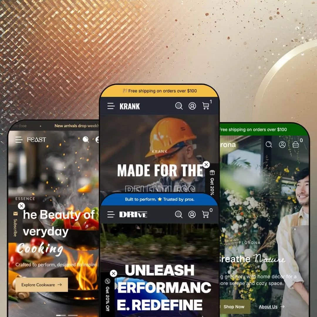
Here's a theme that sells power drills and houseplants from the same codebase, and somehow pulls off both. Krank is a $320 premium Shopify theme from Webvista Studio, and it ships with four presets that don't just swap color palettes. They rethink navigation, content hierarchy, and shopping flow for four very different retail worlds: tools, automotive parts, indoor plants, and kitchenware. Under the hood, every preset shares the same deep feature set: a mega menu that can embed live product cards or lifestyle imagery, a slide-out cart with upsell hooks, quick buy and quick view, countdown timers, cross-selling blocks, age verification, and EU translations in five languages with right-to-left support. It's ambitious. The question is whether that ambition holds up when you actually click around.
Pros.
〰️
Pros. 〰️
✚ Conversion-focused mega menu system
Across all four presets, the mega menu goes beyond dropdowns and becomes a genuine selling tool. Drive embeds product cards with live pricing. Florona fills the flyout with aspirational lifestyle imagery. Krank builds a department-store taxonomy with six columns of subcategories. Feast blends category depth with editorial promo cards. The underlying module is the same, but each preset configures it to match how its target customer actually shops. For merchants, this means the navigation itself reduces clicks between landing and adding to cart, and that's a measurable conversion advantage.
✚ Rich built-in section library without app dependencies
The theme packs in cross-selling blocks, countdown timers, before/after image sliders, image hotspots, lookbooks, product tabs, size charts, stock counters, age verification, promo popups, back-in-stock alerts, trust badges, community feed sections, and dedicated utility page templates for support centers, store locators, and brand storytelling. That's a lot of functionality that would normally require multiple paid apps. When you factor ongoing app subscription costs against the one-time $320 price, Krank starts looking like a bargain for merchants who would otherwise be running five or six add-ons.
✚ Genuine industry versatility across four presets
Most Shopify themes offer two or three presets that amount to color swaps. Krank's four presets genuinely rethink the navigation structure, content hierarchy, and shopping flow for each target industry. A tools store, an auto parts shop, a plant boutique, and a kitchenware brand can all start from a preset that already reflects their customers' browsing patterns. That saves significant setup time, because the foundational information architecture is tailored to the vertical, not just the surface styling.
✚ Slide-out cart with upsell and trust-building tools
Adding a product to the cart triggers a slide-out drawer that keeps shoppers on the page instead of redirecting them. The drawer supports cart notes, gift wrapping options, and sticky cart behavior, giving merchants multiple touchpoints for increasing average order value. The cart drawer's consistent behavior across all four presets confirms it as a core theme capability, not a preset-specific feature.
Cons.
〰️
Cons. 〰️
🚫 Demo staging inconsistencies across presets
Florona's announcement bar still references "KRANK" branding, and several of its menu links route to the same catch-all collection instead of distinct browsing paths. These are content staging issues, not theme bugs, but they make it harder to evaluate each preset's full potential during the trial period. Merchants should test with their own content rather than relying on demo data to judge capabilities.
🚫 Documentation spread across multiple sources
Theme settings and section guides live on a separate GitBook site, while the Shopify Theme Store page provides the feature list. There's no in-theme onboarding flow to bridge the gap. A consolidated setup guide or in-editor walkthrough would cut the learning curve, especially for merchants who are less experienced with premium theme configuration.
🚫 Newer theme with a limited review track record
With 12 reviews (92% positive) and version 1.1.2 as of December 2025, Krank is still young compared to established themes with hundreds of reviews. Feast was added in that December update, so it has the least real-world merchant testing. Early reviews from verified Shopify Partners praise the section variety and support responsiveness, but the smaller review pool means less community-sourced insight into edge cases and long-term reliability.
-
Dark backgrounds, orange accents, and enough product categories to fill a warehouse aisle. The Krank preset stages a full power tools store, and it leans hard into the idea that hardware buyers know what they want and just need a fast path to find it.
What works in this preset
The navigation thinks like a hardware buyer. This is the detail that impressed me most. In this preset demo, Power Drills don't just get a single collection link. They break into Voltage, Drill Type, Use Case, Features, and Kits. Power Grinders list by disc size and application. Oscillating Tools, Measuring Tools, Lighting Tools, and Cutting Tools each get their own top-level entry. If you've ever walked into a Home Depot and appreciated that the aisles are labeled by project type, not just product name, that's exactly the logic at work here. It gets shoppers to the right SKU faster than any on-page filter could.
The dark palette earns its keep. Deep blacks and dark grays with high-energy orange and yellow accents on the calls-to-action. This isn't dark mode for the sake of aesthetics. It mirrors what buyers expect from professional tool brands, and the contrast makes add-to-cart buttons genuinely pop. It's a deliberate conversion play disguised as a design choice, and it works for this category.
Utility pages that actually serve a purpose. The demo stages a Find a Store page, a Support Center, a Community Feed (social wall), and a Behind the Brand story page. These aren't afterthoughts. For hardware merchants who need to communicate warranty policies, dealer networks, and installation guides, having purpose-built templates for that content saves real setup time. Most Shopify themes give you a blank page and wish you luck.
A theme features showcase page. Unique among the four presets, Krank includes a dedicated page walking merchants through the theme's built-in capabilities. It's a small thing, but during evaluation it doubles as self-documentation, and that's genuinely helpful when you're trying to figure out what a $320 theme can actually do.
Where it stumbles
The mega menu can overpower a lean catalog. Some category flyouts in this demo pack six or more columns of links, images, and promo tiles. If you're running a store with thirty products, that menu is going to feel like wearing a suit two sizes too big. Merchants with smaller inventories will need to prune the navigation aggressively during setup, or risk making their store feel emptier than it is.
Dark backgrounds fight certain product photography. The industrial palette works brilliantly for steel tools and dark machinery. But lighter-colored products, or lifestyle shots with natural lighting, can lose their punch against all that black. If you sell brightly colored accessories alongside your tools, plan on tweaking section background colors to give those products room to breathe.
-
Drive takes the Krank foundation and rebuilds it for gearheads. Darker blacks, metallic accents, and a navigation system that does something I haven't seen in many Shopify themes: it puts actual product cards, with prices and "Choose Options" buttons, directly inside the mega menu flyout. For automotive shoppers who already know they want 18-inch wheels, that's one less click between intent and checkout.
What works in this preset
The mega menu becomes a mini-catalog. I spent a while just hovering over the navigation in this preset, which tells you something. Instead of text links, the category flyouts display product thumbnails, names, and prices in a scrollable grid. Under "All Wheels" alone, you can see up to ten products with real pricing without clicking a single link. For parts buyers who comparison-shop on price and spec, the navigation itself does half the work of a collection page. It's clever, and it shaves a meaningful click out of the buying journey.
Category separation mirrors physical auto parts stores. High-consideration items (wheels, brake calipers) sit in their own top-level categories, while impulse add-ons like leather conditioner and glass cleaner live under "Car Care." Anyone who's walked into an auto parts store will recognize this layout immediately. That familiarity reduces cognitive load, and for a niche where shoppers tend to be knowledgeable and impatient, that matters.
The metallic visual identity fits the product. Dark blacks with subtle chrome accents give wheel and caliper product images a showroom-quality presentation. It's the kind of color work that makes a $700 wheel look like a $700 wheel, reinforcing the premium positioning that performance parts buyers respond to.
Where it stumbles
Image-heavy flyouts add weight. Because the mega menu loads full product cards with images, the flyout panels carry more visual baggage than a text-based menu. On slower connections, you might notice a brief delay before all thumbnails render. It wasn't a problem during my testing, but merchants with very large catalogs should check this with their own imagery. A menu that hesitates is a menu that loses clicks.
Fewer supplementary content pages. Compared to Krank's Behind the Brand, Community Feed, and Find a Store pages, Drive's demo is lighter on non-product content. The theme supports all those page templates, and they're available to configure, but this preset doesn't stage them by default. Automotive brands that want to build community around customer builds and installations will need to set those pages up from scratch.
The tire category is labeled "All Ties." A demo typo, not a theme bug. But it's the kind of thing that makes you double-check your own navigation labels during setup. Placeholder content won't always match your vocabulary, and this one slipped through.
-
And then there's Florona, which proves that the same theme selling power drills can also sell monstera plants without anyone raising an eyebrow. The color palette shifts to greens, creams, and earthy tones. The navigation reorganizes around plant shopping concepts: Types, Styles (Minimalist, Tropical, Rustic Charm), and Spaces (Living Room, Office Desk, Balcony). Where Krank and Drive use the mega menu to move shoppers efficiently through a catalog, Florona uses it to set a mood. It's the same module, doing a completely different job.
What works in this preset
The mega menu sells a lifestyle, not just products. In this preset demo, the Shop flyout includes two large promotional cards with lifestyle imagery and taglines like "Bring nature indoors" and "Inspired by the wild." This turns the navigation from a directory into an aspirational browsing experience, which is exactly how plant shoppers discover products. Nobody opens a plant store website thinking "I need a 6-inch pothos in a ceramic pot." They're thinking "I want my living room to feel more alive." Florona's menu speaks that language.
Navigation organized by space and style, not just species. Beyond product types, the menu groups plants by decorating style (Minimalist, Tropical Vibes, Modern Home, Rustic Charm) and by room (Living Room, Office Desk, Bedroom, Balcony, Bathroom). Plant buyers shop by "where will this go?" more often than "what species is this?", and the navigation structure reflects that mindset. It's a small organizational choice that shows real thought about the target audience.
The Journal blog fits the editorial voice. Florona stages a "Journal" blog section instead of Krank's "Inspires" label. It's a naming shift, but it signals something important: the theme supports content marketing pages that match the brand's tone. For plant retailers, where care guides, seasonal tips, and styling inspiration drive organic search traffic, a blog that feels editorially native adds credibility. It doesn't feel bolted on.
The warm palette does real work. Greens, creams, and soft earth tones create a visual environment that's the opposite of Krank's industrial darkness. For plant and eco-lifestyle brands, these warm tones lower visual friction and encourage longer, more exploratory browsing. The color shift alone proves how dramatically the same theme architecture can change its personality.
Where it stumbles
Style and Space categories all route to the same collection. Here's the frustrating part. The menu promises curated browsing paths, "Living Room," "Tropical Vibes," "Balcony," but in this demo, every link under Styles and Spaces points to the same catch-all collection URL. The theme absolutely supports distinct collections for each link, so this is a staging gap, not a feature limitation. But prospective buyers evaluating this preset may think the curated navigation is decorative rather than functional, which undersells the theme's actual capability.
The announcement bar still says "Welcome to KRANK." A demo staging oversight, not a theme bug, but it creates a brief moment of brand confusion when you're scanning a botanical preset and the header greets you with an industrial brand name. Merchants will obviously update this text during setup, but during evaluation it's a small distraction that breaks the illusion.
Narrower product category range than the other presets. Florona stages five categories (Tabletop Plants, Indoor Plants, Large Statement Plants, Pots and Planters, Care and Tools) compared to ten or more in Krank and Drive. For plant shops with broader inventories including seeds, soil, outdoor furniture, or garden apparel, additional menu depth will need to be configured manually. It's a staging choice reflecting a curated boutique approach, but it does mean more setup work for larger catalogs.
-
Feast is the newest arrival, added in version 1.1.2, and it takes a noticeably different approach to the header. Gone is the prominent social media bar from the other three presets. In its place: a minimalist ticker cycling through trust signals like free shipping thresholds, hassle-free returns, and 24/7 support availability. The navigation nests three levels deep around cooking-specific collections. The overall feel is cleaner and more editorial than its siblings, with a warm, inviting palette built for kitchen and homeware brands that take their presentation seriously.
What works in this preset
Trust signals lead, social links don't. The announcement bar cycles four messages, each addressing a specific purchase objection: shipping costs, return anxiety, product freshness, and support availability. For kitchen and home goods, where average order values run higher and brand trust carries real weight, this is a smarter use of header real estate than social media icons. It's a small staging choice, but it reflects a conversion-first mindset that matches the target buyer's priorities.
The three-level nested menu handles kitchen retail beautifully. Collections open into a mega menu with top categories (Everyday Cookware, Coffee and Appliances, Tableware and Dining), each expanding into specific subcategories like Frying Pans, Casseroles and Pots, Knives and Boards, Coffee and Tea, and Blenders and Mixers. Inside the menu, two promotional image cards, "Kitchen Deals You'll Love" and "The New Kitchen Essentials" tagged with a "New" badge, create urgency and discovery without requiring additional homepage real estate. The menu does double duty as navigation and merchandising, and it handles both well.
Two menus, two shopping modes. Separate from the deep Collections menu, a "Shop" top-level link offers quick access to New Arrivals, Best Sellers, Limited Edition, and Top Rated. Casual browsers get curated selections. Power shoppers get granular categories. Neither path clutters the other. The Sale link also carries a visual "hot" tag that draws attention to discounts without needing a banner, which is a nice conversion detail.
Brand Values gets its own page. Under the About menu, Feast stages both an Our Story page and a dedicated Brand Values page. For kitchen and homeware brands where sustainability, craftsmanship, and ethical sourcing messaging drive purchasing decisions, having a separate template for those narratives gives them room to land. Most themes force merchants to cram their values statement into the About page and hope for the best.
The dual-header layout adds visual structure. This preset demo presents a dual-header with a top horizontal navigation bar and a secondary header centering the logo between more visual navigation elements, plus "Find a Store" and "Help Center" utility links. It gives the storefront a layered, editorial quality that suits brands positioning themselves as premium.
Where it stumbles
The secondary header row costs vertical space. That dual-header structure, while visually distinctive, pushes hero content further down the page. On smaller desktop viewports, you notice it. The "Find a Store" and "Help Center" links add utility, but they occupy a full row to do it. Merchants should weigh whether those links earn their vertical real estate or whether they'd work better in the footer or the main navigation.
Niche Suitability
Not Ideal For
-
Merchants selling technical, industrial, or niche products who need deep navigation, built-in conversion tools, and international selling support. Krank is particularly strong for hardware, automotive, home goods, and garden retailers with medium to large catalogs of fifty or more products, where the mega menu's depth and the section library's breadth translate directly into reduced app costs and faster time to launch.
-
Fashion brands looking for lookbook-first layouts, single-product stores, or anyone who wants an ultra-minimalist aesthetic. Krank's strength is its depth, and that depth adds complexity simpler stores don't need. If you have a tight catalog or prefer editorial simplicity over functional density, the extensive configuration options will feel more burdensome than beneficial.
-
Medium. The section library is rich and the mega menu is flexible, but populating categories, configuring internationalization, and tailoring the navigation to your catalog takes dedicated setup time. Comfortable theme editor users will manage fine. Complete beginners should budget a few extra hours to get oriented.
Final Recommendation
★ 8.2/10
Rating
-
Deep feature set covering cross-selling, countdown timers, before/after sliders, image hotspots, age verification, and a configurable mega menu. The built-in section count meaningfully reduces app dependency across conversion, merchandising, and customer service.
9
-
Lots of configurable sections, but the sheer volume means a learning curve. GitBook documentation helps. An integrated setup wizard would make onboarding smoother for less technical merchants.
7
-
Navigation collapses cleanly, product grids reflow well, and announcement bars condense without breaking. The mobile-first approach shows in how quickly pages render across all four presets.
8
-
Pages load responsively, and interactive elements like mega menu flyouts and the cart drawer trigger without noticeable delay. Drive's image-heavy mega menu is the heaviest element but renders acceptably.
8
-
Four presets covering tools, automotive, plants, and kitchenware prove genuine architectural flexibility, not just surface reskinning. Color palettes, typography, menu structures, and content templates all adapt convincingly across industries.
9
FAQ
〰️
FAQ 〰️
-
👑 It's built for exactly that. The default Krank preset stages a full power tools store with navigation organized by voltage, drill type, and use case. The deep mega menu and product badge system handle large, technical catalogs naturally, and the dark industrial palette reinforces professional credibility from the first scroll.
-
📱Yes. During testing, navigation collapsed into a clean mobile menu, product grids reflowed to single columns, and the announcement bar condensed without breaking. The slide-out cart drawer worked smoothly on simulated mobile viewports across all four presets.
-
🎨 Very. The four presets prove the same underlying theme can look industrial, automotive, botanical, or editorial. Color palettes, typography, logo placement, and menu structures are all configurable through the theme editor. No code required.
-
⚡ Page loads felt snappy during hands-on testing. Mega menu flyouts opened without perceivable lag, and the cart drawer and language/currency switchers responded instantly. Drive's product-card-heavy mega menu was the most visually loaded element and still rendered smoothly.
-
👕 The theme includes color swatches, product options, and quick buy as built-in features. Drive's mega menu displays variant-aware "Choose Options" buttons directly inside the navigation flyout, letting shoppers interact with variant selection before they even reach the product page.
-
🔎 The theme uses clean, semantic HTML structure and supports breadcrumbs for navigation hierarchy. Blog templates are staged as "Inspires" in Krank and "Journal" in Florona. These structural elements support standard Shopify SEO practices without requiring additional apps.
-
💱 Yes. The theme ships with EU translations covering English, French, Italian, German, and Spanish, and supports right-to-left layouts for Arabic. Every preset demos working language and currency selectors. Feast stages real local currency symbols (EUR, GBP, JPY, CHF), confirming full multi-currency functionality through Shopify Markets configuration.
-
⚙️ It's built on Shopify's Online Store 2.0 architecture with sections everywhere, so standard app blocks drop in through the theme editor. That said, the built-in feature set covering cross-selling, countdown timers, and back-in-stock alerts may mean you need fewer apps than you'd expect.
-
🛒 All four preset demos are publicly accessible for browsing. Shopify's standard trial option also lets you install and customize the theme in your editor before committing to the $320 purchase. You only pay when you publish.
This review is based on hands-on testing of the publicly available preset demos of the Krank Shopify theme as of March 2026. Theme features, preset availability, and performance can change with subsequent updates from the theme developer.