
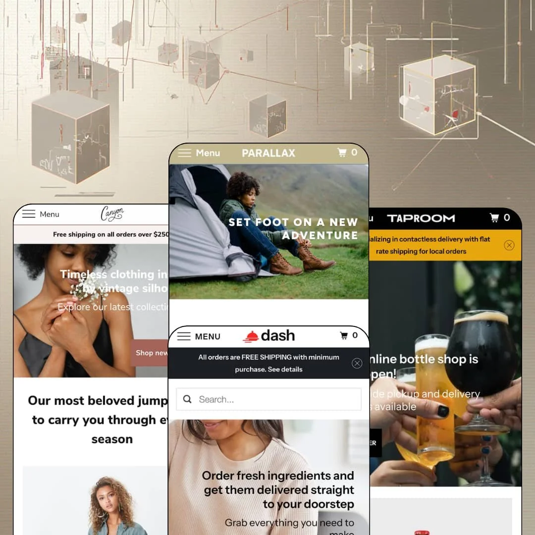
Most Shopify homepages are built to be clicked through. Parallax is built to be scrolled, which is why every one of its four demos, from an outdoor outfitter to a brewery bottle shop to a grocery-delivery service to a Los Angeles womenswear label, reads as one long descending story with full-width image bands doing the pacing. That decision sets the tone for everything else here: the theme runs on the Online Store 2.0 generation, has shipped under Out of the Sandbox since early 2016, and still leans on the scroll effect it's named after as its main argument. Whether that argument holds up for a 2026 storefront is the question worth answering.
The parallax band is a real layout tool, not a gimmick
Every image section in the theme exposes a per-section mobile-parallax toggle and a horizontal and vertical text-position setting, so the effect can be turned off for phones while the desktop page keeps its depth. That matters. Taproom runs its bands with mobile parallax on, Aspen runs its bands with mobile parallax off, and both choices were made in the editor rather than in code, which is the difference between a brand decision and a developer ticket. For single-brand stores under 100 SKUs selling lifestyle goods, outdoor gear, or food and drink, this is the cheapest way to make a homepage feel photographed rather than templated.
Built for merchants with a front door
If you run a brewery taproom, a neighborhood grocer, or an outfitter with a counter, this theme meets you where you are. The map section with opening hours, in-store pickup, and the header utility row for delivery messaging all ship in the box, and three of the four demos stage at least one of them prominently. Local-retail merchants with 30 to 300 SKUs and a hybrid pickup-and-ship model rarely get this treatment from themes that otherwise chase pure DTC.
A coordinated urgency and availability kit
Pre-order, back-in-stock alerts, product badges, promo banners, promo popups, quick view, and a slide-out cart are listed as theme capabilities and function as one merchandising layer rather than scattered toggles. The "New" badge on a Taproom ale and the sold-out states across all four demos are the visible edge of that system. Seasonal or drop-driven merchants with 50 to 500 SKUs in apparel or CPG can run a launch calendar on these pieces alone. That saves an app install or two.
Why does a grocery homepage need four product grids?
Because repeat buyers don't browse, they restock, and Dash answers that by stacking fresh produce, prepared meals, and spices as separate shoppable rows with quick-shop icons on the cards. The featured-collection section is the workhorse of the whole theme, and the demos show it handling "from" pricing, sold-out states, and badges without breaking the grid. For CPG or pantry brands with 100 to 500 SKUs and a repeat-buyer pattern, the homepage can double as the catalog.
The review stars aren't in the box
Taproom's Smokey Porter page shows "Customer Reviews, based on 4 reviews," rendered by a review app rather than the theme. The stars are borrowed. The theme exposes the hooks, which is fine, but it means the product page's only social-proof element is a third-party dependency that a merchant has to install, configure, and pay for separately before the demo's look is reproducible on their own store. Considered-purchase verticals like outdoor equipment or premium food and drink, where a $150 jacket or a case of ale needs a trust signal, should price that in.
Navigation tops out at a dropdown list
All four demos run the same pattern: top-level items that open a single column of text links, sixteen of them under Aspen's Women, Men, and Camping, with no image tiles, no promo blocks, no featured products in the menu. The Theme Store feature list doesn't claim a mega menu either, so this is a theme-level ceiling rather than a staging choice. Multi-category merchants with 500-plus SKUs or multi-brand catalogs will hit it within a month of adding departments.
A 2016 engine at a 2026 price
Parallax runs on the Online Store 2.0 generation, which means section groups and JSON templates but no nested theme blocks, and the front-end still leans on the older carousel, lightbox, and off-canvas menu libraries that date the build. Dawn, Shopify's free theme, sits on the same generation for nothing. At $260, the merchant is paying for the parallax grammar, the presets, and the retail sections, not for a newer architecture. Long-horizon merchants in mid-market apparel or home goods who want to stay on one theme for five years should weigh that.
Replenishment stores without a replenishment mechanic
Dash sells weekly groceries and Taproom promises new brews added weekly, yet neither demo stages a subscription or auto-reorder path, because the theme has none to stage. That's an app. Replenishment-driven CPG brands and repeat-buyer food merchants will need a subscription app installed before the preset's own sales pitch makes sense on their store.
What it takes to launch
Expect a two-to-three-day pass covering a demo-disclaimer sweep through every product description, inventory and sold-out cleanup across collection grids, product-type and category metadata correction, a blog refresh, re-staging of colorway products into variant-based listings, and population of the age verifier and map sections the demos leave unconfigured.
-
What works in this preset
The Aspen demo sells camping gear, and the homepage sequence is the pitch. A fading slideshow with a parallax backplate opens into a short rich-text welcome, then a three-tile Featured Promotions row for Clothing, Tents, and Cookware, then a newsletter band, and only then the first product grid. I scrolled the whole page twice. The rhythm is deliberate: image band, text, grid, image band, and the "Get a good night's sleep" sleeping-bag grid lands exactly where a shopper's attention has been warmed up by two banners.
Local retail gets a real section here rather than a footer afterthought. Near the bottom, a "Stopping by?" map block lists curbside-pickup hours for Monday through Saturday plus an appointment note, and it sits beside a three-post blog row so the store reads as a place with staff and opinions. For an outfitter with a physical counter, that's the right instinct.
I clicked into the women's jackets collection and then the Helium II jacket. The product page runs a draggable gallery with thumbnails along the bottom, a lightbox on the main image, size swatches from XS to XL, a Buy It Now button next to Add to Cart, and a "You may also like" row underneath. Nothing exotic. It's a clean, fast buy box that doesn't bury the price.
Where it stumbles
Colorways are staged as separate products. The Helium II jacket exists three times in the jackets collection, once each for Navy, Blue, and Purple, so the four-item collection is really two products wearing three coats. For an apparel demo whose theme ships color swatches as a listed feature, that's a staging choice that hides the very mechanic the merchant would want to see.
-
What works in this preset
You arrive to a one-line utility message about contactless delivery and flat-rate local shipping before the logo even registers. That header row is the Taproom idea in miniature: a brewery that sells bottles online and plates in person, and wants both audiences served from one page. The navigation keeps it simple with Bottle Shop, Food, Brew News, and About Us, and the hero slide pushes straight to "Shop beer" with a curbside note.
The homepage runs two product grids with different jobs. The bottle grid shows "from $3.95" pricing with a "New" badge on one ale and a sold-out state on another, while the "On the menu this week" grid lists tacos, the local burger, and churros as Shopify products with single prices, which means the theme is fine treating a kitchen menu as a catalog. Between them sits an image-with-text feature for the bottle of the week. It works.
I went looking for the beer product page and found the Smokey Porter staged with a Pack option rendered as four buttons: Single, 4-pack, 6-pack, Case of 12. ABV, IBU, and bottle size are typed into the description above the buy buttons. The structure is legible and the path to cart is two clicks.
Where it stumbles
The theme lists an age verifier as a feature, and this is the alcohol preset, yet the demo loads straight onto beer with no gate in sight. Taproom is the one preset where that section would earn its keep, so staging the homepage without it leaves the merchant to discover it in the editor rather than see it in action.
-
What works in this preset
Dash is the grocery-and-meals preset, and it's the demo that stacks the most product grids on one homepage. Fresh groceries, prepared meals, and spices each get their own collection section, which gives the page four shoppable rows under a hero promising doorstep delivery. The "You Choose / We Deliver / You Cook... or just Eat!" three-column icon row does the explaining up top.
I noticed the testimonials section lands between the meals grid and the spices grid rather than at the bottom. Three short quotes with first names, centered, no photos. Placing social proof mid-page before the last product row is a smart ordering choice for a considered weekly-order purchase, and the section style matches the theme's restrained type treatment.
Spice and pantry products run the simplest buy box in the family. The Cayenne page shows a price, a quantity stepper, the two buy buttons, and a collections line reading Pantry and Spices, then a three-item "You may also like" row. For a $6.99 jar that's the correct amount of page.
Where it stumbles
The all-products collection is staged alphabetically with a heavy run of sold-out items near the top: Avocado, two honey spreads, and Curry Powder all show Sold Out before a shopper reaches the popcorn range. For a grocery preset whose whole promise is freshness, leading the catalog with unavailable produce reads against the vertical.
-
What works in this preset
Scroll past the jumpsuit grid and the homepage starts selling a dress on the spot. The Adelaide Maxi Dress sits in a featured-product section with its full description, an XS-to-XL size swatch row, Olive and Natural color swatches, and live Add to Cart and Buy It Now buttons, all without leaving the page. That's the theme's product section dropped into the homepage flow, and for a "back in stock" hero item it's the right use.
Canyon is the preset that leans hardest on brand storytelling. A "Behind the scenes" band with a play-video trigger promises lookbook footage, three customer quotes name specific garments, and a "Sewn with care in L.A." band closes on the natural-fabrics promise. I sat up at how little product is on this page compared to Dash; four jumpsuits, one dress, and that's the catalog surface.
The Oxbow Jumpsuit product page adds one block the other demos skip: a gift-card promo line under the buy box ("Give the gift that always fits") with its own send-a-gift-card link, followed by an "Also nice" recommendations row. Size and color swatches render as the same button rows as on the homepage module.
Where it stumbles
The Catalog link in the header lands on a collection-list page showing four tiles: Dresses, Tops, Bottoms, Jumpsuits. No products, no filters, just a second layer of doors. For a small womenswear line that's a taste choice, but it adds a click between the nav and the first garment on every path except the jumpsuit grid.
One homepage grammar that survives four verticals
Outdoor gear, a brewery, a grocery service, and a womenswear label all read as the same page skeleton: slide, text, grid, band, grid, trust, footer. That the sequence works for all four without feeling borrowed is the theme's quiet achievement, and it means a merchant who doesn't love any preset can still trust the order of operations.
Restraint as a design position
Across the presets, type stays small, sections stay short, and the page never shouts. This kept bugging me in a good way: the theme refuses the discount-banner voice that so many demos default to, and the result is a storefront that looks owned rather than rented.
Retail and online treated as one store
The hours block, the pickup messaging, and the delivery utility row recur across demos as first-class sections rather than footer text. Parallax assumes the merchant has a physical life, and its section library is built around that assumption.
Product data lives in prose
ABV, IBU, and bottle size in Taproom, fabric and care notes in Canyon, and every spec in Aspen are typed into the description field. There is no metafield-driven spec row, no structured attribute display, so any merchant who wants comparable product facts will hand-format them per product or reach for an app.
The bands are hungry
Every preset depends on wide, high-resolution lifestyle photography to make the parallax effect land. A merchant with product cutouts on white and no campaign imagery will see the homepage's main idea collapse into empty color blocks.
The skeleton repeats
Because the presets share one homepage order so faithfully, the family offers four palettes more than four layouts. Merchants hoping a preset switch would change the store's shape will find it changes the store's clothes.
Rating
★ 6.8/10
-
Pre-order, back-in-stock, age gate, pickup, map, and a homepage buy module are native; reviews, subscriptions, and mega-menu depth are not.
6
-
Section-level parallax and text-position controls keep layout decisions in the editor; the dropdown menu needs no configuration beyond a Shopify menu.
8
-
Sticky mobile header and per-section mobile-parallax toggles are sensible; the off-canvas menu is a plain list and the slide-out cart is the only drawer.
7
-
Lazy-loaded images and short section counts keep pages light; the carousel, lightbox, and menu libraries add weight a newer build would avoid.
7
-
Color, typography, and image-band settings go deep, but the homepage order and the single-column navigation stay the same shape in every preset.
6
Frequently Asked Questions
-
Only if the merchant turns it on per section. Taproom ships with mobile parallax enabled on its bands, Aspen ships with it disabled, and both are editor settings.
-
Yes. Canyon drops the full product section into the homepage for the Adelaide Maxi Dress, with size and color swatches and working buy buttons in place.
-
Taproom does exactly that: tacos, burgers, and churros are Shopify products in their own grid under the bottle shop, each with a single price and a sold-out state where needed.
-
As a variant option rendered as buttons. The Smokey Porter page shows Single, 4-pack, 6-pack, and Case of 12 in a row above Add to Cart.
-
Yes. Aspen's "Stopping by?" section pairs a map with pickup hours and an appointment line, and the theme lists in-store pickup as a native feature.
-
The Aspen jacket page opens the main image into a full-screen lightbox, with thumbnails running along the bottom of the draggable gallery.
-
An off-canvas drawer positioned on the right with an empty-cart state; line items populate on add-to-cart, and it's the only cart drawer pattern the theme ships.
This review is based on hands-on testing of the publicly available preset demos of the Parallax Shopify theme as of August 2026. Theme features, preset availability, and performance can change with subsequent updates from the theme developer.