
A free Shopify theme with mega menus, quick buy, lookbooks, and FAQ sections? Rise promises all of that — and then stages a demo so minimal you'd never know it. Built by Shopify's own team, this single-preset theme wraps a surprisingly deep feature list inside a quiet, Japanese-inspired aesthetic that's all earth tones, whitespace, and slow scrolling. The question isn't whether Rise looks good. It's whether you'll find what's hiding under the hood before you give up and pick something else.
Pros
Product pages that actually inform
Rise's PDP supports collapsible FAQ accordions paired with full-width images, and the demo uses them to surface care instructions, material details, and sourcing provenance. For brands selling fabric-centric or ingredient-focused products, this means shoppers can answer their own questions without leaving the product page. Fewer "what's this made of?" emails, more confident purchases.
Image rollover that earns its keep
Every product card supports a secondary image on hover, swapping a flat product shot for a lifestyle angle. It sounds minor, but across a grid of 18 items it noticeably speeds up browsing. Shoppers get a second perspective before committing to a click-through, which cuts down on wasted PDP visits.
Variant handling that stays readable
Colours and sizes show up as labelled button pills instead of dropdown menus, with sold-out options struck through. On the Terrycloth shorts page — six colours, five sizes — everything stays scannable without visual overload. It's a small design decision that pays off when product matrices get complicated.
A surprisingly deep feature list for free
Quick buy, mega menu, image zoom, lookbooks, FAQ pages, cross-selling, recommended products, enhanced search — these are all officially listed and available as configurable sections. The demo understages most of them, but the underlying architecture is there. For merchants willing to put in setup time, Rise competes with themes that charge money.
Blog content right on the homepage
The theme can surface article previews with images and excerpts directly on the homepage, keeping editorial content in front of every visitor. Brands that invest in content marketing won't have to rely on shoppers finding the blog through navigation alone.
Cons
The demo doesn't show you what the theme can do.
This is Rise's biggest problem and it's entirely self-inflicted. Mega menu, quick buy, image zoom, lookbooks — they're all listed on the feature tab, but the demo either hides them or leaves them ambiguous. Merchants evaluating Rise have to take the feature list on faith, and that's a tough sell when competing themes demonstrate their capabilities front and centre.
Key pages are staged bare
The contact page and footer ship with minimal content in the demo, creating an impression of limited flexibility that doesn't match reality. Anyone evaluating Rise based on the demo alone will underestimate what the theme can do, and anyone who installs it will need to build out these areas from scratch.
One preset, no alternatives
With a single preset, Rise offers no visual blueprints for different aesthetics or industries. Premium themes usually ship three to five presets showing their range. Here, you get one mood board and your imagination. That's fine for confident customisers, but it raises the floor on setup effort.
-
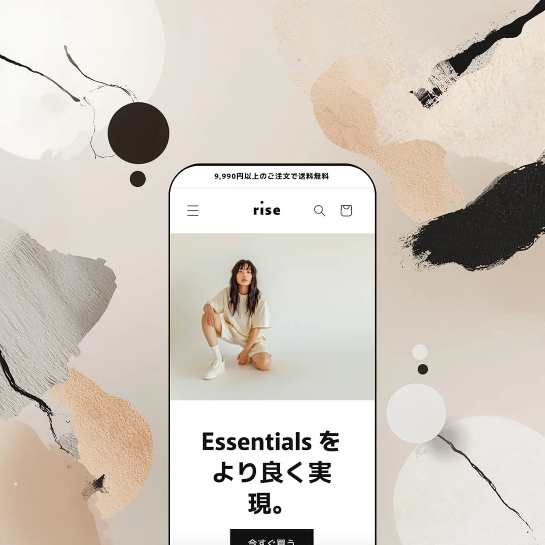
Rise's only preset stages a pared-back essentials brand with sand-and-olive tones, clean sans-serif typography, and full-bleed lifestyle photography that gets plenty of room to breathe. Everything about it says "we care about fabric and craftsmanship." It's built to show off Rise's storytelling chops and detail-heavy product pages rather than to push urgency or conversion tricks.
What works in this preset
The first thing you notice is the pace. Three full-bleed hero slides rotate through lifestyle shots in that earthy palette, each with a short headline and one CTA button. There's no autoplay chaos, no stacking banners. It feels more like a lookbook cover than a homepage, and for brands that want to lead with mood rather than markdowns, that's exactly the right call.
Scroll down and the homepage unfolds in a deliberate rhythm: an 18-product featured grid, then a brand-story block with a large image and a paragraph about sustainability, then a four-card collection carousel, a pair of lookbook-style stacked images, and finally a blog preview row. I appreciated that each section gets space to land before the next one starts. The page is long, but it never feels cluttered — you're reading it more than scanning it, which is unusual for a Shopify homepage.
The product page is where Rise really earns its keep. On the Terrycloth shorts listing, there's a collapsible FAQ accordion sitting alongside a full-width care-instruction image. Questions about washing, drying, bleach, materials — it's all right there on the PDP. Below the main description, two short lines note where the cotton was sourced and where the garment was constructed. That kind of provenance detail is rare in free themes, and it turns a standard product page into something that actually builds trust.
Product cards across the homepage grid and collection page are clean and image-forward. Hover over any card and it swaps to a lifestyle shot, giving you a second angle without clicking through. It's a small thing, but when you're browsing 18 items on a page, that extra image saves a lot of back-and-forth. Worth noting: this preset doesn't emphasise quick-buy triggers in the grid, so every purchase starts with a full PDP visit. The grid stays visually tidy as a result, though it does add clicks.
Midway down the homepage, the collection carousel drops in four large-format category cards — Men's, Women's, Tops, Bottoms — in a horizontal scroll row. It's a natural wayfinding moment that breaks up the product grid and gives shoppers a clear lane into specific categories without disrupting the editorial flow.
Near the footer, three blog article previews with images, dates, and excerpt text round out the page. For a preset built around storytelling, this placement makes sense. It keeps editorial content visible to every visitor rather than hiding it behind a nav link that most people will ignore.
Where it stumbles
Here's the thing that kept bugging me: Rise officially supports mega menus, but this preset demo stages just three navigation links — Catalog, Blog, Contact. That's it. You never get to see what a multi-column menu actually looks like in this theme. For merchants evaluating Rise, that's a real gap. You're left guessing whether the mega menu is polished or perfunctory, and guessing isn't great when you're choosing a theme for your business.
The contact page feels like an afterthought in this demo. It's a heading, a four-field form, and nothing else — no map, no hours, no supplementary text. The theme almost certainly supports additional content blocks on that page, but this staging doesn't show it. First impressions count, and this one undersells the theme.
Same story with the footer. In this demo, it's just a language selector, payment icons, and a copyright line. No navigation columns, no social links, no newsletter signup. I've seen free themes from third-party developers stage more complete footers than this. It's not that Rise can't do better — it's that the demo doesn't bother to show it.
Niche Suitability
-
Small-to-medium apparel brands, sustainable fashion labels, and basics-first DTC stores that care about editorial presentation. The earth-tone palette and slow-scroll rhythm suit anyone who wants to lead with story and craftsmanship. It's also well staged for the Japanese market, given the bilingual English/Japanese demo.
Not Ideal For
-
Merchants who want to evaluate conversion-focused features straight out of the demo, or brands that need a production-ready footer with newsletter capture, social links, and multi-column navigation without building it themselves. If you don't enjoy spending time in the theme customiser, Rise will feel incomplete.
-
New merchants and small brands who want a clean, free starting point with genuine depth underneath, especially in fashion, basics, or sustainability niches. You need to be comfortable spending time in the customiser, because the demo won't hand you a finished store.
-
Anyone with a large catalogue, complex navigation, or a need to see conversion features (countdown timers, stock alerts, quick-view modals) working before they commit. Paid themes demonstrate more, demand less imagination, and get you to launch faster.
-
Medium. The feature set under the hood is legit, but you'll need to wire up mega menus, enable quick buy, populate the footer, and build out content pages yourself. The demo shows you the aesthetic. The rest is on you.
Final Recommendation
★ 6.6/10
Rating
-
The feature list reads well for a free theme — quick buy, mega menu, FAQ sections, lookbooks, and more. But the demo leaves most of these unconfigured, so you can't kick the tyres without installing first.
6
-
It's a Shopify-built Online Store 2.0 theme, so the customiser is familiar and well-documented. Sections drag and drop as expected. The moderate rating reflects the fact that many features need manual activation beyond what the demo shows you.
7
-
Layout reflows cleanly and variant buttons stay tappable. The known friction point: Add to Cart sits below all product images on mobile, forcing a scroll before purchase. Shopify has acknowledged the feedback but hasn't added a repositioning option yet.
6
-
Rise loads fast. The slideshow transitions without layout shifts, collection grids with image rollover don't introduce lag, and page-to-page navigation feels snappy. It's optimised against Shopify's own performance benchmarks, and it shows.
8
-
Colours, fonts, and sections are fully customisable through the editor. The limitation is aspirational rather than technical: with one preset and a demo that understages capabilities, you don't get visual blueprints for what else this theme could become.
6
-
👑 It's a natural match. The demo stages an organic cotton basics line, and the product page handles colour and size variants through clean button selectors. The FAQ accordion on the Terrycloth shorts PDP is especially useful for apparel brands that want to educate buyers about materials and care without cluttering the main description.
-
📱For the most part, yes. The layout adapts cleanly and interactive elements like the slideshow and variant buttons stay functional on smaller screens. The one sticking point: Add to Cart sits below all product images on mobile, which means shoppers have to scroll before they can buy. Shopify has acknowledged this but hasn't shipped a fix yet.
-
🎨 You get the full Online Store 2.0 toolkit — colours, fonts, sections, all adjustable without code. You can rearrange the homepage, tweak the header, and restyle to match your brand. The trade-off is that with just one preset, you're starting from a single visual direction and building out from there.
-
⚡Genuinely fast. Pages load crisply, the hero slideshow doesn't cause layout shifts, and collection grids with hover effects run smooth. I tested across the homepage, collection page, and multiple PDPs, and nothing lagged. Shopify approves Rise against their own speed benchmarks, and it held up.
-
👕 It does. Colours and sizes display as tappable pill buttons with sold-out options visually struck through. The Terrycloth shorts page shows six colours and five sizes at once, so you can scan full availability at a glance. No dropdowns, no guessing.
-
🔎 Rise supports Shopify's standard fields for page titles, meta descriptions, and URL handles. Blog functionality surfaces directly on the homepage in the Rise preset, giving search engines more indexable content to work with. You don't need an extra SEO app for the fundamentals.
-
💱 Yes. The demo runs in both Japanese and English via a language selector in the header and footer. Language and currency switching is configured through Shopify Markets at the platform level, and Rise surfaces the selectors in accessible positions without burying them.
-
⚙️ No issues there. As a first-party Online Store 2.0 theme, Rise supports app blocks and app embeds through the customiser. Reviews, upsells, email capture — standard integrations work the same way they would on any modern Shopify theme.
-
🛒 Rise is entirely free. Install it, customise it with your own products and branding, and publish when you're ready. The live demo is available at the Rise preset link if you want to poke around first, though keep in mind it understages several listed features.
This review is based on hands-on testing of the publicly available preset demo of the Rise Shopify theme as of April 2026. Theme features, preset availability, and performance can change with subsequent updates from the theme developer.