
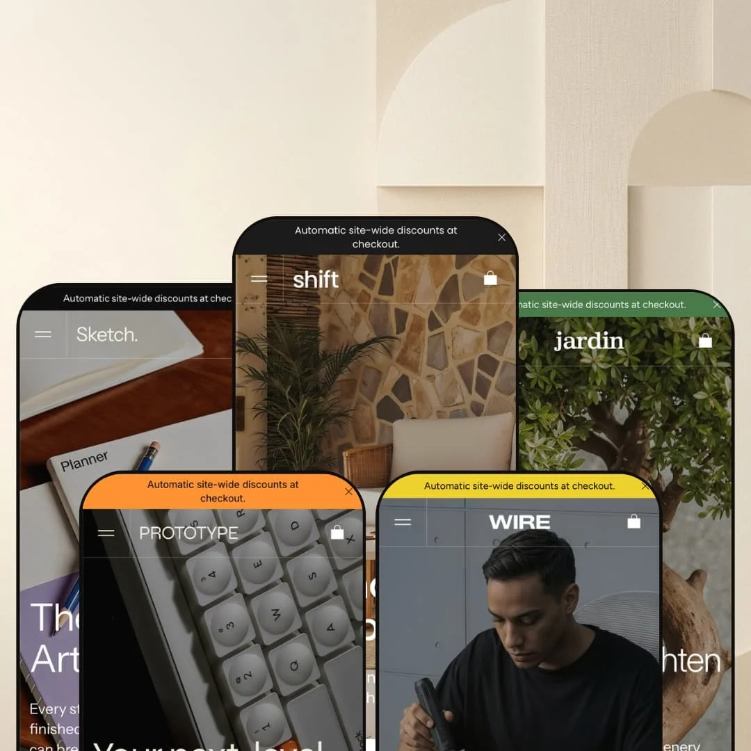
Shift sets out to prove a single codebase can dress up as five entirely different stores without losing its shape. The preset lineup makes that ambition pretty clear: furniture, stationery, plants, mechanical keyboards, and hardware tools, all on the same engine. Every hero opens with three full-bleed promo blocks stacked vertically instead of one rotating banner — a slower funnel, but one that lets a brand tell a small story before asking for the click. The differences between presets are mostly staging and brand voice. The features underneath stay the same.
Pros
Shared section library across presets
All five presets run the same engine, and you can feel it. Every demo gives you multi-image hover product cards with inline color swatches, Quick view and Quick buy triggers in product grids, a cart drawer with a free-shipping progress message, three product gallery layouts (Grid, Slider, Carousel) selectable per product, and the same Shop the look Showcase repurposable for editorial or spec-sheet duty. Picking any preset means picking a starting point, not a feature ceiling. The building blocks travel.
Editorial modules that travel between presets
The second strength is the editorial kit. Numbered philosophy grids, branded collection editorials, inline product spotlights, brand-story blocks, magazine-style testimonial layouts, trust-icon rows, Instagram follow grids, shipping ETA promises — all of it is configured somewhere across the five demos. Per Shift's section system, every one of those modules is available to every preset, not locked to the one where it happens to be staged. That's the main reason five presets feel as different as they do despite running the same code.
Multi-currency and multi-language presentation
Shopify Markets handles the actual switching at the platform level. That's a Shopify capability, not a theme one. But Shift gives each preset a clean visual selector with a country list, language list, and a "you are currently shipping to" status line, and the staging suggests realistic regional positioning rather than a copy-paste picker. Shift's main demo lists 27 countries with English, French, and German. Sketch and Jardin run English, French, and Italian. Prototype runs English, German, and Swedish. Wire runs English, Spanish, and Italian. The presentation is more polished than most themes layer on top of the same Markets backbone.
Flexible presets, consistent core
Shift's preset system is the clearest argument for treating the theme as a base, not a finished product. Five presets cover furniture, stationery, plants, electronics, and tools without re-architecting the underlying layout, and the aesthetic range between Shift's serif editorial mood and Wire's industrial framing is wider than most theme families manage with twice as many presets. That's why Shift is worth picking even for a brand that doesn't fit any of the staged categories cleanly. The section library and gallery layouts will reshape to fit.
Cons
Long homepages across every preset
Every preset's homepage runs long. Multiple full-bleed editorial blocks before the first deep product grid, and Sketch's inline module and Prototype's Nomad 40 spotlight both add real vertical weight on top. Merchants who want a fast, dense path from hero to PDP will have to delete sections rather than add them. Editorial pacing is the default here, not an option.
Demo content debt across the lineup
The second weakness is the staging quality of the demos themselves. Duplicate "Tables" label in Shift's mega menu. Repeated testimonial authors in Sketch. A "Mechanical Keyboards" tile in Prototype that links to /collections/accessories. Sold Out demo SKUs scattered through Wire and Jardin's grids. None of it is a theme bug. All of it is content debt a merchant will have to scrub before launch. Shift expects an editor.
-
The flagship preset sells furniture. Warm neutrals, oversized lifestyle photography, the kind of pacing you get in a print catalog. The mega menu is the busiest of the five demos and leans hard on imagery — browsing feels more like flipping a lookbook than reading a sitemap.
What works in this preset
The hero is three full-bleed promo blocks stacked vertically, each with its own headline. It's slow on purpose. Furniture shoppers don't rush, and a single banner tends to feel too transactional for a $1,500 sofa. By the time the first product grid loads, the brand voice has had three chances to land.
The mega menu is the densest in the lineup. Two image tiles ("Chairs" and "Kitchen") sit beside a column of standard collection links and a second column for named drops. It reads as editorial first, functional second — a working template for merchants who want browsing to start with imagery instead of text.
The Contour, Terra, and Aura collection module is the standout. Three full-bleed editorial blocks, each with its own headline, paragraph, CTA, and a small 01-to-03 counter running down the side. Most themes squeeze named drops into tiles. Shift gives each one a full-width moment, and that's the staging choice that probably explains why a furniture brand picks this preset in the first place.
The "Our Design Philosophy" section uses a numbered three-up grid (Simplicity, Challenge, Timeless) — image, heading, short paragraph. It bakes brand-story content straight into the homepage without sending anyone to an About page, and the numbering carries an editorial weight a plain three-column grid never quite manages. Further down, the brand-logo wall ships with both light and dark logo variants in the markup, so the row reads cleanly on either color scheme.
Where it stumbles
The Shop dropdown contains a duplicate label. "Tables" appears twice, and the second instance links to Outdoor. It's a content slip, not a theme bug, but it's the kind of thing a merchant should expect to clean up before launch.
The hero in this demo doesn't surface a primary CTA button until the third stacked promo. Slow funnels suit furniture, but merchants copying the preset wholesale should know they're inheriting that delay. A few items in the "Latest Collection" carousel are also staged as Sold Out (Harbor Woven Chair, Line Armchair, Metal Armchair). Demo inventory, not a theme issue, but the unavailable items crowd the grid visually.
-
Sketch is the stationery preset. Sketchbooks, planners, calendars, pads. It's the most feature-dense of the five demos and the only one whose Features menu surfaces two extras the others don't.
What works in this preset
The Notes Pad 01 module is the move that makes Sketch interesting. It drops a complete PDP — image rotation, price, "In Stock" badge, quantity stepper, Add to Cart button, shipping promise, product description — straight into the homepage. Most themes tease a hero product. Sketch sells it. For a single-SKU launch or a limited edition, this is exactly what you want, because the merchant can convert from the homepage without forcing a click into the PDP.
Sitting next to the Add to Cart is a shipping ETA promise ("Buy now and receive it in approximately 3 to 5 days") with its own truck icon. Small detail. Conversion-relevant. It anchors the inline module as more than a teaser.
The "Our promise to you" section is a numbered four-step layout — Bright and smooth, Tear-resistant, Friction-free writing, No bleaches or acids. Each step gets imagery, a heading, and short copy. It's a structured way to communicate product attributes without resorting to icon soup, and it gives the merchant somewhere to plant material claims that don't fit naturally into descriptions.
The customer reviews module reads like a magazine spread. Portrait imagery, star ratings, role labels, pull quotes interleaved with product cards. Most Shopify testimonial blocks settle for a slider. This one tries harder, and it shows.
In the Showcase block ("Shop the look"), each pinned product carries a dimension label — 260 × 210 mm, 210 × 105 mm. A neat repurposing of a generic module as a quick spec sheet for stationery sizes. The Features menu in this demo also exposes a Hero section and a Steps section that aren't surfaced in the other four presets, which makes Sketch the most editorially ambitious starting point in the lineup.
Where it stumbles
The inline product module commits a huge chunk of homepage real estate to a single SKU. Right call for a hero launch, awkward for a wider catalog. A merchant with a hundred products will need to either delete it or accept that the homepage is a single-product showcase by default.
Several testimonials reuse the same author and photo (Daniel Kim, Graphic Designer, appears across multiple quotes). Staging filler. Easy to fix, but a launch blocker until it's fixed. The homepage also runs long because of the inline module, the four-step benefits section, and the magazine-style reviews block — three heavy modules stacked in the same scroll.
-
Jardin is the plant and planter preset, and it's the lightest of the five. Same three-promo hero stack as the others, but the trust signals arrive earlier in the scroll and the homepage carries fewer modules overall.
What works in this preset
The trust-icon row is staged directly below the hero (Eco-Friendly, 30-Days Free Returns, Secure Payment) instead of buried near the footer. Smart. Plant shoppers worry about whether a living thing will survive a UPS truck, and front-loading reassurance addresses that anxiety before the first product even appears. It's the clearest example in the lineup of how the same module can be repositioned to serve a different shopper fear.
The "Potted Plants and Planters" content cards are a cleaner alternative to Shift's stacked editorial treatment. Two tiles, two headlines, two CTAs. It suits merchants with a small number of headline categories who don't want to commit to three or more full-width modules.
The customer testimonial module renders star ratings as text — "5 / 5", "4 / 5" — instead of image-based icons. Stays crisp at any screen size. Doesn't depend on icon assets loading correctly. Each testimonial pairs the rating with a customer photo, name, and role label, which fits a category where personal recommendations close the sale.
The About module ("Bloom Where You're Planted") is a single editorial paragraph paired with imagery. More restrained than Shift's numbered philosophy grid, and it matches the lighter editorial pacing of the rest of the page. An Instagram follow grid sits above the newsletter, four image tiles in a row anchored by an "@jardinplants" handle. Plant brands live on Instagram. The staging knows that.
Where it stumbles
Multiple featured products in this demo render as Sold Out — Feather Leaf Tree, Olive Tree, Variegated Rubber Plant. Demo inventory, not a theme issue, but it visually crowds the reviews section with unavailable items.
The hero typography is the largest of any preset and pushes the first product row noticeably below the fold. Suits the editorial framing. Slows the path to inventory more than the other presets do. The Products mega menu in this demo is also the simplest of the five — Flowerpots, Essentials, Plants — which fits a small curated catalog but means a merchant with a wider assortment will need to rebuild it from scratch.
-
Prototype is the tech preset — mechanical keyboards, keycaps, switches. The aesthetic is the most stripped-back of the five. Cooler palette, tighter type, and a single product spotlight where the others place a multi-collection editorial.
What works in this preset
The Nomad 40 spotlight is the standout. One dominant feature block ("New model. The Nomad 40 is our most adaptable board yet") gives one hero product the kind of marquee real estate you'd usually need a custom landing page for. Underneath it sits a secondary product carousel with three keyboard SKUs and their own purchase buttons. So the spotlight pushes traffic into adjacent inventory instead of dead-ending at a single PDP. One product as the marquee, three as the supporting cast — the kind of pattern an electronics brand normally has to assemble manually.
The "Low profile keycaps" module is a dense four-up product strip. Useful for spotlighting a SKU family that doesn't deserve its own page but does deserve its own block, and it pairs naturally with the Nomad 40 above it. Editorial density is lower than Shift or Sketch overall, which matches a tech audience that scans more than it reads.
The hero stack uses the same three-promo pattern as everywhere else, but the typography is tighter and the photography is more uniform. It's the clearest demonstration in the lineup of how Shift flexes from editorial-heavy (Shift, Jardin) to product-heavy (Prototype) without changing the underlying section structure.
Where it stumbles
The Shop categories block lists "Mechanical Keyboards" as a tile but links it to /collections/accessories. Content slip, like the duplicate "Tables" in the main Shift preset. A reminder that the demos are styled as showrooms, not production stores.
The Nomad 40 spotlight is text-heavy and commits significant vertical space to a single SKU, similar to Sketch's inline module. Not a flaw on its own. But it shapes how the rest of the homepage has to work around it, and merchants without a clear hero product will need to either delete the module or repurpose it for something they do want to spotlight.
-
Wire is the hardware and tools preset. Drills, screwdrivers, kits, accessories. It's the most utilitarian of the five and leans on brand-story copy plus a dense category strip instead of editorial collection cards.
What works in this preset
The "We make cool tools" module is the heart of this preset. One editorial paragraph ("Since 2016, we've aimed to rethink everyday tools. In 2018, our first precision screwdriver set launched, quickly reaching over 2 million satisfied users") paired with a large image and a CTA. It plants credibility without sending the visitor to a separate page, which is exactly what a hardware shopper wants — to know who made the tool before trusting the spec sheet. The framing here is the most explicitly brand-historical of any preset, and it shows how a generic section module can be repurposed for storytelling instead of product display.
The Shop categories strip is staged as a five-up row — Screwdrivers, Drills, Kits, Accessories, All. Densest category navigation block in the lineup. It suits a tool catalog where shoppers know what they want and just need one click to get there, and it pairs naturally with a brand voice built on practicality rather than mood. The category tiles are smaller than Shift's or Jardin's collection cards because density matters more than imagery here. The staging respects that.
The "Shop the look" Showcase is staged with four pinned products including one marked Sold Out, which proves the showcase respects inventory state in real time instead of just rendering a static composite. Quiet but important detail. Means the showcase won't strand a shopper on an unavailable item.
Where it stumbles
Several drill SKUs are Sold Out (Cordless Drill with Keyless Chuck, Compact Cordless Drill Driver), and the customer reviews module is staged with product cards but no actual review text or quotes in the rendered markup. So the reviews section reads more like a product strip than a true testimonial block. A merchant will need to write and stage real customer copy before the section earns its name.
The five-up category strip uses smaller imagery than Shift's or Jardin's collection cards. Right call for a tool catalog. Reads as a thumbnail strip rather than an editorial entry point, so merchants who want lifestyle framing for their categories will need to swap the module or reshape it.
Niche Suitability
Not Ideal For
Final Recommendation
-
Merchants who treat the homepage as an editorial surface, have strong photography, want lookbook-style pacing, and are comfortable managing five to eight homepage modules per page. Furniture, plants, stationery, peripherals, and tool brands are all served well by the existing preset staging, and the section library will stretch to cover adjacent categories without major reconstruction.
-
Merchants running thousands of SKUs who need the homepage to function as a category index, or stores without strong product photography. The layouts lean hard on imagery and assume editorial pacing as the default, so a high-velocity catalog brand will end up fighting the theme rather than using it.
-
Medium. Shift gives you a deep section library and five distinct starting points, but the demo staging shows that meaningful customization and content cleanup are expected rather than optional. Plan for editorial work, not just configuration.
★ 7.4/10
Rating
-
Quick view, Quick buy, multi-image cards with inline color swatches, three product gallery layouts, a cart drawer with free-shipping progress, the Shop the look Showcase, and a deep section library are all wired in across every preset. The theme presents Shopify's standard sort and presentation in a clean, configurable way.
8
-
The section library is broad and the five preset starting points are genuinely distinct, but the staging across the demos shows real customization is expected. Five different presets means five different mental models.
7
-
Structurally the markup includes mobile menus, off-canvas navigation, and image-resize parameters across every preset. Interactive mobile fluidity was not tested in this pass, so the rating reflects the structural read rather than runtime feel.
7
-
Image strategy uses Shopify CDN with width parameters and on-demand sizing, the markup is reasonably scoped per section, and asset loading is staged rather than monolithic. The homepages run long across all presets, which puts total page weight on the higher end of the editorial-theme range.
7
-
The five presets cover furniture, stationery, plants, electronics, and tools without re-architecting the underlying layout. The section library, gallery layouts, and editorial modules give merchants real range.
8
-
👑 Based on the preset staging, Shift covers a broad range. Wire stages it as a hardware and tools brand with a five-up category strip, Jardin stages it as a plant retailer with trust icons up front, Sketch stages it as a stationery brand with an inline product spotlight, Prototype stages it for keyboards with a hero product module, and the main Shift preset stages it for furniture with editorial collection cards. The underlying section library is the same across all of them.
-
📱Markup includes off-canvas navigation, mobile mega-menu fallbacks, and Shopify's responsive image sizing across every preset. Runtime mobile feel was not tested in this pass, but the structural signals are consistent across all five demos.
-
🎨 A lot. Each preset uses different fonts, color palettes, and editorial pacing while running on the same engine. Shift's serif headings, Sketch's lighter sans-serif, Jardin's botanical type, Prototype's clipped tech feel, and Wire's industrial framing all come out of the same theme.
-
⚡The Shopify CDN handles the image work with width parameters per section, and asset loading is broken up rather than monolithic. The trade-off is that every preset's homepage runs long. Sketch's inline Notes Pad 01 module and Prototype's Nomad 40 spotlight both add real vertical weight on top of the standard editorial blocks.
-
👕 Yes. Every preset stages products with multi-image rotation, inline color swatches with named colors, and per-variant images on the cards. The Compact Mechanical Keyboard in Prototype shows three named color variants directly under the price (Black, Blue, Gray), and the Marlow Dining Table in Shift shows two material swatches the same way (Wood, Black).
-
🔎 Shift uses clean semantic markup with proper heading levels across every preset, image alt attributes wired into product cards, and a structured section hierarchy. Shopify's underlying SEO controls (page titles, meta descriptions, URL handles) sit on top of that foundation, and the staging across all five demos respects the markup conventions search engines expect.
-
💱 Yes — language and currency switching is handled by Shopify Markets at the platform level, and Shift's contribution is the visual selector and the layout it sits in. Each preset stages a country list, a language list, and a "you are currently shipping to" status line. The main Shift demo lists 27 countries and three languages, Sketch and Jardin run three-language sets including French and Italian, Prototype runs English with German and Swedish, and Wire runs English with Spanish and Italian. Configuration is fully supported and presented cleanly across every preset.
-
⚙️ Yes. Shift is a standard Online Store 2.0 theme with a section-based architecture, which is the prerequisite for most modern Shopify app embeds. Nothing in the markup suggests blockers for app installation or theme-extension integration.
-
🛒 All five preset demos are publicly accessible at the Demo links in each preset section above (shift-main, shift-sketch, shift-fleur, shift-prototype, and shift-wire). Shopify themes are typically free to install and configure on a development store before publishing, so merchants can stage Shift in full before committing.
This review is based on a structural analysis of the publicly available preset demos of the Shift Shopify theme as of April 13, 2026. Theme features and preset availability can change with developer updates.