
Most wellness brands on Shopify end up spending more on apps than on their theme. A before/after slider here, a mega menu there, a countdown timer plugin, a quick-view modal. By the time you've duct-taped it all together, you're $50/month deep in subscriptions and troubleshooting conflicts between plugins that were never designed to talk to each other.
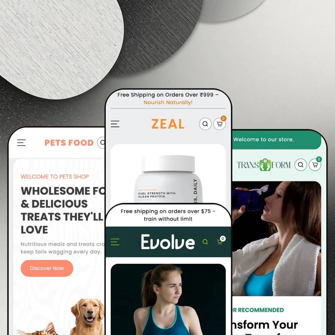
Zeal ($270, one-time) tries to make that app stack unnecessary. It ships with a mega menu that includes in-menu promotional images, a before/after image slider, countdown timers, product badges, quick buy, and an enhanced search overlay that surfaces trending products before you even type a query. Four presets (Zeal, Transform, Evolve, Petzen) cover wellness supplements, weight-loss products, activewear, and pet supplies. The developer clearly built this for health-adjacent brands first, everyone else second.
I tested all four preset demos hands-on. Here's what actually works, what falls flat, and whether it's worth the price tag.
Pros
Mega menu with in-menu promotional images
Zeal's mega menu is one of the better implementations I've tested at this price point. Every preset uses it, and it consistently pairs subcategory links with two promotional images that link to products and collections. That turns navigation into a merchandising opportunity, not just a wayfinding tool. Most themes that offer in-menu promos charge more than $270, so this alone shifts the value equation.
Enhanced search overlay with built-in discovery
Click the search icon on any preset and you'll get popular collections, trending items, and latest releases before you type a single character. It's the kind of predictive, discovery-focused search that typically lives behind a paid app. For stores with broad catalogues, this overlay can meaningfully reduce bounce rates by putting products in front of visitors who haven't decided what they're looking for yet.
Built-in marketing and conversion toolkit
Between the before/after image slider, countdown timers, product badges, stock counters, and a coupon code section with one-click copy, Zeal ships a legitimate marketing stack. Merchants can run urgency campaigns, showcase transformation results, and incentivize first purchases without bolting on additional apps. The coupon block deserves a specific mention: it presents a styled promo panel with a copy-to-clipboard button, which removes friction from discount redemption in a way that feels considered rather than tacked on.
Rich media and social proof sections
A testimonial carousel with customer photos handles social proof on the homepage. An Instagram gallery section adds community credibility with a follow CTA. Video embedding works as a standalone homepage section for brand films, product demos, or workout content. Individually, these are standard. Together, they build the kind of trust-layered homepage that wellness and lifestyle brands depend on, and having them all available without apps is a meaningful time and cost saver.
✚ Tabbed category browsing and product page depth
Tabbed browsing shows up across presets in different forms, letting shoppers switch categories on the homepage without a page reload. Product pages support accordion tabs for structured content like "How It Works" and "Shipping & Returns." Image rollover on product cards reveals a second image on hover. None of these are revolutionary on their own, but the cumulative effect is a browsing experience that feels more like a custom build than a template.
✚ Quick buy and variant handling
Quick buy works consistently across all presets. Products with variants open a selection interface; simple products go straight to the cart. The slide-out cart gives a clean summary without redirecting shoppers away from the page. The behaviour is predictable across all four presets, which sounds like a low bar until you've tested themes where quick buy breaks on half the product cards.
Cons
Demo content inconsistencies reduce showcase quality
Several presets suffer from staging choices that hurt the first impression. The Zeal preset shows the same nine products in two consecutive grids. FAQ entries read "Begin writing your answer here." The Petzen grid has nearly half its products marked sold out. These are all merchant-replaceable, but they make the demos feel unfinished in the exact places where polish would close sales. A theme demo is a sales page for the theme itself, and these details matter.
Unit pricing display can clutter product cards
Products with unit pricing in the Zeal preset stack three lines of data on the card: regular price, sale price, and "Rs. 239.60 / per 100ml." When those cards sit next to products without unit pricing, the inconsistency is hard to miss. The theme could handle this more gracefully, whether by reducing the unit price's visual weight, moving it into a tooltip, or standardizing the card height regardless of pricing lines.
-
Think holistic wellness meets clean-label supplements. The Zeal preset stages itself as a brand selling protein powders, health gummies, nut butters, and alkaline water, wrapped in an earthy green-and-cream palette with a serif/sans-serif type pairing that feels calm and trustworthy from the first scroll. It's built for merchants who need to educate before they sell.
What works in this preset
You land on an animated typographic hero where rotating text ("THRIVE," "NOURISH," "NOURISHING LIFE") layers over a muted background before a full product image anchors the frame. It's not just decorative motion for its own sake. The animation sets a wellness-editorial tone immediately and communicates brand identity without leaning on a single static banner. For a supplement store, that first impression of intentionality matters.
Scroll down and you'll hit the Core Vitality Collection grid: five tall, stylized category cards (Protein Powders, Health Gummies, Nut Butters, Syrups & Energy Drinks, Multi Vitamins) with bold split typography and product-cutout photography. Each links straight to its collection, cutting the path to purchase short. The vertical proportions and image treatment give this section a premium supplement-brand feel that you won't get from a standard Shopify grid.
What really sets this preset apart for wellness brands is a long-form educational section that breaks down a product category (protein powder here) with detailed benefit descriptions and a "Discover Now" CTA. If your brand needs to explain ingredients, sourcing, or efficacy before someone buys, this section does the heavy lifting. It pairs a large lifestyle image with paragraph-length copy and reads naturally next to the more visual homepage blocks.
Near the bottom, five tabs (Energy Drink, Gummies, Vitamin Capsules, Protein Powder, Nut Butters) each reveal a full-bleed lifestyle image and "Shop Now" link. In this preset demo, the tabs are styled as bold uppercase labels against dark photography, giving the homepage a magazine-like feel. The interaction is smooth, and the weight of each tab panel creates a natural pause before the footer kicks in.
There's also a full-width Ayurvedic wellness storytelling block with longform copy about "Ancient Wisdom, Modern Wellness" set against a dark background and capsule lifestyle image. It reads like an editorial page insert. Brands whose positioning leans into heritage, holistic philosophy, or traditional wellness will find a ready-made brand-story module here that most themes simply don't offer.
Where it stumbles
Here's an odd choice: the "Featured Collection" and "Shop Bestseller" sections show the exact same products with the same prices and badges. Scroll through nine cards in the first grid, then scroll through the same nine cards again. A merchant would obviously populate these differently, but as a demo experience it adds dead scroll and makes you wonder whether you've accidentally looped back up the page.
Five of six FAQ accordion entries read "Begin writing your answer here..." with only the first question actually answered. It's placeholder text, yes, but it's also the first thing a prospective buyer sees when evaluating this section. Half-dressed demo content in a visible homepage block signals carelessness, even if the underlying FAQ functionality works fine.
The blog area ("Herb Hero & The Healing Habit") tries to pack a featured article alongside four sidebar posts, each showing a long, untruncated excerpt. The text density is noticeably heavier than anything else on the page. Merchants who write shorter excerpts would tame this, but in the demo staging it creates a wall of text that clashes with the clean visual rhythm established everywhere else.
-
Transform pivots the whole framework toward fitness and weight loss. The palette shifts to deep charcoals, greens, and clean whites, lending a clinical, results-driven tone. What's clever here is the navigation: products are organized by goal (Detox, Cleanse, Appetite Control, Fat Burner) rather than product type. For weight-loss shoppers who think in terms of outcomes, not ingredients, that's a smart structural decision.
What works in this preset
Let's start with the most unexpected feature I tested across all four presets: a BMI Calculator built right into the homepage. Visitors input their age, weight (with a KG/LB toggle), height (CM/FT toggle), and gender, and the widget calculates their BMI score on the spot. It's genuinely useful, and more importantly, it gives weight-loss shoppers a reason to interact with the page before they've even looked at a product. That level of interactive functionality built directly into a Shopify theme section is rare. The calculator sits mid-page between product grids, turning passive scrolling into active engagement.
The hero rotates through three slides, each with a different headline and CTA, while a floating product bottle stays anchored on the right side. Badges reading "Doctor Recommended" and "Science-Backed Results" cycle across slides, building trust without cluttering any single frame. This overlaid product-image approach feels distinctly clinical and direct-response, which is exactly the tone weight-loss brands need.
Below the fold, a before/after transformation gallery shows four paired photos, each labelled with weight figures. Rather than a single draggable slider, Transform presents multiple results side by side, which hits harder for social proof. The section uses a clean grid with "Before" and "After" labels, and seeing four success stories at once creates momentum that a single comparison can't match.
Five collection cards (Fat Burner, Appetite Control, Metabolism Boost, Detox, Cleanse) scroll horizontally with clear imagery and labels. Organizing by customer goal rather than product type feels natural for this niche. This staging shows how the theme's collection sections can be repurposed beyond standard categories, which is something merchants in adjacent niches could learn from.
A horizontal tab bar with circular category icons mirrors that goal-based navigation pattern. In this preset demo, the tabs are styled with category images and bold labels that echo the mega menu's structure. Each tab loads a different product set, cutting friction for shoppers who know they want a fat burner but haven't picked a specific product yet.
Where it stumbles
Every single transformation pair shows "120 KG to 60 KG." All four of them. Same numbers, different people. Merchants will replace this, obviously, but for a showcase demo it looks lazy. Throwing in even slightly varied placeholder figures (115 KG to 62 KG, 130 KG to 70 KG) would have made the gallery feel real instead of copy-pasted.
When you resize the browser to intermediate widths (narrower than full desktop but wider than tablet), the hero headline and floating product bottle start fighting for space. It's not a dealbreaker, but readability takes a hit at those in-between viewport sizes. If you're using this hero layout, test your headline lengths carefully.
-
Evolve is the wild card. It ditches supplements entirely and stages itself as a performance sportswear store, swapping earthy tones for punchy pink-on-black, product cutout imagery, and embedded video thumbnails. The mega menu categories shift to Sports Bras, Leggings & Tights, Hoodies & Sweatshirts, and New Arrivals. It's a convincing proof of concept that Zeal's framework isn't locked to the wellness aisle.
What works in this preset
Each hero slide packs a lifestyle background, a product cutout, and an inline video player into a single frame. The video doesn't autoplay but sits ready as a clickable thumbnail, so shoppers get both a static visual hook and a dynamic content option without one overwhelming the other. The bold pink-on-black colour treatment and athletic product poses generate the kind of high visual energy activewear brands need to compete at first glance.
Seven categories (Training T-Shirts, Leggings & Tights, Compression Wear, Sports Bra, Jackets & Hoodies, Sports Shoes, Gym Sports) lay out in a clean grid with rounded image cards. For a brand with multiple product lines, that's genuinely useful. The rounded corners and lifestyle photography give the grid a contemporary editorial feel that's a world apart from the supplement presets' clinical look.
Browse the /collections/all page and you'll notice a left-hand sidebar with category thumbnails and labels. Instead of a standard dropdown filter, shoppers can visually identify and jump between categories. For apparel, where visual recognition drives most browsing decisions, this sidebar approach makes more sense than text-only filtering.
Product cards in this preset demo keep it minimal: name, price, and a subtle discount badge. No unit pricing, no extra data rows. That clean layout lets product photography carry the weight, which is exactly what you want when the image is doing the selling. Compare this to the Zeal preset's three-line pricing stack, and the difference in visual clarity is obvious.
A dedicated New Arrivals block gives recent additions a larger-than-standard grid treatment. If you're an apparel brand that drops new collections regularly, this section keeps the homepage current without requiring you to rebuild the layout every season.
Where it stumbles
With only about 15 products spread across seven collections, several collection pages look underdressed. Click into Sports Shoes or Compression Wear and you'll find one or two items where there should be a full lineup. Merchants would populate these properly, but the demo fails to show off how the theme handles a fully stocked apparel catalogue.
All three hero slides use different background colour treatments but essentially the same layout and similar product cutout poses. By the third rotation, the visual repetition dulls the impact. Switching up the product positioning or photography angle across slides would have kept the hero feeling dynamic.
-
Petzen takes the Zeal framework and reimagines it for pet owners. Warm earth tones, rounded design elements, and pet lifestyle photography replace the supplement aesthetic. Navigation organizes around Health Care, Grooming, Accessories, and Toys & Play, and there's a top-bar FAQ link for quick access to support content. The overall feel is friendly and practical, aimed at everyday pet parents rather than premium boutique shoppers.
What works in this preset
Petzen's standout section is an icon-based tabbed product filter on the homepage. Five tabs (All, Food, Health, Grooming, Toys & Accessories), each with a custom SVG icon, let visitors filter the product grid by category without a page reload. Click a tab, the icon toggles between dark and light states, and the grid updates instantly. It's the most app-like interaction across all four presets, and the custom icons feel native to the pet niche rather than generic.
The hero cycles through four slides, each with different pet food photography and a distinct headline. Unlike Evolve's repetitive cutout poses, Petzen actually varies the product imagery and composition across slides. The warm background textures tie each frame together while keeping the rotation visually interesting. Four slides is just enough to tell a story without overstaying.
Above the announcement bar sits a persistent "FAQ" link in a secondary navigation row. Small touch, big payoff. Pet store customers constantly ask about ingredients, shipping for perishable food, and return policies. Having that shortcut always visible, regardless of scroll position, saves them from digging through the footer. It's the kind of detail that shows the developer understands the niche.
Four category cards (Food & Treats, Toys & Play, Grooming, Health Care) use high-quality lifestyle photos that actually look like they belong on a pet store. The rounded corners and soft palette reinforce the approachable brand feel, and the visual warmth here is noticeably different from the bolder, more clinical supplement presets.
Where it stumbles
Nearly half the homepage product grid is greyed out. Pet Food for Dogs & Cats, Freeze-Dried Dog Food, Premium Dry Dog Food, and Automatic Gravity Pet Feeder all show as sold out with no interaction possible. Merchants manage their own inventory, but someone evaluating this theme sees a storefront that looks half-closed. For a demo designed to sell the theme itself, that's a self-inflicted wound.
Niche Suitability
Not Ideal For
Final Recommendation
-
Wellness, supplement, fitness, weight-loss, and pet brands that want built-in marketing tools and don't want to manage a stack of paid apps. The four presets demonstrate real range across health-adjacent industries, and the section library runs deep enough to cover everything from ingredient education to BMI calculation. If your store lives in the health and lifestyle space, Zeal gives you a lot of functionality for $270.
-
Brands outside health, wellness, and lifestyle verticals will find the preset staging hard to adapt. Tech stores, home goods merchants, and fashion brands beyond activewear would need significant customisation to make Zeal feel native. Same goes for anyone chasing a minimalist aesthetic. Zeal is content-rich by design, and its homepage sections are built for density, not whitespace.
-
Medium. The section library is robust and the mega menu works well out of the box, but you'll need to replace demo content with intention. Countdown timers need real dates, FAQs need real answers, before/after images need real results. The BMI calculator and tabbed product filters also require deliberate content planning. This isn't a drag-and-drop-and-publish theme; it rewards merchants who invest time in setup.
Rating
★ 7.4/10
-
Quick buy, mega menu, before/after slider, BMI calculator, enhanced search, countdown timers, product badges, tabbed filtering, all without third-party apps. The feature set punches above its price point.
8
-
Sections are well-structured, but the sheer volume of homepage blocks means you need a content plan before you start building. Replacing placeholder content is manual but not complicated.
7
-
Navigation collapses into a well-organised drawer. Product grids reflow cleanly. The enhanced search works well on smaller screens. The mega menu transitions to an accordion-style mobile layout without losing functionality.
7
-
Reasonable speed for a feature-heavy theme. Homepage sections with multiple grids, carousels, and video embeds add weight. Interactive elements respond without noticeable lag, but merchants should be selective about how many sections they enable.
7
-
Four presets spanning supplements, weight loss, activewear, and pet supplies show real range. The section library (BMI calculator, tabbed filters, before/after, ingredient blocks, testimonial carousels) gives merchants diverse layout options. Typography and colour are fully configurable.
8
FAQ
〰️
FAQ 〰️
-
👑 It's one of the strongest options in that niche. The Zeal preset stages ingredient-focused educational blocks, a before/after slider, and an Ayurvedic storytelling section that are purpose-built for supplement brands. Transform goes further with a BMI calculator and transformation gallery. You'd struggle to find another theme at $270 with this level of wellness-specific functionality.
-
📱Navigation collapses into a full-screen drawer that includes social links, language selection, and currency switching. Product grids reflow to single or double columns, and the enhanced search overlay works smoothly on smaller screens. During testing on the Petzen preset, the icon-based tabbed filter remained functional and tappable on mobile widths.
-
🎨 Highly. Each preset uses a distinctly different colour palette, typography pairing, and layout arrangement, all built from the same section library. Zeal runs earthy greens with serif fonts; Evolve goes bold pink with sans-serifs; Petzen is warm and rounded. Typography is fully self-serve with system fonts and custom upload support.
-
⚡ Interactive elements like Petzen's tabbed filter and Transform's BMI calculator respond without perceptible delay. Page transitions feel snappy. That said, the Zeal preset's homepage is content-heavy, with multiple product grids, a testimonial carousel, video sections, and an Instagram gallery. Merchants with slower hosting should be selective about which sections they enable.
-
👕 Yes. The Zeal preset's product page displays Size and Flavor variants as clickable buttons that update immediately. Transform uses similar button-style selectors for Flavor options. Color swatches are listed as a supported feature in the theme store listing. Quick buy on product cards handles variant selection before adding to cart, including for multi-variant products.
-
🔎 Zeal follows Shopify's standard SEO structure with clean URL slugs, proper heading hierarchy (H1 for product titles, H2 for section headings), and alt-text support on images. The blog section across presets supports long-form content. The enhanced search with trending collections also helps internal linking, which benefits crawlability.
-
💱 Language selection and currency switching are Shopify Markets features configured in the Shopify admin, not in the theme itself. What Zeal provides is a clean selector UI in the footer and mobile drawer where shoppers can pick their country and language. The theme store listing notes EU translations (EN, FR, IT, DE, ES), meaning built-in theme strings (button labels like "Add to cart," "Search," form text) ship pre-translated in those five languages. The Zeal preset demo stages English and Traditional Chinese (zh-TW) to show how those selectors look in practice.
-
⚙️ The theme uses Shopify's standard section and block architecture, which supports app embeds and app blocks. The product page includes "Sign in with Shop" and subscription/recurring purchase support, indicating compatibility with Shopify's native app ecosystem. The slide-out cart and quick buy flows follow standard Shopify patterns, so most apps should integrate without issues.
-
🛒 Yes. All four preset demos (Zeal, Transform, Evolve, Petzen) are publicly accessible for hands-on browsing. Shopify's "Try before you buy" policy applies: you can install and customise the theme in your editor and only pay the $270 when you publish.
This review is based on hands-on testing of the publicly available preset demos of the Zeal Shopify theme as of March 22, 2026. Theme features, preset availability, and performance can change with subsequent updates from the theme developer.