
Most $280 Shopify themes give you three or four presets and call it flexibility. Atlas gives you one preset and 32+ built-in sections that replace half your app stack. It's a bold trade-off, and after hands-on testing, I think it works — for the right store.
Pros.
〰️
Pros. 〰️
You probably don't need half your app stack
This is the headline feature, even though it's not a single feature at all. Atlas bakes in a sticky cart, stock counters on every product card, a promo code block inside the cart drawer, cross-selling tools, and a newsletter signup that takes over the empty-cart state. Most merchants would need three or four paid apps to assemble that same stack on a simpler theme. Here it's native, which means faster load times and fewer compatibility headaches.
Search that actually merchandises
I clicked the search bar expecting a blank text field. Instead, I got "Popular products" with thumbnails, prices, badges, and live stock counts before typing a single letter. Below that, "Trending searches" listed clickable keywords: powerbank, headphones, smartwatch, desk lamp. It's the kind of predictive search that turns a utility into a discovery tool, and it works across the entire storefront.
A mega menu that pulls its weight
Multi-column category layouts, lifestyle promo image cards, and inline badges on category headers. Merchants can spotlight collections, new arrivals, or active promotions directly inside the dropdown. That turns navigation from a wayfinding chore into an active merchandising surface. At $280, this level of built-in menu richness is uncommon without bolting on an app.
Badges and brand attribution everywhere
The badge engine is thorough: Bestseller, Staff Pick, New, and calculated savings labels appear consistently across homepage carousels, collection grids, and the search overlay. Every card also carries a "By [Brand Name]" line, which is a genuine differentiator for multi-brand stores. The fact that these elements stay uniform across every product surface gives the whole storefront a polished, coherent feel that cheaper themes often lack.
A deep bench of sections and blocks
32+ sections and 18+ blocks is a big number, and Atlas actually puts that range to use. The feature list includes before/after image sliders, image hotspots, countdown timers, FAQ pages, press coverage sections, promo banners, and promo tiles on top of the standard merchandising tools like slideshows, image galleries, and product videos. You can build a heavily customized storefront without touching code or hunting for a section injection
Cons.
〰️
Cons. 〰️
One preset, one starting line
Every merchant begins from the same dark-palette, tech-forward look. Themes at this price routinely ship three or four presets covering different niches, which gives store owners a visual head start. With Atlas, merchants outside the electronics world will invest real time reworking colors, typography, hero imagery, and section ordering before the store feels like their brand. The tools are there, but the shortcut isn't.
Carousel-heavy layouts hide products behind a swipe
The tabbed bestsellers section and other carousel-style areas tuck the bulk of the product selection behind horizontal scrolling. Shoppers who don't instinctively swipe, or who miss subtle scroll indicators, will only see a fraction of what's curated. Ten-plus cards per row amplifies the risk. This isn't unique to Atlas, but the theme leans harder on this pattern than most.
-
A polished consumer tech storefront selling smartwatches, headphones, power banks, and desk lamps. Dark navy hero, minimalist product photography, brand-name labels on every card. The vibe is curated electronics marketplace, editorial but never cluttered, even with a lot of content on the page.
What works in this preset
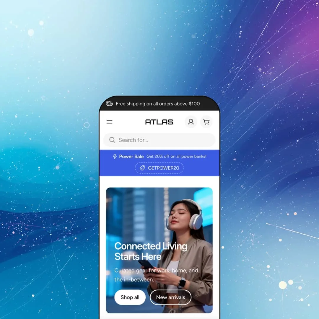
You notice the pacing first. The homepage doesn't just stack sections; it sequences them. A wide hero image with "Connected Living Starts Here" gives way to two side-by-side promo tiles (Audio and Essentials), then a horizontal trust badge strip, then a Shop by Category grid with four tall image cards and overlay text, and finally a tabbed bestsellers carousel. Each layer feels like it earns its place rather than padding the page.
That bestsellers section is worth calling out. Two tabs, Smartwatches and Headphones, each load a scrollable row of product cards. Flip between them and the content swaps instantly, no page reload, no stutter. It's a smart way to show off a deep catalog in a compact footprint. Ten or more products per tab, all accessible without vertical scroll fatigue.
The palette does a lot of the heavy lifting here. Dark navy and white, clean sans-serif type, generous whitespace. Product images sit on neutral backgrounds with consistent proportions, which keeps the grid looking cohesive even when you're mixing watches next to power banks next to desk lamps. The color scheme doesn't compete with the merchandise. It frames it.
The mega menu is a standout in this demo. Open the "Shop all" dropdown and it unfolds into a multi-column layout: Audio, Wearables, Power, Lighting, Computing, Home Tech, Accessories, each linking to a collection. The right side features lifestyle image cards with editorial labels like "Everyday essentials" and "Worth the upgrade." Category headers carry inline badges: "New releases," "-20% OFF." It's not just navigation. It's a second storefront inside the header.
Two announcement bar messages run across the top: "Free shipping on all orders above $100" and "24/7 Expert Support" with a contact link. Communicating two value propositions up front is a nice touch, though the double-line bar does eat vertical space. On narrower desktops, that pushes product content a bit further down than you'd like.
Product cards carry a lot of information without feeling overloaded. Contextual badges (Bestseller, Staff Pick, New, Save $10, Save $80) appear consistently, and every card shows a "By [Brand Name]" line beneath the title. That brand attribution turns a standard product grid into something that reads more like a marketplace, which is exactly right for a multi-brand electronics store.
Where it stumbles
The horizontal scrolling in the bestsellers area is a double-edged choice. Ten-plus cards per tab sounds generous, but if a shopper doesn't instinctively swipe or spot the scroll affordance, they'll see three or four products and assume that's everything. A "View all" link exists, but you have to scroll all the way to the end to find it. Burying the escape hatch defeats the purpose.
And then there's the elephant in the room: one preset. Just one. At $280, most competitors give you three or four, covering different niches and palettes so you can pick a closer starting point. Here, every merchant begins with the same dark-tech look. The 32+ sections and block system absolutely provide the tools to build something different, but you're building from scratch rather than tweaking a preset that already fits your niche.
Niche Suitability
-
This setup is tailor-made for multi-brand electronics and gadget stores, curated tech marketplaces, and any high-SKU catalog where brand recognition, stock visibility, and specs matter. The combination of brand attribution, category-organized mega menu, and inventory counts creates a storefront that feels engineered for exactly that kind of shopping.
Not Ideal For
-
It's a harder sell for single-product brands, tiny catalogs, or merchants chasing a warm, lifestyle-driven look. The dark tech palette and editorial density require real visual rework to suit softer brand identities, and there's no alternate preset to shortcut that process.
Final Recommendation
-
Merchants running medium to large catalogs with multiple brands or product categories, especially in electronics, gadgets, home tech, or any niche where specs, stock availability, and brand attribution matter to the buyer. Also a strong pick for store owners who want to keep their app stack lean, since the theme's built-in conversion tools cover sticky cart, promo codes, stock counters, and cross-selling natively.
-
Brands with very small catalogs, single-product stores, or merchants who want a warm, lifestyle-driven aesthetic without heavy customization. If picking from multiple ready-made presets is important to your workflow, Atlas won't offer that flexibility at launch.
-
Medium. You'll spend meaningful time configuring the layout and visual identity from a single starting point. But the 32+ sections and block-based architecture keep the learning curve manageable once you're inside the editor, and the payoff is a store that runs lean on apps.
★ 8.0/10
Rating
-
Exceptionally feature-rich for its price. Built-in sticky cart, quick buy, stock counters, mega menu with promos, enhanced search, promo code blocks, and product badges cover most conversion needs without third-party apps.
9
-
Deep flexibility from 32+ sections and 18+ blocks, but the single preset means more manual setup than themes with multiple starting points. Straightforward once configured.
7
-
The layout adapts cleanly. Mega menu collapses into a well-organized mobile drawer, search overlay stays fully functional, and product grids reflow without breaking.
8
-
Pages loaded quickly throughout testing. Search overlay, cart drawer, and mega menu all opened without perceptible delay. Smooth image rollover and instant tab switching. No jank.
8
-
Wide design canvas with animations, slideshows, image galleries, RTL support, and a large section library. The single preset is the only constraint at launch.
8
-
👑 Practically purpose-built. The demo stages smartwatches, headphones, and power banks with brand attribution on every card, and the mega menu sorts products into categories like Audio, Wearables, Power, and Lighting, complete with promo image cards inside the dropdown.
-
📱It adapts well. The mega menu collapsed into a clean mobile drawer during testing, and the enhanced search overlay kept its product thumbnails and trending search terms intact. Card grids reflowed cleanly without layout breaks.
-
🎨 Absolutely. 32+ sections and 18+ blocks give you room to restructure the homepage, swap the dark tech palette, and overhaul typography entirely through the theme editor. The single preset means more upfront work, but the building blocks are comprehensive.
-
⚡Yes. The slide-out cart drawer, mega menu, and predictive search overlay all opened without perceptible delay. Image rollover on product cards was smooth, and switching between bestseller tabs felt instantaneous. No lag worth noting.
-
👕 Multi-variant products display a "Select options" button that opens variant selection, and sale items carry calculated savings badges. On the Venture Pro smartwatch, for instance, a "Save $80" label appeared automatically. Color swatches and size charts are both listed as built-in features.
-
🔎 Breadcrumbs appear on product and collection pages, URLs are clean, and heading hierarchies are properly structured. The blog section (Journal) sits in the main navigation, giving merchants a ready-made content marketing channel without any setup.
-
💱 The theme ships with EU translations covering English, French, Italian, German, and Spanish, plus built-in RTL layout support for right-to-left languages. Currency and country selection visible in the demo header is powered by Shopify Markets, not the theme itself. Atlas simply provides the toggle to display that selector in the header or footer.
-
⚙️ It runs on Online Store 2.0, so the full Shopify app ecosystem is compatible. That said, built-in features like the mega menu, quick buy, stock counter, sticky cart, and promo code block may mean you need fewer apps than you'd expect.
-
🛒 Yes. The live demo is freely accessible, and you can also try the theme on your own store through Shopify's Theme Store. You only pay the $280 when you decide to publish.
This review is based on hands-on testing of the publicly available preset demos of the Atlas Shopify theme as of March 26, 2026. Theme features, preset availability, and performance can change with subsequent updates from the theme developer.