
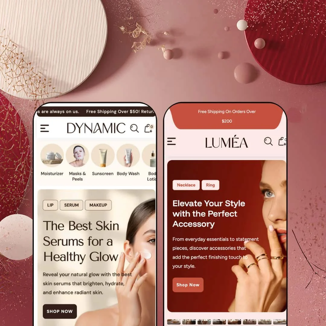
Dynamic is a $290 Shopify theme that tries to replace your app stack. Mega menu, product quiz, before/after slider, countdown timers, video sections, quick buy — it's all baked in. The theme ships two presets: a soft, editorial skincare storefront and a dark, luxurious jewelry showcase. Same engine underneath, completely different vibes on the surface. Whether that feature density is a gift or a headache depends on how much content you're working with. I tested both presets hands-on to find out.
Pros.
〰️
Pros. 〰️
Built-in Product Finder Quiz
Both presets deploy a tag-based quiz that filters products by two user-selected criteria, no third-party app required. In Dynamic it's configured for skin type and concern; in Lumea it swaps to jewelry type and metal preference. The fact that it adapts this cleanly across two completely different verticals through simple tag changes makes it one of the theme's most commercially valuable sections. For stores with large or complex catalogs, this can meaningfully shorten the path to purchase.
Before/After Image Slider with Product Callout
The draggable before/after slider appears in both presets and ties directly to a linked product card. That's the key detail. It doesn't just show a transformation; it pairs visual proof with an immediate purchase opportunity. For results-driven categories like beauty, fitness, home renovation, and jewelry styling, this mechanic is a genuine conversion lever. And it's built in, not bolted on.
Mega Menu with In-Menu Promotions
The multi-column mega menu goes well beyond what most Shopify themes offer at this price point. It supports deep subcategory nesting, direct product links, and embedded promotional images. In the Dynamic demo, it opens under "Shop" to reveal three category groups alongside two promo banners labeled "Best Seller" and "New Arrivals." That's advertising real estate inside the navigation itself, and it dramatically reduces clicks for shoppers trying to reach deeper catalog pages.
Multiple Video Storytelling Sections
The theme supports native Shopify video embeds in at least two distinct section layouts: a single video block with heading, body copy, and CTA, plus a multi-video gallery capable of showing several clips side by side. For brands where product motion matters (jewelry sparkle, skincare textures, fabric drape), this keeps video within the theme's visual system and eliminates the need for third-party embeds. It's a feature that punches above its weight for the price.
Conversion-Driven Product Card Treatments
Product cards feature a scrolling discount marquee that animates the percentage-off value continuously across the card face. It's more eye-catching than a static badge and creates urgency without cluttering the layout. The theme also supports color swatches directly on featured product cards, as demonstrated in Lumea's "Eternal Glow Necklace" section where Brown, Beige, and Bronze options appear inline with an Add to Cart button. Variant selection and purchase without a full page load? That's a real time-saver for shoppers.
Cons.
〰️
Cons. 〰️
High Homepage Section Density
Both presets stack roughly 12 to 15 or more sections on the homepage: hero slideshows, category strips, quizzes, video blocks, testimonials, Instagram grids, and more. For merchants with deep catalogs and plenty of photography, that density is an asset. For everyone else, it means a lot of section trimming before the store feels focused. On mobile, the scroll depth gets especially long. This isn't a flaw exactly, but it's a reality merchants need to budget setup time for.
Sold-Out State Needs Stronger Visual Treatment
In Dynamic, the "Body Lotion for Dry" card shows a plain "Sold out" text label with no contrasting background, color shift, or overlay. Next to the animated discount marquees on adjacent cards, it's easy to miss entirely. A more prominent treatment, like an image overlay or a color-blocked badge, would make stock status legible at a glance. Right now, the sold-out indicator whispers when it should be speaking clearly.
-
A clean, editorial beauty storefront dressed in soft pinks, whites, and warm neutrals. It channels DTC cosmetics brands that invest heavily in storytelling, the kind of homepage that reads more like a magazine spread than a product catalog. The photographic styling is airy and feminine throughout, targeting shoppers who expect polish alongside their product discovery.
What works in this preset
The tabbed product showcase is where this preset really hits its stride. Three tabs labeled "Best Seller," "Trending Now," and "What's Hot" each pair a large lifestyle image on the left with a scrollable product grid on the right. Switch tabs, and both the hero image and the product selection swap simultaneously. The beauty-specific photography sells the editorial mood hard, and the whole section feels more like a curated lookbook than a grid dump.
There's a numbered step-by-step skincare guide that walks shoppers through a six-step routine: Prep Your Skin, Apply Foundation, Conceal & Set, Add Color, Eyes & Brows, and Finish with Lips. Each step pairs a small icon with a linked product card. It's clever. You're reading advice, and before you know it, you've got six items to consider adding to your cart. For beauty brands, this kind of educational selling is exactly the play that turns browsers into buyers.
Product cards carry tag-based badges like "Anti-Aging," "Dry," "Brightening Boost," and "Hydration" right on the grid. They sit alongside collection tags such as "Body Care" and "Foundations," which gives shoppers a quick read on what each product does before clicking through. It's especially useful in the "Latest Arrivals" and "Featured Products" sections, where the tags add a layer of browsing intelligence that makes immediate sense for a skincare catalog.
Two video sections appear on the homepage. The "Ellara Story" block plays a native Shopify-hosted video inline alongside heading text and a CTA, while a second section titled "Easy Steps To Cleanse" sits lower on the page. Both use beauty-lifestyle footage that fits the editorial tone. Having two separate video placements creates breathing room between the product grids and reinforces the brand narrative without needing a YouTube or Vimeo embed.
A large image-and-text block titled "Where Beauty Meets Gentle Care" rounds out the brand storytelling. Two stacked photographs pair with a multi-paragraph origin story and a "Discover more" CTA. It's warm, soft-focus, and on-brand. Nothing groundbreaking, but it sustains the editorial rhythm the rest of the page establishes.
Where it stumbles
The image aspect ratios aren't consistent across every section. In "Latest Arrivals," product cards sit in clean squares. But further down in "Glowing Beauty in The Spotlight," the paired icon-and-product layout creates uneven visual weight. The icons and thumbnails are at different ratios, and the result is a rhythm hiccup on an otherwise polished page. It's noticeable if you're paying attention.
Blog cards display dates in a rigid format ("07 Jan 2026") with no relative-time option. For merchants publishing weekly, those fixed dates start making content feel stale faster than necessary. It's a small thing, but editorial-minded brands notice details like this.
-
Dark backgrounds, gold accents, warm metallics. Lumea stages a luxury jewelry storefront that targets premium accessories and occasion-based gifting. The mood is opulent and deliberate, suited to fine jewelry, bridal shops, and artisan accessory brands. It's heavier and more dramatic than the Dynamic preset, and it wears that weight well.
What works in this preset
Social media icons for Facebook, Instagram, YouTube, and TikTok sit directly in the top navigation bar. It's a small staging choice, but it matters for jewelry brands where social presence builds trust. The header-level placement gives the store a different navigation personality compared to Dynamic's cleaner top bar, and for luxury verticals, that instant cross-channel signal is worth the real estate.
The "Timeless Elegance Collection" section is the standout here. Instead of organizing products by type (rings, necklaces, bracelets), it groups them by occasion: Wedding, Engagement Rings, Birthday Gift, Anniversary Gift, Couples, Everyday Essentials, Kids, Travel, and Party. That's smart. Jewelry shoppers often browse by intent, not category. This grid turns gift-buying into a guided experience rather than a scavenger hunt.
Three separate video placements appear on the homepage, including a craftsmanship story block ("Unveil The Craftsmanship") and a multi-video gallery titled "The Sparkle Steals The Spotlight" with three side-by-side thumbnails. For jewelry, video isn't optional. You need to show sparkle, movement, the way light catches a stone. This triple-video staging delivers that kind of proof in a way no static image grid can match.
Two side-by-side promotional banners ("Enjoy 25% Off This Stunning Ring" and "40% Off Elegant Earrings") break up the product grid with independent CTAs and imagery. They're well-suited to jewelry's seasonal sale cadence and provide targeted promo space without hijacking the full-width hero. It's a practical layout decision that gives merchants two extra conversion touchpoints.
A repeating text strip runs horizontally mid-page: "Crafted With Precision / Designed To Shine / Luxury In Every Detail / Timeless Jewelry." It's kinetic typography, and it works here. The constant motion adds a layer of visual rhythm between product sections and reinforces the luxury positioning more effectively than a static banner ever could.
The Product Finder Quiz shows up again, but reconfigured with "Jewelry Type" and "Metal Choice" dropdowns. Picking "chain" plus "gold" surfaces matching necklaces with color swatches visible inline. It's the same engine that runs in Dynamic's skincare version, just re-tagged. The fact that it adapts this cleanly across verticals confirms it's a genuinely flexible tool, and it gives this preset an interactive discovery mechanic that feels like it was custom-built for jewelry shopping.
Where it stumbles
The blog section heading reads "fgncbng." That's a placeholder string that was never swapped out for final copy. It's sloppy. The rest of the Lumea demo is staged with care, so this one oversight stands out sharply. Merchants won't see it on their live stores, but for anyone evaluating the theme, it suggests the Lumea preset got less editorial attention than Dynamic.
Product repetition is an issue across the homepage. With only about 12 items in the demo catalog, the same Diamond Bracelet, Celestial Silver Ring, and Moonlit Pearl Twist Earrings keep showing up in section after section. A fuller catalog would solve this instantly, but during evaluation it makes it harder to judge how the theme handles visual variety at scale.
No product in the grid carries a sold-out state. Unlike Dynamic, where at least one card shows a "Sold out" label, Lumea doesn't demonstrate the out-of-stock treatment at all. The capability exists at the theme level and would kick in once inventory hits zero, but merchants evaluating stock management UX won't find a reference point here. A missed opportunity to show the feature in action.
Niche Suitability
Not Ideal For
-
Beauty, skincare, jewelry, and premium DTC brands that want an editorial, conversion-optimized storefront with built-in product quizzes, before/after proof sections, and video storytelling. It suits merchants who have the content to fill a dense homepage and who don't mind investing time in curation. If you've got the photography and the product depth, Dynamic gives you a lot to work with.
-
Merchants who want a minimal, fast-to-launch setup, or anyone running a catalog under 10 products. The homepage density would feel repetitive with a thin catalog, and the editorial approach doesn't suit utilitarian stores where search and filtering matter more than storytelling. If your priority is getting products in front of shoppers with as few clicks as possible, there are leaner options out there.
-
Medium. The theme ships with sections pre-built, which saves development time, but the high density means you'll need to decide what stays, what goes, and how to reorder things for your brand. The Product Finder Quiz also requires proper product tagging to function, adding a configuration step that goes beyond typical theme setup.
Final Recommendation
★ 7.4/10
Rating
-
A genuinely impressive built-in feature set: mega menu, product quiz, before/after slider, countdown timers, video sections, and quick buy. The quiz and slider in particular go beyond what most themes offer at this price, removing the need for multiple third-party apps.
8
-
The number of homepage sections means setup requires real decision-making about what to keep and what to disable. Product tagging for the quiz adds another step. Once configured, day-to-day management is straightforward.
7
-
Sections stack and scale well. The category strip becomes swipeable, the mega menu collapses into a drawer, and product grids adapt to touch. The trade-off is scroll depth: with this many sections, mobile shoppers do a lot of thumbing.
7
-
Pages loaded at reasonable speed during testing. Multiple video sections and heavy image counts could slow things on weaker connections, but interactive elements like the menu, search, and sliders felt responsive and fluid throughout.
7
-
Two presets targeting completely different verticals (beauty vs. jewelry) prove the theme's range. The quiz, slider, collection grid, and video sections are all configurable. Typography and color are fully customizable through the theme editor.
8
-
👑 It does. The Product Finder Quiz, before/after slider, and step-by-step guide are all vertical-agnostic. In Lumea, the quiz adapts from skincare concerns to jewelry metal preferences with just a tag change, so food, fitness, or home goods stores could repurpose these sections with proper product tagging.
-
📱Both presets adapt their layouts for smaller screens. The horizontal category strip in Dynamic becomes swipeable, the mega menu collapses into an accordion-style drawer, and product grids shift to single or double columns. The homepage does get long on phones, though. That's the trade-off for all that section density.
-
🎨 A lot. The two presets alone prove the theme can swing from soft pastels and editorial skincare photography to dark backgrounds with gold-accented jewelry staging. Typography, colors, section ordering, and imagery are all configurable through the standard Shopify theme editor. You're not locked into either preset's aesthetic.
-
⚡Interactive elements responded quickly during hands-on testing. Lumea's search overlay opened instantly and surfaced popular products and collection links without delay. Image-heavy sections like the slideshow and product grids rendered smoothly. Merchants loading multiple video sections should keep an eye on total page weight, but the baseline experience felt fluid.
-
👕 Yes. In Lumea, the "Eternal Glow Necklace" featured section shows color swatches (Brown, Beige, Bronze) directly on the homepage card with an inline Add to Cart button. On product pages, variant selectors appear clearly above the quantity field. The theme's feature list also confirms swatch filters at the collection level.
-
🔎 The theme follows Shopify's standard SEO architecture: clean URLs, meta title and description fields, proper heading hierarchy (H1 through H3 observed across pages), and alt-text support on images. Blog functionality with post summaries and "Read More" links is present in both presets. There's no proprietary SEO tooling beyond the Shopify defaults, but the foundation is solid.
-
💱 Yes. The theme ships with EU translations covering English, French, Italian, German, and Spanish. Lumea's demo includes a country and currency selector accessible from the footer, which displayed INR pricing with an English language option during testing. Broader language and currency handling runs through Shopify's standard configuration tools, and the theme supports those settings out of the box.
-
⚙️ Dynamic is built on Shopify's standard theme architecture, so app integration follows normal workflows. Worth noting: the theme already bundles functionality that typically requires paid apps (product quiz, before/after slider, countdown timers, mega menu), so you may actually need fewer apps than usual.
-
🛒 Yes. Shopify's standard "Try theme" option is available on the Dynamic listing. You can install it on your development store, customize freely, and preview everything with your own products before committing to the $290 one-time purchase.
This review is based on hands-on testing of the publicly available preset demos of the Dynamic Shopify theme as of March 2026. Theme features, preset availability, and performance can change with subsequent updates from the theme developer.