
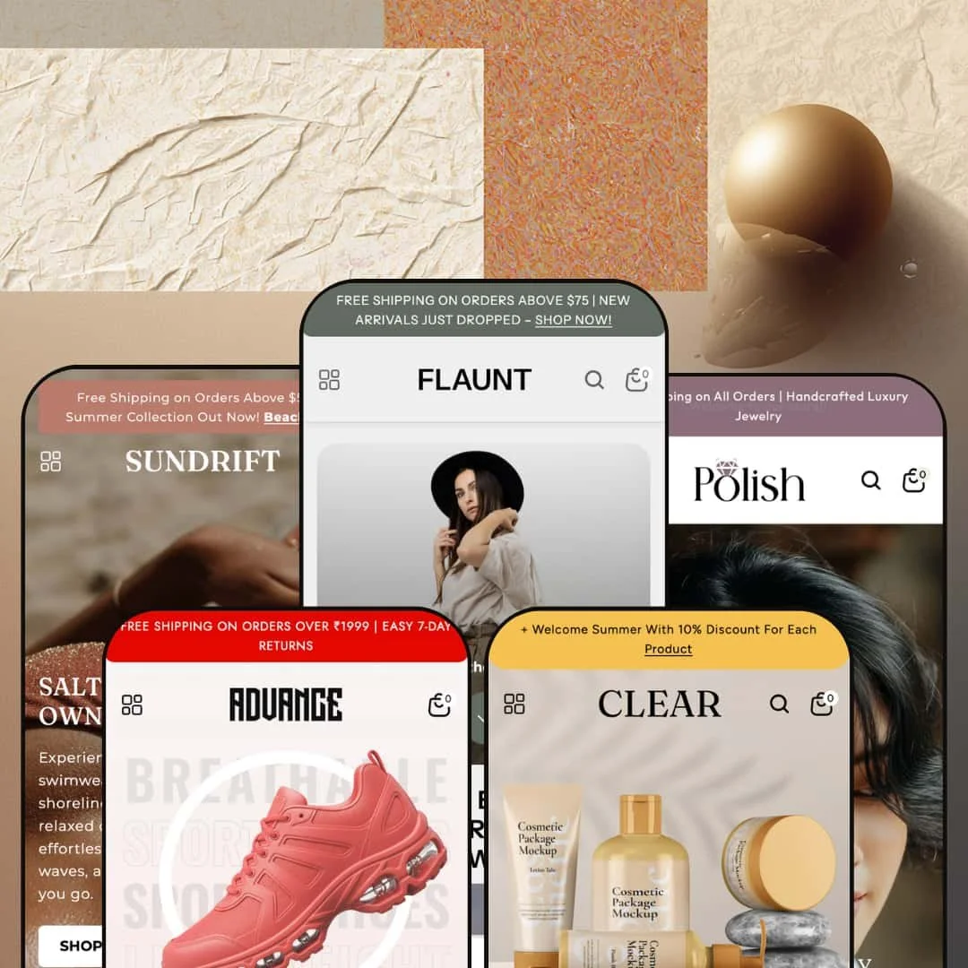
Flaunt wants to be the one theme that covers fashion, beauty, swimwear, jewelry, and footwear without making you compromise on any of them. At $290, it ships with five presets, each staged for a different niche, and the range is genuinely impressive once you start clicking through the demos. This isn't a theme that swaps color palettes and calls it a day. Each preset rethinks navigation, homepage rhythm, and visual density to match its target industry.
Pros.
〰️
Pros. 〰️
✚ Mega menu with embedded merchandising
The mega menu system is Flaunt's most versatile feature. Every preset uses it, and the ability to embed promotional images alongside nested product and category links turns the navigation into a merchandising surface. Clear pushes it to three nested levels for skincare routines, Advance uses it to organize by sport, and Polish stages intent-based shortcuts like "Best Sellers" and "New Arrivals." The architecture adapts to the niche rather than forcing a one-size-fits-all dropdown.
✚ Predictive search that actually helps
Before you type a single character, the search drawer shows popular query tags and a "Best Sellers" product grid. That pre-populated state cuts friction for returning customers who know roughly what they want. Once typing begins, results update in real time with thumbnails, prices, and direct links. The behavior was consistent across all five preset demos.
✚ Built-in tools that replace paid apps
Product bundles, a lookbook template, before/after image sliders, image hotspots, countdown timers, a featured product section with mid-page purchasing, and a slide-out cart with upsell capability all come built in. These are tools most competing themes handle through third-party apps, so having them native reduces ongoing costs and compatibility headaches. The bundle section alone is a meaningful conversion advantage for stores with complementary product lines.
✚ Product cards packed with urgency signals
Cards across all presets display percentage-off badges, "Sold out" labels, and low-stock counters at the same time. That's three built-in urgency levers without any app installs. The percentage-off calculation is automatic based on compare-at pricing, the stock counter pulls real inventory data, and quick buy with image rollover round out the card. For a grid element, it's carrying a lot of weight.
Cons.
〰️
Cons. 〰️
🚫 Countdown timer labels need fixing
The Flaunt preset demo displays the countdown timer with placeholder zeros and a duplicated "Mins" label instead of "Hrs" and "Mins." Until a merchant configures an active end-date and verifies the label output, the section reads as broken rather than urgent. It's a small fix, but it's the kind of detail that erodes trust if a merchant publishes without catching it.
🚫 Announcement bars won't go away
Across the Flaunt and Polish demos, the announcement bar sits at the top of the viewport with no visible close or dismiss button. It permanently occupies vertical space, which on smaller laptop screens eats into the hero section and product content. Merchants can control the message, but visitors can't make it disappear, and that's a UX limitation that keeps the bar visible for an entire session.
-
This is the flagship preset, and it shows. Flaunt stages a women's fashion boutique with warm editorial photography, a blush-ivory-charcoal palette, and a homepage that just keeps going: hero image, four-column category grid, product slider, video block, lookbook gallery, countdown timer, blog section. It's the most section-dense of the five, and it leans hard into editorial storytelling.
What works in this preset
The standout here is a "Build Your Bundle" section sitting right on the homepage. Shoppers pick items, each card shows pricing and a thumbnail, and a sidebar tracks the selection in real time before sending the whole bundle to cart. For a clothing boutique where outfit-building drives average order value, this is a genuine conversion tool, not a gimmick. Most competing themes would need a paid app for this.
The Lookbook page deserves its own mention. It's not a flat image gallery. It uses an asymmetric masonry grid with overlaid CTAs ("Inspire," "Wardrobe Goals," "Style Story," "Glam Guide"), each linking to products or collections. The result feels editorial, like flipping through a fashion magazine that happens to have buy buttons. This is the most fully staged lookbook across all five demos.
Scroll further and you'll hit an embedded video section that transitions from a lifestyle poster into auto-playing background footage. Fashion brands running seasonal campaigns will appreciate the ability to embed a brand film directly into the homepage flow without building a separate landing page for it.
There's also a "Spotlight Collection" section that pairs a promo banner with a horizontal thumbnail strip. Hover over a thumbnail and the main product card swaps, complete with pricing and an add-to-cart button. It works well for curated edits, seasonal picks, or staff favorites, and it feels more interactive than a standard product grid.
Mid-homepage, a featured product block lets visitors browse a full image gallery, pick colors and sizes, open a size-chart modal, and add to cart without ever leaving the page. That's a meaningful shortcut for stores with a hero product they want to push hard.
The palette itself is worth noting. Warm blush tones against charcoal, editorial-grade photography styling, and a section rhythm that alternates between content and commerce. The whole thing feels curated, not templated. Typography pairs a bold display heading with thin body text, reinforcing the fashion-forward identity.
Where it stumbles
The countdown timer is a problem. It displays "00 Days 00 Mins 00 Mins 00 Secs" with a visible label duplication, "Mins" printed twice instead of "Hrs" and "Mins." Until a merchant configures an active end-date and fixes the labels, this reads as a broken element rather than a conversion driver. The timer capability itself is theme-wide, but its staging here needs immediate attention before going live.
-
Clear takes a sharp turn from fashion drama into spa-inspired calm. It stages a beauty and skincare store with soft pastels, generous white space, and the deepest navigation hierarchy of any Flaunt preset. Where most themes organize products by type, Clear organizes by skincare concern, and the difference immediately feels more intuitive for beauty shoppers.
What works in this preset
What caught my attention first was the navigation. Categories are organized by skincare concern ("Acne & Blemish Care," "Dark Skin & Circles") alongside routine-based groupings (Cleansers, Serums & Essences, Moisturizers & Creams). That's how beauty shoppers actually think. They're searching by problem, not by product format, and this demo shows how the mega menu can be configured to match that mental model.
The "Hair Care" section goes even deeper: three levels of nesting from the top-level collection down through subcategories (Shampoos, Hair Oils, Hair Masks, Serums & Conditioners, Scalp Care, Heat Protection) and then into individual product links. It's the deepest menu staging across all five presets, and it proves the theme can handle a 50+ SKU beauty catalog without the navigation feeling cluttered.
Visually, the soft pastel palette and white space do exactly what a skincare brand needs. Product imagery sits against light, airy backdrops that communicate cleanliness and efficacy. The typography is understated, thin heading weights with generous letter-spacing that reinforces a clinical-editorial aesthetic. It's a deliberate style choice that separates Clear from the bolder presets.
The "Bath & Body" section organizes into six subcategories (Body Scrubs, Body Lotions & Creams, Body Oils, Hand & Foot Care, Soaps & Cleansers, Deodorants), and each links to its own collection page with proper breadcrumbs. For personal care and wellness brands with broad product lines, this staging shows the theme won't buckle under catalog weight.
Two promotional banner images sit inside the mega menu alongside the navigation columns. They're staged with lifestyle shots that complement the skincare context, guiding the eye from category links to seasonal highlights. It's a subtle touch, but it turns the navigation into a merchandising surface.
Where it stumbles
That three-level navigation depth cuts both ways. It's powerful for large catalogs, but a skincare brand carrying only 15 to 20 products would find some subcategories surfacing nearly empty collection pages, which undermines trust. This isn't a theme limitation. It's a staging choice that assumes a medium-to-large catalog, and smaller merchants should simplify the structure before launching.
-
Sundrift trades editorial weight for sun and sand. The photography is warm and coastal, the collection categories are organized around swimwear types, and the homepage opens with a multi-slide hero carousel before moving into a five-column collection grid. But the real draw here is a "Fits For Every Body" section that speaks directly to how swimwear shoppers actually make decisions.
What works in this preset
The "Fits For Every Body" section is the kind of feature that makes you pause and think "someone actually understands this niche." Custom SVG icons represent body types and fit preferences: Tummy Control, High Waisted, Tankinis, Mid Size, Push Up, Long Torso, Underwire. Each icon links to a filtered collection, so shoppers can navigate by fit concern before browsing a single product. Fit confidence is the conversion bottleneck in swimwear, and this section attacks it head-on. No other preset stages anything like it.
The hero slideshow rotates through three full-bleed beach scenes, each with its own headline, body text, and CTA pointing to a different collection (Beachwear, Resort Wear, Bikinis). The messaging hierarchy stays consistent across slides, and the warm coastal photography creates an aspirational tone that fits the niche without trying too hard.
Navigation under "Shop" breaks into swim-specific categories: Beach Dresses, Cover-Ups, Bikinis, One-Piece Swimsuits, Performance Swimwear, Luxury & Designer. Each includes three product links and two promo images within the mega menu. The taxonomy feels immediately relevant to the target shopper rather than generic.
A five-column collection grid with rounded-edge imagery (One-Piece Swimsuits, Performance Swimwear, Luxury & Designer, Bikinis, Tankinis & Monokinis) functions as a visual category map. There's zero ambiguity about what this store sells. The rounded image treatment softens the grid and contributes to the relaxed, resort-inspired identity that defines Sundrift.
Where it stumbles
No significant issues surfaced during testing. The staging is clean, the sections render well, and the interactions work as expected. The only real caveat is that the beach-heavy photography and swim-specific navigation modules would require substantial reconfiguration for merchants outside the seasonal fashion space.
-
Polish is the luxury play. It stages a jewelry boutique with a dark-and-gold palette, a three-slide hero carousel, and a five-column collection grid covering Rings, Necklaces, Earrings, Bracelets, and Accessories. Everything about the staging says "high ticket," and the visual presentation is calibrated to match.
What works in this preset
The dark-and-gold palette is Polish's defining feature, and it works. Jewelry photography pops against dark backgrounds, gold and gemstone textures catch attention, and the overall aesthetic conveys luxury without veering into over-the-top territory. This is a hard style choice that separates Polish from every other preset. Any brand that wants its storefront to feel like a curated showroom will find a strong foundation here.
The hero carousel runs three slides with layered messaging: "Elevate Your Everyday Elegance," "Where Art Meets Elegance," and "Jewelry That Speaks Your Story." Each pairs a subhead label (Explore Collections, New Arrivals, Signature Styles) with a headline, body text, and CTA. Jewelry brands live and die by seasonal campaigns (holiday gifting, Valentine's Day, bridal), and this rotation gives them three campaign slots right above the fold.
A five-column collection grid (Rings, Necklaces, Earrings, Bracelets, Accessories) uses consistent jewel-toned photography with rounded image masks. It reads like a gallery wall, and the consistent photographic treatment across categories reinforces premium positioning. The mega menu includes "Best Sellers" and "New Arrivals" promo images that function as intent-based shortcuts, particularly effective for gift buyers who start with "what's popular" rather than "rings."
A "Luxury Sets" collection surfaces gift-ready bundles (Layered Gold Interlocking, Opulent Multi-Gemstone), supporting the gift-giving use case that jewelry stores depend on. Staging bundled sets as a distinct collection rather than burying them within categories makes the gift-shopping journey more intuitive.
Product cards display original prices, sale prices, and percentage-off badges ("16% OFF," "20% OFF," "21% OFF") simultaneously. Price anchoring matters more in jewelry than almost any other category because the absolute discount amount feels significant at higher price points. Combined with stock counters and "Sold out" badges, the cards build a scarcity-and-value narrative that resonates.
Where it stumbles
The "Our New Arrivals" grid defaults to a single horizontal row before requiring a scroll. For a jewelry store where browsing new pieces is a core shopping behavior, this limited initial exposure could reduce engagement. A merchant could reconfigure the section to show more rows, but the default staging favors a curated, fewer-is-more approach that won't suit every catalog size.
-
Advance goes full athletic. Dark palette, high contrast, energetic hero imagery, and a navigation structure organized by sport and audience. The homepage layers a three-slide hero carousel, a four-column audience grid, an icon-based shoe-type strip, and a tabbed "Shop by Sport" section, creating multiple entry points that mirror how footwear buyers actually shop.
What works in this preset
The tabbed "Shop by Sport" section is the centerpiece. Basketball, Football, Running, Tennis, Skateboarding, and Gym & Training each get their own tab, complete with item counts visible before clicking. This navigation pattern mirrors how footwear buyers think: activity first, then style. No other preset stages this kind of tabbed category system, and for a multi-sport shoe store it's the most efficient way to segment a large catalog.
Below that, an icon-based shoe-type strip uses custom SVG icons for Boots, Boat Shoes, Chelsea Boots, Formal Shoes, Casual Shoes, Loafers, Orthopedic Shoes, and Sneakers. Each links to a dedicated collection, creating a secondary navigation layer that complements the mega menu. The icons are clean, consistent, and give an at-a-glance overview of the store's range that text links alone couldn't match.
A four-column audience grid (Men, Women, Kids, Unisex) sits above the sport-specific navigation, creating a layered funnel. Someone who arrives knowing they want "women's shoes" and someone who arrives wanting "basketball shoes" both find an immediate entry point without scrolling. The funnel goes audience at the top, sport in the middle, shoe type at the bottom, and the layers don't overlap.
The mega menu under "Shop" organizes into six sport and type categories (Basketball, Football, Tennis, Formal Shoes, Loafers, Gym & Training), each with three product links and two promotional images. Even the "Our Story" menu item uses a nested dropdown (About us, FAQ's, Contact us), which is useful for stores investing heavily in brand storytelling alongside product sales.
The dark, high-contrast palette with bold accents creates an energetic visual identity that matches the athletic niche. Hero slides use action-oriented headlines ("Step Into Comfort," "Designed For Moves That Matter," "Built To Go The Distance") with separate desktop and mobile banner images for proper subject framing across devices. The tone is sporty, confident, and youth-oriented.
Where it stumbles
The custom SVG icon sets for shoe types and sport tabs are a double-edged sword. They're a strength for footwear stores, but a merchant switching to a non-footwear niche would need to replace or remove two entire visual navigation modules. The icons are specific enough (shoe silhouettes, sport equipment) that generic substitutes wouldn't feel coherent without dedicated design work. If you're not selling shoes, start with a different preset.
Niche Suitability
Not Ideal For
-
Fashion, beauty, swimwear, jewelry, and footwear brands with medium-to-large catalogs (20+ products) that want editorial-grade visual merchandising, deep navigation, and built-in conversion tools without leaning on third-party apps. The five presets provide genuine niche-specific starting points rather than generic reskins, so merchants in these categories can launch faster.
-
Merchants with very small catalogs (under 10 SKUs) will find the extensive homepage sections and deep navigation structures hard to fill convincingly. Stores needing highly technical product configurators, or brands that prefer an ultra-minimal single-column layout with zero promotional sections, would be better served by a more stripped-back theme.
-
Medium. The presets give you a strong starting point, but you'll need to customize countdown timer labels, replace placeholder promo images, and adjust mega menu depth to match your actual catalog. Stores outside the five preset niches should budget extra time for icon and photography replacement.
Final Recommendation
Rating
★ 7.8/10
-
Dense feature set covering mega menus, predictive search, bundles, lookbook templates, before/after sliders, image hotspots, countdown timers, quick buy, swatches, size charts, and stock counters. Built-in tools reduce app dependency and compete with themes at higher price points.
8
-
Five well-staged presets offer strong starting points, but the volume of homepage sections and mega menu options means new merchants will spend real time on initial setup. The drag-and-drop section system keeps things accessible for non-developers.
7
-
Separate desktop and mobile hero banners confirmed in source. Mega menu collapses into a structured mobile drawer. Product grids adapt to single-column layouts, and the slide-out cart stays accessible. Mobile behavior felt fluid across all presets tested.
8
-
Reasonable load speed during testing. Image-heavy sections add payload, but lazy loading and optimized image delivery keep things in check. Interactive elements like the cart drawer, search overlay, and mega menu responded snappily.
7
-
Five presets covering fashion, beauty, swimwear, jewelry, and footwear show real design range. Section-based architecture, customizable color and typography, and configurable navigation depth give merchants substantial control without code.
9
FAQ
〰️
FAQ 〰️
-
👑 It's built for exactly that. The Flaunt preset stages a complete women's clothing boutique with an editorial lookbook, product bundles, and a mega menu organized by clothing type. Beauty (Clear), swimwear (Sundrift), jewelry (Polish), and footwear (Advance) each get purpose-built presets with niche-specific navigation.
-
📱Well. Layouts collapse cleanly to single-column grids across all five presets, the mega menu transforms into a structured mobile drawer, and hero banners use separate mobile-optimized images confirmed in the page source. The slide-out cart and predictive search both work within the mobile viewport.
-
🎨 A lot. Colors, fonts, and section layouts are all adjustable through the Shopify theme editor without touching code. The five presets range from minimal pastels (Clear) to dark high-contrast palettes (Polish, Advance), which shows the breadth of visual identities achievable from a single theme.
-
⚡ Interactive elements like the mega menu, search overlay, and cart drawer responded quickly during testing. The theme uses lazy loading for images, which offsets the payload from heavier sections like the lookbook and video block. Perceived performance felt smooth across all presets with no noticeable delays.
-
👕 Yes. The Flaunt preset's featured product block displayed color swatches (Rust red, Brown, Black, Pink, Olive green) and size selectors (S, M, L, 2XL) with a size-chart modal. Quick buy on product cards handles variant selection for multi-option products across the grids.
-
🔎 The theme supports editable meta titles and descriptions, clean URL structures, image alt text, and structured breadcrumb navigation confirmed on product and collection pages across all presets. A blog template is present in every demo for content marketing.
-
💱 Language and currency support is handled by Shopify Markets at the platform level, not by individual themes. Flaunt is fully compatible with that system. The footer across all preset demos renders a country/region selector and a language switcher, and the Flaunt preset had English and French active during testing. Any Shopify merchant can configure additional languages and currencies through their admin regardless of which theme they use.
-
⚙️ The theme uses Shopify's standard section and block architecture, which supports app embeds. The built-in features (bundles, countdown timers, lookbook, before/after sliders, image hotspots) reduce the need for common paid apps, but the architecture stays fully compatible with the broader app ecosystem.
-
🛒 Yes. Shopify's "Try theme" option lets you install and customize Flaunt before paying. All five preset demos (Flaunt, Clear, Sundrift, Polish, Advance) are publicly accessible on the Shopify Theme Store for hands-on evaluation.
This review is based on hands-on testing of the publicly available preset demos of the Flaunt Shopify theme as of March 2026. Theme features, preset availability, and performance can change with subsequent updates from the theme developer.